Apple doesn’t focus much on the Mac these days, but its newest version of MacOS has officially landed. Where MacOS High Sierra did most of its work behind-the-scenes, MacOS Mojave leaps onto center stage, basking in the spotlight. Instead of bundling together a bunch of file system and security updates, Mojave revels in revamping the MacOS user experience.
Compared to previous updates, are there enough updates here to give Apple a thumbs up?
Lights out
MacOS Mojave is all about front-end updates, new visual elements, new apps, and all sorts of new stuff to get your hands on. First among which is a feature that Mac users have been clamoring for: Dark Mode.

Available in your System Preferences, under General, the new Dark Mode swaps your Mac’s familiar frosty gray-and-whites for a classy evening look. With Dark Mode enabled, your menu bar and dock look less like translucent frosted glass and more like translucent smoked glass.
Apps from Apple take this transformation one step further, trading white backgrounds for a few shades of gray-and-black. It also changes the trash can icon. The day-time theme trash can is silver, the night-time theme trash can is what I can only assume is space gray.
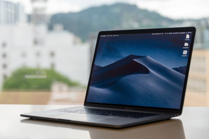
Apple also rolled out a “dynamic wallpaper” that changes depending on the time of day where you are.
Taking this day-and-night theme a step further, Mojave also rolls out a “dynamic wallpaper” that changes depending on the time of day where you are. Start out with a sand dune at dawn and end the day with a sand dune alone beneath a shroud of stars.
They don’t seem like much, but these new features change the character of your MacOS experience — in a good way. The nuts and bolts of the operating system are unchanged, but the texture becomes definitively modern, tasteful, and slick.
Setting up shop
Mac fans have a variety of opinions about the Mac App Store but the consensus seems to be somewhere between “it’s awful” and “it could be better.” Thankfully, Apple is taking those criticisms seriously and rolled out a revamped App Store experience with MacOS Mojave.

The biggest change here is how the store is organized. The bar on the left lets you jump between major categories and browse through regularly updated lists of carefully curated apps, like the iOS App Store ever since iOS 11. It’s a small change but a welcome one, making the App Store more accessible and putting apps on display more prominently.
We’re going to see more iOS apps on MacOS in the near future. At least, that’s the hope.
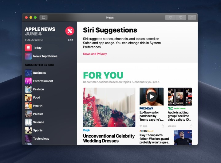
Along with the new App Store, you’ll also get a couple new apps in the Mojave update — an Apple News app, a new Stocks app, an Apple Home app, and finally the Voice Memos app is making its MacOS debut. These apps made their way to MacOS via Apple’s new slightly unified back-end framework.
MacOS apps are typically built with Apple’s AppKit, and iOS apps are made with UIKit, but some behind-the-scenes changes bring these two development tools closer together, which means we’re going to see more iOS apps on MacOS in the near future. At least, that’s the hope.

In addition to some new apps, a major change is coming to an old favorite: FaceTime. Finally, you can ditch Skype entirely — if you haven’t already just replaced it with Discord — and use FaceTime for all your group video chat needs. The new FaceTime supports group calls with up to 32 people — which sounds like a total nightmare.
For regular-sized group conversations, involving just a couple people, it works well. Unfortunately, you’re still stuck FaceTiming with just Apple devices so most of the time you’re probably going to be stuck using Skype anyway — or Discord, which is an excellent alternative. It’s great that FaceTime supports group calls now, but let’s be real: It should have had that feature a long, long time ago.
Stacks and screenshots
This one’s another quality of life change, but it’ll make a difference for anyone who takes a lot of screenshots — like we did for this review. Just right click on your desktop and you can have your files automatically arrange themselves into stacks.

Stacks aren’t folders, but they play a similar role. By clicking on one of these stacks, they automatically expand so you can open the file you want to open, and once you do, they close right up again.
Screenshots also got a bit of a makeover in the MacOS Mojave update. They behave like they do on iOS, which means once you snap one (with Command + Shift + 3) it slides over to a little corner of your screen where you can just pop it open and make any changes you want before saving it to the desktop. MacOS remains the king of screenshotting.
Not bad, not bad at all
For something as simple as an operating system update, Mojave manages to pack enough quality-of-life changes in that you’ll definitely find something to like about this update. Even though Mac users enjoyed the back-end changes Apple made in the last MacOS update, the Mojave update feels a lot more people-focused. With that in mind, it’s no surprise to see Safari receive some major security updates. Now, you’ll get a warning box every time a website requests information from Safari, and Apple redesigned the browser’s back-end to make it harder for ads to track you from site to site. We still prefer Chrome, but at least Safari is now a safe, quick alternative.
Apple has lavished much of its attention on its iOS products for so long, it’s easy to feel neglected as a MacOS fan. Some of that is earned. As Windows and Chrome OS machines get cheaper price tags and innovative form factors, Macs remain relatively unchanged. The small changes in Mojave are cool, but they don’t excuse Apple’s lack of focus, nor do they re-ignite enthusiasm for the company’s desktop platform.
However, hidden beneath some of the flashier updates is a glimmer of hope. Changes to the App Store and APIs point toward a an exciting future of MacOS where its a bit more relevant to Apple’s other products. They lay the groundwork for a possible sea-change in the future where Apple can devote more resources to the Mac. Let’s hope that comes sooner rather than later.


