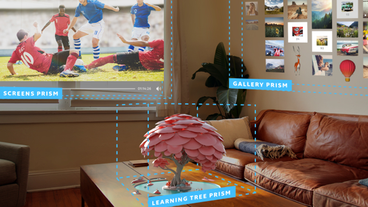
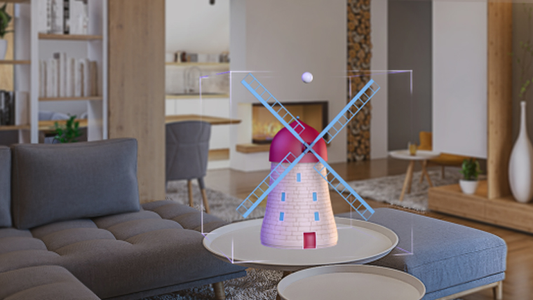
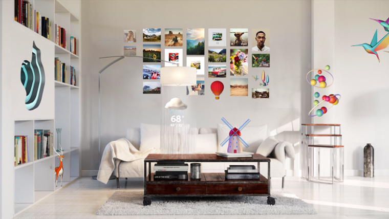
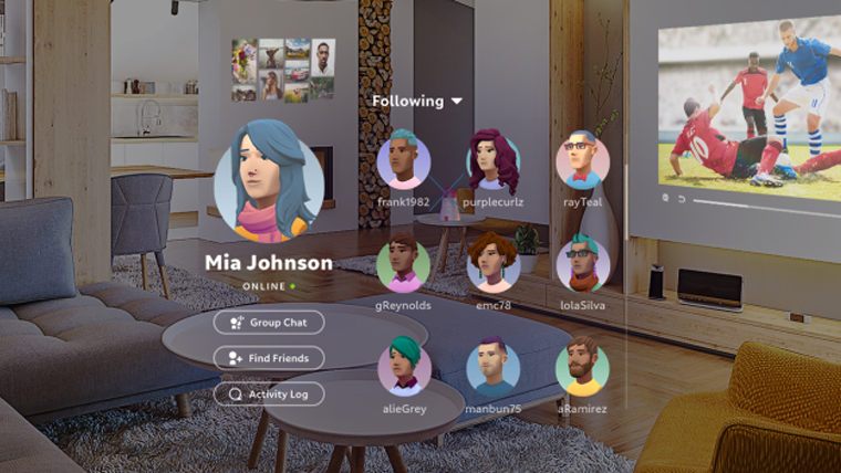
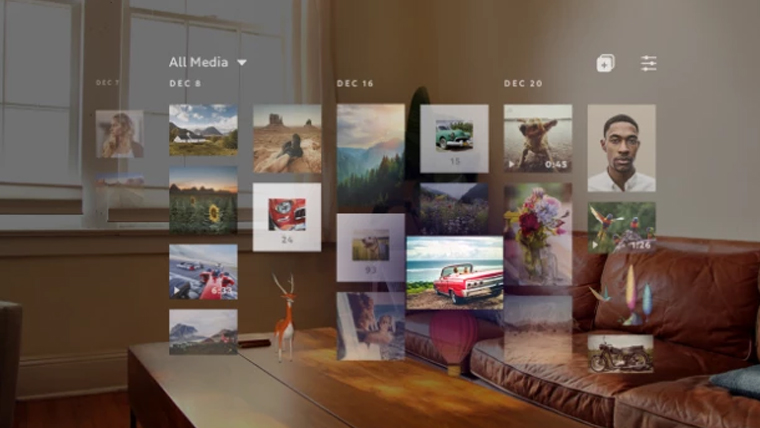
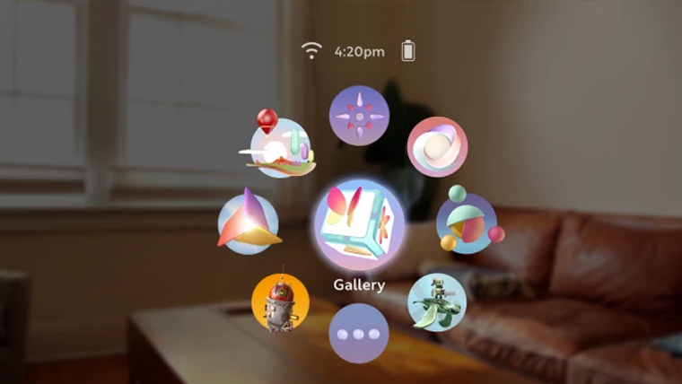
There are no standards for what a virtual or augmented reality user interface should look like, but in the case of Magic Leap, it could be a blend of floating icons in wheels and grids. New mock-up screenshots of what users will see through their augmented reality goggles have been released, showing that menus and icons will be used in both 2D and 3D forms, but in each case will float a customizable distance from the user. With enough space, headset wearers will be able to operate several different menus at the same time, even pinning them in place if needed.
In Magic Leap’s operating system, there will be two distinctive classes of menu systems. The first, known as “Landscape” applications, will use traditional grid and wheel designs to showcase content and options across a 2D pane. Where the menu displays its information and at what distance, will be customizable by the user. Several “menus,” such as galleries of images, or a larger virtual display could operate side by side or in front of one another if that was preferable.
“Immersive” apps, will conform to the environment around them, letting them sit atop a tabletop or ‘break through’ a wall, or hang from the ceiling. Like the Landscape apps, the menus in Immersive applications will be customizable by the user, but they will also take more guidance from the geometry of the space around them.
User controls will involve hand-tracking inputs with drag-and-drop ability, as well as pointer-tracked taps. For more in-depth inputs like typing, virtual keyboards can be displayed to the viewer at whatever angle is most comfortable for them. TechCrunch reports that there will also be options for hardware accessories like Bluetooth keyboards for those who prefer the feel of physical peripherals under their fingertips.
All of this information is available in more depth in Magic Leap’s Creator portal, which has a long list of guidelines and recommendations for developers looking to make content for the augmented reality platform. It suggests that Immersive applications need to allow for smooth entry into and out of the experiences, to prevent them from being jarring and that no matter what kind of app is being created, it should be geared toward enabling multitasking.
