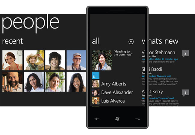
Windows Mobile 7 – or Windows Phone 7 as it will henceforth be known – has finally arrived. Steve Ballmer showed off Microsoft’s long-awaited new mobile operating system at Mobile World Congress in Barcelona Monday morning. But is the slick new interface a true challenger to Apple? Is it too little too late? Will a host of unknowns – like Flash support – trip up the fledgling OS? The Web is already abuzz with pounding keys on the subject. Here’s a sampling.
Gizmodo
In the same way that the Windows 7 desktop OS was nearly everything people hoped it would be, Windows Phone 7 is almost everything anyone could’ve dreamed of in a phone, let alone a Microsoft phone. It changes everything. Why? Now that Microsoft has filled in its gaping chasm of suck with a meaningful phone effort, the three most significant companies in desktop computing—Apple, Google and Microsoft—now stand to occupy the same positions in mobile. Phones are officially computers that happen to fit in your pocket.
Engadget
This really is a completely new OS — and not just Microsoft’s new OS, it’s a new smartphone OS, like webOS new, like iPhone OS new. You haven’t used an interface like this before (well, okay, if you’ve used a Zune HD then you’ve kind of used an interface like this). Still, 7 Series goes wider and deeper than the Zune by a longshot, and it’s got some pretty intense ideas about how you’re supposed to be interacting with a mobile device.
CNet
What Microsoft has shown of its new mobile operating system looks nothing like the tired Windows interface of old; instead it looks like the much more enjoyable Zune HD. The idea of putting people and photos in one place where one can do multiple things is a good one. The connection to Xbox Live could help Microsoft appeal to a whole new area, while a pervasive connection to social networks like Facebook is also a key advance.
Phone Scoop
The user interface looks absolutely nothing like previous versions. If you’ve used a Zune HD, you’re halfway there. There’s a lot of big, pretty text, lists, and swiping up, down, left and right. The animation between screens is sexy as hell. Only what’s absolutely necessary and relevant is shown on the screen. Forget about status bars, menu bars, or any of the usual “chrome”, as Microsoft calls it. Instead, all you see is the content you’re working with at the moment, and absolutely minimalist icons. Well, there is a very minimal status bar on some screens, but it’s much more minimal than you’re probably used to.
PC Magazine
…if it actually performs properly, WP7 has the intangibles that Microsoft phones have lacked for years. It’s fun to explore. The interface makes sense. It’s easy to find the things you need. Nothing is buried. It uses the power of a mobile computer to put important information at the fore – possibly even more immediately than the iPhone.
SlashGear
We had a chance to try out some of the prototypes – though not take photos or video yet – earlier on today, and first impressions are reasonably positive. Microsoft were at pains to point out that it’s still an in-development build, and indeed we saw various bugs and slow-downs. Often these would take place when opening an app, with data being pulled in but no on-screen indication of that taking place nor its progress. The touchscreen on the development device seemed responsive, as was the onscreen keyboard, and the animations are smooth. The browser supports pinch-zoom and will eventually reflow text on a double-tap.


