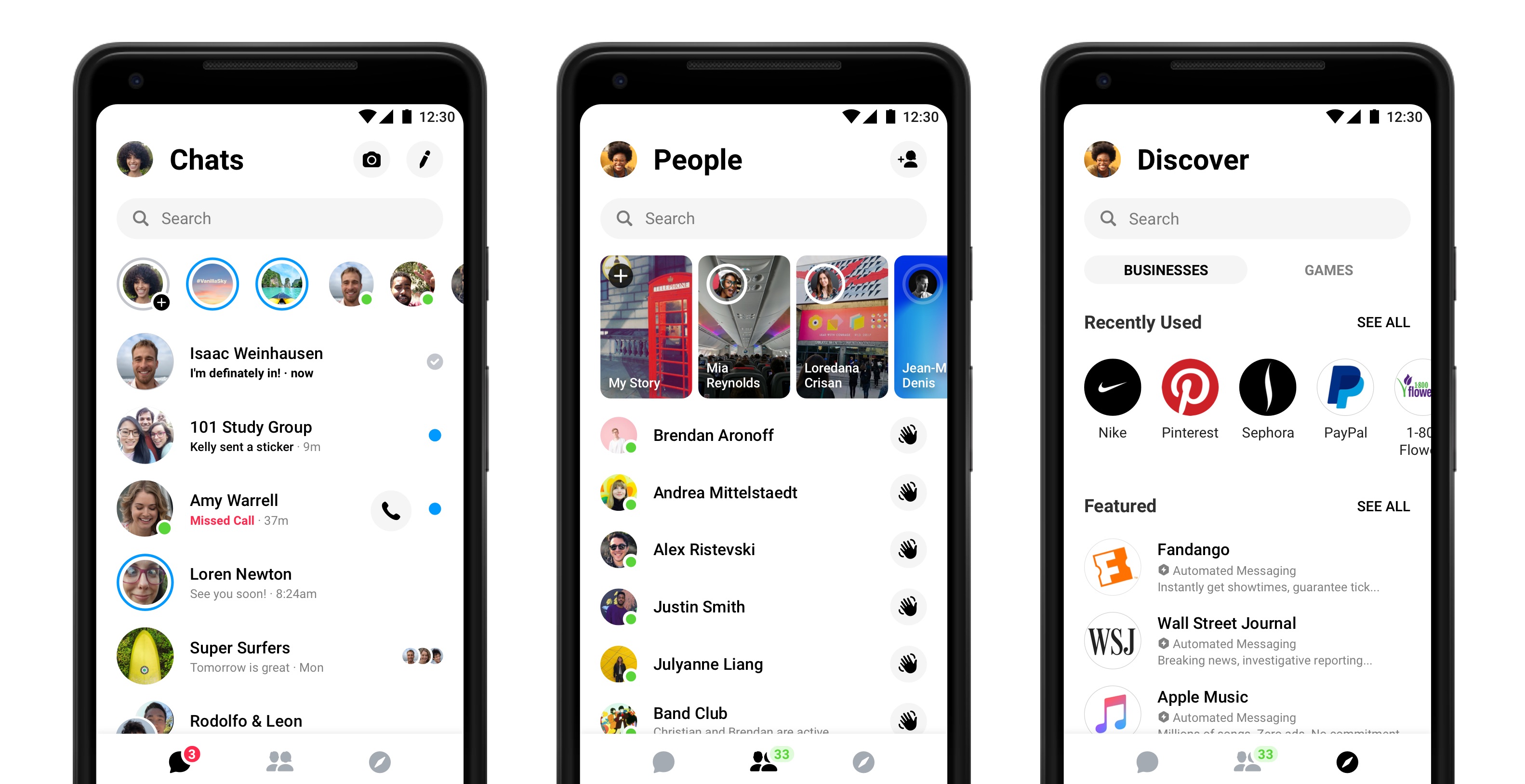
Facebook Messenger will soon funnel all the chat features into a simpler, redesigned app. Facebook has unveiled a new look for the chat platform, dubbed Messenger 4, which will roll out globally over the next few weeks. The redesign simplifies the user interface while introducing new customization options.
Messenger users will first notice the less cluttered screen after updating the app. Instead of five shortcut icons at the bottom, there’s just three. Inside the chat page, messages are no longer divided into tabs for splitting messages from calls and single chats from group chats. Instead, Messenger 4 has three main navigation categories: chat, people, and discover.
The chat interface is the closest to the current Messenger’s home screen, organizing messages and calls into one place. Groups and individual messages are also mixed into the same interface. A shortcut at the top will pull up the Messenger camera.
The People icon organizes Stories while also housing that list of who’s currently active. Games, businesses and automated messaging for tasks like booking tickets will soon live under a single Discover section.
Facebook says that 71 percent of those who responded to a recent survey said simplicity was a top feature for messaging apps. “We believe Messenger 4 delivers the closeness and authenticity that you’ve been asking for — through simplicity of design and powerful features that put the focus back on messaging and connecting,” said Stan Chudnovsky, Messenger vice president.
Besides the streamlined interface, the redesign also brings a handful of new features to customize conversations. Color gradients allows users to customize the look of the chat bubbles with a color scheme that gradually changes over the course of the conversation. Facebook says the color gradients can be changed at any time.
While Messenger 4 looks different, Facebook says that all the familiar features are still there, including location sharing, polls, and group video chats.
Messenger isn’t finished with the changes — the company says it has a handful of other features in the works, including a dark mode that’s designed to reduce glare using a black background. The update is also rolling out in phases, which means your Messenger friends may see the new look before or after you do.


