Apple’s iOS 13 is an update worthy of desire.
Highs
- Dark theme
- Improved editing features in Photos app
- Sign In with Apple offers privacy-focused login option
- Slide to type
- Quality-of-life updates
Lows
- Siri could use a new look
What’s the most obvious change you’ll see with the next version of iOS? The new Dark mode that will transfigure the entire operating system — and your apps — into a darker theme so it’s easier on the eyes.
But while that may be the most talked-about features in iOS 13, it’s just the beginning. Apple announced many upgrades at WWDC 2019, and they result in a more privacy-focused operating system than ever before, along with a host of welcome features.
You can find out exactly what’s new yourself by downloading the public beta, which is available now. It’s a good idea to backup your data first, and be warned you will encounter bugs and issues. I don’t recommend you download it on your everyday phone. If you still want to proceed, here’s how to download iOS 13. The final version will be released in September alongside new iPhones.
Performance improvements
Last year, we saw a performance boost with iOS 12, and iOS 13 is no different. I’ve been using the developer beta on the iPhone XR and haven’t noticed much of a difference, as performance already feels buttery smooth thanks to the powerful A12 Bionic processor inside the phone. It’s likely you’ll see a tangible improvement when installing iOS 13 on an older device, like the iPhone SE or iPhone 6S. The same applies to app launch times, which are reportedly twice as fast as before.

Face ID unlocks 30% faster in iOS 13 if you have an iPhone X or later, and the minor speed bump is appreciated. I hardly have a chance to see the unlocking icon as I swipe up on the lock screen now. Put next to an iPhone XS Max on iOS 12, the iPhone XR unlocked half a second faster.
Finally, you can download apps of any size over an LTE connection. As app sizes will shrink (and app update sizes will be are even smaller) by the fall, you can now update or download apps over a cellular connection. It’s a long-awaited feature for those who aren’t always near Wi-Fi but have unlimited data plans.
User interface changes, and dark mode
It’s interesting to see both Apple and Google add dark mode to their respective operating systems in the same year, and I have to say, Apple’s apps look far more polished than Google’s did out the gate (both are still in beta, so expect further refinements throughout the year).

Apple’s Dark mode starts out with a deep black at the base level, and as you pull up other menus and layers of an app, the tones get a little brighter (grayer, specifically). It helps distinguish parts of the app, while adding depth. It’s not perfect — there are some areas in select apps that are now difficult to read because the text color hasn’t changed and remains dark on the dark background. However, these will likely be fixed as the official launch draws nearer.
At the moment, Apple’s apps support the new dark mode, but third-party manufacturers will be able to add it, too.
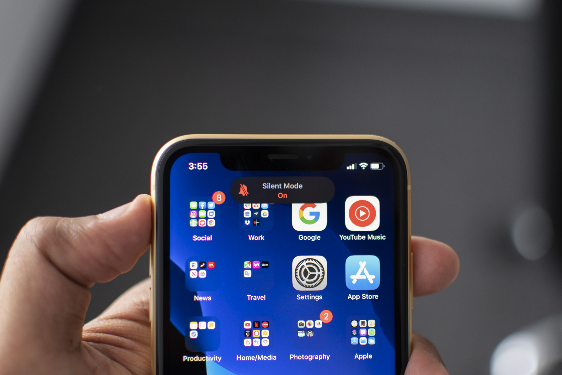
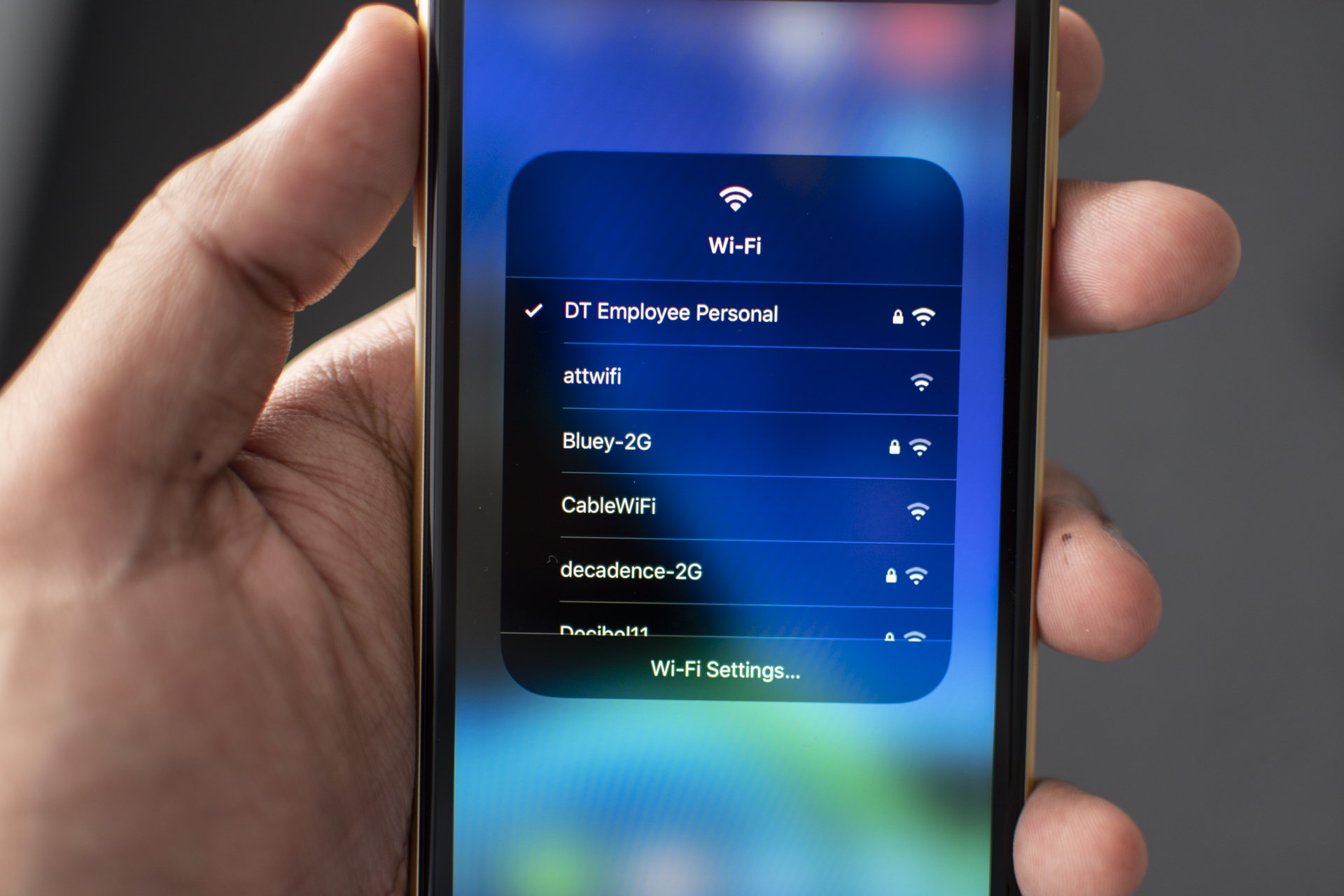
That’s not the only UI tweak I like. Changing the volume no longer places a HUD at the center of the screen, and neither does toggling the mute switch. It’s far less disruptive. Perhaps my favorite change is the ability to change the Wi-Fi network (or find a Bluetooth device) straight from the Control Center, instead of having to go to the Settings app. It’s a staple feature on Android, and I’m thrilled it’s finally on iOS.
Ever wanted to take a screenshot of a full webpage? iOS 13 adds the capability, but it’s only supported on Safari right now. When you take a screenshot, you’ll see the option for the full screen or for what was only on the screen. It’s a helpful addition, and one I’ve already used while messaging friends. It’d be nice if this could be extended to third-party apps.
Text editing has improved, too. You can now drag the cursor exactly where you want, though I do wish the cursor was magnified, because it can be tough to see under your thumb. Press and hold, and then drag your finger to select a bunch of text. You can even grab the scroll bar to quickly move through content.
A double tap will select a word, a triple tap will select a sentence, and a quadruple tap will select a paragraph. You can also slide three fingers left to undo text, pinch in with three fingers to copy, and pinch out to paste. These triple-finger gestures are meant for working on an iPad, so they’re tricky on an iPhone. Still, the text editing improvements make typing on the iPhone slightly faster.
Apple has also added Slide to Type, also known as swipe typing. Yes, you can already do this on iPhones through third-party keyboards (and Android has long had this feature), but it’s finally supported with the default iOS keyboard. Just slide your finger to the letters to make up a word. It’s accurate, easy to use, and now my favorite way of typing on the iPhone.
Finally, you can rotate a video
Filmed a video the wrong way? You can finally rotate a video in the Photos app, but that’s not all; there’s a breadth of new editing tools for both photos and videos, and they’re among my favorite additions in iOS 13.
First, there’s a wide range of editing options, from Highlights and Shadows to Black Point, Saturation, and Noise Reduction. You can even rotate the plane of a photo. The interface for tweaking images and videos is clever. After using the slider, you can tap on an icon to remove the edits for a quick look at the original.
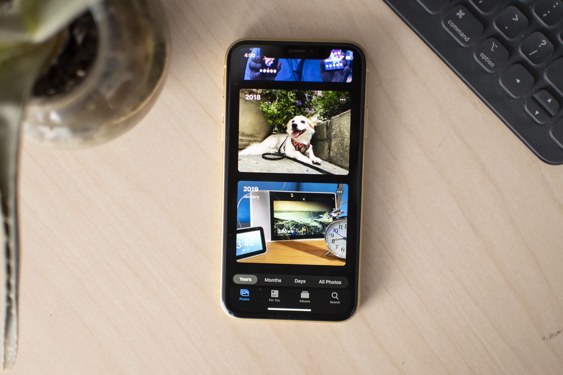
The Photos app feels less cluttered thanks to a new Year, Months, and Days view. Instead of seeing all your photos (though you still can), you can tap on these new viewing modes. The Photos app will use on-device machine learning to select the best images.
Go into the Years view, and the Photos app will try to identify relevant moments. For example, if it’s your daughter’s birthday and you’re looking at the Year view, you’ll see cover photos from her birthday last year. This makes the Photos app more like your personal photo book.
Sign in with Apple, privacy-focused location tracking
Services like Sign in with Facebook or Sign in with Google make logging into apps more convenient, but it’s a two-way street. Facebook and Google benefit from the data collected as you use the feature. Apple’s offering a privacy-minded solution with Sign in with Apple, and I’m all for it.
No one likes passwords, but we shouldn’t have to give up our data for the convenience of not using one. Sign in with Apple is linked to biometric authentication, requires two-factor authentication, and the data is stored on device in the Secure Enclave, or on Apple’s servers. And if an app or service asks for an email, there’s an option to use a randomized email address from Apple; any emails the app developer sends to you is routed and forwarded through this email.

It’s a fantastic feature, and lets you use single sign-in services with peace of mind. It’s not available just yet in the public beta, but it will be ready by the fall. Apple is requiring it to be an option if an app already offers single sign-in from other companies, and it will be the first option on the list for you, too.
In the vein of giving you more control of your data, iOS 13 offers more options as to when apps can use your location. You can allow an app to use location data just once, always allow access, never allow access, or only while using the app. You’ll see notifications when an app is using your location data in the background.
Overhauled Reminders and Find My, and updates to core apps
One new app in iOS 13 is an overhaul of two existing apps: Find My iPhone and Find My Friends. They’re now called Find My. You can easily find your own devices, like your Apple Watch, and if you enable Family Sharing, you can see your friends and family. The app looks great, but I haven’t had much of a reason to use it yet.
The Reminders app has been redesigned. The functionality remains the same — you can create time-based or location-based reminders — but I like how you can also create lists to categorize and color code reminders. You can trigger a reminder when you get in the car or arrive home, and you can attach images and webpages, adding further utility. However, the main hub page could’ve been streamlined a little more.
Messages has a small update. You can now create a public-facing profile (that you can share to anyone or to your contacts), where you can add a Memoji as your profile picture along with your name. It’s an easier way to share your details with people. You can now also use your Memoji as stickers to send in conversations, and there are more customization options to choose when creating your Memoji, along with more Animojis.
The Health app has also been redesigned for the better. What used to look like a clunky mess has been streamlined. There are now just two tabs, and you can customize the health data that populates on the main summary page. There’s no way to organize these cards in a preferred order, unfortunately, but otherwise the app is easier to digest. There are two new features: Cycle Tracking for monitoring menstrual cycles for women, as well as the ability to monitor hearing health. You can even track how loud you’ve been listening to music, and if you have an Apple Watch, it will alert you if you’re in an area where the sound level is potentially damaging.
Finally, the Maps app is better. There’s a good deal more data, and it’s easier to see. Look Around, which is Apple’s version of Street View, makes its debut, and it’s a little less jarring to use. Gliding through the streets is smooth, and visuals look realistic. I do think Google Street View’s image quality is stronger, however.
I want more from Siri
Siri has a few new features. First off, the assistant has a new voice that sounds more natural. It’s a nice upgrade, but it’s not going to blow your mind.
If you have AirPods, Siri can now read incoming messages, and you can respond to them. This feature, already available on Android, is genuinely helpful when you’re at the gym or otherwise can’t use your hands to respond. Speaking of AirPods, you can share audio from music or a movie with someone else’s AirPods.
Siri can also play live radio from third-party services like iHeartRadio. You’ll be able to ask Siri to perform functions from third-party apps, like playing music.
There are a few more features, but I would’ve liked to see more, especially with how you interact with the assistant. If Apple understands having a centered Volume HUD when changing the volume can be distracting, then the Siri page shouldn’t take up a full screen. Taking a cue from Google’s approach with the Google Assistant would be a smart idea.
iOS 13 looks like a winner
Too many updates, too little time to talk about then. I’ve focused on some of the biggest user-facing changes in Apple’s next version of iOS, but there’s so much more.
All-in-all, iOS 13 is a much better update than iOS 12. Almost all the changes and additions are welcome, and there’s plenty more for me to pour over. I can’t wait to see what it’s like on the next iPhone.


