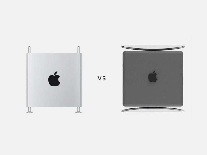
The new Mac Pro has been a long time coming. We’ve known for a while that Apple would forgo the cylindrical “trash can” design of the 2013 Mac Pro as, in the words of Apple bigwig Craig Federighi, the company had “designed [itself] into a bit of a thermal corner.” In other words, the Mac Pro got too damn hot.
The 2019 Mac Pro, meanwhile, is certainly different. The tower design is a sly nod back to the original Mac Pro — if it was on steroids, that is. It’s as if Tim Cook looked at the first-generation Mac Pro and said to the Apple design team: “yes, yes, very good… but can you make it look more like a cheese grater?”
The irony is that the original Mac Pro was known by this unfortunate moniker due to its perforated front panel. But it ain’t got nothin’ on this beauty:

Tired jokes aside, the new Mac Pro certainly isn’t a design disaster. It even looks quite attractive, in that classic sterile Apple way. But one designer felt they could do better, with Semin Jun posting a concept on their Behance page of their reimagining of the reimagined Mac Pro.
The concept features a mesh polycarbonate wrap surrounded by a clear “Transparency Frame,” a play on the real Mac Pro’s stainless steel “Space Frame” and clearly influenced by the Power Mac G4 Cube from 2000. The effect is that the actual computer appears to be floating — just imagine the fun Apple could have with the promo video (albeit without Jony Ive’s soothing tones). “A weightless design revolution that embodies the true nature of computing, effortlessly evolving to meet our needs in an almost impossible way,” or some other nonsense. We can see it now.
The function behind the form

One reason the actual Mac Pro looks like a gigantic cheese grater is to maximize the surface area of the front panel, which essentially acts as a huge heat sink to dissipate the thermonuclear heat generated by the Mac Pro’s raw power. Jun’s concept, though… let’s just say that plastic Transparency Frame will keep it nice and toasty.
But while that choice may be something of a misstep, there’s certainly nothing wrong with the next idea flowing forth from Jun’s brain. Their design features a Touch ID button to switch the machine on and, presumably, verify that you are the proper owner. That’s something we wish Apple implemented — you verify yourself right when you switch your device on, meaning there’s no need for a login screen slowing you down.
Elsewhere, Jun has taken the twisting handle from the real Mac Pro and flipped it 90 degrees. Instead of residing on the top of the computer and allowing you to lift off the cover, Jun has placed it vertically, meaning you slide the innards out towards you.

Jun has even squeezed in a “One more thing” moment, with a slightly redesigned Pro Display XDR featuring the same mesh design on the back as their Mac Pro concept. And, like the Mac Pro, it features a handy Touch ID button, presumably so no one except you can turn on the monitor and reveal the mountains of questionable pornography you’ve just been viewing.
The asking price for the Pro Display XDR and the Pro Stand together? A mere $2,999, Jun reckons — half the price the monitor and stand will actually set you back.
The final twist comes in the form of a “Wireless Sync Edition” of the Mac Pro. As the name suggests, this would let you place an iPhone on top of the case and it would instantly start wirelessly charging. It would also work with AirPlay, apparently, and automatically connect your iPhone to the Mac Pro so you could transfer files.
Jun has many other designs on their Behance page, including a folding iPhone and a (non-folding) iPhone XI concept. They certainly look lovely, if a little fanciful; but then, that’s no surprise. Part of the fun of following Apple is that we get to wonder what the company will come up with next, no matter how outlandish. Considering Apple has just released a credit card, anything is possible.


