The iPhone 13 Pro arrived on the morning of Friday, September 24, and I’m writing these words on Monday, September 27, giving me around 48 hours of time spent with Apple’s latest smartphone to comment on so far. That’s not enough time for a full review, which will come later, but it is enough for an overview of the phone and what those crucial first days of ownership are like.
To sum it up, it’s been incredibly easy — almost too easy. Changing phones can be daunting, and I feared something problematic would raise its head over the weekend, but going from an older iPhone to the iPhone 13 Pro only required time. It has slipped into my life with the absolute minimum of fuss, and this also set the tone for the rest of the weekend.
Does it feel any different from the iPhone 12 Pro?
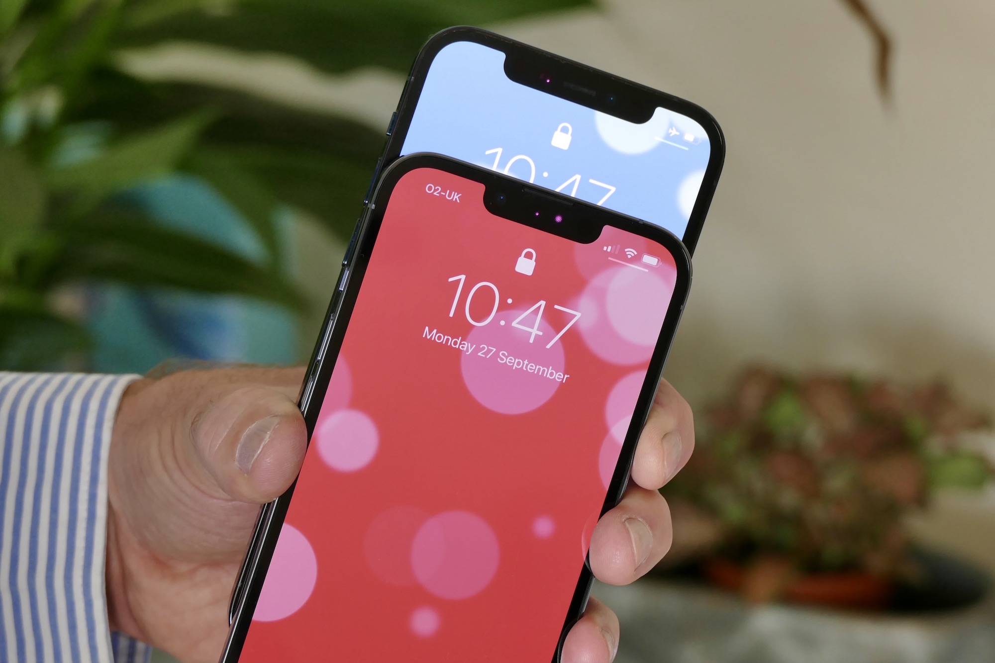
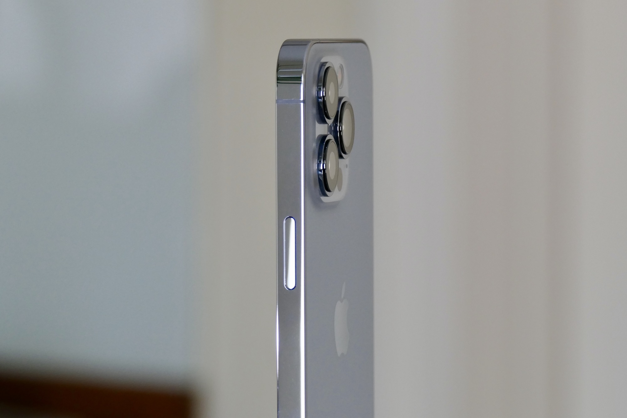
Seeing as you won’t be able to tell the difference between the iPhone 12 Pro and iPhone 13 Pro just by holding them, there’s no adjustment necessary if you’re coming from the last-generation phone. The dimensions, the smooth glass rear panel, and the cool-to-the-touch stainless steel chassis all feel practically identical. I chose the Sierra Blue model, which has a far lighter tone than the Pacific Blue iPhone 12 Pro and takes on a silvery hue in most lighting conditions. It pairs well with the polished steel chassis.

I don’t notice the new, smaller notch — which extends a little deeper vertically compared to the 12 Pro’s notch — but the wider notch never bothered me, either. Despite initially thinking the screen’s bezels were a little bigger on the 13 Pro, upon close examination, they appear to be the same size as the 12 Pro’s. In other words, at first glance, the front of the iPhone 13 Pro is basically the same as the 12 Pro’s. If you’re coming from the curvy iPhone 11 Pro, it’s a very different beast.
Is there anything new in the design? Yes, there are small differences between the 12 and 13. The speaker is set right at the top of the screen on the 13 Pro, the camera module is considerably bigger, the lenses protrude further from the chassis on the new phone, and the buttons are in slightly different positions. This means any iPhone 12 Pro cases you have will not fit the new phone. The extra-large camera lenses mean a case is essential. though, and on the ones I’ve tried, the camera module cutout has an extra-high, raised ridge to protect them.
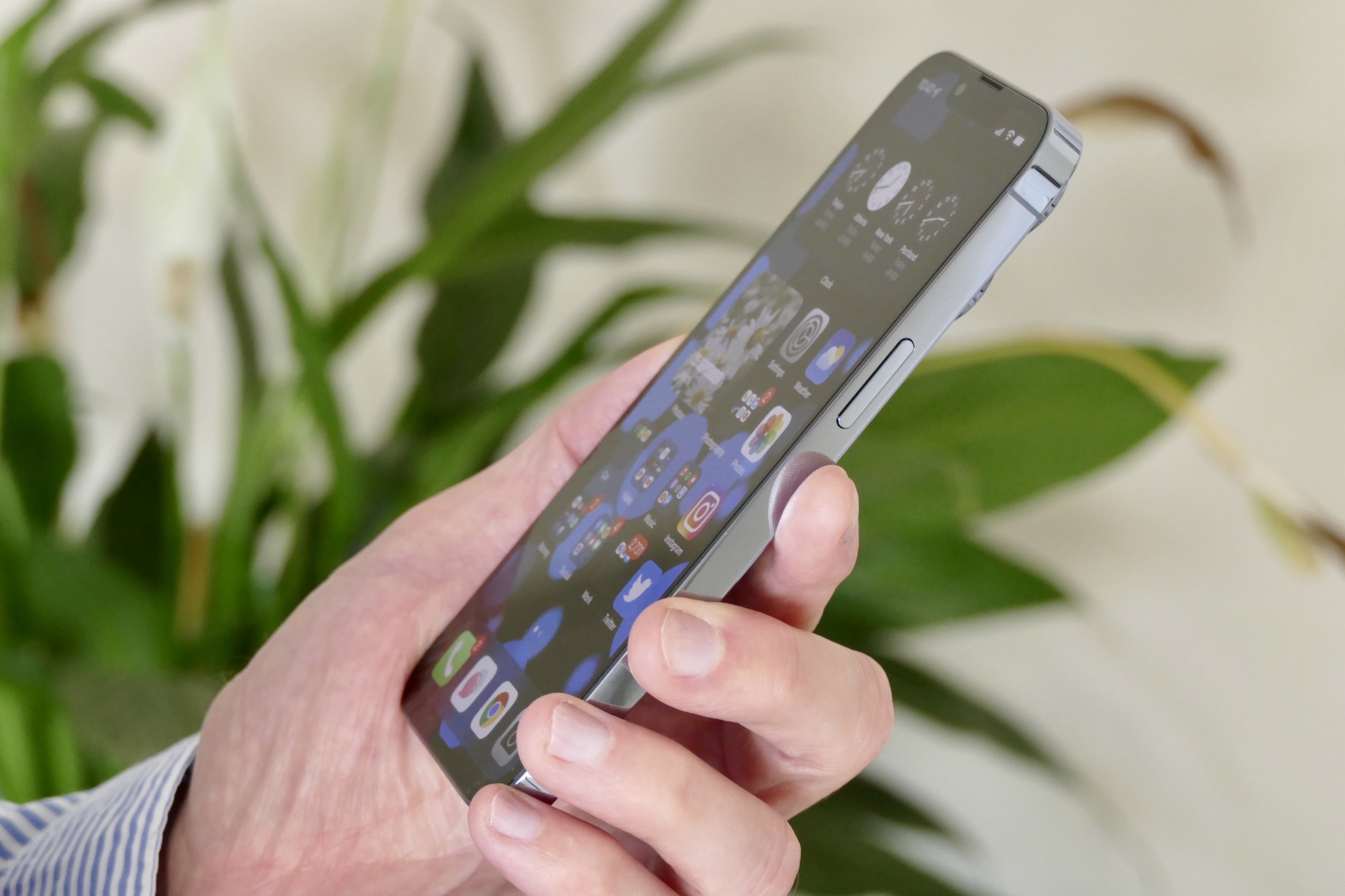
I went with the iPhone 13 Pro over the 13 Pro Max due to there being no specification differences between the two outside of the screen, and the smaller 13 Pro being just the right size to hold without fatigue. It’s pocketable, slips into a bag easily, and can be used with one hand. No, it’s not especially “new” in design, and yes, it’s still a little uncomfortable to grip compared to the iPhone 11 Pro, but there’s no question that the iPhone 13 Pro is a beautifully made, ideally sized, exquisitely finished piece of modern technology.
Do you notice the 120Hz refresh rate?
The iPhone 13 Pro and 13 Pro Max use Apple’s 120Hz ProMotion screen technology for smoother scrolling through the operating system. If you own an iPad Pro or an Android phone like the Samsung Galaxy S21 Ultra, you’ll be aware it can make a considerable difference. It’s a mixed bag on the iPhone 13 Pro at the moment, due to some third-party apps not refreshing at 120Hz until they’re updated. But when it’s working, it’s glorious.
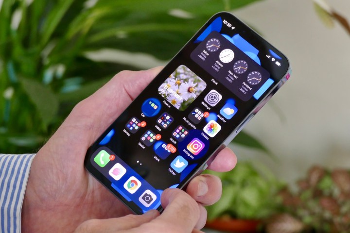
I see the change most when opening and closing apps, or swiping through the Settings menu and the Gallery. It’s clearly smoother than on the iPhone 12 Pro, and it’s easier to see the images or text as you go. It looks better and doesn’t strain your eyes as much as a 60Hz screen. However, don’t expect a constant, incredibly obvious difference with 120Hz, as not all apps use the screen tech at the moment. Also, your eyes quickly adapt to the higher refresh rate, so you’ll notice its benefits more if you return to a lower rate.
The A15 Bionic processor’s speed benefits show up in the same way. Going back to the iPhone 12 Pro highlights how fluid and smooth the iPhone 13 Pro is in general use. It’s not tiring in any way. The iPhone 12 Pro has never felt slow, but it’s amazing what a difference a year makes to a phone’s overall performance when you add in a higher refresh rate screen and more processing power.
How long does the battery last?
This is where our in-depth review will come into play, as it’s impossible to say how good the iPhone 13 Pro’s battery life is after just a couple of days. What I can do is tell you my experience so far. I charged the iPhone 13 Pro up when I received it on Friday, and then didn’t charge it again until Sunday night. I opted to turn the phone off overnight, usually around midnight or later, and then on again when I woke up around 7 a.m.

During this time, the phone has been used on both Wi-Fi and 4G for browsing, messages, social media, photographs, and streaming audio over Bluetooth, plus other incidental app use including some YouTube videos. I have not played any games. When I put the phone on charge after midnight on Sunday, it was at about 5% — and I hadn’t visited a charger since late afternoon on Friday.
This suggests a two-day battery life will be achievable from the iPhone 13 Pro with general use. There may be a dip if you play a lot of games, but two days is great for a top-of-the-range smartphone. Not charging the phone at all until Sunday played a big part in my blissfully easy weekend.
How is the camera?
I’ve taken a selection of photos with the iPhone 13 Pro, and it’s very good so far. The new macro mode is of particular note. It adds another dimension to the camera in terms of fun, creative use, and although it takes a bit of wrangling to get used to, it can take some good shots. It uses the wide-angle camera and automatically switches over to it when you get close to a subject, which does cause the image in the viewfinder to alter accordingly. The level of detail in the result can be astonishing, but there’s currently no way to manually activate or deactivate macro mode, which may frustrate users in some situations.

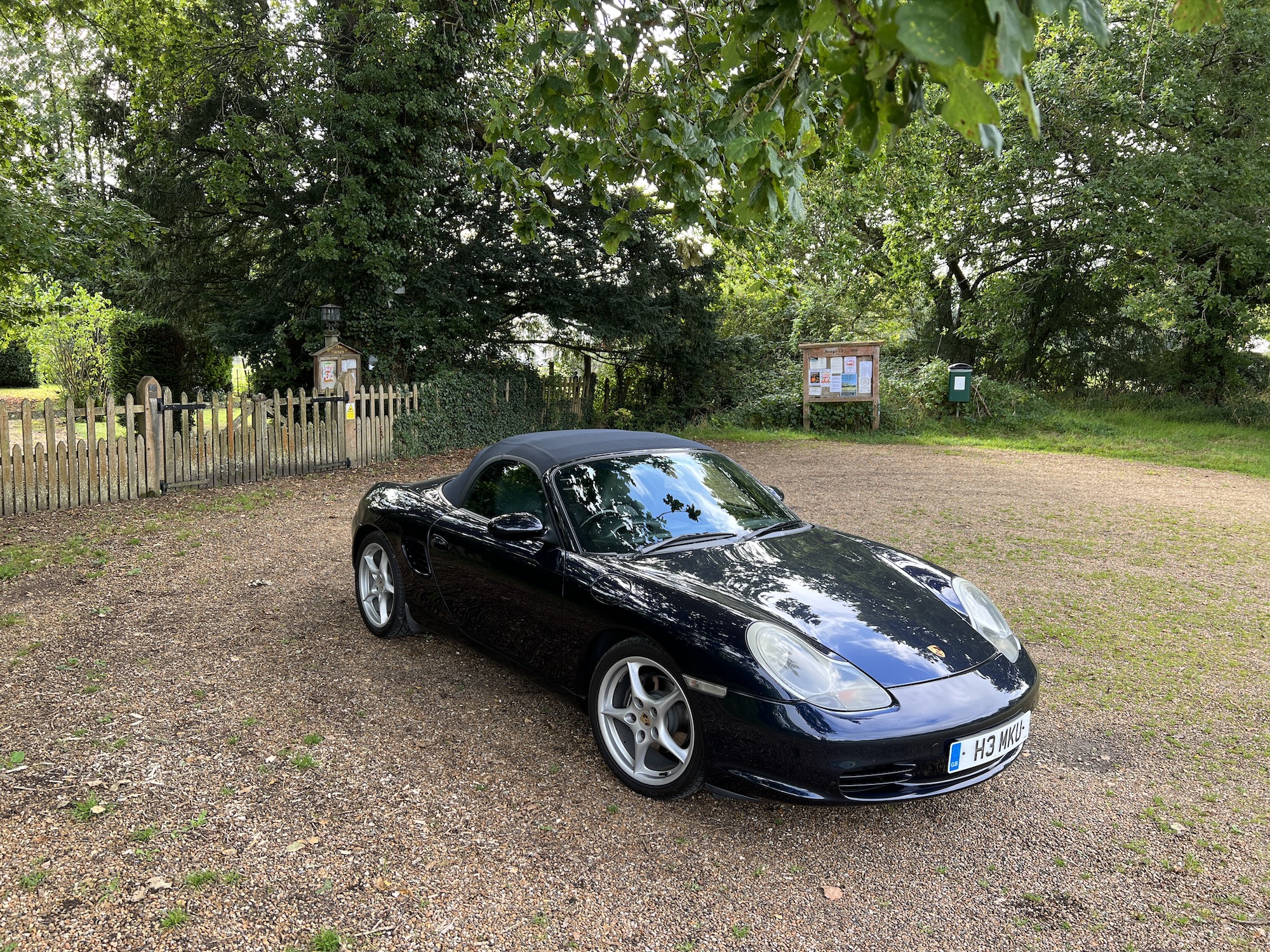
In normal photos, you can spot the iPhone’s usual warm tones, although I have noticed a little more saturation than expected in some images. The white balance is outstanding, bringing out some very realistic skies and cloud formations. What strikes me most about the iPhone 13 Pro is how easy it is to take really pretty photos. I took seven photos of a cat on my lap, and five were instantly ready to share, no editing or alterations needed. The other two photos were ruined by the cat’s movement, which is not something even the iPhone can compensate for.
It’s this accessibility that makes me love the iPhone’s camera. There are a few changes that don’t make a positive difference, though. When you first start using the iPhone’s camera app, it asks if you want to keep an original tone, a vibrant tone, a cool tone, and several others. Essentially, it’s asking if you want to permanently add a filter to your photos. I’d recommend leaving it on the original setting, as the filters are still there, ready to be added after you’ve taken a photo. Given the lovely natural look in standard mode, you may not always like the filtered result, potentially spoiling your enjoyment.
I’ve played with the new Cinematic video mode a little. This adds Portrait mode to videos, with the twist that it’ll adjust focus dynamically between subjects during the video (or you can alter it later in the edit mode). It’s usually obvious that the video you’ve shot is using an artificial bokeh effect if you look closely — it doesn’t always separate the foreground and background perfectly — but I expect it will be surprisingly effective in the right situation if you’re prepared to experiment.
Like many similar special video modes, professional results aren’t possible in seconds. You’ll need the right environment and subject, an understanding of the way the iPhone’s A.I. works to manage focus, and a fair amount of luck. It’s more accurate than the Huawei version on the P40 Pro Plus (but not dramatically), and less gimmicky than the A.I. video modes on the Xiaomi Mi 11 Ultra. It’s fun, but don’t expect to use it very often.
Have I fallen in love yet?
The iPhone 13 Pro has settled into my life with no fuss, and I definitely love it for that. Restoring all the data and apps from my iPhone 12 Pro was incredibly easy, perhaps more so than it ever has been, taking a couple of hours due to a wealth of audio I transferred, but never requiring additional input once it was set in motion. It took just another hour to set up all the apps, and it was like the 13 Pro had been my phone for weeks. It even remembered the spot where I stopped a podcast on the outgoing iPhone 12 Pro, so I could resume where I left off on the 13 Pro.
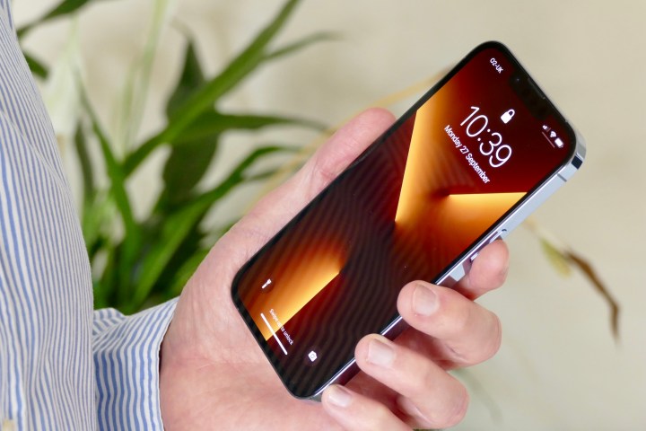
Have I fallen in love with the iPhone 13 Pro after my weekend with it? An accurate response here is that, as I was already smitten with the iPhone 12 Pro, and the iPhone 13 Pro doesn’t look or feel much different, my feelings for it have currently continued. The initial ownership experience hasn’t been a trial at all. From the plastic-free packaging to the simple onboarding process, the iPhone 13 Pro is almost totally fuss-free and has instantly become part of my everyday life. It’s a very good start.
These first positive 48 hours lead me to believe the iPhone 13 Pro will really come into its own after having more time to experiment with the camera, assess the battery life longer term, and push the new A15 Bionic chip harder. Our final verdict about the iPhone 13 Pro will come with the full review after we’ve spent more time with it.
