No matter how many smartphones are critiqued for being boring and dull, one thing remains true — smartphones released over the past year look far more distinct than ever before. Whether it be crazy colors, crazy cameras, or just crazy materials, high-end Android phones have never looked more different. It’s a far cry from the day Samsung wanted to be Apple, or when HTC launched a smartphone that was a dead ringer for the then-new iPhone, and it exposes the critique that smartphones all look the same as a fallacy.
More expressive hardware
In 2022, it’s different. Walk into any phone store and pick up a flagship Android phone, and you’ll find something different. From the choice of materials to colors, there’s a lot of variety that you wouldn’t find before. The time Android phone makers used to slavishly follow the iPhone has gone. A lot of companies are striking out on their own and leaning unapologetically into their own novel designs.
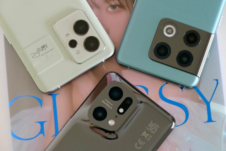
- 1. Realme GT 2 Pro, OnePlus 10 Pro, and Oppo Find X5 Pro
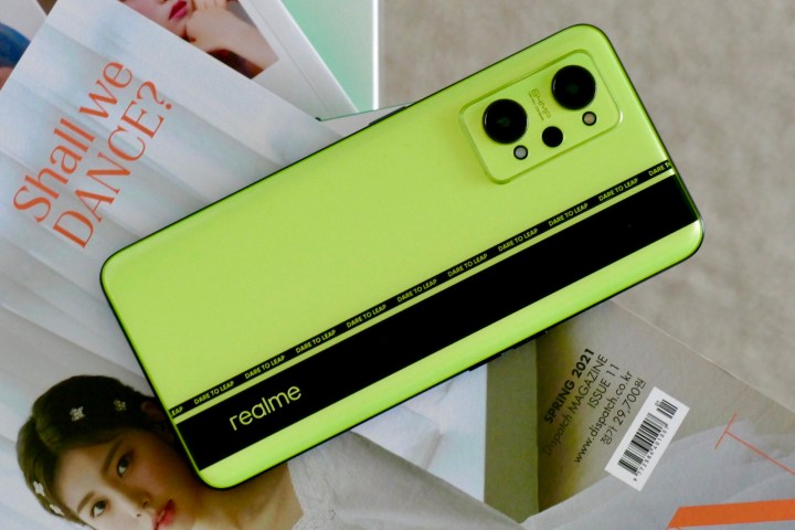
- 2. Realme GT Neo 2
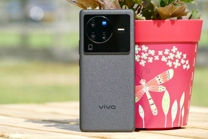
- 4. Vivo X80 Pro
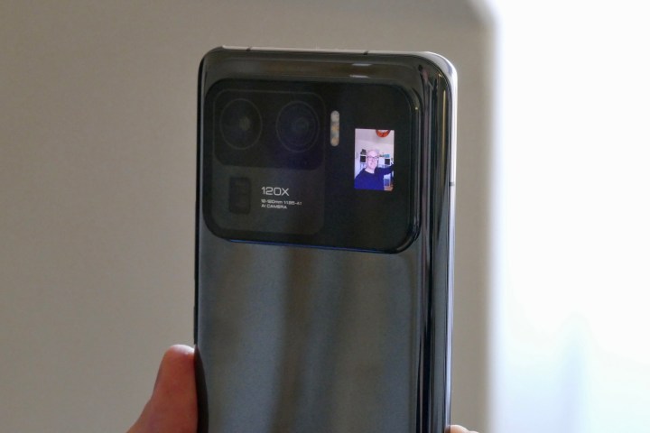
- 5. Xiaomi Mi 11 Ultra
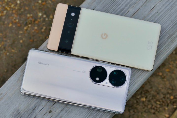
- 6. Google Pixel 6 Pro and Huawei P50 Pro
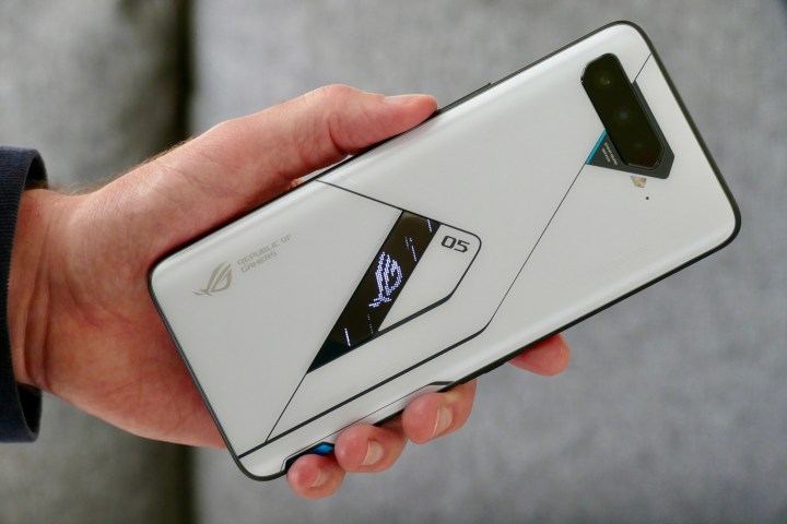
- 7. Asus ROG Phone 5 Ultimate
You may call some gaudy, and to be fair, some of them are. Xiaomi’s ginormous camera bump in the 11 Ultra could double as a parody of ever-swelling camera bumps, the racing stripes on Realme’s GT phones are in-your-face, and Google’s camera bump would certainly do double duty as face-wear for a member of the X-Men. These designs come as a result of phones being so ubiquitous and so good that for companies to convince you to separate from your money, they need to signal that their phones are worth the cost. A first impression is hard to shake, and these phones certainly do leave first impressions.
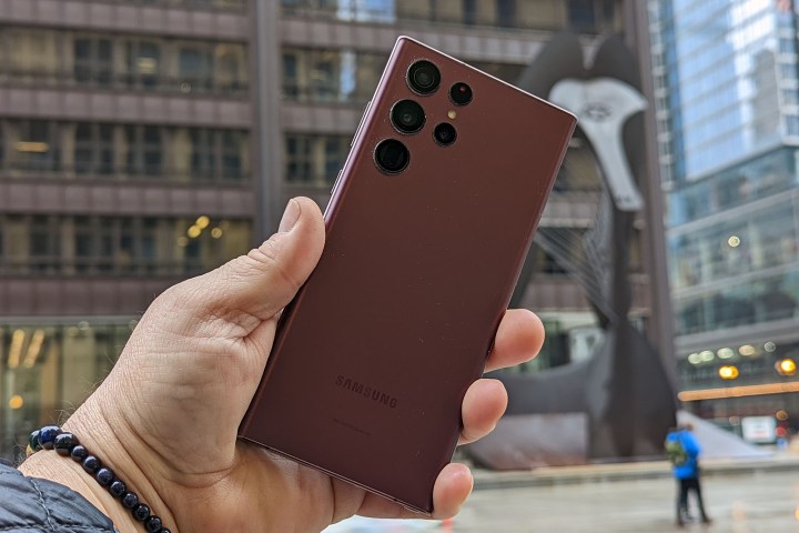
If you want a phone that looks like it could double as a gaming PC with odd lights, buttons, and weird patterns, there’s one for you, notably from Xiaomi or Asus. If you want status and to look refined and important, Samsung has this market on lockdown, but Oppo’s most expensive phones sit here too. You want everyone to know you’re a serious mobile photographer? You’ve got the newest Vivo phones with camera bumps that out camera bump other camera bumps.
You’d never confuse these phones for any other. In a market where there are safe phones, the abundance of choice from refined to excessive is something that should reassure a person who is concerned about the increasingly dull smartphone market. You can still see some iPhone influence in lower-end models such as the Vivo V23, where selling as many phones as quickly as possible remains the name of the game, but individual, recognizable designs rule the high-end.
Most importantly, the persistence of smartphone companies going their own way in terms of design is a pretty good indicator of which companies you should support. If a brand goes out of its way to craft a distinct, well-conceived, unapologetically flagship design, you can expect that they plan to stay around for the long term. At the same time, if a brand is pumping out generic-looking phones, slapping generic parts inside, and launching the next “Pro Plus Max” phone, you pretty much know what you’re going to get when buying it.
Software is a different story
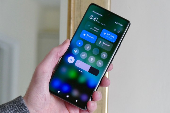
At the same time, even as hardware evolves to be more distinct, the software is sliding into conformity. Far from adopting Google’s wild ideas of what an Android phone should look like with Material You, the vast majority of Android phones sold have yet to shake their habit of designing their software to be an iOS-clone. Sure, Samsung and Google stand somewhat apart, but the majority of Android phones sold around the world come from Xiaomi, Oppo, Realme, OnePlus, Vivo, and soon maybe even Honor if the company plays its cards right.
All these companies have iOS-styled operating systems. There’s the now-classic 4 icon dock, the glossy control and notification centers, the system-apps design, and so on. Even Google itself is slowly creeping towards an iOS-style design. Android 12 ditched the five icon layout for a four icon one. There’s no benefit to the consumer other than it “looks more like iPhone.”
At the same time, there are grounds for defense of this software convergence. For those smartphone brands which have stuck with Google’s take on Android, they have found middling success. Alternatively, those larger brands who have moved closer and closer to iOS have been rewarded with sales. It is possible general buyers prefer this style of system.
If you were to pick up a mainstream computer, with Windows or Mac or even Chrome OS, there’s a convergence in design that’s taken place over the last few years. They are all similar to the point that you aren’t re-learning how to use a PC every time you switch operating systems. There’s a notifications center, a quick actions panel, a centered dock, light themes, and dark themes. Why should the same not be true for mobile?
Be together, not the same
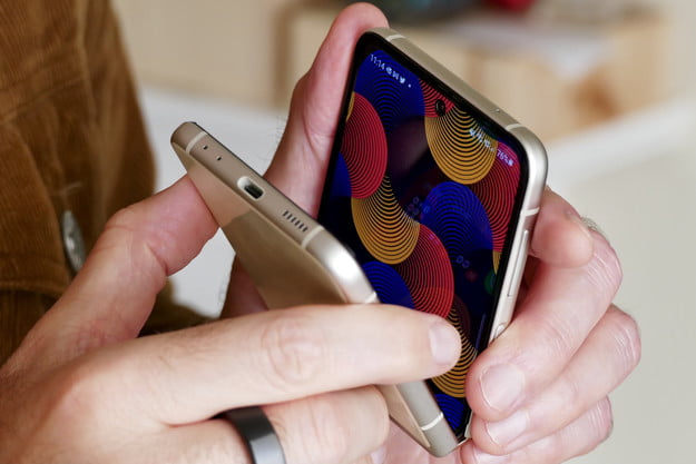
There’s a danger in assuming the only way to get an Android phone that looks different is to get a foldable or some other novel form factor. That couldn’t be further from the truth in 2022. Sure, foldable phones are different, and they aren’t slabs, but for one reason or the other, people still mostly gravitate towards the large screened slabs we all know and love.
The good news is, from the rear, modern phone designs are drifting further away from the iPhone and taking on an identity all of their own. For those who want uniqueness, it’s the best possible situation.
