I’m all for smartphones encouraging creativity, but providing masses of customization options under the guise of making things more functional, attractive, or individual is a dangerous path to tread. The new lock screen system in Apple’s iOS 16 software is getting very close to that line, and in doing so, threatens to ruin the wonderful simplicity of the current lock screen. At the same time, it fails to address a couple of the big complaints against it.
Busy new lock screen
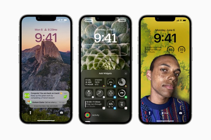
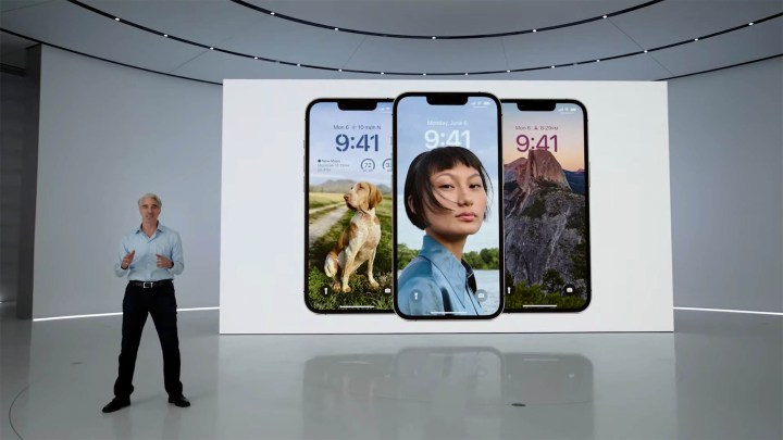
What does the new iOS 16 lock screen let you do? At its most basic, some of your wallpaper choices will have a multilayer effect added, allowing the subject to stand out against the background. Plus, Apple has added several new wallpaper styles — Astronomy, Pride and Unity, and Weather — to the standard lineup of options. Different lock screens can be created and changed with a swipe to match your mood.

That all sounds good. The depth-effect watch faces on the Apple Watch work well, but require a Portrait mode photo to work, and it may be the case on the iPhone too. The Weather wallpaper sounds fun as it updates based on local conditions, and if the Astronomy wallpaper is anything like the one on Apple TV, it should look great. Also in iOS 16, you can change the look of the clock on the lock screen, choosing from “expressive type styles and color choices,” which is a nice addition.
This is really where the customization options should have stopped, but Apple has gone all-out in iOS 16. Inspired by the Apple Watch’s complications, iOS 16’s lock screen can have tiny widgets added to it, showing information gathered from the weather app, battery levels, your activity in the Fitness app, alarms, and plenty more. Expect developers to be given access to this, so they can adapt existing widgets from iOS 15 for the new lock screen, meaning there may well be dozens to choose from.

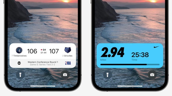
Then, Live Activities will splash information from apps and Apple News across the lock screen, with scores from sports games and delivery information highlighted as features already. Instead of a long list, notifications will stack at the bottom of the lock screen ready to be unrolled. Apple says this means you will still have a “clear view of the personalized lock screen,” but it actually sounds like it’s just making room for all the rest of the rubbish you can now cover your lock screen in.
What’s the problem?
Apple’s current lock screen is wonderfully simple. There’s one clock design, you can change your wallpaper, and — outside of a few options related to the wallpaper itself — that’s it. It’s incredibly simple, it shows off my choice of wallpaper without interruption. It is fantastic. There’s no temptation to try this clock or that widget, add reports from an app that wants to bother me with notifications or be constantly informed about what the weather is doing.

Apple employs designers. I trust that when it comes up with a core look for the home and lock screen, it’s after a lot of experimentation by people who understand what works and what doesn’t. A smattering of options to personalize it is obviously required, but add too much, and it quickly becomes overwhelming as we give in to the temptation of activating all of the options, losing any benefit in the process. Apple’s designers may as well say, “Here, we’re done for the day, you have a go.”
That’s what Oppo’s designers likely said when ColorOS 12 was released. It’s stuffed full of endless ways to change the look and operation of not just the lock screen, but every tiny aspect of the operating system. Having a few options put in place by design experts over a carefully engineered core experience is very welcome, but leaving it all down to you is quite the opposite. This approach doesn’t do ColorOS any favors at all, and because I’m not a designer, whatever I come up with rarely gels, and I would rather someone else had just sorted it all out instead.
Apple’s iOS has always benefitted from a light touch when it comes to personalization, and even getting iOS 15’s home screens right requires very careful use of the existing options. It’s very easy to get carried away, at which time iOS’s simplicity, which gives it speed and that distinctive visual appeal, quickly disappears. This careful, considered approach will certainly be needed on the iOS 16 lock screen, as otherwise, it will become a mishmash of widgets and data that confuses more than it informs — complete with a design that I keep changing because it’s never quite right. See ColorOS for more details.
It won’t matter if you can’t see it
My iPhone 13 Pro is sitting beside me right now, and all I can see is a black screen. Adding a mass of customization options to make the phone “mine” seems a little pointless if the only way I can see them is to pick up the phone or tap the screen. The iPhone and iOS’s lack of an always-on screen, especially with this added attention on personalization, continues to baffle. How will I see what a mess I made of the lock screen if it’s only illuminated for a few seconds when a notification arrives? Code hidden in iOS 16 apparently hints at an always-on screen feature, but for now, it doesn’t exist.

On the subject of notifications arriving, it’s unclear if iOS 16 will fix some of the ongoing frustrations with that particular feature. iOS isn’t very good at managing notifications. On the lock screen, the messages you address elsewhere don’t always clear away, and none of them seem to at all in the Notification Center, with its long list of increasingly aging notifications that add no value at all. I almost never use the Notification Center for this reason, preferring to manage them on the lock screen. Except in iOS 16, they’re going to compete for space with widgets and updates, relegated to a stack I have to scroll through at the bottom of the screen.
It feels like personalization for the sake of personalization.
I’m aware all iOS 16’s customizations will be optional, but the temptation to use them liberally will be considerable, and once they’re in place it doesn’t sound like any long-encountered problems will be solved. Instead, what makes iOS 15’s lock screen so appealing will be lost.
The best operating systems have a strong default style created by talented designers, with just the right amount of personalization, for a comfortable, smooth, fast, and informative user experience. iOS’s slow creep towards information overload takes it further away from a clean, fuss-free nature, and without an always-on screen and improvements to notifications, it feels like personalization for the sake of personalization. That’s where Oppo is going wrong, and I don’t want iOS to follow.
Apple will release iOS 16 later this year, and other opinions on the lock screen are available in the meantime.


