Remember when Apple introduced the iPhone X? It was the first iPhone with a display notch, something that quickly gained near-comprehensive infamy. This little black bump on the screen was proof that Apple had lost its touch and could no longer innovate. What would Steve Jobs think? Oh, how we all laughed.
Well, Apple wasn’t laughing. We didn’t know it, but the notch was the start of something quite amazing. With the introduction of the iPhone 14 Pro, Apple has shown us all what it had up its sleeve. Turns out the notch would morph into the incredible Dynamic Island, giving Apple the last laugh. It’s the feature I never knew I needed, but good lord, do I ever need it now.
A delightful surprise

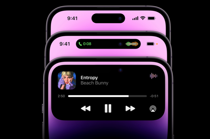
In case you missed Apple’s September 7 event, Dynamic Island is a total reimagining of the notch in a way that no one saw coming. Instead of a static black slab housing the Face ID sensors and front-facing camera, you now get a shape-shifting, purpose-altering, definition-defying slab that seems to do anything you need. It has a stupid name, granted, but that’s where the stupidity stops and the superlative starts.
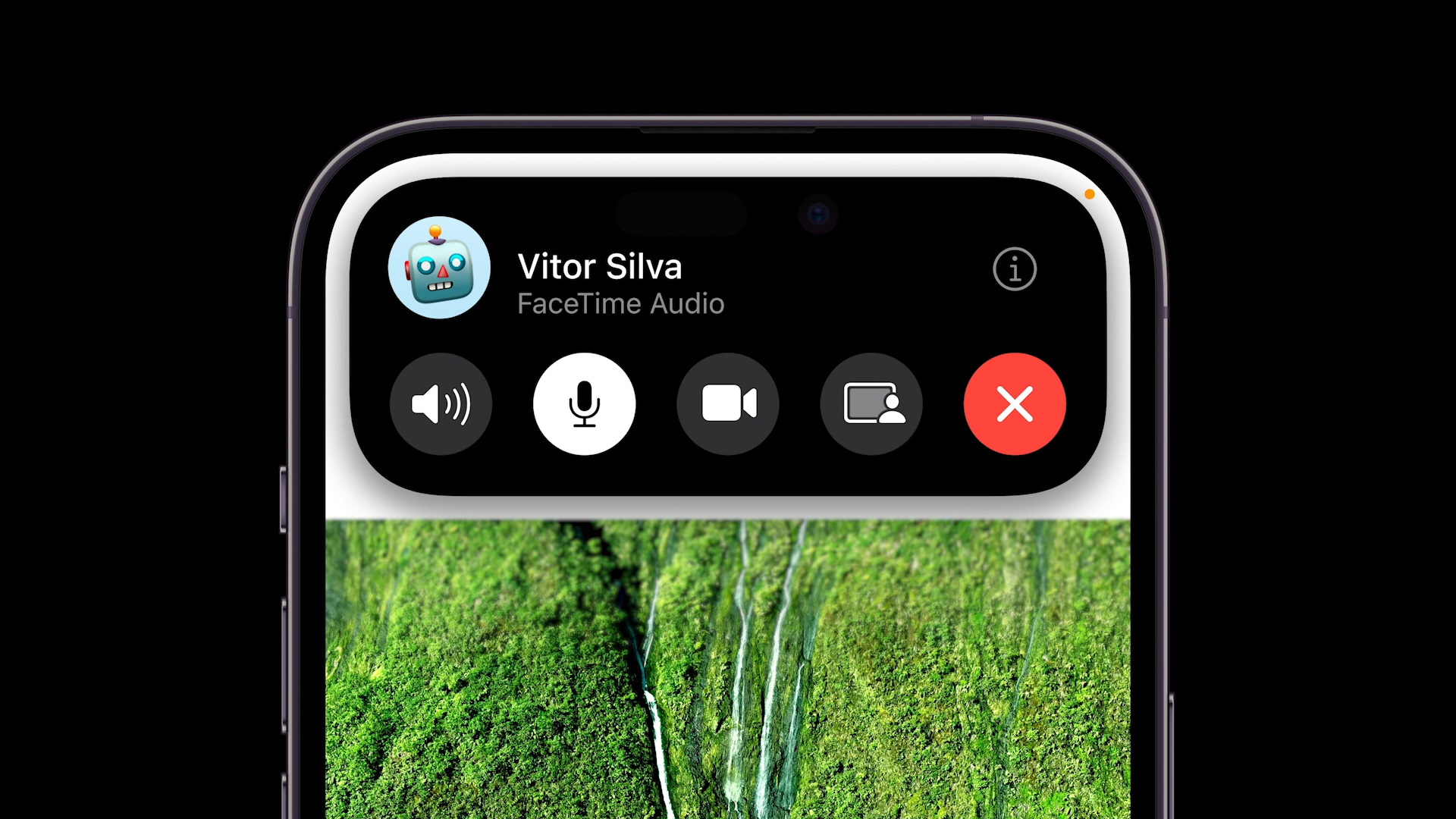
Playing music? Swipe the app away, and your now playing info shows up in the Dynamic Island. Incoming call? The Dynamic Island expands to show you who is on the other end of the line. Want to verify a purchase with your face? Look, there’s the Face ID animation, bursting out of the Dynamic Island. You get the idea.
Who in their right mind would take something so, well, functional and make it so joyous? Who would see a begrudging concession — you can’t hide the Face ID sensors under the display, at least not yet — and make it something you will actually love? I can’t think of anyone but Apple that could do this.
Tell me, do you think Google would have the chops and the chutzpah to try this? Would Samsung even dare? Hell no. Samsung probably has its interns drafting daft tweets mocking Apple’s latest feature as we speak. Just give it a few months for the company to follow up with its own C-list imitation.
The design freak’s dream

Apple has taken something that was a universal symbol of derision, a reason to avoid the iPhone, a “yeah, but” rebuttal to every iPhone selling point, and flipped the script completely. It’s the most unexpected surprise of any Apple event I can remember and the most welcome one by some distance.
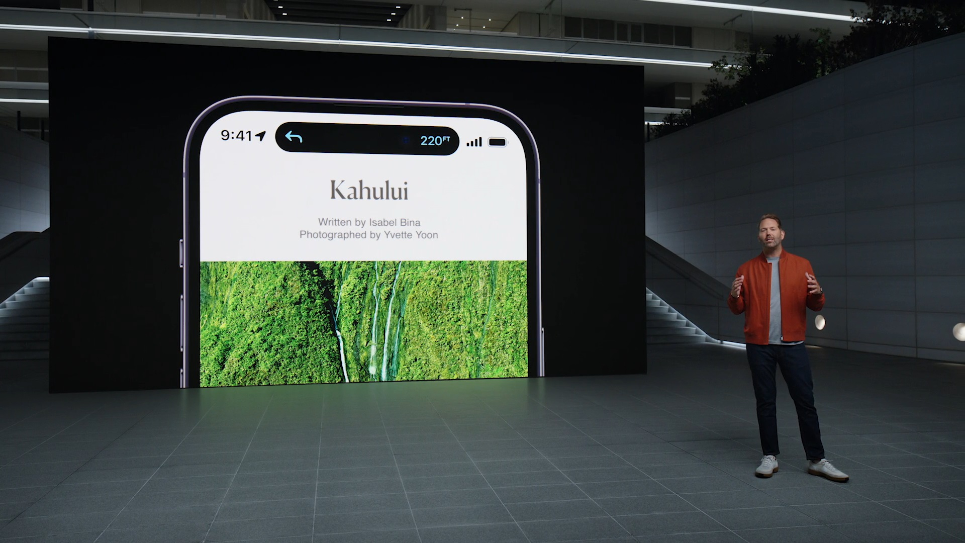
You might think I’m overreacting here. After all, it’s just The Notch 2.0, right? Wrong. The notch was bland, inert, and pedestrian. Sure, it housed something great, but its form was lacking. And for the design freaks at Apple, adequate just isn’t adequate. Everything needs to be great. The Dynamic Island has righted that wrong in spectacular fashion. It was fitting, then, that it was introduced by Apple’s Chief Design Freak, Alan Dye.

This is a feature you couldn’t get with any other smartphone because it relies entirely on both software and hardware working in perfect harmony. No other company can pull that off.
But it’s also more than that. It’s one of those rare features that makes you feel just a little giddy, in the same way that another hardware-software collaboration — Universal Control — made me feel. Say what you like about Apple, but no one else can replicate that feeling in quite the same way.
OK, enough gushing. Time to start saving for a new iPhone 14 Pro.


