With the iPhone 14 Pro and iPhone 14 Pro Max Apple gave us a wonderful gift, but I’m seeing some ungratefulness. I’m talking about the always-on screen, which brings the new iPhone alive in a way it never has been before. Yet, and I can’t believe I’m about to say this, there are quite a lot of people turning the feature off!
By dismissively rejecting the iPhone 14 Pro’s always-on screen like this, you’re ruining the best thing about it.
What’s so good about it?

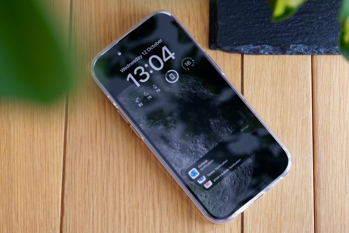
What’s so good about the iPhone’s always-on screen? Mainly, it’s absolutely gorgeous. Always-on screens aren’t anything new. If you’ve used almost any Android phone over the last few years, there’s the option to see the time, date, notification icons, battery percentage, and sometimes, if you’re very lucky, a little picture on the lock screen too. But the screen is always black, and while informative, Android always-on screens feel merely functional and nothing more.
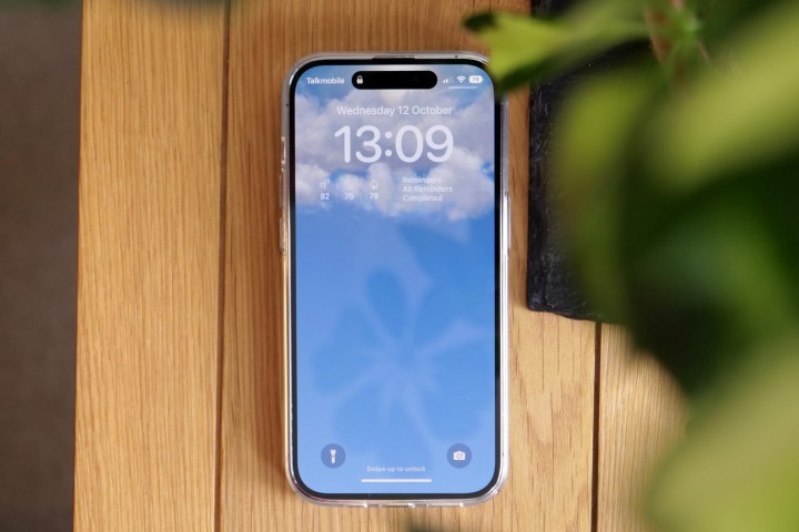
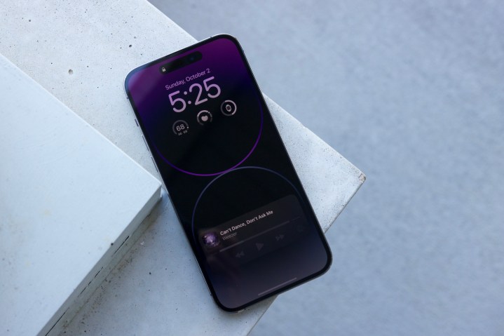
The iPhone’s always-on screen is a stunning, full-color continuation of your home screen. The designers took what they learned from the Apple Watch’s always-on screen and applied it directly to the iPhone’s much larger screen. It’s now a part of the operating system, and the flow between it, the home screen, notifications, shortcuts, and widgets is seamless.
If you choose one of Apple’s themed wallpapers (I’m obsessed with the astronomy themes), the attention to detail is amazing. The small green dot showing your location on the globe is just such a cool touch. If you want to use other wallpapers it’s fine, and if you want the always-on screen to be busier, you can add widgets too. However, in my opinion, it’s at its absolute best when left almost entirely stock with no widgets — just a beautiful wallpaper you can see all the time.
Practical as well as beautiful

The iPhone 14 Pro’s always-on screen is also excellent from a practical standpoint. The iPhone now technically has three main interactive screens. The first is the locked always-on screen with its large, obvious notification alerts along with the time and date. Second, when you unlock the phone with Face ID but don’t swipe, you can read and respond to notifications. Then, the third and final stage is to swipe up and unlock the phone completely. At all times, the wallpaper, icons, fonts, and brightness all shift and morph to make your phone appear like a living thing.
I put the always-on screen on a wish list of features for the iPhone 14, and couldn’t be happier with the feature now that it’s here. I have the new iPhone 14 Plus next to my iPhone 14 Pro now, and the Plus’ dreary black screen makes the phone look old and boring. The 14 Pro, with its always-on screen, looks inviting, bright, exciting, and downright cool. If you’re turning it off, you’re missing out on a beautifully designed software feature that actually enhances everyday use.
What about the battery?

Early on, the iPhone 14 Pro got some bad press about its battery life, and some people put this down to the arrival of the vibrant always-on screen. It’s a fair point, as it absolutely does use battery power when it’s on. But is it so vastly all-consuming that your new iPhone will no longer function for a day? I’ve been using the iPhone 14 Pro since launch, and it has received several small software updates since then — each gradually improving efficiency to the point that my initial concern over very short battery life has mostly been alleviated.
With around three to four hours of activity per day, from around 7:30 a.m. to midnight, the iPhone 14 Pro now ends the day with around 20% remaining. According to iOS 16’s Battery page, the astronomy wallpaper theme I’ve been using consumes about 3% of the battery, or on days where I haven’t used the phone as much, it drains about 5%. The way I look at it is this: Things would be pretty desperate if the battery level reached just 5%, and at that point, I probably wouldn’t worry about the few percent I would have gained back if the always-on screen had been off all day.
The battery life isn’t the iPhone 14 Pro’s best feature, but it’s improving as the phone is further optimized through software updates. However, judging by the battery stats after more than 10 days, the always-on screen isn’t the primary cause of any drain I’ve seen. Yes, you’ll save some power by turning it off, but nothing life-changing based on my experience. Why not enjoy the always-on screen instead of worrying about a few percent?
Leave it on — or don’t buy the phone

Is there an exception to my rule about using the always-on screen? I didn’t think so, but in a Twitter poll I ran asking whether iPhone 14 Pro owners used the always-on screen (a shocking 69% said they didn’t), a reply said they didn’t feel the need to use it due to wearing an Apple Watch. It’s an interesting point, as the functionality is mostly repeated, but I still love seeing the phone’s lovely screen lit up on the desk beside me, even with an Apple Watch Ultra on my wrist.
https://twitter.com/AndyBoxall/status/1579496385174736898
The iPhone 14 Pro isn’t the biggest, most exciting upgrade over the iPhone 13 Pro or even the iPhone 12 Pro, but the always-on screen is the most obvious visual difference between them. If you plan to turn it off all the time, what makes it really special — alive almost — will be missing. And at that point, you should ask yourself if you really want the phone at all.


