“At Apple, we’re focused on creating extraordinary products. Products born from designing hardware and software together, so you don’t know where one ends and the other begins. The Dynamic Island does this in a truly magical way and enables an entirely new iPhone experience.”
This is how Alan Dye, vice president of human interface at Apple, introduced the Dynamic Island during the iPhone 14 Pro launch in September. As ethereal music played in the background, we saw a new and exciting feature that practically no one expected, and I couldn’t wait to try it out. That was almost three months ago, and unfortunately, I’m still waiting for Dynamic Island to really change the way I use my iPhone.
The Dynamic Island isn’t a feature problem …

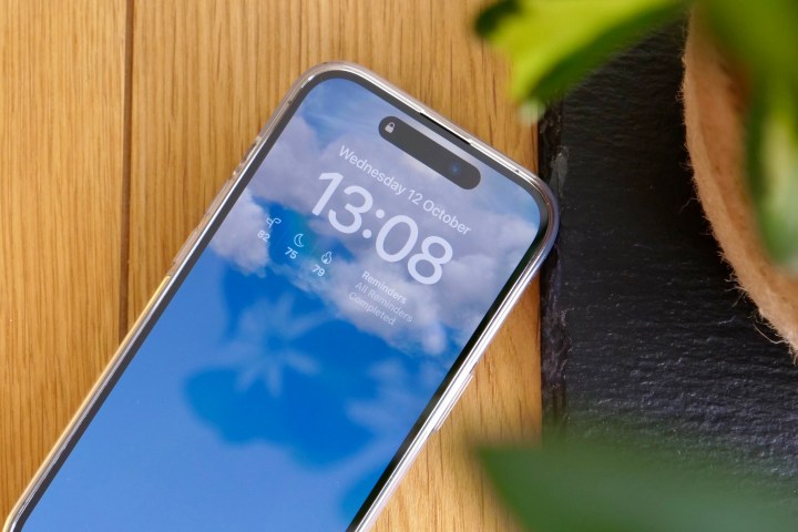
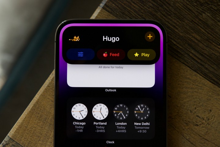
The problem isn’t really with Dynamic Island itself. I still think it’s a really interesting, very effectively integrated feature. I like the way it morphs, and the way it gives the lock screen some visual interest with the little padlock that clearly shows when the phone has been unlocked. I noticed that I look at it every time I pick up my iPhone, showing it’s not only eye-catching but informative too.
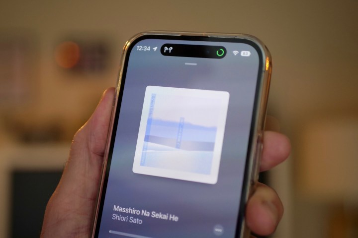
I use the tap-to-switch feature with the Music app and find it useful when the timer app splits off into its own little bubble. Dynamic Island works in a few other Apple apps, including the Phone app and Apple Maps, and it regularly animates when you perform actions like switching on silent mode, connecting Bluetooth headphones, and using Face ID. But in terms of how I use the Dynamic Island and how often I notice it, that’s about it.
That was fine at first because it’s a new feature, and of course, it needs to be integrated into iOS 16 before anything else happens. I was also happy to have some patience before iOS 16.1 was released with complete Live Activities support, where live app information can be displayed on the lock screen. The two go hand-in-hand as Live Activities can use the Dynamic Island on an iPhone 14 Pro or iPhone 14 Pro Max. The iOS 16.1 update came at the beginning of November and, unfortunately, hasn’t brought with it many changes.
… It’s an app problem

None of the apps I regularly use support the Dynamic Island. That’s right, none. I’m not going to extensively list them all, but to give you a few examples, this includes Microsoft Outlook and Teams, Instagram, Facebook, Twitter, Gmail, Google Maps, Waze, Asana, and Messenger. Hardly obscurities.
It’s the same for any Live Activities-specific features, as Starbucks, Uber, and Lyft were mentioned as working on the features, but none of these apps have released anything new yet. My FedEx and DHL apps don’t use the feature, despite them being ripe for inclusion.
What apps do work with Dynamic Island? Search the App Store specifically for Dynamic Island, and you get Pixel Pals, the virtual pet game, and some wallpaper apps, plus Apollo for Reddit and Flighty. Flighty shows flight details on the Dynamic Island, while Apollo shows live updates of bookmarked threads on the lock screen. If you care about sports, there are some apps that show live scores on the lock screen, and there are other apps that focus on very specific use cases, such as ski app Slopes.
While I appreciate some others may find the small selection enticing, for a new and hyped-up feature, the line-up is lackluster at best and lacks wide variety. Why does this matter? The Dynamic Island is one of the top reasons to consider the iPhone 14 Pro over the cheaper iPhone 14, and one of the few differences if you’re thinking about upgrading from a recent iPhone. If it’s only really used by system apps, then its appeal plummets, and with it, the overall appeal of the latest phone.
More money trouble on the horizon

I expect more features that use Live Activities, and therefore the Dynamic Island, will eventually come. It may take some time, though, as Apple’s guidelines for developers wanting to use Dynamic Island and Live Activities are fairly restrictive, and it’ll take some creativity to integrate the feature into common apps. But there’s another concern brewing, and that’s whether any future features will be free to use.
Popular travel app Citymapper has added Lock Screen Navigation, a feature that speaks for itself and uses Live Activities to operate. Except it’s only available to those who pay for its premium subscription service. Weather app Carrot also uses Live Activities, as does photographic app Lumy and baby-tracking app Mango Baby — but again, the features aren’t available to folks using the apps for free.
App subscriptions and the value they provide is a different topic, plus all-new features naturally incur developmental costs, and it’s also possible the live updates add further costs to maintaining and running the app — forcing the developer to only include Live Activities and Dynamic Island-specific features for paying subscribers. But should making Dynamic Island useful be considered a “premium” feature we have to pay for?
If it does end up hidden behind paywalls, then Dynamic Island is destined to remain a niche iOS feature for many. That’s a serious waste of what is an innovative feature, and the chances of it changing anyone’s iPhone experience will be hugely diminished. It needs some standout apps to provide interesting, useful features very soon, or Dynamic Island runs the risk of ending up on the same feature scrap pile as the Touch Bar.


