Google is refreshing the look of Google Docs, Slides, Drive, and Sheets. The changes are happening across the board for Google Workspace subscribers and free personal accounts. I love that we all get to enjoy the changes, and there are five things, in particular, that really stand out to me as significant improvements.
This is a continuation of the Material Design 3 updates to Gmail last year. If you are happy with how Gmail looks, you’ll probably enjoy the new Docs as well.
Subtle color adds structure

Google prefers an uncluttered look, but a big, blank page is intimidating. A little color and contrast can go a long way to making a page look more inviting, and that is coming with the latest refresh.
There won’t be shadows, but that stark white also won’t be everywhere. In the new Workspace, Google favors varying shades of gray with a sky-blue tint. This update helps separate comments and the taskbar from the rest of the page, however subtle, making it easier to spot what you need.
Look out, curves ahead
The subtle shading isn’t the only change. Google gave some elements a bit of visual lift. Buttons and icons have been refreshed with rounded corners, perhaps borrowing inspiration from the popular Apple pill design.
Again, it’s a minor detail, but these little improvements make a difference when you live in Google Workspace for hours each day. Why curved edges? So your eyes don’t get stuck on a corner, and your gaze flows freely. That might sound crazy, but there are rarely sharp edges in nature, and we’re beginning to emulate that in our technology.
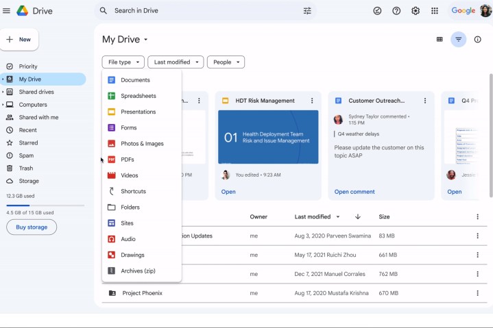
Search chips find it faster

If your Google Drive is anything like mine, it can be challenging to find a particular file. It’s the old story of the burden of naming and organizing, which works well until your schedule gets too tight. Then things just pile up in My Drive with whatever name they began with instead of having Google Drive files tidily tucked away in folders.
Search chips will help by making it quick and easy to filter by file type, modification date, and owner. Quality of life improvements to Google Drive add up hour by hour, day by day, saving you a huge amount of time and avoiding the frustration of knowing that what you are looking for is there, but you simply can’t find it.
Everything, everywhere, all at once
Google notices if you do repetitive tasks with Drive files, and when the update rolls out, you’ll begin to get help taking care of those chores with its new key actions. Even better, you can select multiple items and do them all at once.
Google didn’t provide specific details about what will be possible. Still, any type of Google Drive automation and bulk actions can improve productivity.
Don’t keep us waiting
One of the best things about the new Google Docs refresh is that you won’t have long to wait. If you’re a Google Workspace subscriber and are under the Rapid Release schedule, you’ll see the updates by March 21. The full release is scheduled for March 22, but Google says it can take a couple of days for the updates to roll out to all users.


