The best kind of marketing is the one that happens in the hands of an interested person who just might be your next customer. Samsung certainly thinks that way and is trying its best, not just because it’s a sound strategy, but also owing to the fact that arch-rival Apple has mastered the art with its meticulously imagined store experience.
Samsung’s latest ploy is a web app designed for iPhones that will give you a taste of its One UI 5.1 software that runs on its Galaxy S23 series phones. Actually, scratch that. The company is welcoming you to “the other side” by letting you experience its heavily customized take on Android and find out for yourself if it can surpass iOS for you. The solution is called Try Galaxy.
Try Galaxy makes your iPhone a Samsung phone

It’s a double-edged sword, but as they say, every conversion counts. All you need is an iPhone 7 — or any other subsequent model — running iOS 15 or later, and you’re good to go. Just visit the webpage, hit the share button, and tap on Add to Home Screen in the share sheet. No app install shenanigans are required, and neither is there any system permission hassle involved here.
I’ll start with the standard warning. The experience is a tad buggy, and infuriatingly sluggish on some occasions, there are ads (yep) disguised as pre-loaded product demos, and you won’t get to enjoy the full One UI 5.1 experience. It’s just a small taste that is limited by what a web app can do (and the permissions Apple allows for a rival on its bread-and-butter product).

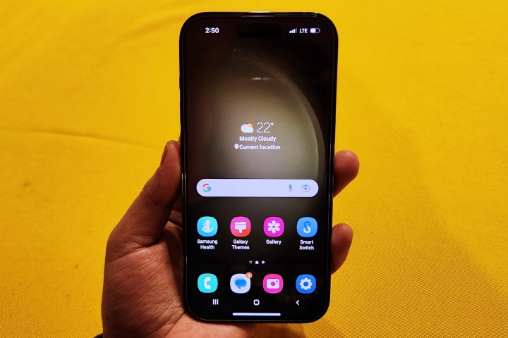
The first time you launch the Try Galaxy, it leaves on the home screen where you see the three-button navigation format, instead of the single gesture-based navigation bar on iPhones. Android has that system, too, but it looks like Samsung chose to highlight the three-button format intentionally because iOS doesn’t offer you that flexibility. Clever, Samsung!
The app arrangement is a familiar affair, and so are some of the gestures. Swipe up to see the app gallery (instead of swiping left on iOS across multiple pages to find the desired app), swipe left to see the discover feed, and pull downwards to the quick settings shade and the (superior) notifications alert panel.
A showcase for Samsung and Google’s best apps

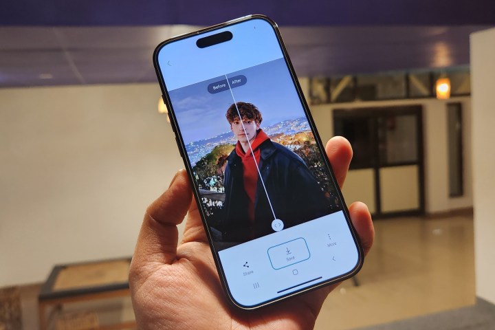
At the app level, you get a limited view of in-house apps like Samsung Health, Smart Things, Galaxy Wearable, and Galaxy Store, among others. But the star of the show is the Gallery app, which showcases some of Samsung’s more impressive tricks — such as object remover and image enhancer, among other editing tools.
Once again, it’s a limited preview, and you won’t get to edit photos stored on your iPhone, but at least you’ll get an idea of the goodies Samsung offers that you won’t find on an iPhone.
Another cheeky addition is the Messages app by Google. Opening the app’s barebones preview will give you a preview of the messaging app’s capabilities, such as the ability to send attachments, share GIFs, emojis, stickers, etc. You know, the whole shebang of “cool” messaging tricks you get an instant messaging app like WhatsApp … and iMessage.

Yep, Samsung (and Google) are again desperately hawking the idea that RCS is loaded with features, and it’s Apple that is fiercely guarding its walled garden using the poison pill that is Android’s dreaded “green bubble” in iMessage chats. The attempt is deliberate; Google’s Messages and Meet (hello, FaceTime!) are the only two third-party app previews available in the Try Galaxy app.
It’s just a shame that Samsung’s web app doesn’t showcase the deep home screen and lock screen customization options offered by One UI 5. In my experience of comparing Apple and Samsung’s best side-by-side, One UI 5 offers a higher degree of versatility compared to Apple’s smartphone OS.
Likewise, the smorgasbord of experimental features that Samsung serves with its Labs system is also locked. For me, and a lot of Samsung loyalists, Labs is one section that lifts One UI above any other smartphone user interface out there. It truly shines when you power up a Samsung tablet, but the phone-centric tweaks are quite rewarding on their own.

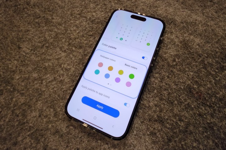
Almost the entirety of the Settings app is locked, but enthusiasts can still get a taste of Android’s Material You theming system. One of those demonstrations is how the UI color palette matches that of the wallpaper, and how the app icons also acquire a uniform matching shade. On an iPhone, you get none of that flexibility. Come on, Apple, flex those design muscles (and also use all that pile of cash). Thank you!
As if rubbing salt on iPhone users’ customization deficit, Try Galaxy also lets you play around with a few themes that overhaul the entire UX, from changing the wallpaper to applying fancy app icons, all in one go. Once again, you will have to pass quite a few hoops to achieve even half of that on an iPhone.
Samsung flaunts its security tools, too

Apple makes a big show about the privacy and security aspect of iPhones. Naturally, Samsung wants to show off its own progress, too. In the Settings app, Try Galaxy gives a preview of the Permission Manager system that acts as some sort of access dashboard and lets users see apps that have access to sensitive metrics like call logs, contacts, mic, and body sensors, among others.
Then there’s the Device protection feature, which claims to protect your phone against spyware and other malware-loaded packages. Created in collaboration with cybersecurity giant McAfee, this feature is an answer to Apple’s repeated problems that the Android ecosystem is a cesspool of malware, and which Apple also uses as a potent excuse to prohibit side-loading.
Overall, Try Galaxy seems like a solid attempt by Samsung to showcase what its Android-based One UI 5.1 skin has to offer over Apple’s iOS experience. More importantly, it once again tries to send home the message that Android — or at least, Samsung — is catching up to Apple’s top exclusive bragging rights for iPhones. It’s worth a try, I reckon, even if you’ve pledged never to abandon iOS and its supposed convenience.


