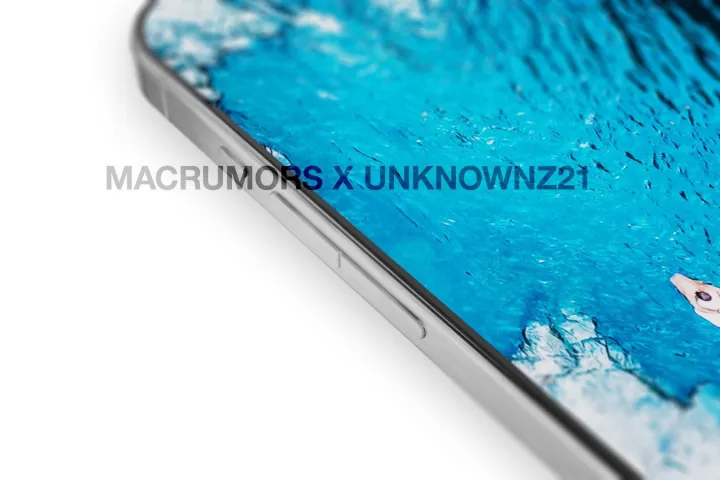
The iPhone 15 Pro’s rumored design changes have stirred quite some hot debate. Leaks suggest Apple is abandoning the cause of your usual clicky buttons on the side in favor of solid-state buttons that sit flush with the frame. But a fresh rumor says Apple has hit some engineering and performance snag with the tech and will stick to the physical tactile buttons.
But it looks like some design changes are still in the pipeline. MacRumors has shared updated renders of the iPhone 15 Pro, which show a single pill-shaped format for the volume rocker. To recall, Apple has been shipping its phones with distinct volume up and down buttons for years. Most Android phones, on the other hand, offer a single-volume rocker. It’s a mixed bag of experience and repairability.
The single, distinct volume rocker button often starts to wobble over long usage, and from my experience, I’ve even seen them detach from the socket in some cases. On the flip side, these buttons are easy to feel with your fingertips. A two-button design for volume adjustment, like the current-gen iPhones, offers some respite from button-related mechanical issues, but there are chances of accidentally landing the fingertips on the wrong volume button, too.

Apple apparently wants to solve two problems in one go. If the leaked renders are to be believed, the iPhone 15 Pro’s volume button will be a single pill-shaped unit, but it is raised above the metallic frame, and there’s a distinct indent that divides it into two functional halves for increasing and decreasing the volume.
As for the mute button, well, it will be a clicky button that presses downward with satisfying tactile feedback. I am all in for this implementation, especially when compared to solid-state buttons, which don’t actually move downward and only replicate the feel of a button with a vibration produced by a haptic motor underneath. There’s actually some precedent for that.

Remember HTC? The Taiwanese brand launched its flagship HTC U12 Plus back in 2018. This phone had solid state buttons, and for the lack of a better word, a handful of experts called them “disastrous.” You know when such experimental design elements are actually terrible when the brand itself publishes a whole cautionary article titled “Do’s and don’ts with pressure-sensitive buttons” because these buttons are, well, sensitive. And not the good kind of sensitive, mind you!
Digital Trend’s review of the phone mentioned it right in the headline that “digital buttons suck.” I rest my case with your informed reading for further context. Apple’s rumored decision to skip the solid state button, at least on the iPhone 15 Pro, sounds sane to me. Oh, did I also mention that a sophisticated system of solid-state buttons with complex haptic engines underneath would be a repairability chore? And, of course, heavy on the buyer’s pockets.
I am dearly hoping that Apple goes with the design depicted in the latest leak instead of going all cool and maddeningly experimental with solid-state buttons.


