Apple gave us a jam-packed WWDC 2023 keynote, and it was one of the most significant ones in years. After all, it introduced a brand new product category for Apple with the Vision Pro mixed reality headset. It’s basically as significant as when Steve Jobs revealed the iPhone in 2007, then the iPad in 2010, and when Tim Cook showed off the Apple Watch in 2014.
But the headset isn’t the only thing we got in the WWDC keynote. Since it’s a developer conference, it’s also about the software for all of our devices. This includes iOS 17 for the iPhone, along with iPadOS 17, watchOS 10, and macOS 14 Sonoma.
There were many rumors about iOS 17 before the keynote, and for the most part, those fizzled out. I was getting hyped up for iOS 17, but it’s not the update I was hoping for.
There’s no game-changing feature in iOS 17

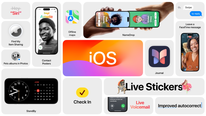
I’ll be honest — I’m not sure what the headline feature for iOS 17 is supposed to be. Is it the new personalized Contact Poster that you can create that shows up on the recipient’s entire iPhone screen when you call them? Or is it NameDrop, the new AirDrop feature that lets you easily share your contact information with others just by holding your iPhones close together?
Maybe the new Journal app? Perhaps it’s StandBy, the feature that turns your landscape iPhone display into a nightstand display showing the date and time or other informative widgets.
That’s the problem. I don’t really see a huge feature that’s supposed to draw people into this update. Unlike past releases like iOS 7, iOS 14, and even iOS 16 — all of which had a major change, such as a complete redesign of iOS, finally adding widgets to the home screen, and lock screen customization — iOS 17 doesn’t have that. To me, it’s a quiet release that seems to refine a lot of things and bring about some quality-of-life improvements overall. But that’s about it.

Not that any of that is bad, per se. In fact, it’s actually rather welcome after some of the messy changes in iOS 16. I still wish Apple would revert some of those changes, like let us change a home screen wallpaper directly from the Photos app again (if you don’t believe me, go ahead and try it on your iOS 16 device right now).
However, I suppose after hearing all the rumors of iOS 17 in recent months leading up to WWDC, I was just expecting more. There was actually a lot of back and forth from Mark Gurman about iOS 17 — how it would be a quiet release, then he flip-flopped and said it may bring in some highly requested user features.
iOS is still trailing behind Android

Don’t get me wrong, there are definitely some good quality-of-life improvements in iOS 17. You’ll be able to quickly input verification codes from your email, similar to how it works with Messages, and there’s even verification code cleanup in Messages, so you can get rid of all of those one-time use codes.
There are now offline maps available in the Maps app, something that many of us weren’t expecting at all. Visual Lookup has expanded to help you find similar recipes when meals are recognized in a photo. NameDrop makes it easier than ever to share contact information, and AirDrop even works for large downloads over Wi-Fi if you’re out of range. And multiple timers, finally!
Perhaps a few of those would be considered highly requested features from users, like offline maps and multiple timers (I can’t believe it took this long). But other areas that need improvement to catch up to the competition are still neglected.
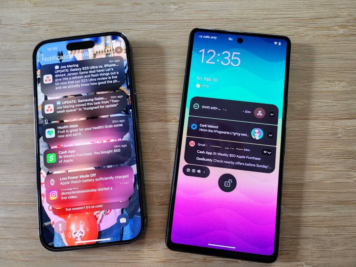
For one, notifications didn’t get any improvements and are still terrible compared to what you get on Android. If you get a lot of notifications, the Notification Center is like an endless Rolodex of notifications, with grouping all over the place. Comparatively, Android is much more organized, and the condensed view is easily expandable if you want to see more. And iOS notifications are still an all-or-nothing affair (unless the developer offers various settings) compared to the granular controls that Android offers.

I was also hoping to see individual volume controls on iOS. On Android, when using the volume rocker, you can tap on a button on the volume slider to bring up independent volume settings for various elements, like system, alerts, ringtone, and media. It’s a simple little thing that Android offers, but it makes life so much better — maybe I want to hear some media at a certain volume, but I don’t want my alert sound to be that loud if it’s on at all. I really was crossing my fingers for this feature, but I guess I’ll just have to continue wishing for Apple to get the hint one of these years.
Again, there are plenty of good improvements and little refinements in iOS 17, and I’m glad to see them. But I was also hoping for more from iOS 17 as well. What we got is fine, but that’s about it.
Oh well, there’s always next year.


