On July 11, U.K.-based upstart Nothing will introduce its second smartphone — the Nothing Phone 2. As usual, the hype machinery is in full swing. Drip-feeding of key features, straight from founder and CEO Carl Pei, is frequent news these days. The leak land, as usual, is busy churning out all kinds of expected and unrealistic upgrades.
Pei recently hinted that the leaked renders were probably fake, so we’re not going to touch that grass. But so far, official promises of a bigger display, larger battery, and a flagship-grade chipset have created the aura of an uncompromising smartphone experience from Nothing’s next handset.
The Nothing Phone 1 was quite a palate-cleanser that shone (quite literally) in the crowd of bland budget phones, but based on my own experience, I am hoping that the Nothing Phone 2 improves in the following areas.
Add some substance to that software

I am all for a bloat-free software experience, but there’s a difference between stock Android and a rewarding clean Android experience. The best example? Motorola versus Pixel phones. Motorola’s phones run arguably the cleanest Android experience, but it is also depressingly devoid of features that could elevate the experience.
Pixel phones, on the other hand, serve a pristine Android experience with a whole bunch of practically exclusive features. It might look the same at first glance, but the Pixel software is in an altogether different league compared to Motorola’s spin on the same idea.
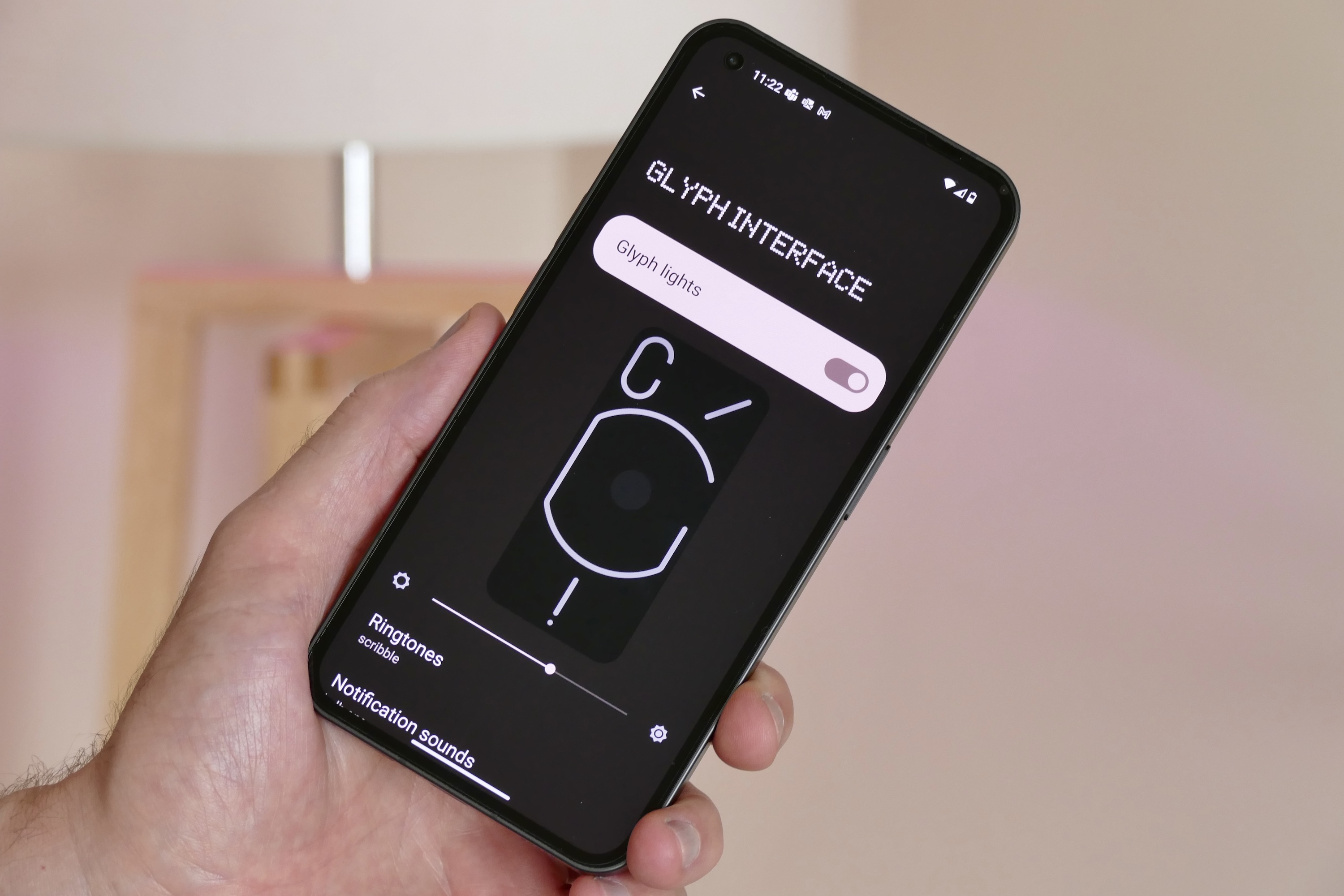
Nothing OS tried to imitate the formula, but its software felt closer to Motorola from a functional perspective than a Pixel. Now, Nothing likely won’t ever catch up to the Pixel experience because Google is always cooking up exclusive tricks of its own, while Nothing tried to stand out with custom widgets, unique glyph-tunes sounds, and its own dot-inspired aesthetic styling.
But there’s only so far you can go with aesthetics. The Nothing Phone 2 needs to step up the software game. And it looks like Nothing will deliver this time around. Pei has confirmed that it now has more people working on the software side than ever, and we’re certainly hoping that the Nothing Phone 2 finally rises up to the expectations with a UI worth talking about — instead of banking solely on a snazzy light-up design.
The camera sensors need to step up

The Nothing Phone 1 offered a pair of 50-megapixel cameras, which were beefy on paper, but the photo and video output from each sensor was miles apart. The main snapper captured reliable photos, but it had quirks of its own. It struggled with motion objects, HDR output was inconsistent at times, and low-light image capture was nowhere near as good as a budget Pixel phone like the Pixel 6a.
Over time, Nothing sorted out some of the camera woes. However, the major letdown was the ultrawide camera, which had too many pixels to gloat about, but the actual output left a lot of room for improvement. It had some glaring exposure adjustment and color accuracy issues, and the disparity in image quality captured by the primary Sony sensor and the ultrawide Samsung sensor was quite evident.
Then there were some technical limitations, such as the inability to capture 4K videos at 60fps. Now, we don’t have any official confirmation regarding imaging hardware upgrades, but a Snapdragon 8 series chip brings its own set of camera capabilities courtesy of a beefier Image Signal Processor (ISP) and AI-assisted tricks.
With the Nothing Phone 2 primed to jump firmly into the high-end Android segment, it needs to deliver on the critical aspect that is a standout camera output. If it doesn’t, the likes of Pixel 7a, Galaxy S23, and the iPhone 14 will be more than happy to trounce the new entrant in the U.S. market.
Make it sturdier, please

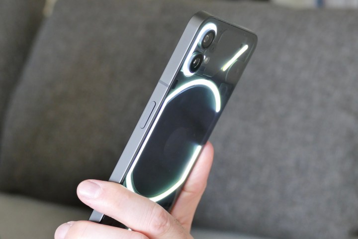
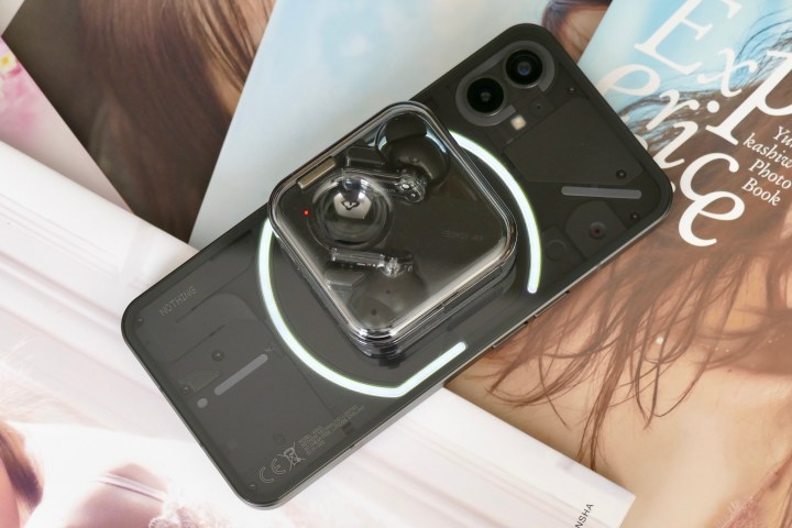
Yes, the Nothing Phone 1 was quite the looker. That transparent design was far ahead of the competition, and those glamorous glyph LEDS at the back were cleverly integrated at a functional level. But there’s only so far a flashy design can take you. A phone needs to hold its own against accidental bumps and the inevitable drops. Plus, water and dust resistance are of critical importance, too.
The Nothing Phone 1 underwhelmed at the resilience aspect, thanks in no part to an IP53 rating, which put the phone strictly in the “splash-proof” category. Multiple Nothing Phone 1 users have also complained about fogged camera lenses and dust getting underneath the transparent rear shell.
Rival premium phones at least begin at the IP58 level, but if you’re paying anything in the $800 ballpark, most of your options will offer IP67 or IP68 levels of ingress protection. The Nothing Phone 2 needs to step up in this department. I, for one, want to flaunt the phone in all its glory without having to worry about physical damage and needing to begrudgingly put a case on it.
Give us a charger, Lord Pei!

The Nothing Phone 1 had its struggles with battery life, despite packing a decidedly mid-range Snapdragon 778 processor. With the Nothing Phone 2 upping the ante to a flagship-tier Qualcomm silicon, Nothing really has to step up the optimization game to keep up with the power-hungry silicon inside.
But that’s not the sole concern. My biggest gripe with smartphone makers is that they make tall claims about how fast their phone can charge and then yank the charging brick off the retail package. What’s the point of parading a trick if you want the customer to pay extra for it?
What if I am an iPhone user, and Pei has me convinced to jump ship and get the Nothing Phone 2 instead? I don’t have a 33W or 50W charger lying around to juice up the phone at its peak charging speed. Yes, I do appreciate the convenience of wireless charging and even reverse wireless charging, but at least put a brick in that neat box.

Pei’s former employer OnePlus doesn’t cut corners here. The OnePlus 11 goes up to 100W, and you get a chunky 100W brick in the box. (Thanks, OnePlus. I love it. I really do!) I’m not sure if the Nothing Phone 2 will even go half that level – 50W is still faster than Samsung and Apple phones – but I would really appreciate even a basic 20W brick in the box.
I don’t have my hopes high for the cause of a bundled charging adapter, but if there’s one brand that can truly pull out a surprise and has the ethos to stand out from the crowd, it’s Nothing. I hope the folks over at Nothing’s headquarters are thinking about the same!


