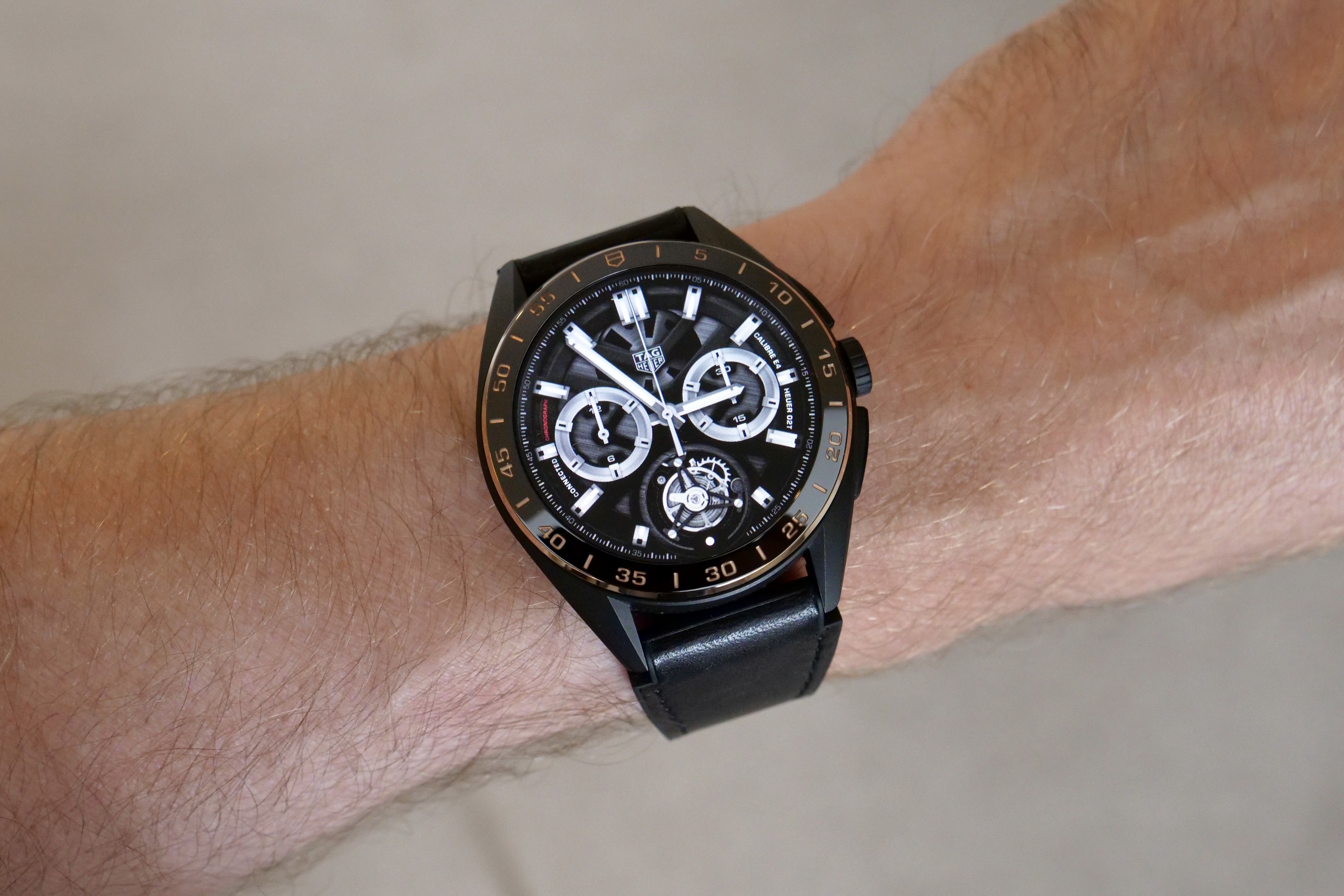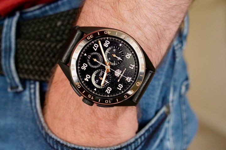
Yes, the Tag Heuer Connected Calibre E4 Bright Black smartwatch costs $2,750, and if I had that kind of cash hanging about, I wouldn’t hesitate to splurge on it. Madness, you may be saying, as some of the best smartwatches you can buy cost less than $400.
But the Tag Heuer is special, where others simply are not, and an upgrade to Wear OS 3 has really helped emphasize the sheer quality of this smartwatch. Let me try and explain why the expensive Tag Heuer smartwatch is still worth buying.
Fantastic design, materials, and finish
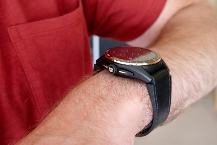
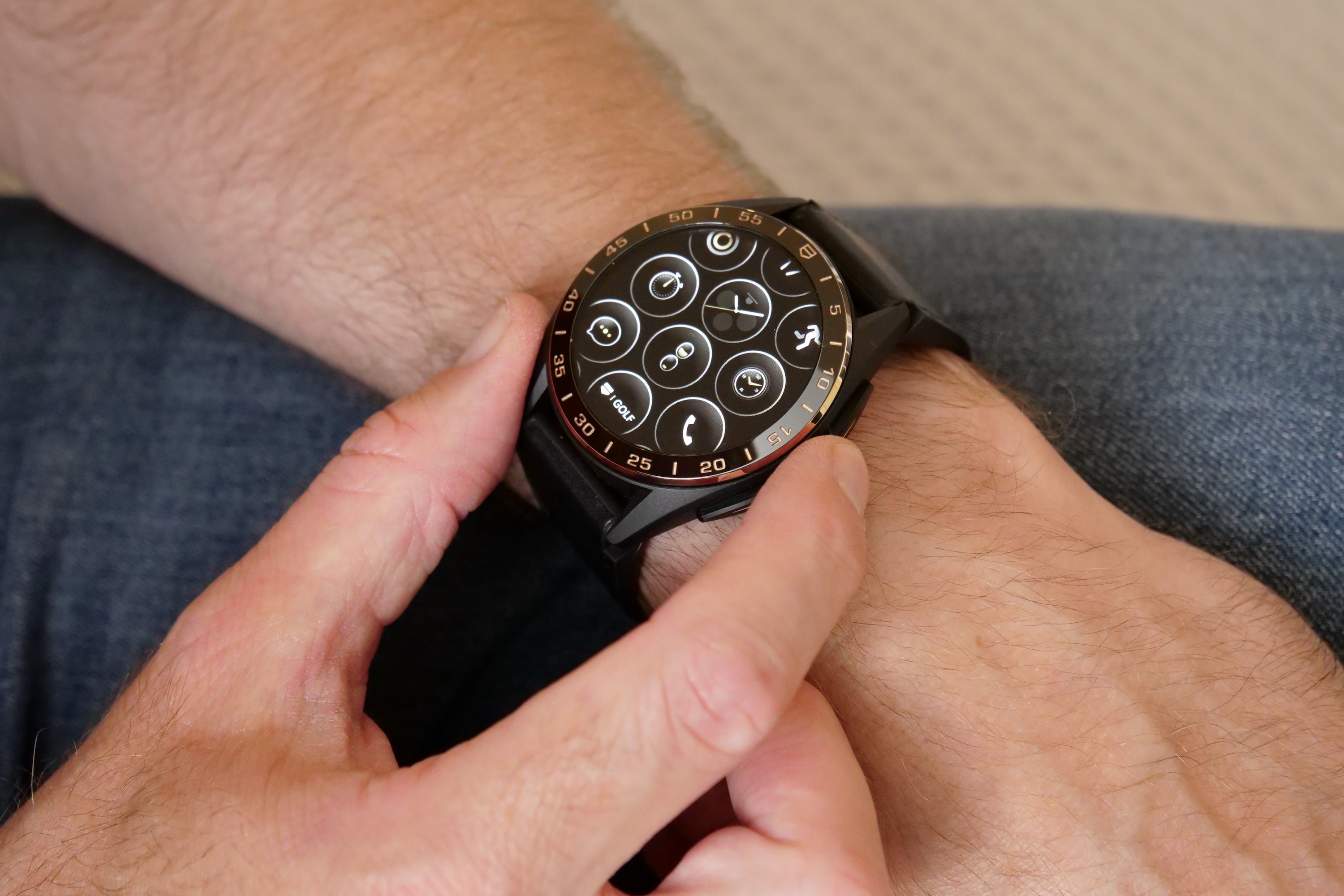
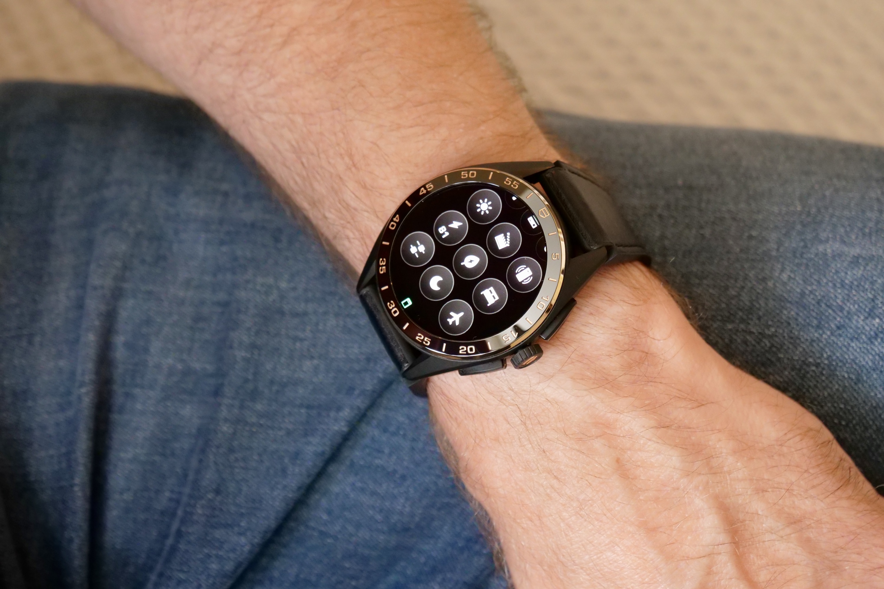
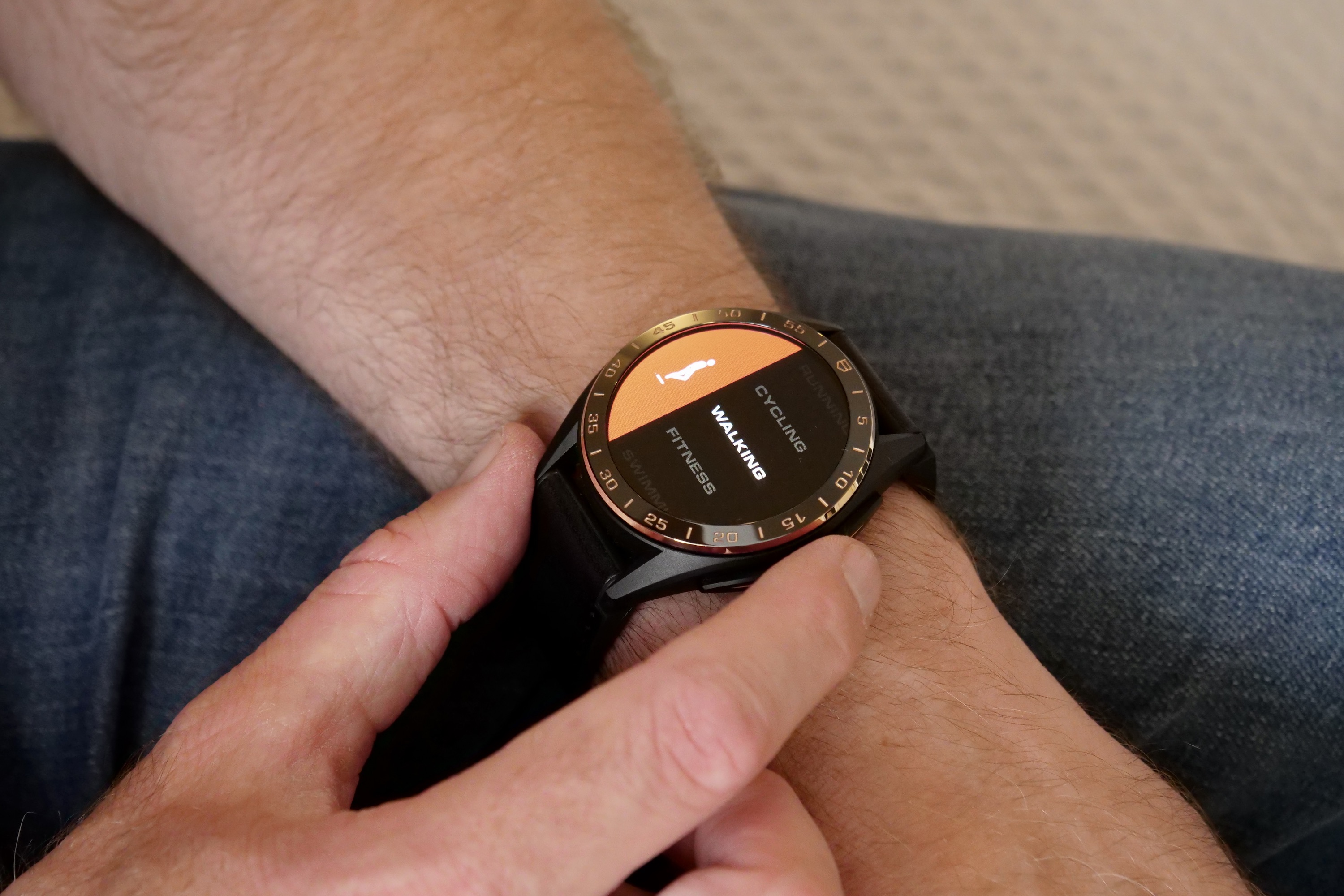
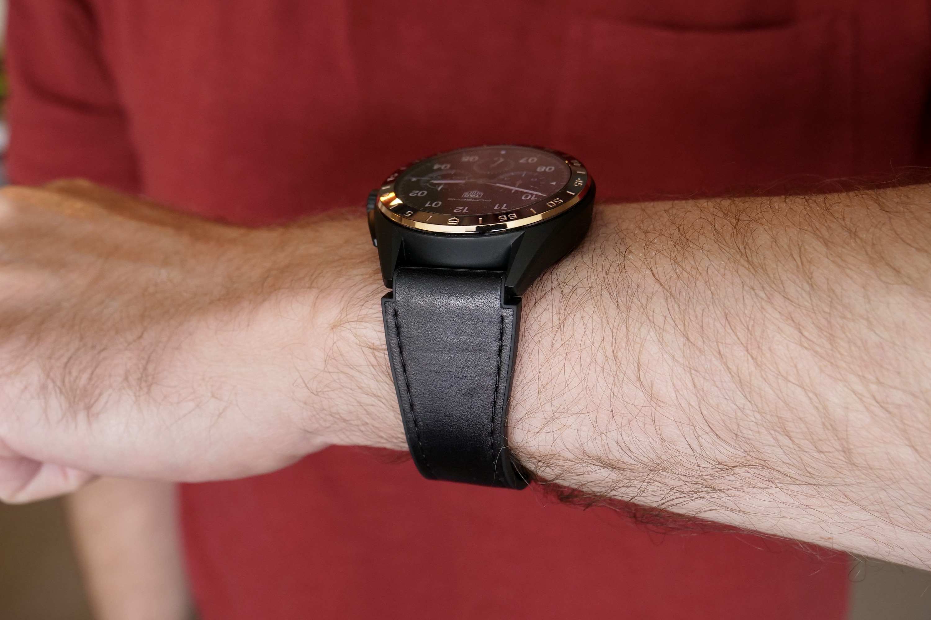
Tag Heuer added the Golden Bright and Bright Black editions to its already extensive range of Connected Calibre E4 smartwatches in June 2023, and they’re characterized by their use of gold in the color scheme. I’m wearing the 45mm titanium Bright Black Edition, while the Golden Bright — which is very golden — comes in the smaller 42mm case size and is made of steel with a physical vapor deposition (PVD) coating to increase durability. I don’t find the 45mm model overpowers my 6.5-inch wrist, and the other dimensions have not changed over the version I previously reviewed.
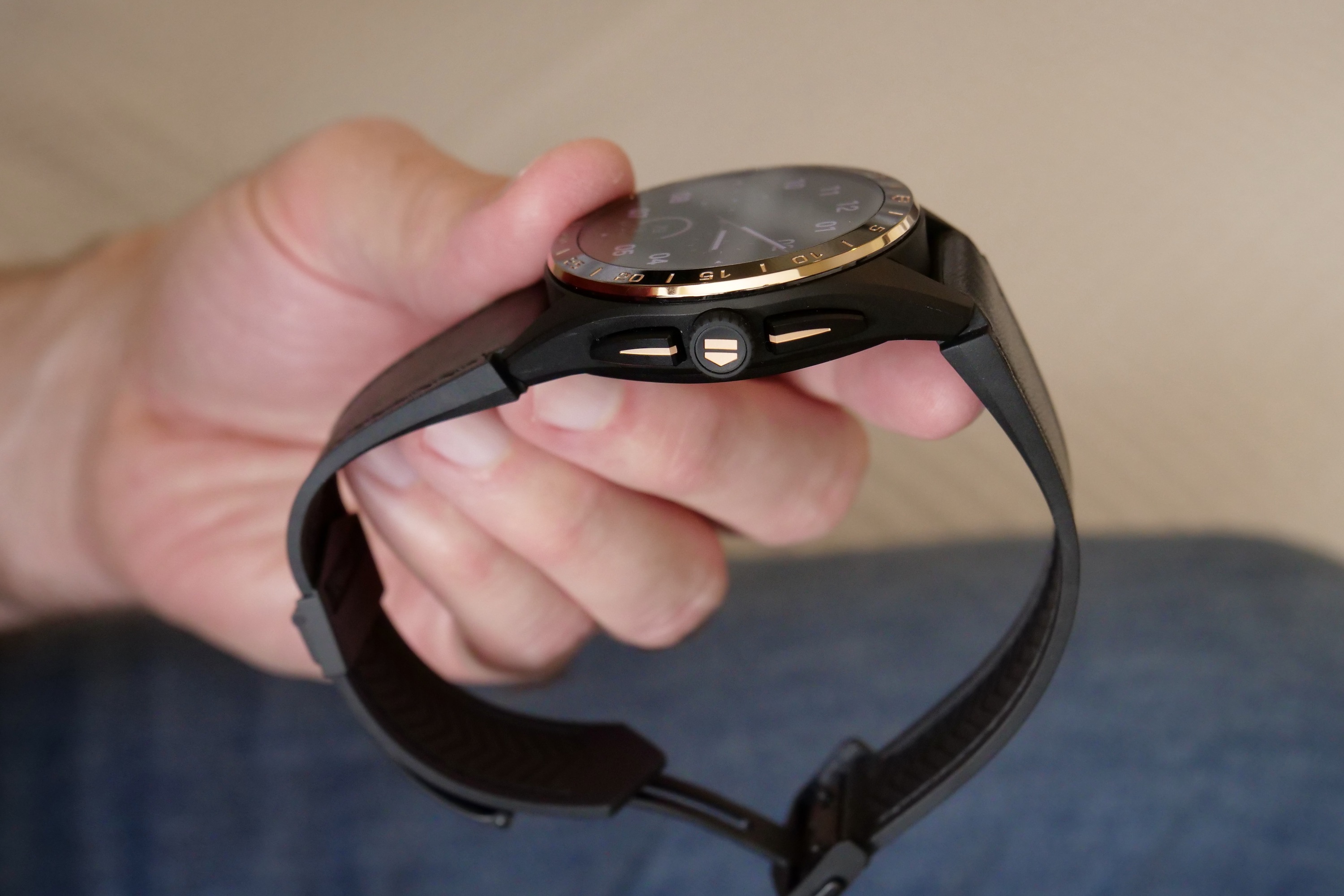
The 45mm version has a black diamond-like carbon (DLC) coating and highly polished gold accents, which really stand out against the matte black titanium case. The gold continues on the buttons and on the Tag Heuer logo embossed on the crown. It’s not too showy, which the 42mm Golden Bright version definitely is, and the mostly black color means it goes with everything. The sapphire crystal over the screen gives it a beautiful shine too. I’ve worn it comfortably throughout my time with it, and a lot of this is down to the wonderfully light 89-gram weight (and the amazing strap).
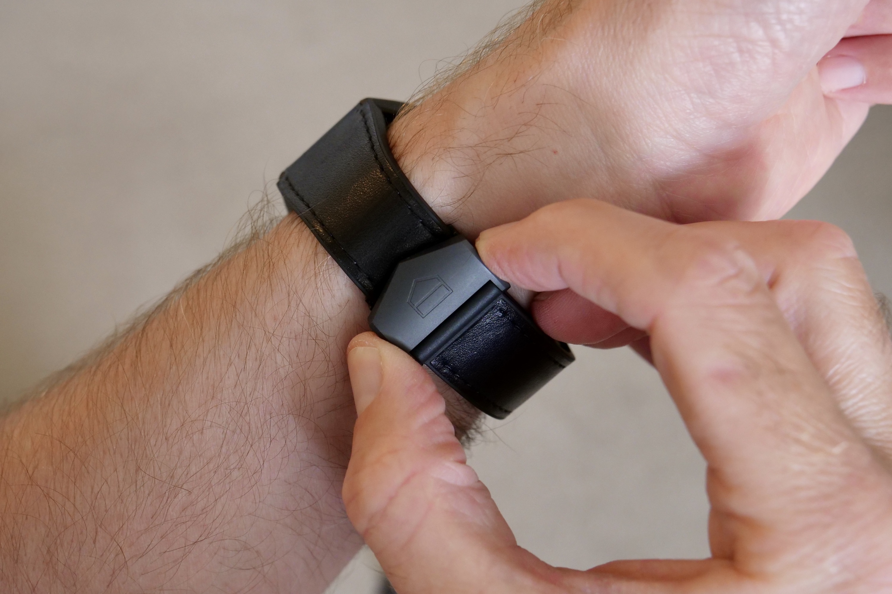
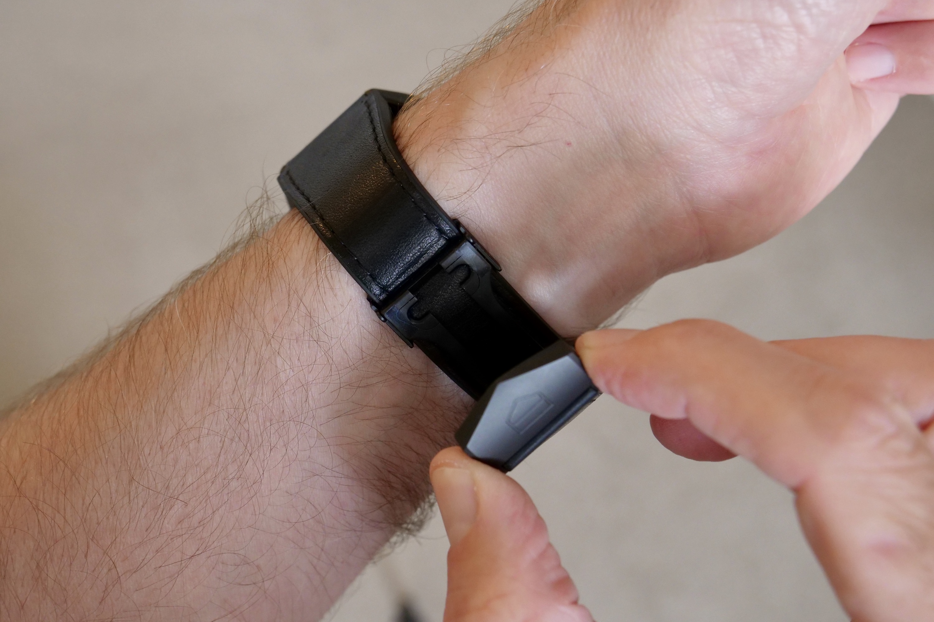
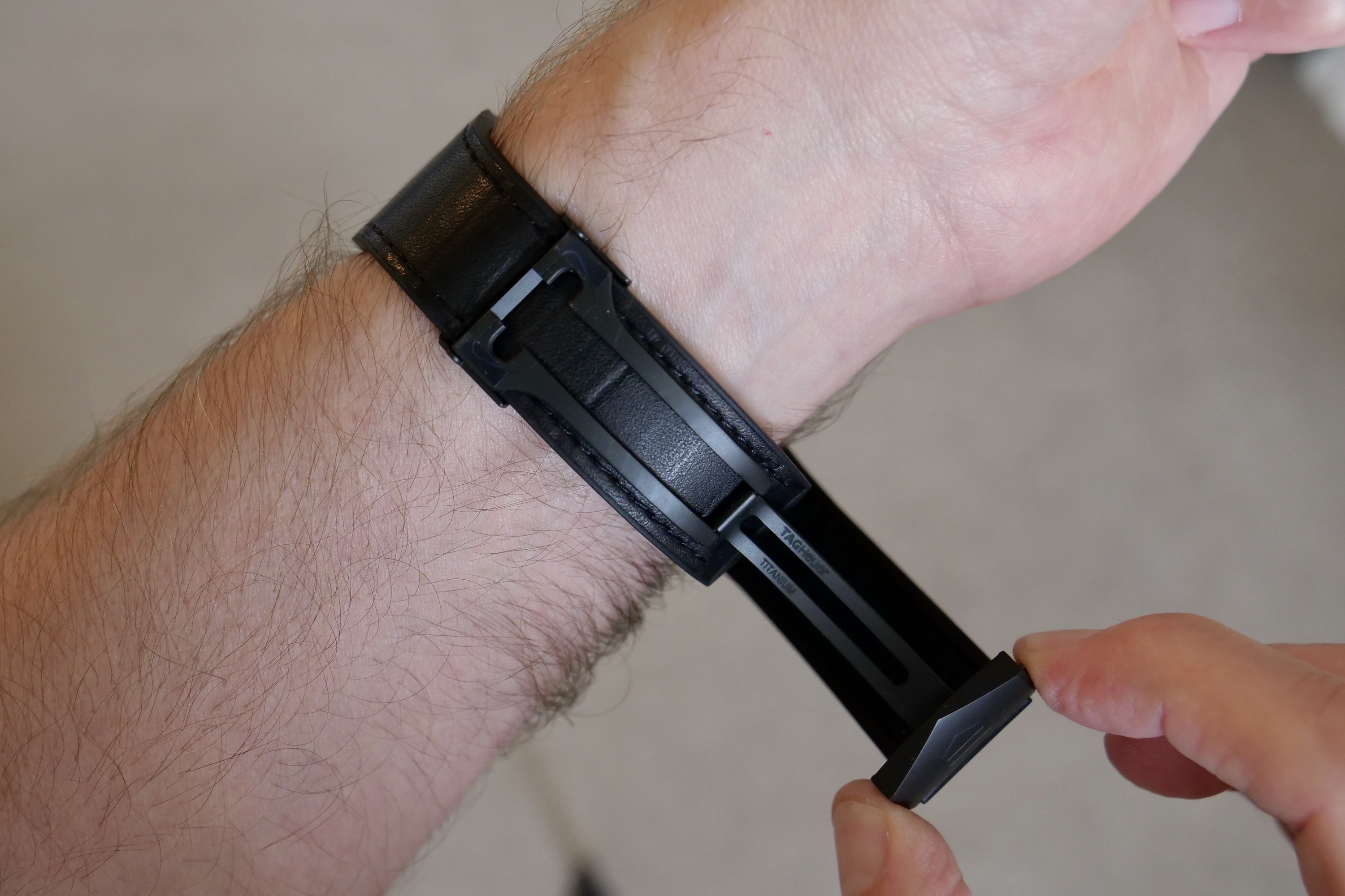
The strap is one of the best I’ve used on any smartwatch. It’s a deployant clasp that’s incredibly easy to adjust, something I’ve done often. When I want to work out, it needs to be tight against my wrist, but not so much at other times, and it takes just a moment to get the fit exactly right. Two small buttons on the clasp undo it, it’s incredibly secure, and it looks superb too. The strap has leather on the outside and rubber against your wrist. It doesn’t get sweaty or annoying — I love it.
This combination of low weight, supreme comfort from the strap, and stunning design mean the Tag Heuer Connected Calibre E4 feels like it could be a permanent fixture on my wrist. It has never felt too big or heavy, despite its large size, and I’ve had no real desire to change it for another watch. Beyond all this, it successfully manages to do what I want from any luxury timepiece — it makes me feel special, and that’s perhaps not something you’ll easily grasp until you actually put it on your wrist.
Tag Heuer’s app is superb
But the main reason I’m revisiting the Tag Heuer Connected Calibre E4 is not the design, which I already liked, but the software. When it launched, the smartwatch had Wear OS 2 onboard, whereas both the Bright Black and Golden Bright models launch with Wear OS 3 installed. There’s also an update available for existing Connected Calibre E4 models. I wanted to see how this had changed the smartwatch and what Tag Heuer’s updated app was like.
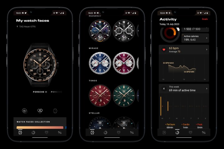
With Wear OS 3, you don’t need to install any Google app to connect your watch to your phone, as it’s all done through the manufacturer’s customized app. I’ve connected the smartwatch using Tag Heuer’s app to several different Android phones, and it has worked faultlessly. The app is well-designed and stylish. The main splash page is all about the watch faces — which have been modified to fit in with the golden theme on the new watches — and there’s an informative page next to it with all your activity data, more about custom workout programs, and your settings.
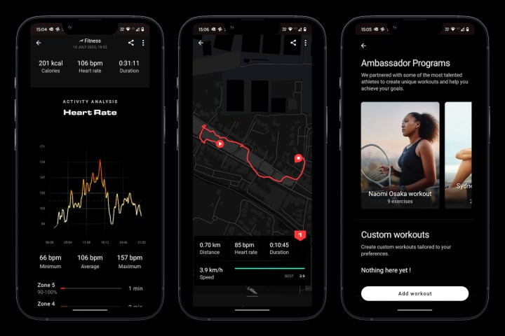
It succeeds because of this simplicity. There’s no fluff for a start, as Tag Heuer hasn’t dedicated a page to ads, other watches, or to showcase brand partnerships. Instead, it has kept distractions out of the app entirely. It does what you want, simply and cleanly, plus it has used its partnerships to create custom workout plans. The data presented for daily activities and workouts is similarly clear. Too many manufacturers use these apps as pseudo-shop windows, which instead of making you warm to your purchase, feel intrusive and money-grabbing.
The Tag Heuer app continues the high quality, luxurious, personal feeling you get from the smartwatch itself. It’s working with me, not against me. It also works very reliably, and I’ve had no problems with connection or reconnection. I haven’t worn the smartwatch overnight (it’s a bit too big), but it has always synced with the app the instant I put the watch on in the morning. Tag Heuer has been making smartwatches since the beginning. Its experience really shows with its top-notch hardware and app, and the addition of Wear OS 3 has genuinely improved life with the Connected Calibre E4.
The excellent watch faces
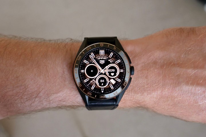
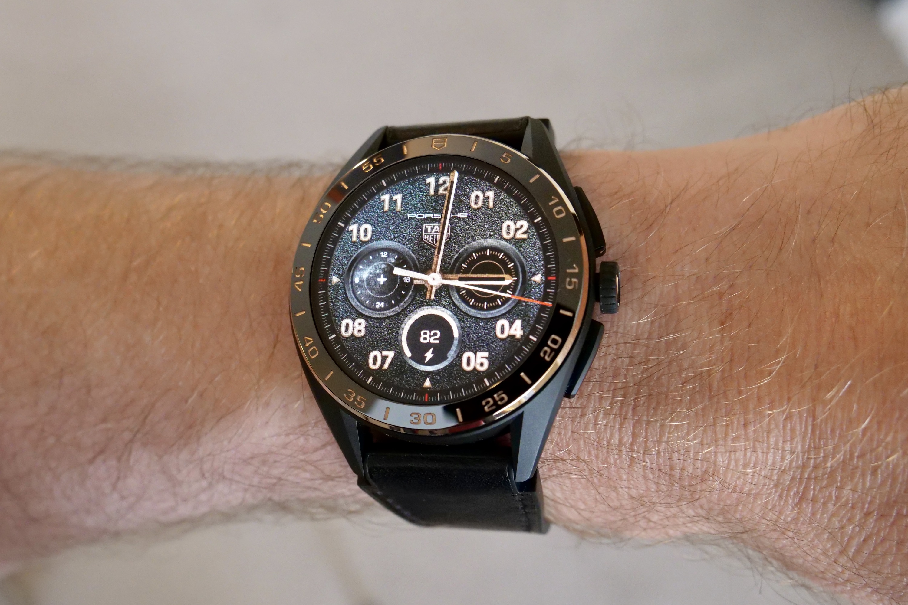
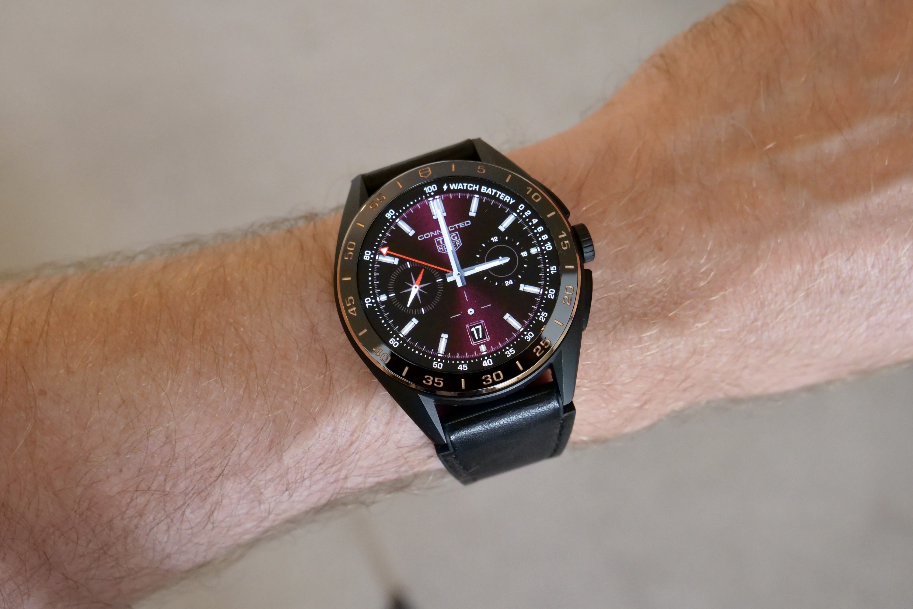
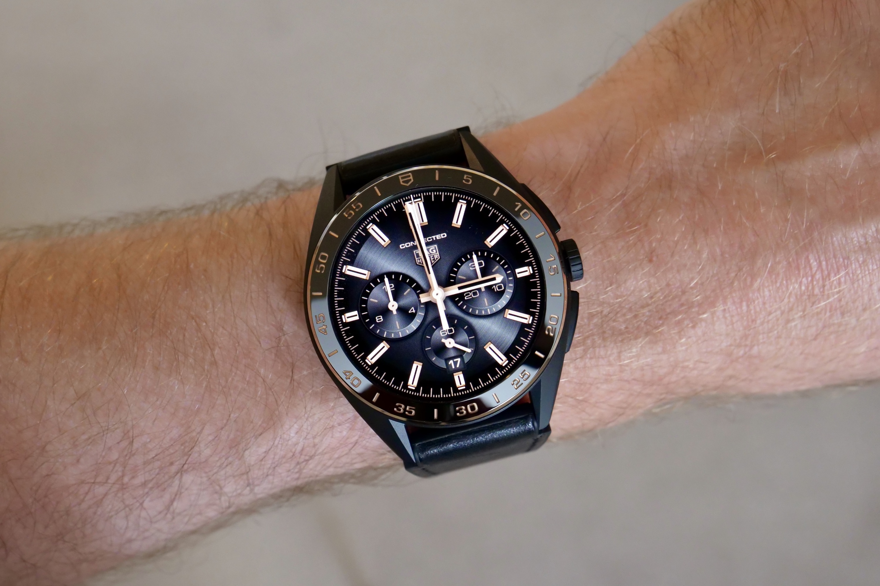
Before I go on to talk about what’s not so great, I really need to highlight the superb collection of watch faces that come with the Tag Heuer Connected Calibre E4. I recently complained about the awful watch faces that come with Samsung smartwatches, as none reflect me personally, especially compared to the watch faces that come as standard on an Apple Watch.
Tag Heuer shows Samsung how it should be done as it draws on its own watchmaking history to create an eclectic, beautiful, and still fun collection of watch faces. It doesn’t even hold its exciting faces made for some of its brand partnerships back, either, as its amazing Porsche watch faces are preinstalled. Each of the traditionally styled watch faces looks like the dial on a Tag Heuer watch, and it changes the way I feel about the smartwatch. I sometimes feel embarrassed about the Galaxy Watch 5, but never about the Connected Calibre E4.
There are data-heavy digital faces if you prefer, but my favorite quirky watch face is the Heuer02T, with the T standing for tourbillon. Yes, the most lusted-after complication on a traditional watch now has a digital equivalent, and you can see it “working” on your Connected Calibre E4. It’s ridiculous, but I absolutely love it, and if I wasn’t so attached to the Porsche watch face, I’d use it quite often. The fact I have a choice of watch faces to use — all of which I like — that reflect the type of watch on my wrist and the brand that makes it is yet another reason the Calibre E4 feels so special.
Are there any downsides?
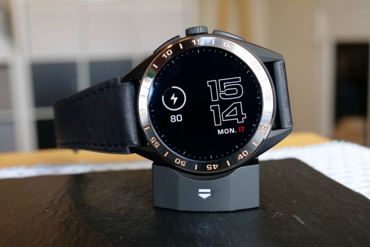
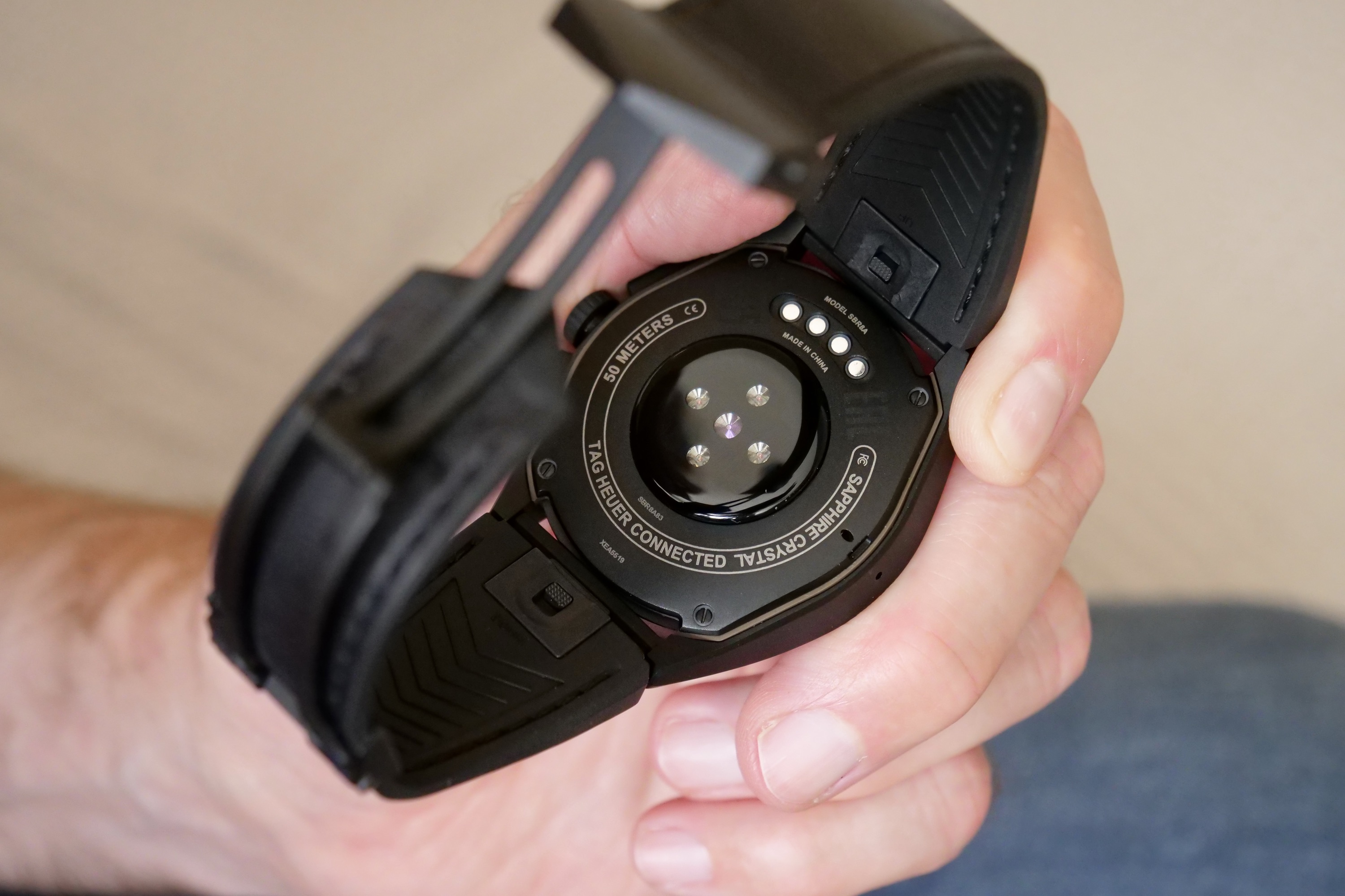
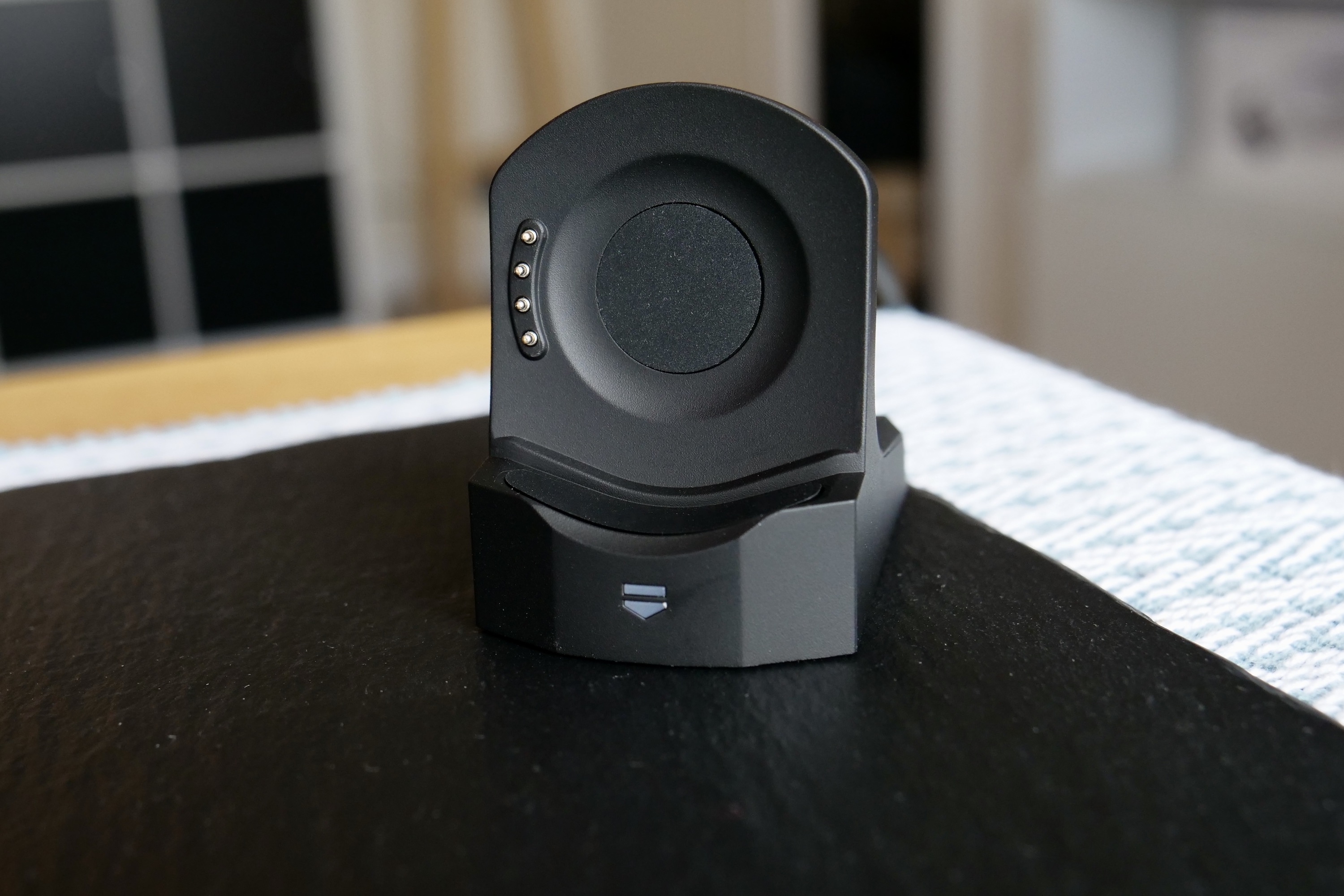
I’m aware I’ve talked a lot about what Tag Heuer has got right with the Connected Calibre E4 running Wear OS 3, so is there anything bad about it? Oddly, despite the rest of the watch and package being so excellent, the charger is awful. It holds the smartwatch in an upright position but uses pogo pins to connect to the contacts on the back of the watch, and they need a lot of fiddling around to actually get the watch to sit properly and charge. When you do get it to connect, it’s not quite level either, which bothers me more than it should. When the rest of the watch is so precise and carefully engineered, the poor charger is an odd misstep.
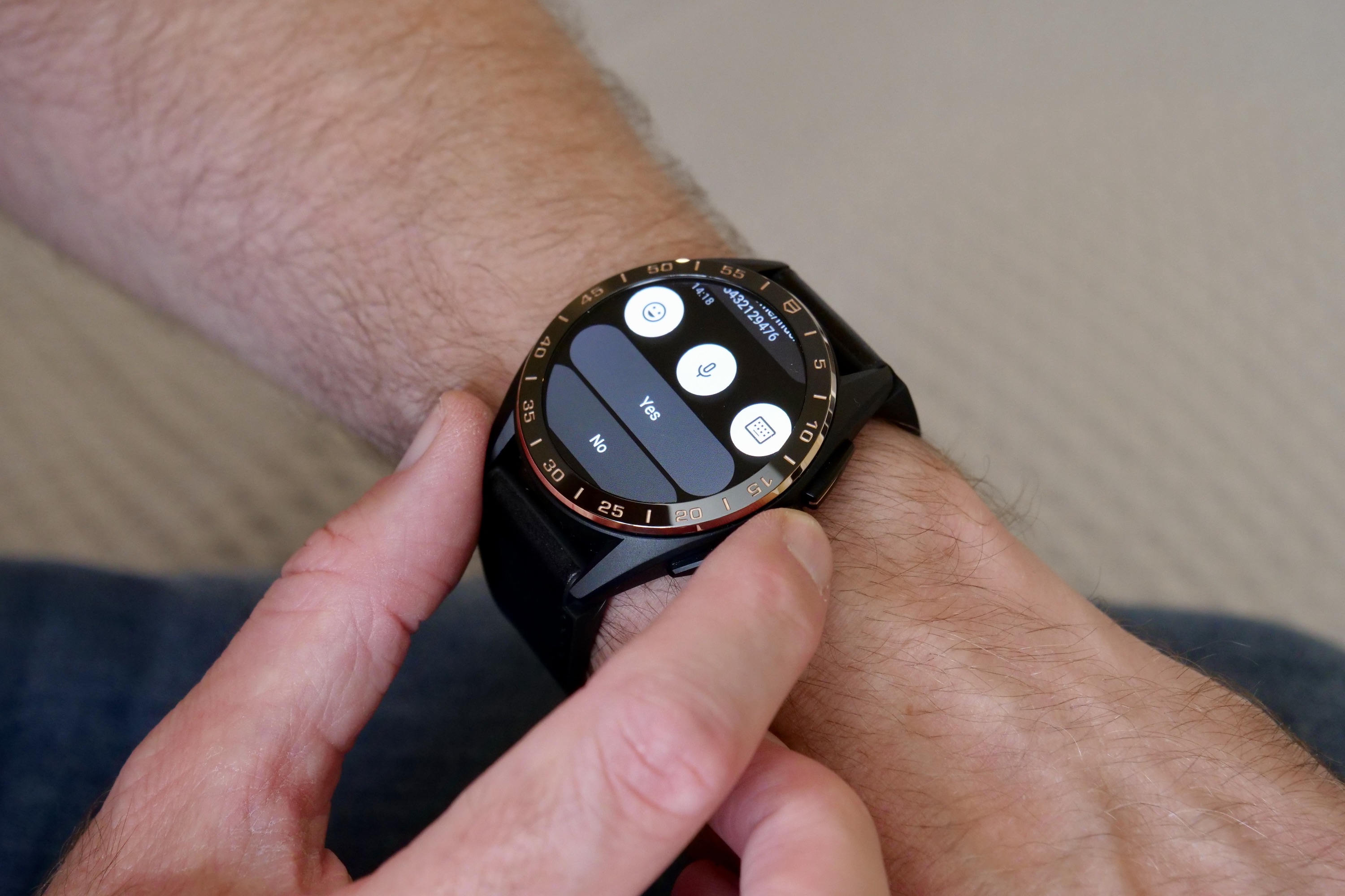
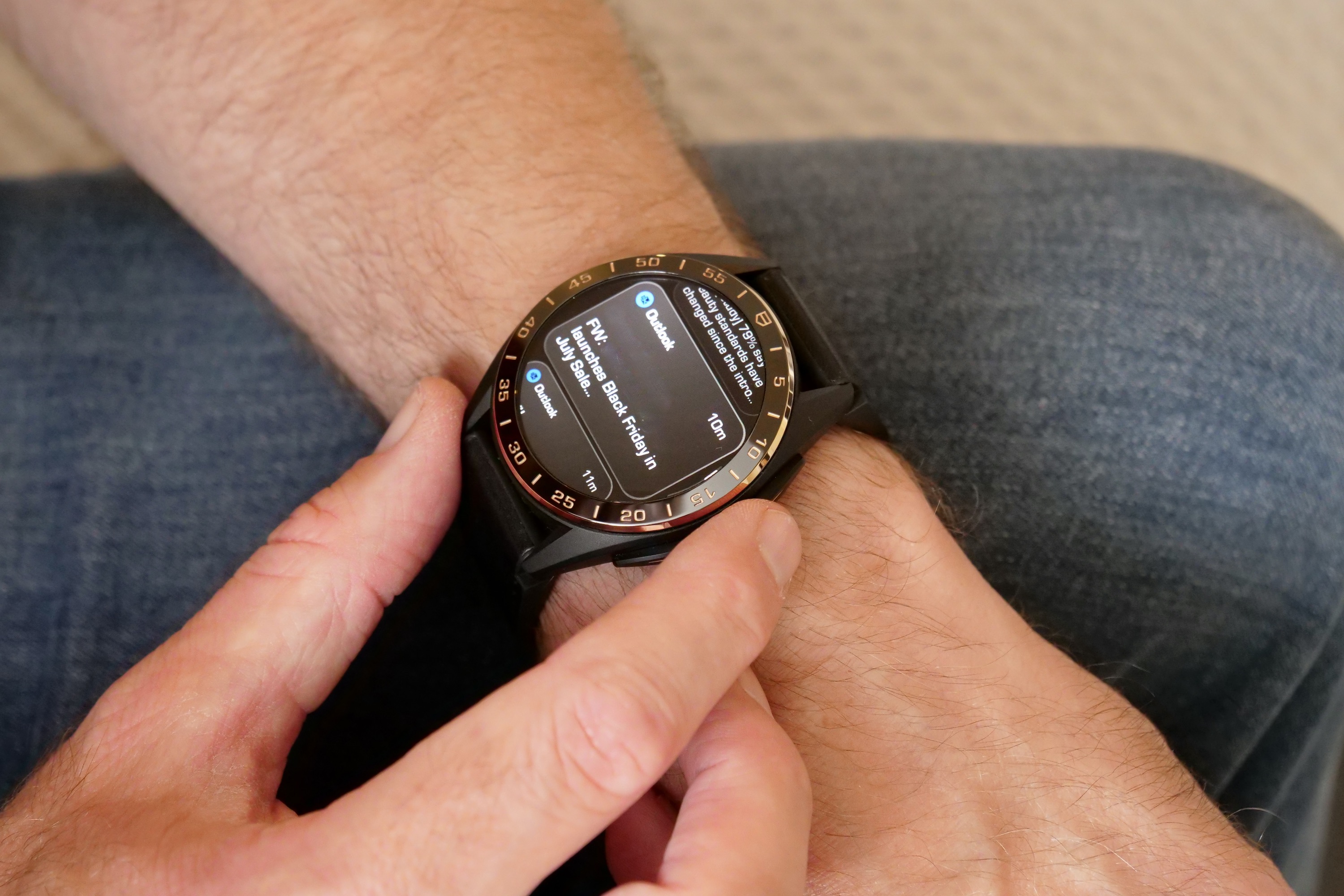
While Tag Heuer has given Wear OS 3 its own very stylish look, the software still has many of the problems seen on Wear OS smartwatches at any price. Notifications aren’t always very reliable, and I’ve found an odd bug where pressing the crown doesn’t always exit the menu completely, forcing you to restart the watch to cure it. Wear OS 3 is the best version of Wear OS yet, but it still can’t compete with Apple’s watchOS, regardless of which company does the design work. That said, the overall software design added to Wear OS on the watch is minimalist, cool, and mature.
However, the biggest problem with the Bright Black Tag Heuer smartwatch is the $2,750 price. It’s a hard one to justify because I loved wearing the standard Connected Calibre E4 45mm, which costs only $2,050.
I also own a non-connected Tag Heuer Formula One watch which costs less than either 45mm Calibre E4, and I love it dearly. If I had one fixed budget that covered all these watches, I’d have a very hard time deciding which one to buy.
Don’t listen to your sensible side
This leaves me with a bit of a dilemma. I’ve really enjoyed wearing the Tag Heuer Connected Calibre E4 again, and the color and finish have attracted several compliments, but I’d personally be very happy with the standard 45mm stainless steel model or even the smaller 42mm Calibre E4. It still has a ceramic bezel and sapphire crystal, and the standard rubber strap is equally as adjustable, if not quite so upmarket as the rubber and leather version. But it’s at least $700 cheaper, and that’s a lot.
Sensible heads wanting a Wear OS smartwatch will go and buy the Mobvoi TicWatch Pro 5, which is cheaper and technically superior, but luxury watches aren’t purchased with sensible heads. The Tag Heuer Connected Calibre E4 has been improved with Wear OS 3, the hardware remains fantastic, and it gives you most of the ownership enjoyment you want from a luxury watch despite its lack of mechanical internals. If you don’t mind spending the money, you’ll love it. Just do it when your sensible head isn’t looking.
The Tag Heuer Connected Calibre Bright Black Edition is made of titanium, comes in a 45mm case size, and only with the black leather and rubber strap. It costs $2,750 or 2,400 British pounds. The Golden Bright Edition has a rose gold PVD steel case and is in a slightly different 42mm case size. It comes with a full leather strap and costs $2,300 or 2,000 British pounds. Both are available through Tag Heuer’s online store and boutiques now.
