I finally switched to Microsoft Edge for this one feature

The Teams sidebar open in Microsoft Edge.
Digital Trends

Microsoft Edge has gotten increasingly better over the years, but I’ve stuck with Google Chrome — perhaps by habit, if nothing else. After all, a web browser is the kind of application I don’t want to think about. That’s why the flashier features of recent updates to Chrome, Edge, or even Arc haven’t swayed me. I don’t use Copilot, Collections, or even tab groups. That left me defaulted to Chrome.

I’m now using Microsoft Edge, though — and it’s not because of the most common complaints about Chrome, such as its well-documented memory usage. No, no. My reason for deciding to leave Chrome for Edge is based on a feature that was actually launched way back in 2022. For the longest time, I ignored the Edge sidebar — after all, the less clutter in my web browser, the better.

Recommended Videos

But then I tried it. In particular, I pulled it up with Microsoft Teams. We’ve been using Teams as an organization for many years at this point after switching from Slack, and the benefit of which has always been its integration into the broader Microsoft 365 ecosystem. We use SharePoint, and despite my continued inclination to use Google Docs and Sheets, having all your collaboration tools in one place is certainly handy.

Never have I felt that more, however, than when using Teams built right into Edge. I’m in Teams and my browser all day — the two are pretty inescapable. I’m constantly copying and pasting between the two, referencing things, and opening links — just like a lot of people who work in front of a computer do, I would assume.
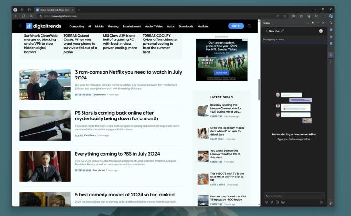
The Teams sidebar in the Edge browser.
Digital Trends

But something about having Teams built right into the sidebar has really clicked with me. For some people, Outlook is going to be more useful. But for me it’s Teams. Not having to constantly click away or even deal with a second window has really been convenient for me. I just don’t need the full Teams window in 90% of cases. Having just my list of chats at a glance at all times is fantastic. You don’t need necessarily need to be in the Microsoft ecosystem to take advantage either, since plenty of third-party apps are supported

Now, there’s a major asterisk here. I’ve appreciated the Teams Sidebar in Edge most when working on a large monitor, which I do here in the office. When I work on a smaller laptop, the sidebar can get in the way. I often prefer to have a full-screen view of what I’m working on in my browser, and in that case, it’s less ideal.

Obviously, this is a feature that’s useful only in my scenario. I’m not at all saying it’s a good reason for everyone to ditch Chrome. But if your work requires you to stay on Teams throughout your day, I’d at least give it a shot.

Luke Larsen
Luke Larsen is the Senior Editor of Computing, managing all content covering laptops, monitors, PC hardware, Macs, and more.
I have really good news about Microsoft Teams
The Microsoft Windows logo surrounded by colors of red, green, yellow and blue.

Microsoft is bringing some changes to its Teams app in the near-ish future, according to The Verge, including a combined chats and channels view that will go into public preview in November. There are also plans to bring threaded conversations to the app sometime in 2025.

Right now, the Teams app organizes your chats (both one-on-one and group chats) under one tab and your channels under another. Whenever you’re on the chats tab, your channels are just one tap or click away — and yet that one click has a pretty significant impact.

Read more
This new Google Docs feature is exactly what I’ve always wanted
Text box in Google Docs on a laptop.

As a writer of a certain age, I've lived a lot of life in Google Docs. It's where my first drafts go, but it's also where my crazy ideas, unhinged brainstorming, and research dumps go. 
There’s so many conveniences about Google Docs that make it my go-to for word processing, but let’s be honest: It’s still fairly barebones, especially when it comes to organizing and managing different files within Google Drive. But this new feature makes all of that much easier, keeping it all contained all within Docs itself.
It’s called Document Tabs, which you may have already noticed floating just to the left of your document.

The idea is simple: It lets you create multiple documents within a single Docs file. Create as many “tabs” or separate documents as a single project might need, and switch between them extremely fast. That accessibility to them is really where the gold is. No more switching between different browser tabs.
It’s even more handy on mobile, of course, where switching applications or tabs is even more cumbersome. Here, you’ll find Document Tabs hovering just at the bottom of the screen with some simple arrows to flip between your different tabs. All we need now is a simple gesture to be added to flip between them even more seamlessly.
Document Tabs takes the place of the old outlining system, which would grab headers and automatically create a table of contents around them. I used this frequently, but it was pretty finicky. More than that, it resulted in overly long documents that I still found myself scrolling through. 
Document Tabs is a really elegant solution to that problem. Whether it’s segmenting chapters in a book, multiple aspects of a project, or even just different parts of an article, it’s already become an extremely useful outlining and productivity tool for me.
It even had a pretty clean way of converting the tabs when you need to export. All the tabs do is combine down into one document, but they’re sectioned off with titles and some basic formatting. That’s not going to be ideal in every situation, of course, so it’s something to keep in mind if you need to export and share it with someone outside of Docs.
At the very least, though, it’s worth trying out. And if you’re a Google Docs fiend like I am, I have a feeling you’ll get quite a lot out of it.

Read more
Microsoft is finally making Copilot+ laptops useful for AI
Microsoft Surface Pro 11 front view in tablet mode.

Microsoft's Copilot+ PC initiative has been a smash hit, with many of them landing among the best laptops, but not for the AI hardware inside. Now, finally, Microsoft is putting the neural processing unit (NPU) inside Copilot+ PCs to good use. Starting today and going throughout the next two months, Microsoft will begin rolling out the 24H2 update for all Windows 11 PCs, and in the process, unlock several features for Copilot+ PCs, including the highly controversial Recall.

Recall is definitely the star of the show here, which will start showing up on Copilot+ laptops with a Snapdragon X chipset throughout October. Last week, Microsoft laid the groundwork for the release of Recall, detailing the security architecture of the feature and addressing some major criticisms of it. Now, for example, Recall is turned off instead of on by default. Microsoft is also allowing users to filter websites and giving users more control over their snapshots, including deleting them all.

Read more