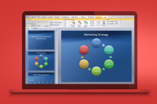
 Let’s be honest: Everyone has used (and likely abused) PowerPoint before. Microsoft’s presentation program is more than 20 years old, and although Redmond works very hard at keeping one of its primary honeypots sweet, PowerPoint has become so ubiquitous that it’s hard to stand out by using it.
We’ve all seen it. Dozens of slides, all with multiple bullet points. Perhaps some cheesy clip art. Definitely some cheesy transitions between slides. Many people and organizations, including the US military, believe this method actually contributes to the cognitive degradation of your audience. It really says something if your audience comes out of your presentation knowing less than they came in with.
PowerPoint’s grip has tightened as more and more people, not just in technology but in all walks of life, are being asked to give presentations. Perhaps they’ve been invited to speak at a conference. Maybe they have organized a lunch for prospective clients. Whatever the reason, being able to speak well in public is a crucial skill for a growing number of professionals. Most of these talks require a visual aid of some sort. The problem, unfortunately, is that very few people are able to think outside of the PowerPoint box. Are there alternatives out there? Yes, and some of them are even cheaper and easier to use than PowerPoint.
Software alternatives to PowerPoint
For iPad users, the best and most obvious alternative would be Keynote, Apple’s answer to PowerPoint. Just like Pages and Numbers, Keynote is one of those Apple apps that sort of do what the competing Microsoft program does, but you lose some functionality if you import a PowerPoint file.

As is the case in other technology sectors, the more interesting alternatives tend to be Web-based. Chances are that you’ve seen a Prezi before. The best way to describe one of their presentations is an infographic come to life. It’s a slide deck in three dimensions. That ability is great for highlighting important text or details, but has become somewhat of a one-trick pony itself, notable only for its novelty compared to PowerPoint. In fact, the transitions can make audiences a little nauseous.
SlideRocket offers the ability to import existing presentations, convert them to HTML5, and beam them down to your tablet. It also provides the same template, animation, and chart ability of PowerPoint, with some added toys like embeddable software demos and real-time plug-ins like an updating Twitter feed and stock quotes. With a little effort, it can definitely help you stand out compared to the typical PowerPoint.

Both Prezi and SlideRocket offer free versions with limited functionality or a subscription-based model that offers the works for a monthly or yearly fee.
Ditch the clicker
One of the coolest capabilities of using a tablet during a presentation is the ability to wirelessly control what’s going on. That way, you don’t have to be a PowerPoint jockey, pressing the down button on the keyboard every time you want to advance to the next slide. Leave a laptop hooked to the projector and then control the presentation using a personal wireless connection between tablet and laptop, a Bluetooth connection, or AirPlay (for iOS people). With a wireless projector, you can even ditch the laptop. Play around with the possibilities. and your clicker or laser pointer will be a thing of the past.
Less is more
Perhaps the best idea to break out of PowerPoint chains is to not only reconsider the tools you use to present, but also the presentation itself. “Death by PowerPoint” is real, and the cure is more story, more engagement, and fewer slides.
You don’t need a degree in creative writing to tell a story. The simplest form of a story is a simple problem and solution; chances are almost any talk can fit that storyline. Let’s put it this way: If your presentation is not addressing a problem with a solution, you’re wasting the audience’s time. Tie the problem to real life and real people, not some chart or spreadsheet, and you’re golden.
A good way to tell if your audience is engaged? Make it plain that questions can be asked at any time. If you’re doing your job, you should average one question per minute. Limit the length of your responses, though. A presenter going off-track is just as annoying as one that fervently sticks to a rigid outline – like just reading directly from slides.
For your next talk, make it a goal to use as few slides as possible. Not only will it force you to exercise your creative muscles, but it will also make you consider using some other tools to stretch the time. Recognize that a huge slide deck is a crutch that you don’t need. You’re there to have a conversation with the audience, no matter if it numbers in the single digits or thousands of people. That’s exactly what the best presentations accomplish.


