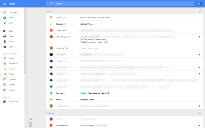
Detailed by Geek.com recently, the development team that works on Gmail is internally testing a simplified layout of the Web-based version. With more similarities to the mobile interface, the new Web interface, as seen in the screenshots, has been created with responsive design in mind. For those that are unfamiliar, responsive design mean that a site will automatically position elements on the screen based off the screen size. Basically, someone viewing the interface on a 1080p 24-inch monitor or a 10-inch tablet will have the same experience.

On the left side of the screen, Google appears to be transitioning to “fly-in” menus to select different folders or various inboxes. On the right side of the screen, Google has added a quick access menu at the bottom to quickly start an email as well as a Hangouts option at the top to launch into chat with an email contact. In the middle of the screen, Google has positioned all recent emails. The additional width of this layout will likely allow for longer subject lines. Oddly, there doesn’t seem to be a position for Google Adsense in this layout, a element of the current Gmail interface.

This interface also includes Google’s transition from stars to pins when it comes to noting the importance of a specific email chain. After than email has been pinned, the pin toggle at the top of the screen will automatically organize all pinned emails at the top of the feed. This is a welcome addition since the height increase of each email preview is about twice the size of the current layout, thus the new interface will show fewer emails and require scrolling sooner.
As noted by Geek.com, there’s no release date on the redesigned version of Web-based Gmail. Assuming this version is nearing completion within the next six weeks, Google could officially show off the new interface at the Google I/O conference during late June 2014.


