Apple introduced iOS 9 at WWDC 2015, and we’ve been playing around with the various beta versions of the software for a few months now. Now that Apple is pushing the final version of iOS 9 out to users everywhere, we thought we’d share some of our thoughts on the newest software for iPhones and iPads.
Here is our first review of the brand-new version of iOS.
3D Touch interactions only work on iPhone 6S
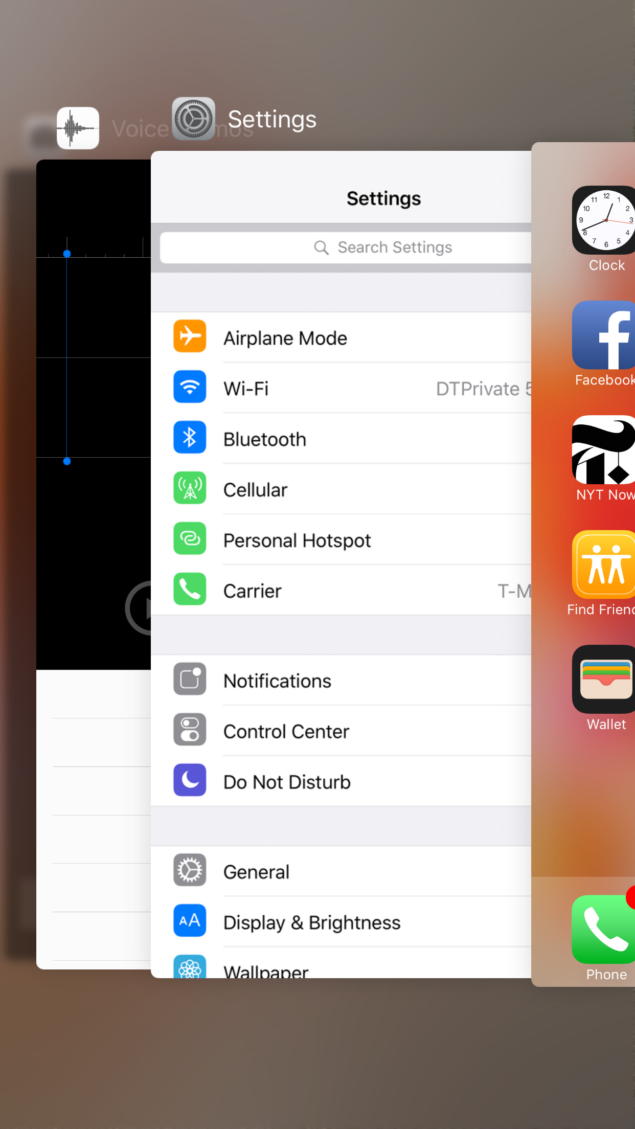
Apple made a big deal about how deeply the cool new 3D Touch feature is integrated into iOS 9, but you’ll only be able to use those cool features on the iPhone 6S and 6S Plus. Regardless, iOS works just as well on last year’s iPhones, and most of iOS 9’s new features are fully functional on older iPhones. For example, the new app switcher looks great, but you’ll have to access it via the old double touch of the Home button, rather than a hard press on the screen.
The multitasking view shows an elegant carousel of all the apps you have open. You can swipe through them to switch or swipe them away to close the apps. Each app is clearly labeled at the top so you know what it is, and the list of contacts is gone from the top. The result is a cleaner, more easily navigable multitasking view of your apps.
Looks like iOS 8 (almost), but with new apps
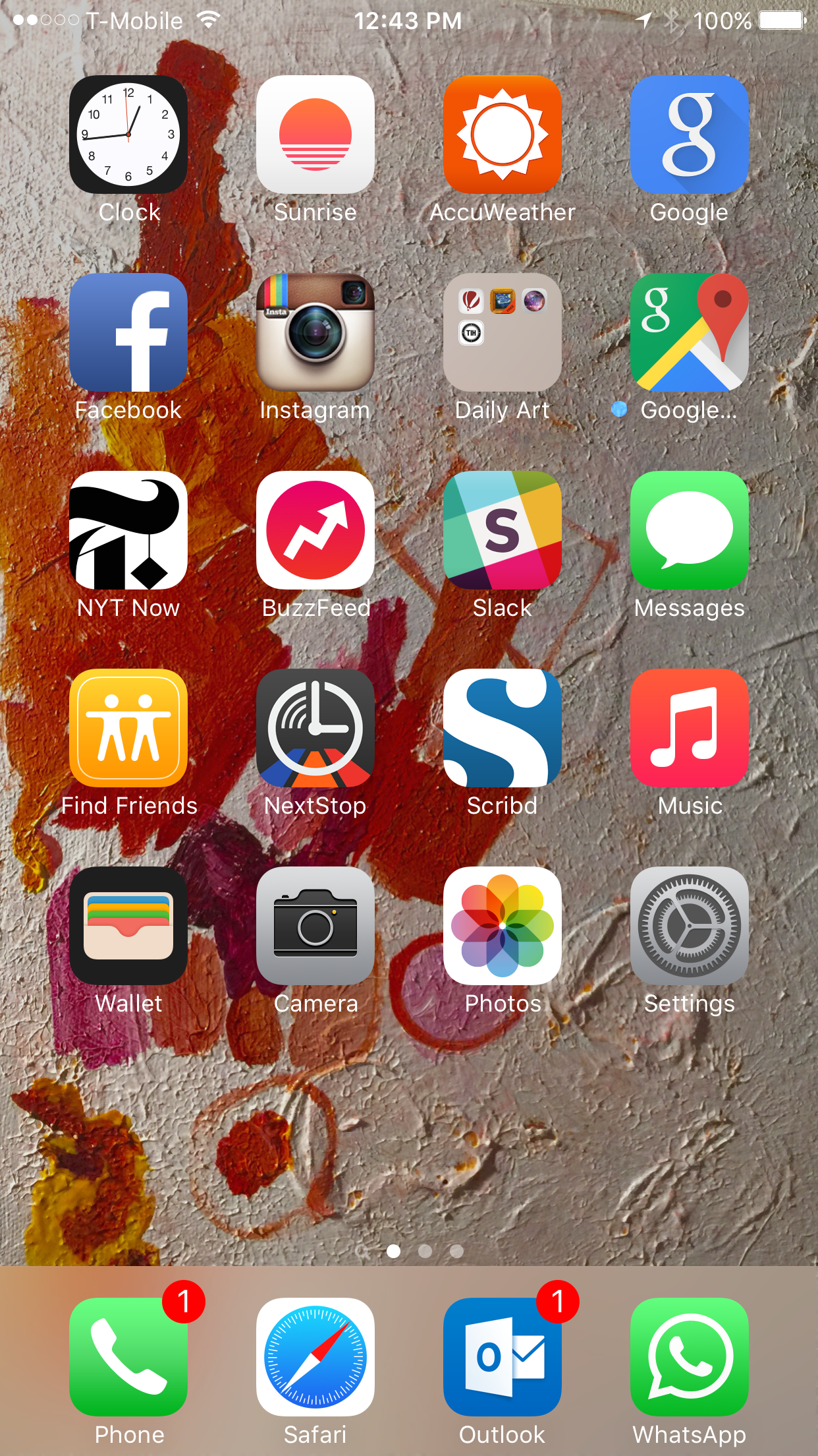
While iOS 9 looks visually very close to iOS 8, there is one tiny difference and there are a handful of great new features that change the user experience. One of the first things you’ll notice is the new font. There’s nothing to it really, but Apple has slightly tweaked the font. So if everything looks a little ‘wrong,’ you’re not crazy. After your eyes adjust, you’ll notice the new baked-in apps. Gone is the colorful Passbook app, which held your boarding passes, tickets, and Apple Pay credit cards. In its place is the Wallet app, which besides having a new icon, looks exactly like Passbook when you open it up. Soon, Apple Pay will support rewards cards, but that feature, alas, is not final yet.
The News app is the most useful new app Apple added to iOS 9.
There is a new-but-old addition in the shape of Find my Friends, which looks to see if your contacts are nearby, and helps you more easily share your location with them. Previously available as a standalone app, in iOS 9 it comes pre-installed and can’t be deleted (stop putting apps on my phone, Apple. I’ll make the decisions here!). You have to have AirDrop activated on your iPhone for the feature to work, so if your friends are Android users, or they don’t use the feature, it’s not terribly useful.
The other new app is iCloud Drive, which you can activate in the Settings > iCloud > iCloud Drive >Show on Home Screen. The app will show you everything you’ve got in iCloud Drive, which unless you use Pages, Numbers, and other Apple services with iCloud, may be entirely empty (at least mine was). For those who use iCloud Drive, though, the app could be useful.
The brand-new Music app is of course included. You can read our full review of that service here.
The News app is the most useful new app Apple added to iOS 9. It looks gorgeous, has slick animations, and makes for the perfect news reading experience. You can follow your favorite publications, or rather get an array of news based on topics that interest you. Apple’s News app lets you save articles for offline reading, favorite them, and easily share them on a variety of social networks. Instead of giving you an endless stream of news, you can read different magazines, which are collections of news based on topics. For example, you might not want to mix your political news with fashion stories, so you can choose to read only political news in that magazine. It’s a fantastic news reader app, that could easily displace Flipboard on iOS.
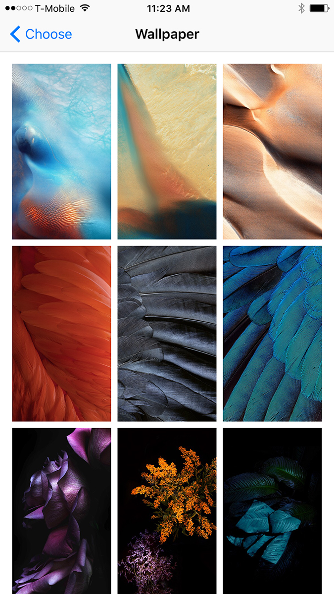
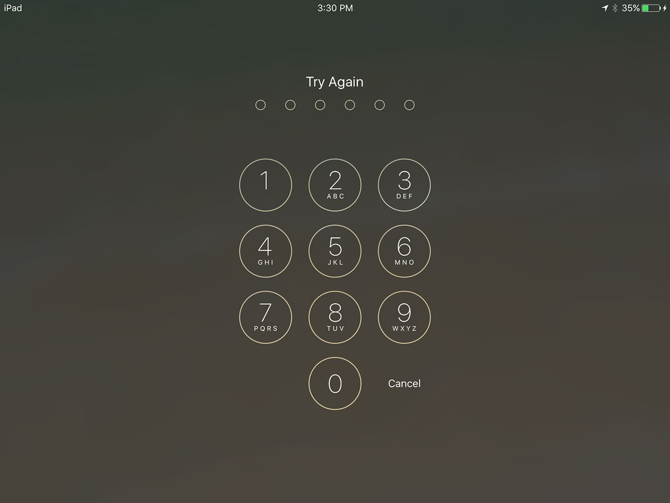
In terms of design changes in iOS 9, they are few and far between. Siri has a new Apple Watch-esque wave at the bottom of the screen when you activate it, Music has a new look (more below), and a six-digit passcode is now the default, though you can revert to four digits if you’re lazy.
Proactive will be awesome
Apple’s Google Now competitor is just getting started in iOS 9, but it sure looks promising. A quick swipe to the right from the home screen brings you to Proactive, in much the same way a swipe right opens Google Now for some Android users. There’s a search bar at the top, which can be used via Siri or with the keyboard. You can search for anything from apps, websites, contacts, news items, and more, and Proactive will find it for you.
It also brings up a list of suggested contacts, apps, attractions nearby, and news items right from the get-go. These suggestions will start to make more sense as you use iOS 9 and Proactive daily. Soon, the feature will show you things like upcoming flights, the weather where you are, traffic warnings, and other relevant items of information. Proactive has huge potential, and it could become a true Google Now competitor, assuming Apple gets it right.
However, right now, Siri needs to get to know me a lot better before Proactive starts to work in earnest. I’ve only used the feature off and on. We’ll update this section as we use Proactive more. If you don’t use iMessage or the phone app very much, perhaps because of apps like WhatsApp, the contact recommendations come out a little skewed at the moment. Proactive will only get smarter, and the more developers work with it, the more accurate it will be.
Siri understands natural language
Apple showed off some pretty impressive stats on how much people use Siri earlier this year, and now that she’s gotten so much smarter with iOS 9, it seems likely that even more people will start turning to her for help. For a while now, Siri has lagged behind Microsoft’s Cortana assistant for Windows when it comes to natural language and contextual awareness — Not so anymore, though.
Siri’s new abilities are a big deal for iOS 9.
Siri understands that when I say, “Remind me to buy milk on the way home today,” I want her to create a reminder to alert me when I’m leaving the office and on my way home. She promptly created a reminder in the Reminders app and told me she’d ping me when I left a specific address, which was almost the correct address for where I work, but not quite (Oh, Apple Maps…).
Siri also lives in Proactive, so you can call upon her to search for any content on your phone, the Web, apps, and so on. Now that Siri is making sense of conceptual terms like, “today,” “tomorrow,” “that,” and so on, it’ll be much easier to talk to her, and more natural. You can even call out to her with a, “Hey, Siri,” and she’ll answer you. It’s pretty uncanny.
Although I’m not big on using voice assistants, Siri’s new abilities are a big deal for iOS 9, and consequently for those who do like talking to their phone.
Apple Maps gets Transit directions
For the first time in my life, I may actually use Apple Maps on a daily basis — that is, I’m going to try. Why, you may ask? Because Apple finally added transit directions. When you live in a big city and take public transit every day, a maps app that doesn’t have transit directions is almost completely useless. Now Apple Maps is connected to the NYC subway and bus system, I can actually start using it. Expect a full review on Maps alone, after I’ve had more time with it on my primary device.
For the first time in my life, I may actually use Apple Maps on a daily basis.
When you search for directions, you can choose the transit tab right under the search bar. It’ll show you what Apple thinks is the best route to your destination at the bottom of the screen and on the map in the center. If you want more details, tap on the route. You can also ask for more routes, which you may have to do, if the first suggestion is wrong.
Transit on Maps looks nice and clean, and it works. Apple’s worked hard to improve the transit feature since the first beta release, and now it gives me excellent route recommendations. Now, Apple Maps actually tells me to use the route I use every day to get home. The app learned which train made the most sense based on my work location and my home location. It tells me to take the F train uptown to Queens, and even recommends a bus I could take if I was feeling lazy to spare me the 10 minute walk from the final train stop to my apartment. Bravo, Apple Maps! You’ve learned so much.
Previously, when I searched for directions home from work, it suggested a route that included the Long Island Railroad and the 7 train. Great, but there was just one problem with this suggestion: It was something I’d never do, especially when the E, F, and M trains are all just as close, and don’t require me buying an extra ticket on another type of train service. That terrible suggestion is now the last one on Apple’s list. Maps might actually be useful now. It’s certainly smarter.
Split screen on the iPad needs more apps
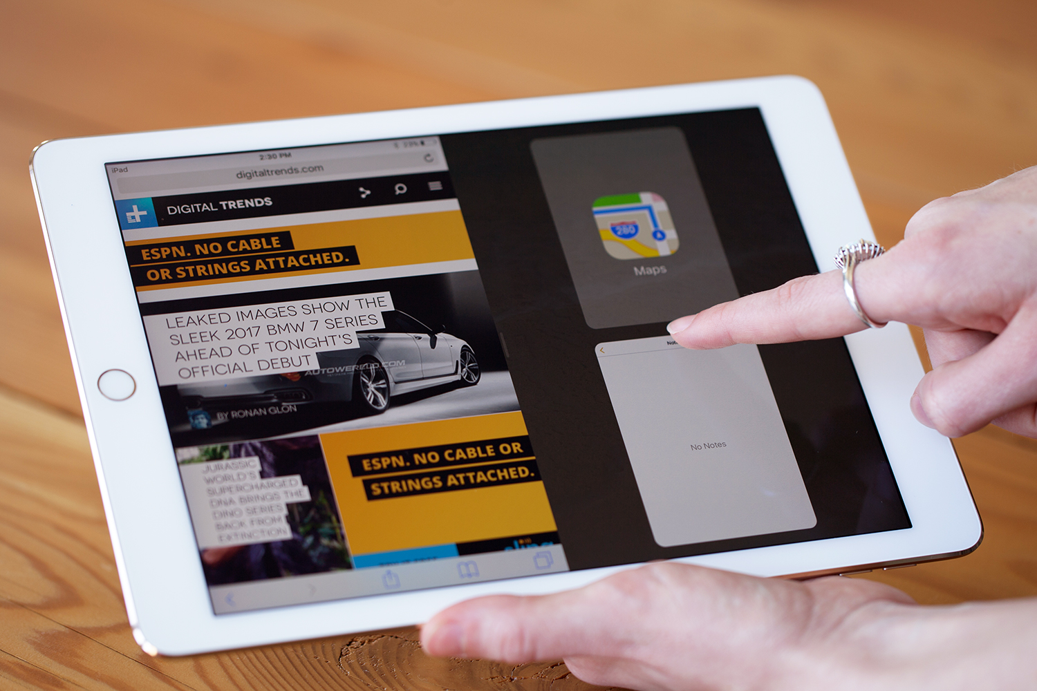
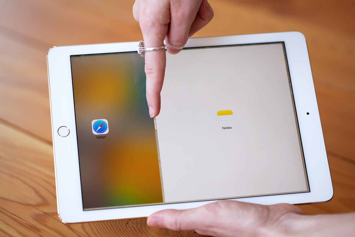
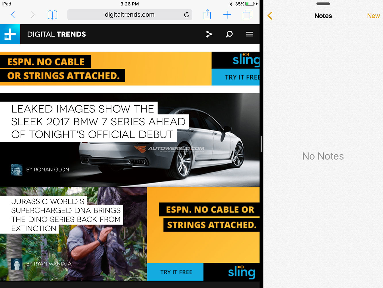
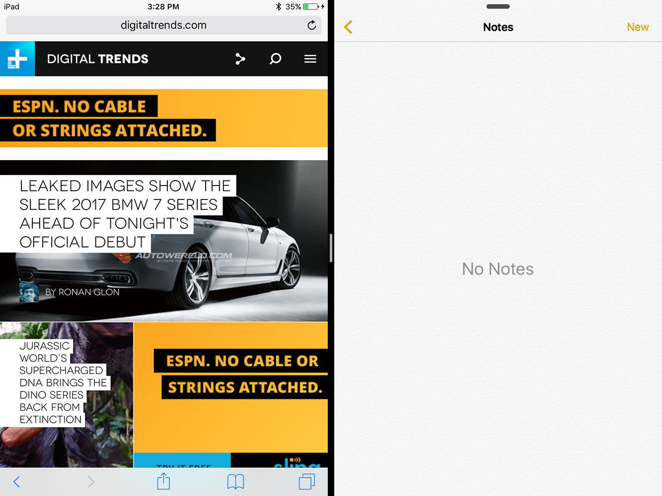
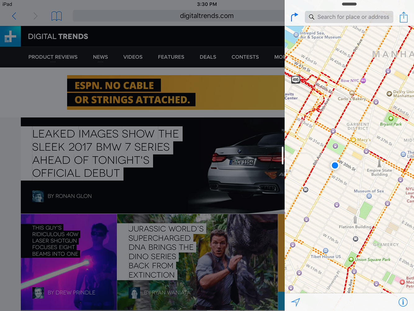
Rejoice, multitaskers! Split screen apps are now available on the iPad in iOS 9. Split screen on iOS works just like it does on Android and Windows 8. You open two apps side by side, and adjust the ratios, so you can have one app bigger than another, or both equal. It’s a great feature that iPad users have wanted for a very long time. It works smoothly, and it’s effortless to enable the feature.
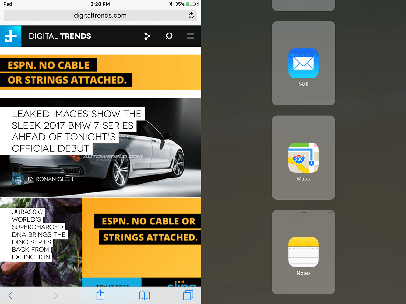
You simply open an app like Safari, and the swipe over from the right to see a list of apps that you can add as the second window. You pick one, pop it in, and decide how much of your screen real estate you want to dedicate to each app. When you’re done, you can swipe down to make it disappear and choose another app to put in split screen. Alternatively, you can close the second app window all together and go back to a single app view.
Right now, the app selection is limited, so you can’t pull up third-party apps — only Apple-made ones — but that will soon change, now that developers have had their hands on iOS 9 for a while. Sadly, this feature doesn’t work on the iPhone 6 Plus (believe me, I tried).
Other small updates
Apple’s iOS 9 holds a number of smaller updates — many of which are so subtle most users will miss them. One of the coolest ones is the new battery saving feature. It lives in Settings under the section labeled Battery. There you’ll find a little toggle for a battery saver mode, which will extend your battery’s life in times of crisis.
Android users are rolling their eyes right now because they’ve had a Back button for ages, but iPhone users will love this.
Anyone who owns an iPhone will love this feature, as iPhones offer notoriously poor battery life. We’ve all had those days where an extra 10 percent of battery would have saved the day (and prevented our mothers and significant others from freaking out when we don’t answer a text late at night). The feature will preserve your iPhone’s battery just long enough to get you home when you need it. You’ll know it’s turned on when you see the battery icon in the upper right of your screen turn bright yellow.
Also, there’s now an ad blocker built right into Safari. It seems to work very well and speeds up the online browsing experience. Of course, you can download alternative ad blockers if you hate Safari.
Another cool little feature is a small back button in the upper left-hand corner that pops up when you leave one app for another app. It’ll say, “Back to Facebook,” or whatever app you were in previously. It sounds simple, but it makes it much easier to get back to what you were doing before you were asked to open another app. You no longer have to hit the Home button, flip around, and find the app you were in before.
Android users are rolling their eyes right now because they’ve had a Back button for ages, but iPhone users will love this. The only criticism I have of it is that it’s in the wrong place. I’m using an iPhone 6 Plus with girl hands, so it’d be awesome if that back button was in the lower right-hand corner.
The Photos app now has a scrollable gallery underneath each photo when you tap on it, and more options for sending the pictures to other apps. Notes now has folders for categorizing your ideas, offers better search, hand-drawn items, and a recently deleted list for those times when you hit delete by accident. HealthKit finally offers entry spots for reproductive health and a few other metrics, too.
And finally, the Settings menu now has a handy search function, so you don’t have to scroll through that massive menu. There are many more small alterations in iOS 9, but these are the key ones.
Conclusion
Apple’s iOS 9 is a refinement of iOS 8 that offers a few huge improvements, all of which center on making iOS smarter. Context is king in today’s world — We want what we want NOW, not five minutes from now. Because Google has so much data from us, its services are hyper aware of our needs and even manage to anticipate them in advance. Apple is more privacy focused, and has held off on developing its smarts to predict our every move, but with iOS 9, it has taken a big step forward in the smart, predictive direction.
Proactive also has a great deal of potential, but it needs to individualize users before it becomes a Google Now for iOS users. Siri is finally getting as smart as Cortana, and Maps has perhaps the biggest improvement at the moment, thanks to transit directions. The News app is stellar, and I can’t wait to use it daily. Split-screen on the iPad is very useful (especially on larger models). The updates seem small, but the future is bright. Do Proactive, Maps, and Siri trump Google’s alternatives? Not yet, but thanks to iOS 9, that answer may soon change.
Sadly, the 3D Touch features in iOS 9 will be among its least used features, and won’t make a complete impact until three years from now when almost everyone owns an iPhone 6S or above, and all apps support it.
Highs
- Proactive menu is very helpful
- Siri gains some smarts
- Apple Maps might finally be useful
- News app is stellar
- Splitscreen multitasking works well
Lows
- 3D Touch only available on iPhone 6S
- Split screen needs more app support
- Apple apps are non-removable
