“If you want an Android watch right now, this is the one to buy. It looks better than the Apple Watch. But if you’re not sold on smartwatches yet, hold off. There’s nothing all that great about Android Wear watches yet.”
- Beautiful round screen
- Stainless steel design
- Best Android Wear watch yet
- Fantastic wireless charging cradle
- Heart-rate monitor
- Always-on pedometer
- Poor battery life (1 day)
- Android Wear is confusing, useless
- Sync and setup is a hassle
- Lights up at inappropriate times
I have a Jekyll and Hyde relationship with the Moto 360. Half of me loves to wear it. It’s a very good-looking watch, and the first piece of connected tech that’s made me feel like a slicker, cooler individual after I put it on my wrist. A dozen random people have asked me about it and complimented how different and cool it looks.
Then Hyde comes out. Using this watch is not as friendly as its round, fun demeanor suggests. And that’s a real shame.
I dig Moto’s style
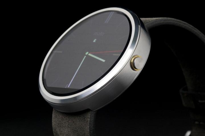
Motorola is on fire these days. The Moto Hint is a completely new take on Bluetooth headsets, and the new Moto G and Moto X phones look like fantastic deals. This success extends to the wrist. The Moto 360 is the best-looking Android Wear smartwatch on sale, and there’s one simple reason: It’s round.
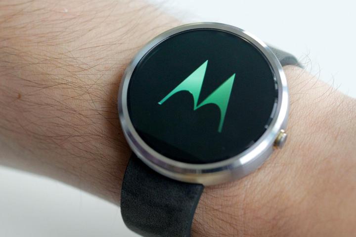
It’s expectedly bulky, with a 1.56-inch screen and 11.6mm height, but even on my rather dainty wrists, it looks good. Most women (and men) should find the 360 at least close to the right size for a smartwatch. It will be nice when it can get maybe half as thick, but even today’s model looks sharper to our eyes than even the Apple Watch, and that’s saying something.
The brushed stainless-steel exterior encloses the screen with a smooth, 45-degree bezel, and the Gorilla Glass screen has a thin chamfer on it as well, popping out of the front of the watch by a millimeter or two to beautiful effect. A single power button sits on the side, looking like an ordinary watch crown, and a gray leather strap holds the device on your wrist well.
Screen and strap problems
Unfortunately, no compliment for the Moto 360 comes without an equally annoying caveat. Though the screen is beautiful, and its 320 x 290 pixel resolution is so high that we can barely notice pixels, the screen itself isn’t actually round. There’s a small dead portion of the Moto 360 screen right at the bottom, As if a stray knife lopped off the pixels there. Many times, you don’t notice it, but when you do, it drives you nuts for a while. Several watchfaces cut off at the bottom, ruining the otherwise premium, gorgeous effect of a circular screen.
The 360 screen continually turned on, like a bright jackass beacon, every time I moved my arm at the movies.
On top of that, the Moto 360 is not suited for dark areas or shows. I went to the movies with the watch on and it continually turned on, like a bright jackass beacon, every time I went for a drink, popcorn, or tried to hold my lucky lady’s hand. Putting your palm over it easily turns it off for the moment, but there isn’t a permanent solution unless you turn it totally off. So I found myself turning my watch off whenever I was in a dark, social place. Annoying.
Finally, the strap/band of the 360 is decent, by my low standards, and more comfortable than any smartwatch I’ve used yet, but it is made of leather (nice leather), will age, and only select bands will fit it. There’s a metal band option, but it costs more.
Android Wear, why can’t you behave?
As beautiful as Moto 360 is, its software lets it down. Google’s Android Wear is not yet ready for prime time, and probably won’t be for another year or two. But it’s on shelves now anyway.
If you’ve ever used Google Now on your smartphone, wearing an Android Wear watch is a lot like having that app strapped to you. Instead of a central home interface, you have a watch face, and random notifications that will pop up whenever Google decides it wants to tell you something. Once in a while, a sports score, weather forecast, or traffic direction will be very useful, but often they’re annoying things you need to flick through to see if there’s anything useful to see.
Even helpful notifications, like email or IMs, aren’t particularly useful because you often either can’t read the whole message, or can’t respond without pulling out the phone anyway. Android Wear takes a lot more of my time to read notifications than the Martian Notifier, which is just an analog watch with a tiny LCD screen that shows the sender of emails or messages. The benefit of the Notifier is that it does one thing well. Android Wear does a lot of things poorly.
The main menu of Android Wear hardly feels like a main menu. Tapping on the watch face brings up a Google voice search box. If you want to voice search, you say something, but if you want to reach the actual menu, you have to be silent and swipe up. Annoyingly, some of the commands in the menu require voice, while others are visual. You’ll have no idea which is which.
The 360 has some nice built-in pedometer features and constantly monitored my steps and could take my heart rate, but I can’t even find how to get to the nifty screen that told me whether I had achieved my solid hour of good heart-rate activity each day. I see it once in a while, if Google decides to show me the card.
Android Wear really shows how little Google knows about what I want right now, and how out of touch it is with how people want to use a device. Hopefully it fixes this mess soon. Until then, the software on the Moto 360, and every Android watch, will be as annoying as it is useful.
Great specs
Let’s run down the numbers. The Moto 360 has a TI OMAP 3 processor in it, 512MB of RAM, a 1.56-inch 320 x 290 (almost) round LCD screen, has 4GB of storage, runs Android Wear, requires an Android 4.3 or higher smartphone to sync to via Bluetooth 4.0, and connects with the Android Wear app, and a special Motorola Connect App, that you have to use to customize watchfaces.
It’s confusing which of these apps do what, and the setup process for the watch was more than 20 minutes – tech novices need not apply.
Battery life, who needs … it?
Battery life on the Moto 360 is not as solid as its stainless steel façade. If you’re lucky, a full charge will last you one complete day. But that means about 8 a.m. to 11 p.m. If you’re out on a bender, your watch won’t make it home alive.
The 360 has the worst battery life of any watch we’ve used so far.
Like most of these competitors, the Moto 360 charges with a special cradle. It’s nicer than any others we’ve seen so far, but it’s still a little annoying to have a nightstand with a tablet, smartphone, and watch all charging. First-world problems, I guess. The watch can double as a night clock, but not as an alarm clock.
Expensive
The Moto 360 starts at $250, which is more expensive than the recently discounted LG G Watch, which starts at $180, and the Samsung Gear Live, which will run you about $200. Compared to the upcoming Apple Watch ($350), however, it’s a bargain.
We think the round screen and stainless steel build justifies the price relative to the other two Android watches available now, but LG already has a round watch coming later this year and the watch wars are just getting started.
Conclusion
If you want an Android watch right now, this is the one to buy. But if you’re not sold on smartwatches yet, hold off for 6 to 12 months. The Apple Watch is going to change the entire game in this field. Next year’s Android watches will be smaller, look better, and hopefully run an operating system that doesn’t drive you nuts. So if you want a watch now, go for the 360, but otherwise, just use your phone and a standard timepiece for now.
Score: 
Highs
- Beautiful round screen
- Stainless steel design
- Best Android Wear watch yet
- Fantastic wireless charging cradle
- Heart-rate monitor
- Always-on pedometer
Lows
- Poor battery life (1 day)
- Android Wear is confusing, useless
- Sync and setup is a hassle
- Lights up at inappropriate times


