
Apple is no stranger to controversy, but the missteps on the latest MacBook Pro design go beyond the standard fare.
WWDC is just around the corner, and while we don’t expect Apple to refresh the MacBook Pro beyond a CPU bump, it’d be a great chance to level with its fan base about the failures of its laptops. At the very least, I don’t want to hear a word about how innovative these two features were without some admission of guilt.
The failure of the keyboard

First introduced in the 12-inch MacBook, the low-travel keyboard of the MacBook Pro has been divisive. It uses a “butterfly” switch mechanism to create a greater sense of movement in the keys, without actually providing much key travel. While some people prefer it and some people despite it, its durability issues can’t be overlooked.
Reports about failing, sticky keys started in 2016, and the negative consensus only grew from there. According to annoyed Apple fans, even the smallest amount of dust could render a key useless. The public pressure hit a fever pitch in the past few months when lawsuits were filed and petitions were signed.
Apple must acknowledge the keyboard problem at WWDC.
Normally, Apple would just replace the defective units and quietly move on, but here there’s no avoiding the issue. While we probably won’t see a recall or a replacement program on the level of the iPhone battery situation, Apple needs to fix the problem moving forward. It can’t keep selling defective keyboards in new products.
The good news is Apple is already pursuing technology that could solve the problem. In March, we reported that Apple had patented a “crumb-less” keyboard that used a couple of different approaches to keeping small particles away from the keys. We doubt Apple can iterate on that technology quick enough for WWDC in June, but Apple needs to do something to resolve the problem.
The failure of the Touch Bar

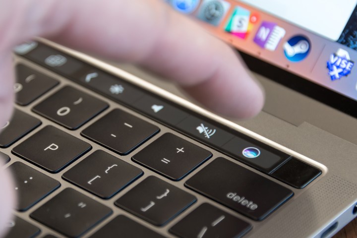
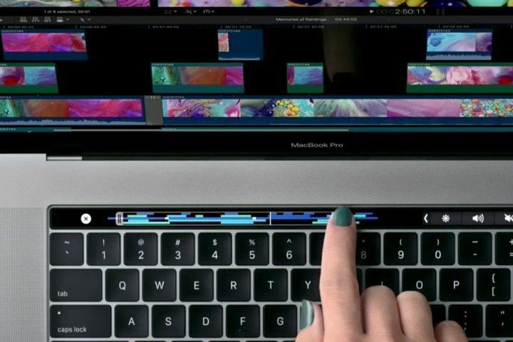
We may get some kind of acknowledgement of the keyboard problem at WWDC, but this next one is almost hopeless. The Touch Bar was first introduced in the 2016 MacBook Pro, and it looked like an interesting alternative to touchscreen laptops. The company has famously avoided them, and the Touch Bar seemed like a way to bring some of that touch capability to MacOS. Unfortunately, it ended up being more of a hassle than anything else.
Because of its location on the keyboard deck, it actually removes useful buttons. On top of that, it often freezes, which requires a reboot to fix. I haven’t spoken to a single person that uses the Touch Bar and appreciates its functionality over physical function row keys. Even in Apple forums, you’ll be hard-pressed to find anyone who likes the Touch Bar. From the perspective of people who use MacBooks, it’s a total failure.
The 2016 MacBook Pro: an awkward teenager going through puberty.
Yet Apple can’t go back on it. It’s spent too much time and energy pouring development resources into it. There’s really only one way Apple could (and actually would) fix it: Double-down. I wouldn’t be surprised if Apple replaced the keyboard and trackpad altogether with a full-sized touchscreen in the next redesign. It’ll be a tough sell, but there’s no question it’s the direction the company is headed.
The best we can hope for is that ten years from now we’ll look back at the 2016 MacBook Pro as an awkward teenager going through puberty.
What can it do in the meantime?
Well, for starters, Apple could release a 15-inch model without the Touch Bar. Continue to make it a premium option for those willing to pay for it. That would at least please Pro users who need the extra power without the unnecessary expense of the Touch Bar.
A ‘sorry’ would be nice, too.


