At age 17, I seriously contemplated stuffing a computer into my Pontiac Grand Prix. I was a geek, all my pirated Deftones MP3s lived on a hard drive, and it seemed infinitely cooler than a CD changer. But I could never quite figure out how to make it look right. Sure, I could hide the guts in the trunk, but where would I put the screen? Just zip tie a touchscreen on the dash? Wouldn’t that look obnoxious? Even as a high-schooler in the era of AutoZone tape-on neon lights, this type of modification just seemed sloppy.
I scrapped my plan altogether. But 15 years later, it turns out my worries were ill-founded. As modern car designers have demonstrated, you can shove a gigantic screen just about anywhere.
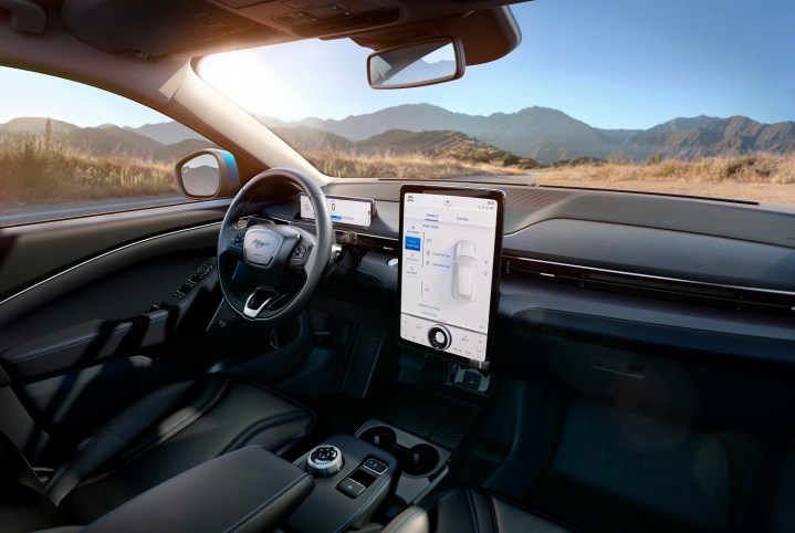
Tesla set this standard with the Model S, then doubled down with the Model 3. Toyota piled on with the Prius Prime. Byton showed us a prototype of a car with a 48-inch screen (yes, 48, not 4.8) at CES 2019. And now Ford has abandoned any pretense of even integrating it into the rest of the vehicle with the Ford Mach-E. The 15-inch screen plopped into Ford’s newest EV looks like it may have been installed with a nail gun. Surely this is not the way screens and cars were meant to live together?

Just about all cars have some sort of screen for infotainment at this point, but it’s the mondo monitors that go too far. These aren’t displays, they’re dashtop computers, swallowing every car function, right down to A/C. From a designer’s perspective, I get the appeal. All of the knobs and buttons that used to make a dash look like the control room for a Soviet-era nuclear reactor can be swept under a pane of shiny black glass. How minimalist! Now you, discerning consumer, are free to luxuriate in all this Alcantara we’ve swathed your dashboard in (you can brag to your dates “It’s Italian for fake suede.”)
But in real life, that screen means nothing is a single button press away anymore. It’s multiple screen nudges away, buried in a submenu you’ll need to find while driving. On a screen that’s either too bright at night, or too dim to see beneath the sheen of glare during the day. And when you turn off the car, you can look at a handy map of every screen selection you’ve ever made on the black screen pockmarked with greasy smudges.
I’m certainly not the only person to notice. Mazda is cutting giant screens out of its latest cars. Jaguar’s design boss says he’ll never put them in. User interface designers say they’re objectively a terrible idea.
Yet Ford just stapled one front and center on the Mach-E, and I’ll bet my life savings we’ll see an even bigger one on the soon-to-be-unveiled Tesla Cybertruck. I mean, it’s called the Cybertruck, so we can safely assume that subtlety is off the table when it comes to screen size.
So why is a trend so obviously at odds with usability taking flight? Even I’ll admit: Giant screens look futuristic. It doesn’t take Don Draper to figure out that when you’re selling an EV, you’re selling consumers on the future. And all the most egregious touchscreen abuses we’ve seen thus far have come from EVs or plug-ins. Oh, you still turn up your heated seat with buttons? I change it with a screen while I glide to work on electrons.
Time marches on; our susceptibility to gimmicks does not.
Just as auto designers of the ‘50s evoked the imagery of the space age with aerodynamic designs and rocket fins, modern automakers are adopting the electronic age with … well, iPads shoved into the dash. Time marches on; our susceptibility to gimmicks does not.
But I wonder if the screen in Ford’s Mach E and its contemporaries will weather time as gracefully. Will we look back at monitors shoved in our dashboards like the razor-sharp fins on the iconic 1959 Cadillac Eldorado … or like the plastic cladding on a 2001 Pontiac Aztec? “Really, someone thought that looked cool?”
After a couple of decades baking in the sun, a few Slurpee spills, and the cruel march of digital obsolescence (would you use a 20-year-old phone?), somehow I think these oversize screens will age more Aztec than Eldorado. So give me buttons or give me death. Or at least in-car Alexa. Because I want a Mustang Mach-E, but I don’t want it to come with a new desktop computer built-in.


