Last weekend, I was in LA for a family event (mazel tov, Aidan!), which meant I’d need to rent a car. It used to be that renting a car came with loads of uncertainty: What kind of car would the rental gods bestow upon me? Even more importantly, what kind of radio, air conditioning, and navigation would I be working with?
Renting a car used to be such a wildcard that I’d pack a portable TomTom GPS device in my carry-on luggage. This was partially because rental agencies charge silly amounts to rent terrible GPS devices, but also because my TomTom had my preferred addresses already in it and I knew how to use it. If you’ve ever used a GPS device, especially one from more than five years ago, they’re often hamstrung by terrifically confusing user interfaces. Once you know how to use a particular nav unit, you stick with it.
Virtual, software-based dashboards like CarPlay and Android Auto are clearly the future and that’s a good thing.
These days, however, renting a car is a much less harrowing experience. That’s because the car dashboard, from GPS, to radio, to phone, to even getting sports scores, is moving away from the car and into software. For example, with Apple CarPlay, my dashboard is essentially already in my pocket in the form of an iPhone X.
When I picked up my rental car, I simply fired up CarPlay and my map information was ready to go. All my phone contacts were queued up. I had my own music with me, much to my wife’s dismay, and I could even check baseball scores with the MLB app (also to my wife’s dismay). In one pairing, the car was mine.
This is the future, and I want more of it. Speedometers and tachometers be damned: Let’s move on to the knob-free dashboard.
The car I rented last week in LA was an Audi A4 that employs an entirely software-based dashboard called the Virtual Cockpit. I can set up my speedometer however I want. I can relay navigation or entertainment info to the display that’s right in front of me instead of the one on the center console.
But virtual, software-based dashboards like CarPlay and Android Auto are clearly the future. That’s a good thing: It means that using a car is becoming less complex, more personalized, and more flexible. The Audi I rented still had dozens of dials and knobs throughout for climate control, entertainment, navigation, windows, sunroof, and more. It’s a gaudy mess, and with virtual dashboards, the future is clean and clear.
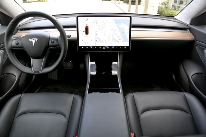
If you’ve ever been inside a Tesla, you’ve seen what the future for the car interior holds. Almost everything you need to control in a Tesla is software-based and available on a touch screen, whether you want to just listen to a podcast, open the sunroof, or fire up Ludicrous mode to terrify your passengers. The result is a car interior that’s so sparse, so simple, so beautifully obvious that stepping into another car after the fact is akin to sitting down in a Model T. Regular cars — non Teslas, that is — are positively prehistoric when it comes to dashboards. It’s no longer luxurious or useful to sit in a car that looks more like a 747 cockpit.
The 2018 Toyota Camry’s Entune 3.0 app suite was a disaster and left drivers with nearly useless dashboards in their brand-new cars.
Of course, we’re still very early in the game. Tesla’s touchscreen has issues of its own, from software bugs to curious UI decisions that make some common functions more difficult than they need to be. There are reports of Tesla drivers having their touch screens — the only way to do many things in the car — go completely unresponsive or even reboot while driving. Moments like that certainly make drivers yearn for the simplicity of a couple analog dials and switches.
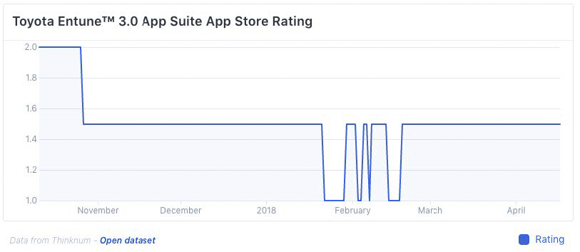
Then there’s the case of the 2018 Toyota Camry’s Entune 3.0 app suite. Intended to bring the convenience of smartphone-based navigation and entertainment to one of the world’s best-selling cars, Entune 3.0 has left thousands of Camry drivers with nearly useless dashboards in their brand-new cars. Entune’s App Store reviews are abysmal, as seen below.
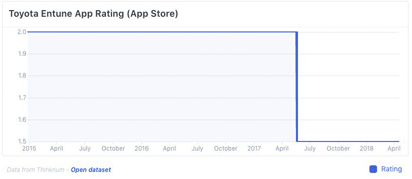
It’s a curious situation for Toyota, too, as the company has been pushing Entune on its customers for years. The regular (non-Camry) version of the Entune app has fared even worse when it comes to user reviews.
To add to the frustration, Toyota cars don’t support CarPlay or Android Auto. Instead, Toyota is pushing its own app ecosystem on drivers. That can be an OK thing when it works, like Ford’s Sync AppLink system, because it allows car manufacturers to maintain some control over how the system integrates with the car’s other functions.
But when it doesn’t work, it renders the car virtually useless. True story: My stepfather has driven Camrys and only Camrys since the ‘80s. He recently returned his beloved candy-apple red 2018 Hybrid Camry LE not because he didn’t love its looks and handling, but because the Entune 3.0 system rendered his new car’s navigation functions virtually useless. In fact, the Scout GPS Link app, meant to be the Entune system’s navigation app, is one of the world’s most-hated apps based on App Store review trends.
The traditional car dashboard is doomed and already being replaced.
And that’s the rub. With anything that’s technology based, when it works, it’s so great it’s essentially invisible. When you’re watching Netflix on your smart TV, for instance, you’re not thinking about the fact that a computer is processing a video file that’s being streamed in packets over a broadband connection.
But when it doesn’t work — when you can’t watch your favorite show or, in the case of this column, when you can’t get directions to your nephew’s Bar Mitzvah — it fails utterly.
That said, the writing is on the wall: The traditional car dashboard is doomed, already being replaced by software, smartphones, and touch screens. This is a good thing for us all when it comes to personalization, ease-of-use, and a simpler overall experience. When it works.
With CarPlay, Android Auto, and Ford Sync (arguably the first of its kind), we’re moving in the right direction.


