“Trying to avoid a me-too Android phone – a growing problem for Android handset makers – Samsung seems to have made alterations for the sake of differentiation more than for improvement.”
- 5-megapixel camera, 30 FPS half-VGA videos
- Bright and colorful AMOLED screen
- Long battery life
- Wi-Fi
- Awkward horizontal app drawer orientation
- Redundant app menus
- Overly-sensitive microphone
- Poor video resolution/display
Introduction
If you’ve heard good things about the Samsung Behold (or read our Samsung Behold review), well, forget all of that. The Behold II, Samsung’s new 3G Android phone from T-Mobile, is not an update of the original Behold, which was a CDMA phone available from Sprint. The original Behold was an update of Samsung’s Instinct, the company’s first iPhone competitor. The Behold II looks nothing like the original Sprint version, it runs Android, which the original did not, it’s a GSM/HSPA phone, not CDMA, and it’s from a different carrier. It’s like calling The Dark Knight a sequel of Superman Returns. Ignore the name, and behold the phone’s impressive attributes: a bright and colorful AMOLED display, a solid 5-megapixel camera and lengthy talk time. But do the Behold II’s quirks keep it from being a reasonable alternative to T-Mobile’s other Android models, the Motorola Cliq and the HTC MyTouch3G?
 Features and Design
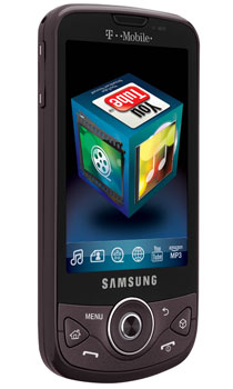
The Behold II is a standard Android slab phone: dull charcoal black, with a 3.2-inch capacitive AMOLED touchscreen above the control buttons, which include a circular navigation array. Most Android phones eschew this superfluous control, since you can navigate Behold II by touching its screen (duh).
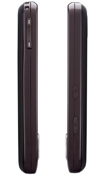
Controls and jacks around the perimeter are similarly…off. Up top is the 3.5mm headphone jack – just an eighth-inch away from the microUSB jack. While this jack adjacency presents some difficulty only if you’re simultaneously charging the Behold II and using headphones with a right-angle plug, we just don’t understand why Samsung chose to locate the two in such an uncomfortable proximity.
To “wake up” most Android models, you to hit end, then menu. The Behold II uses a single key for locking and unlocking, located just above the camera shutter key on the right side. It’s a far handier single-key solution, except said key is flush to the surface and difficult to quickly locate and depress.
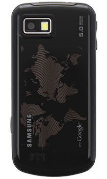
On the left side of the phone is the volume toggle. On the rear is the 5-megapixel camera with flash.
Samsung has also futzed with Android. For instance, Android’s app menu is usually dragged up via a tab from the bottom of the screen, then you swipe up or down to scroll and scan the choices. The Behold II’s Android iteration employs aspects of its TouchWiz OS, including a left-to-right horizontal drawer pullout of the Android apps menu – but keeping the vertical swipe scroll once the drawer is pulled out.
The problems with this counter-intuitive arrangement surface when swiping left-to-right to access the first of the phones three home screens (compared to five on the Motorola Cliq). We kept accidentally pulling out this horizontal app menu drawer instead. Also oddly, the phone’s three home screens are like a triptych: Each is a separate panel with differing wallpaper, and seem to turn at a 3D animated 45-degree angle as you move from one to the other, instead of a single seamless multi-part screen with a single wallpaper as on other Android phones.
Not all the modifications were for the worse. Samsung replaced the connectivity menu under settings with separate Bluetooth and Wi-Fi apps in the menu, which actually makes more sense.
What doesn’t is Samsung’s swirling Cube interface, for which there is a dedicated key on the phone’s face. Each of the six sides supplies one-touch access to a specific app. If you shake the phone, the Cube swirls around like a tossed die on a craps table and eventually lands showing one side. It’s kind of cool, but totally redundant since you can easily find the apps either in the pull-out app menu drawer, or via the home-screen based “Quick List,” a page of 12 frequently accessed apps. How many app menus do we need?
 Can a phone serve as a workable PMP?
Potentially, yes, but not in its current iteration. Colors pop out of Behold II’s bright AMOLED screen – although it’s not as crisp as Motorola Cliq’s LCD screen and neither reaches the nirvana of Motorola’s Droid’s display. (And why do the phone’s settings refer to its AMOLED display as “LCD”?) Like some other Android phones, such as the Droid, YouTube videos can’t be blown out to full screen, there are no high-quality options, and therefore videos are small and of poor resolution.
There is nothing special about Behold II’s Android music player. It works fine, but we thought the sound was subtly sludgy – like many aspects of Behold II, just slightly off.
Sound Quality
We got ambient feedback while chatting. For instance, while wandering midtown Manhattan, we heard a consistent whoosh in our ears as the phone picked up and processed traffic noise from the street. Voices, however, were crisp and clear, but we wanted a bit more volume to overcome ambient noise.
Phone Functionality
Again, phone functionality seems a bit – yes – off. Like other Samsung touchscreen phones with haptic feedback, swiping on the Behold II isn’t as smooth as on other Android phones; there is a nanosecond reaction lag and a hint of herky-jerky motion while scrolling.
We also experienced a one- or two-second lag in the screen waking up after you pull the phone away from your ear at the end of a call.
Dialing from your contact list isn’t as intuitive as on other Android models. For one thing, your contacts aren’t as omnipresent. When you tap a person’s name from your list, you don’t get an on-screen option to simply dial the number – you get the full dialer, complete with now superfluous dial pad with your contact’s number displayed. You have to hit the physical call key to then dial the number – there’s no on-screen green dial button.
 Web
Web
Surfing speed depends heavily on location, since T-Mobile’s 3G map is even sparser than AT&T’s. In 3G coverage areas, mobile-optimized pages such as CNN, ESPN and The New York Times load within five seconds; non-optimized pages in 7-15, depending on graphic content – around average for 3G. In EDGE areas, pages fill a bit slower, but faster than 1X surfing on a Verizon or Sprint phone.
Behold II doesn’t include multi-touch, and we could find no zoom control to increase text size. The weirdest oversight is the lack of period on the main on-screen portrait QWERTY keyboard when inputting Web addresses; You either have to access the symbols/number screen, or rotate the phone and use the horizontal keyboard to get this essential URL punctuation mark.
Camera
Of T-Mobile’s three Android phones, Behold II has the highest resolution, and best, camera, and the only one with a flash. Photos are colorful and bright, although there are hints of fuzziness and pixel interpolation in otherwise clear shots. Samsung has solved its nagging shutter lag delay, and added a voice toggle, although misplaced on the underside left of the phone when held in landscape camera mode.
There’s a cool, panoramic mode – click the shutter once, then just move the camera left or right to a new framed target position in sequence and hit OK when you’re done. Resulting wide shots are lower resolution, but aren’t as distorted as other panoramic shots we’ve seen.

Battery Life
In our completely unscientific tests, we pulled more than eight hours of talk time from it, two more than the rated talk time.
Conclusion
Trying to avoid a me-too Android phone – a growing problem for Android handset makers – Samsung seems to have made alterations for the sake of differentiation more than for improvement. Some of these changes, like the horizontal app menu drawer orientation, and redundant swirling Cube interface, are merely annoying, rather than detrimental. But if texting and social networking are paramount to your T-Mobile phoning desires, you want the Cliq. If mobile photography is higher on your priority list, behold the Behold II.
Highs:
- 5-megapixel camera, 30 FPS half-VGA videos
- Bright and colorful AMOLED screen
- Long battery life
- Wi-Fi
Lows:
- Awkward horizontal app drawer orientation
- Redundant app menus
- Overly-sensitive microphone
- Poor video resolution/display


