The release of Windows 8, and the death of the Start menu, has spurred numerous developers to partake in black arts. Through arcane coding, they have resurrected and even improved the old Start menu for the benefit of desktop users everywhere. What Microsoft killed has been brought back to life in numerous new incarnations.
Three particular Start menu replacements have caught our eye: Start Menu Reviver, Start8, and Start Menu 8. All the apps in this trio come from established developers and re-construct the Start menu while also offering significant customization. But which is the best?
Start Menu Reviver

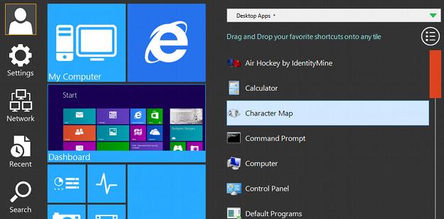
Start Menu Reviver has chosen a path that differs from the Start menu alternatives developed thus far. Rather than ignoring touch, Start Menu Reviver tries to incorporate it while simultaneously courting the mouse. The goal is to give users an interface that’s equally suitable for desktops and tablets.
Surprisingly, Reviver manages to meet this goal with few compromises. The large, metro-style icons shown when the menu is first opened can be complimented by a pop-out list of programs and files that allow for quick access to any software installed. And don’t worry if you find something you don’t like; it can probably be customized. Tiles can be moved, apps changed, icons switched, and more. All of this makes for a flexible and enjoyable menu.
There are just two minor flaws that might annoy some users. First, the menu takes up a lot of space and can’t be made smaller. However, this is only an issue on a PC with a large display. Second, there are no animations that respond to touch, which means you’ll wonder at times if an app didn’t activate because it wasn’t registered or you simply fat-fingered it.
But these two flaws don’t come close to outweighing the advantages, and best of all, Start Menu Reviver is free.
Start8

Stardock was among the first to spring on the opportunity to create a replacement Start menu and also the first developer to sell a Start menu (at $4.99) rather than offer it for free. To justify the price, Stardock meshed the Start menu everyone knew with a long list of new features.
If you’re in love with the Windows 7 Start menu, you’ll quickly fall for Start8’s faithful reproduction. At a glance, the menu looks almost identical to that formerly used by Microsoft, and once you dig in, you’ll realize it’s actually better. Stardock has packed in a plethora of functional and aesthetic options that let users tweak the look and function of the menu significantly. Yet customization isn’t a chore because the app boasts a simple, easy-to-use settings menu.
Start8’s commitment to the old-school Start menu can be a weakness, however. Touch users will have trouble because some interface elements are too small to reliably activate. A new “Windows 8 style” menu option has been added to address this, but we found it to be clunky and buggy. Users with touch should simply use Start Menu Reviver instead, at least until Stardock pushes out a few more updates.
Start Menu 8

Start Menu 8, from IObit, came out a few months after the release of Windows 8. This gave the developer some time to sit back and craft its own take on what a Start menu should be. Rather than copy Windows 7, this menu creates its own unique look and feel which is optimized for use with a keyboard and mouse. The app’s customization includes a battery of keyboard hotkeys that activate various menu functions.
The menu’s detailed interface relies too much on small elements, however, which makes Start Menu 8 almost impossible to use properly on a touchscreen device. Yet, at the same time, the app takes up nearly as much space as Start Menu Reviver. Where’s all the space going? Nowhere. Large portions of the interface sit empty at times. Users can manually re-size the menu, but this quickly becomes an annoyance, as the amount of wasted space will depend on the folder or location you’re exploring.
At least Start Menu 8 is free, though a few advanced features (like tabs) are locked behind a $9.99 paywall.
Conclusion
So, which of these competitors is the victor?
Our nod goes to Start Menu Reviver. This new app manages to fuse support for traditional desktops and new touchscreen devices into one interface with minimal pain. We also like that the app is developed in the style of Windows 8, which makes it look more like a built-in feature than a third-party app.
Start8 is strong competition, however, and basically neck-and-neck if your computer lacks touch. If Stardock can fix the buggy and clunky “Windows 8 style” menu, it might just take the throne back from Reviver.
Our bottom pick of the three is Start Menu 8. We found its interface inefficient and poorly suited for touchscreen computers. However, its support of keyboard shortcuts and extensive customization support might make it preferable for certain desktop power users.


