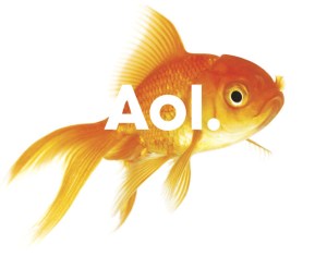
AOL is on the verge of being cut loose from corporate parent Time Warner to become an independent company focused on delivering online content and services—and today the company revealed part of its new logo and branding strategy designed to separate the “new” AOL from its previous corporate icons. And the new designs are certainly raising some eyebrows: the new logos eschew capital letters (and even legibility) in an effort to graphically portray AOL as a dynamic, fluid, and youthful organization.
“Our new identity is uniquely dynamic,” said AOL CEO and chairman Tim Armstrong, in a statement. “Our business is focused on creating world-class experiences for consumers and AOL is centered on creative and talented people—employees, partners, and advertisers. We have a clear strategy that we are passionate about and we plan on standing behind the AOL brand as we take the company into the next decade.”
AOL developed the new logos and identity in conjunction with Wolff Olins, an international brand and identity consultancy, to develop the new logos.
“AOL is a 21st century media company, with an ambitious vision for the future and new focus on creativity and expression, this required the new brand identity to be open and generous, to invite conversation and collaboration, and to feel credible, but also aspirational,” said Wolff Olins CEO Karl Heiselman.
Reactions from industry watchers has been mixed: some responses have been profoundly negative, pointing out that none of the new logos are particularly legible or convey anything about the identity of AOL: they mostly look like clip art or images of random objects with some text splattered on top of them. Others applaud AOL for taking such a chance with its corporate identity and having the courage to ditch its staid and iconic logos of the past in an effort to get a clean start on its newly independent business.
AOL announced last week it is cutting 2,500 positions, or about one third of its global staff, in order to bolster its bottom line.


