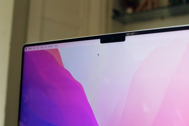
Ever since the 2021 MacBook Pro was released, its notch has been a source of fascination — and derision. That’s a shame, because it really is one of the best laptops we’ve reviewed all year. Yet we totally get it: The notch looks pretty damn weird.
Fortunately, the developer of one of the best MacOS utility apps has come to the rescue. Andreas Hegenberg, the mind behind BetterTouchTool, has updated their app with a new beta feature called the Notch Bar.

This puts a black bar on either side of the MacBook’s notch, essentially making it disappear. “So what? Plenty of other apps do that already,” I hear you say. But BetterTouchTool goes one step further and adds customizable buttons to this black bar. It’s like a control strip for quick-access shortcuts. In other words, it makes the new notch a whole lot more useful.
As with everything in BetterTouchTool, the Notch Bar’s strength lies in its flexibility. You can use it to display widgets like the current weather or whatever you have playing in Apple Music. It can launch specific apps or perform defined shortcuts and gestures. It integrates tightly with Apple’s Shortcuts app, letting you start your automations with just a tap or a click. And you can add volume and brightness controls — and even an emoji button — into the Notch Bar, much like the old MacBook Pro’s Touch Bar. All the while, you can tweak each button’s icon, colors, and label.
The key benefit is that since the Notch Bar is ever-present, you always have your shortcuts close to hand. There’s no need to remember a bewildering array of keyboard shortcuts or switch between multiple apps. Instead, everything is located at the top of the screen.
Just added brightness & volume scroller widgets and a emoji widget to the BTT Notch Bar alpha. Slowly things are falling into place, I think for Christmas I can do a first non-alpha release. Still lots of bug-fixing to do until then🙂 https://t.co/UBBb7Tb1cJ
— Andreas Hegenberg (@LLo_ai) December 17, 2021
Showing off a bit more of the feature’s flexibility, Hegenberg has demonstrated two potential orientations of the Notch Bar: One where the MacOS menu bar hides out of sight until you move your pointer to the top of the screen, and another where the Notch Bar sits above a static menu bar.
Right now, the Notch Bar is still a beta feature, so bugs and issues are to be expected. For instance, Hegenberg recommends you use dark mode in MacOS so that your menu bar is also dark, which helps it fit in with the dark buttons on the Notch Bar. Over time, we’d expect these issues to be ironed out.
Even without the Notch Bar, BetterTouchTool is worth looking into. It lets you overhaul almost any touch input device for your Mac, including the trackpad, Touch Bar, Magic Mouse, Siri Remote, and much more. If you don’t like how your touch controls work, BetterTouchTool lets you change and tweak them to your heart’s content, adding new MacOS gestures and shortcuts instead of relying on Apple’s defaults.


