Google rolled out an update to Docs and Drive today that makes sharing files a little bit simpler. As originally reported by 9to5Google, the new Share menu is considerably smaller, and all of its elements are more compact and better organized.
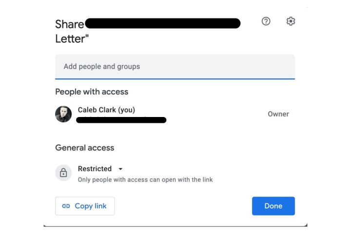
The first thing you will notice is that “Share with people” and “Get link” have been condensed to one box. In the last version, Sharing with individual people was its own stand-alone box, with another box for link sharing directly beneath it. In the new Share interface, the “Get link” box has been entirely removed, and now you can simply copy the link with the button in the bottom left corner. It’s cleaner, removes a lot of needless text, and is far easier to find than before.

The “Share with people section” is largely unchanged. It has been retitled “People with access,” but otherwise the steps for sharing files with individual people are unchanged. Below that is the new “General access” section, which lets users adjust who can view the link. It can be set to restricted (where only the people added can view the link), a specific workspace ( a set group of users, like a company), or to anyone with the link. These settings used to be in the “Get link” section.
The “Copy link” button is directly below general access, as we covered above.
There is also a setting shortcut in the top-right corner that adjusts user settings. Those settings are:
- Editors can change permissions and share
- Viewers and commenters can see the option to download, print, and copy
Toggling these off restricts sharing and permission changes to the original file creator, and it restricts viewers from downloading, printing, or copying the document (at least conveniently).
Overall, these are useful changes to the sharing UI. Consolidating the Copy link button, in particular, is going to save a lot of people looking around for a commonly used feature.


