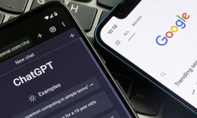
The new logo looks right at home with the redefined modern UI that was recently introduced in the Android OS. Dropping the serifs from the letters is only part of the equation, however, and the new letters also take a flat, matte color to them. Otherwise, the logo is basically the same as it was, with the most striking difference seen in the letter G.
This isn’t the first time Google has mixed things up when it comes to its logo, not counting the doodles. In fact, a short video on the Google blog explains that this is the sixth iteration of the Google logo, which for a brief time in the late ’90s included an exclamation point!

In addition to saying goodbye to the old logo, Google says with it will also go the blue “g” icon that’s become a big part of Google’s mobile apps and services. Instead, a capitalized “G” with all four colors of the main logo will replace it. These colors will slowly find their way into other areas too, like the voice search microphone button.
This makeover isn’t just to keep up appearances though, as the redesign actually plays a role in the usability of Google’s software. The original logo was designed for a single, desktop screen, but with so many new form factors, it made sense to switch to lettering that reads better on small displays. Whether it’s your watch screen or your car’s in-dash system, you’ll always know when Google has your back.


