Laptops all look the same. Yes, some are black, and some are silver, some are aluminum, and some are fake aluminum — leaving just the logo on the back to distinguish one from another.
Still, the second I first saw the Pixelbook, I knew there something different about it. It wasn’t like other laptops, or even previous Google laptops. It felt designed in a way the sea of silver MacBook clones flooding store shelves don’t.
The untold story of Google’s most ambitious product is one of meticulous attention to detail, and an uncompromising vision for how a laptop should be used. To learn it, we sat down with the design team to go behind the scenes of how, and why, the Pixelbook was brought to life.
The material break
The lead designer of the Pixelbook — and the Pixel phones before it — is Alberto Villareal. He described the contours and design features of the Pixelbook more like a sculptor and less like a laptop manufacturer. Hailing from Mexico City and learning design in Sweden, Villareal’s approach was to make the Pixelbook fit in with the world around us.
“We took influences from interior design or fashion or furniture — we’re applying it to the entire color portfolio of the product,” said Villareal, holding the laptop in his hand. “We very intentionally wanted something that was bright and light in terms of color, so that we have a more positive and happy view when you open the laptop, and you’re looking at the keyboard and trackpad.”
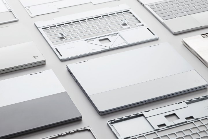
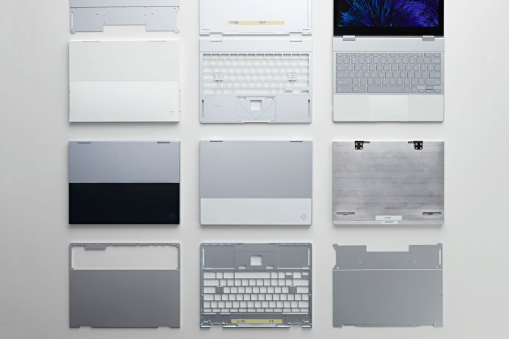
Nowhere is that more evident than the iconic “material break,” as Villareal calls it, which has become a distinctive, visual indicator of the entire portfolio of new Google products.
“We very intentionally wanted something that was bright and light in terms of color, so you have a positive and happy view when you open the laptop.”
“It’s a bold gesture that’s recognizable from a distance,” he told Digital Trends. “We could have taken the whole product in the same sort of grey and aluminum. But we wanted to make it in a more visual way, so that when you see this product from a distance, you can immediately tell which product this is.”
It’s not hard to guess where his influences came from. You’ll see clean lines and two-tone color breaks all down the aisles of Ikea, or on racks of Swedish-made Cos clothing.
It’s the simplest design flourish you could imagine — a horizontal line, separating the back of the product in two with color, material, or both. It’s become iconic of the entire Google family of products, whether you’re talking about the Pixel phone, the Pixelbook, or Google’s smart speakers.
The material break isn’t just skin-deep. Once you open the Pixelbook, the two-tone color and material separation continues onto the keyboard and palmrest areas. It’s subtle, but it’s once again a significant departure from what you’ll find on other laptops.

“We also wanted to take an approach that is semantically telling the user which areas are for which functions,” said Villareal. “The color break that is very intentional — the white portion on the front and the aluminum grey keys — are to visually separate and guide the user to which areas are for typing and which areas are for trackpad and resting.”
Of course, the story of design isn’t just about aesthetics. In the same way that a well-designed chair needs to hold your weight comfortably, the design language behind the Pixelbook also needed to be linked, at the hinge, to its function as a laptop – and tablet.
One product, two purposes
The Pixelbook is a 2-in-1, meaning it can be used as either a traditional laptop or folded into a tablet. I wasn’t surprised to hear the choice to move to a 360 hinge was no arbitrary decision for Google.
“We do a lot of research,” Villareal said. “We look at how some of people’s behavior patterns have changed over time. We looked at how people are using these products not only on the desk or in the office but also working in a mobile context. Sometimes you don’t want to have to pull out your phone to open certain applications, so by combining the efforts on our software teams and hardware teams. We really want to bring these together.”
Think of it like a fully-reclining chair that must be comfortable both sitting and laying down. Instead of just throwing a 360 hinge on a traditional laptop design, Villareal and his team embarked on the mission to make every bump, edge, piece of material, and design flourish function in more ways than just one.
“Sometimes when we’re designing a laptop that is not 360, you might want to think of a form that looks good when it’s closed and looks good at a certain angle,” said Villareal. “But these had to work on all four orientations. That was a challenge. As we were negotiating some of the thicknesses with engineering and looking at those details, that’s where we found those solutions.”
Villareal and his team embarked […] to make every bump, edge, and design flourish function in more ways than just one.
The solutions came in finding ways to integrate things like antennas into the material break of the device, across both the top and the bottom. Most of the product is aluminum, which provides structural integrity and heft. But where the antennas are placed along the material break, it transitions to glass for the purposes of antenna transparency. After all, the antennas still must work when you’ve got it flipped around in tablet mode.
Then there’s the soft silicon pads around the touchpad, which work overtime. They serve as palm-rests while typing, feet while in tent mode, and raised support to keep the keys from touching the table in tablet mode. Even the built-in microphone serves double-duty as a hole through which the power LED shines.
To accomplish the dual-purpose functionality of every aspect of the Pixelbook, Villareal said the hardware teams and software teams had to be united in their efforts. “It’s a very, very collaborative process,” he noted. “It’s very organic where we’re thinking about crafting the product and bringing all those areas together. These industries are moving so fast, and there’s technology developments happening so fast, that we can’t afford to first spend three months designing it and then pass it over to the engineering team to engineer it. We basically have to work together since day one.”

Merging Chrome and Android
While the hardware is important, the operating system, Chrome OS, had to ensure everything worked in unison, in both laptop and tablet modes. Trond Wuellner, Product Team Lead, believes that’s what makes the Pixelbook stand out from the competition.
“If you look at both Apple and Microsoft, neither have a compelling manifestation of a mobile ecosystem in their devices,” said Wuellner. “That’s something that’s going to be really difficult for both of those competitors to do effectively.”
“If you look at Apple and Microsoft, neither have a compelling manifestation of a mobile ecosystem in their devices.”
While Apple has been coy about its plans to bring iOS apps to the Mac, Google has stepped into it in full force. With the recent integration of Android apps onto Chromebooks, Wuellner argues that Google now has a platform for connecting the worlds of mobile and desktops in a meaningful way. “You’ve got to bring people the applications they know and love,” he said. “That was the center-point for how we started thinking about what we wanted to start doing differently with the hardware itself.”
Wuellner said such deep collaboration was only possible after a shift in organization behind the scenes at Google. Before the last few years, Chrome and Android weren’t integrated the way they are today.
“The DNA of the platform team is more unified and more together than it’s ever been in the past,” he remarked. “Everyone from the design teams to the product teams — and even the engineering and overall platform organization leadership — is the most tightly-coupled teams we’ve ever had working on these different approaches. It’s been a really important milestone in bringing a unified experience to our users.”
Still, Wuellner admits that Google’s use of Chrome OS as a touch-capable operating system isn’t perfect. Developers still must be courted to make apps more seamless, and the operating system itself must continue to evolve to make the mobile and desktop interfaces feel more unified. The Pixelbook must be the start of the journey, not the destination.

“We’ve done a lot of work with the Chrome OS team to iterate the OS forward so it’s more touchable than it’s ever been before,” Wuellner said. “That’s still a work in progress, but we really aspire to make the roots of it a productivity-focused OS, with the touch targets that just work better.”
The Pixelbook might not have the entire picture painted yet, but one thing is clear: Google intends to solve the problem through careful, concentrated design.


