Take a walk down the shopping hub of downtown San Francisco, and it’s hard to miss Razer’s street-level storefront. People off the sidewalk are invited in to be dazzled by the spectacle of the live DJ’s thumping music and flashing lights. That’s certainly represents one aspect of Razer’s ethos.
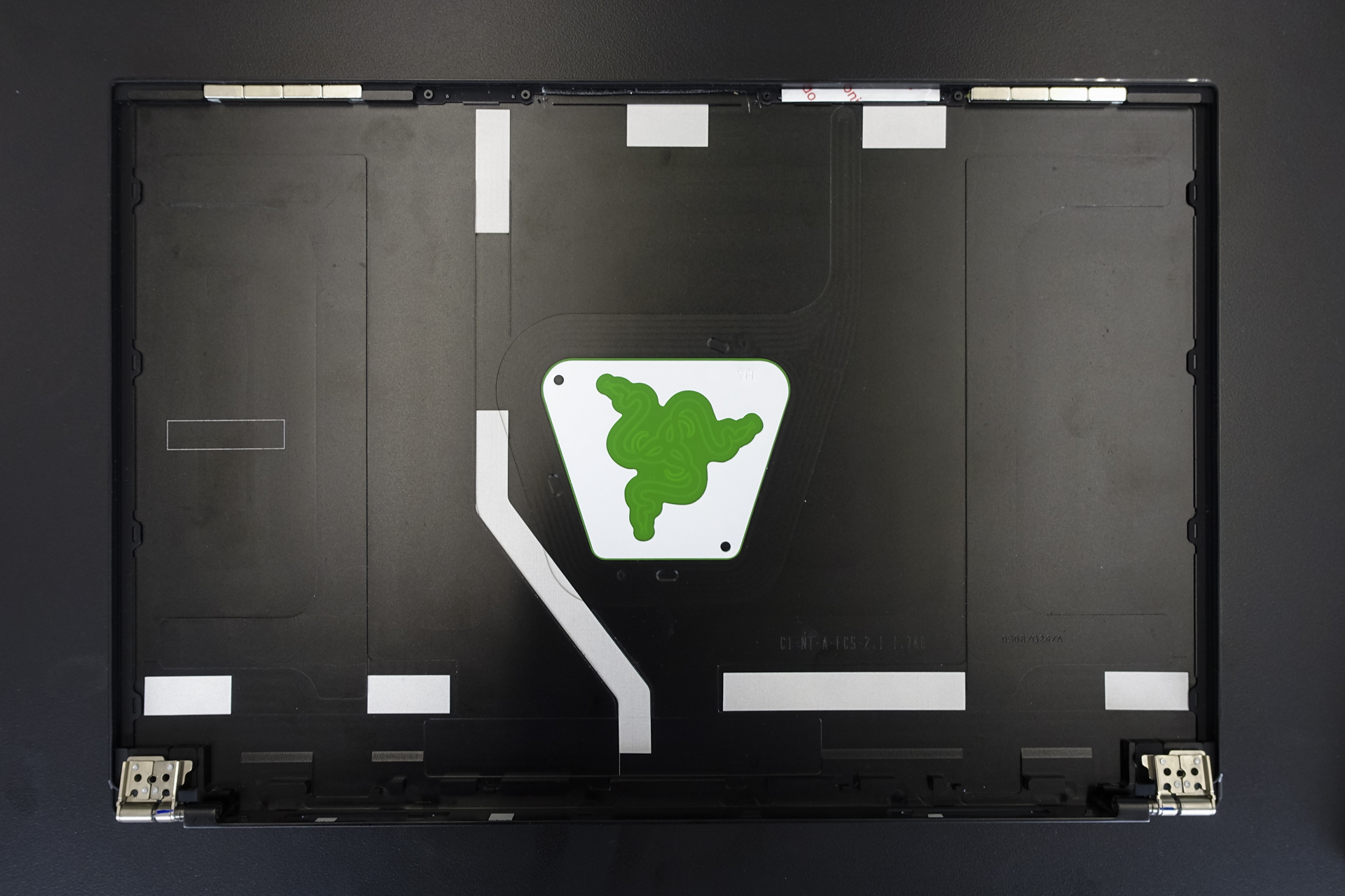
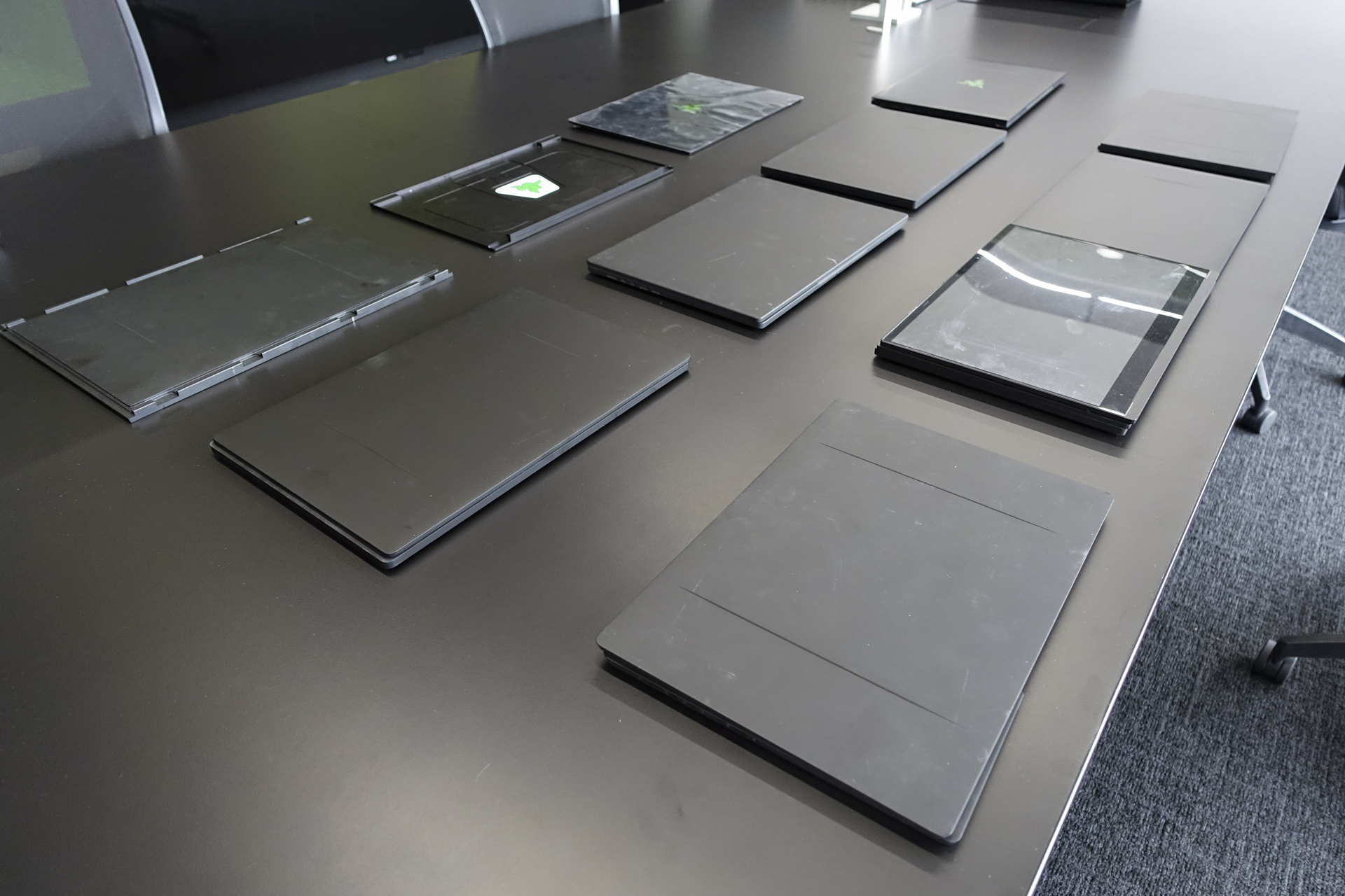
But just a few blocks away is a non-descript, mid-level high-rise where the magic behind Razer’s designs are crafted. Secured doors conceal prototypes, sketches, and mockups for products that have yet to be launched — and like other tech companies in the Valley, employees treat the space as their own garage. Strip away the thumpa-thumpa music and the club-like decadence, and you’ll find the simpler aspect of Razer’s approaches design – methodical, purposeful, and devoid of unnecessary excesses.
That was the space Razer invited us into to hear the story of how the Blade 15 came to be. It’s a gaming laptop that fully embodies that design philosophy both in terms of how it looks and how it performs.
Learning from the smartphone
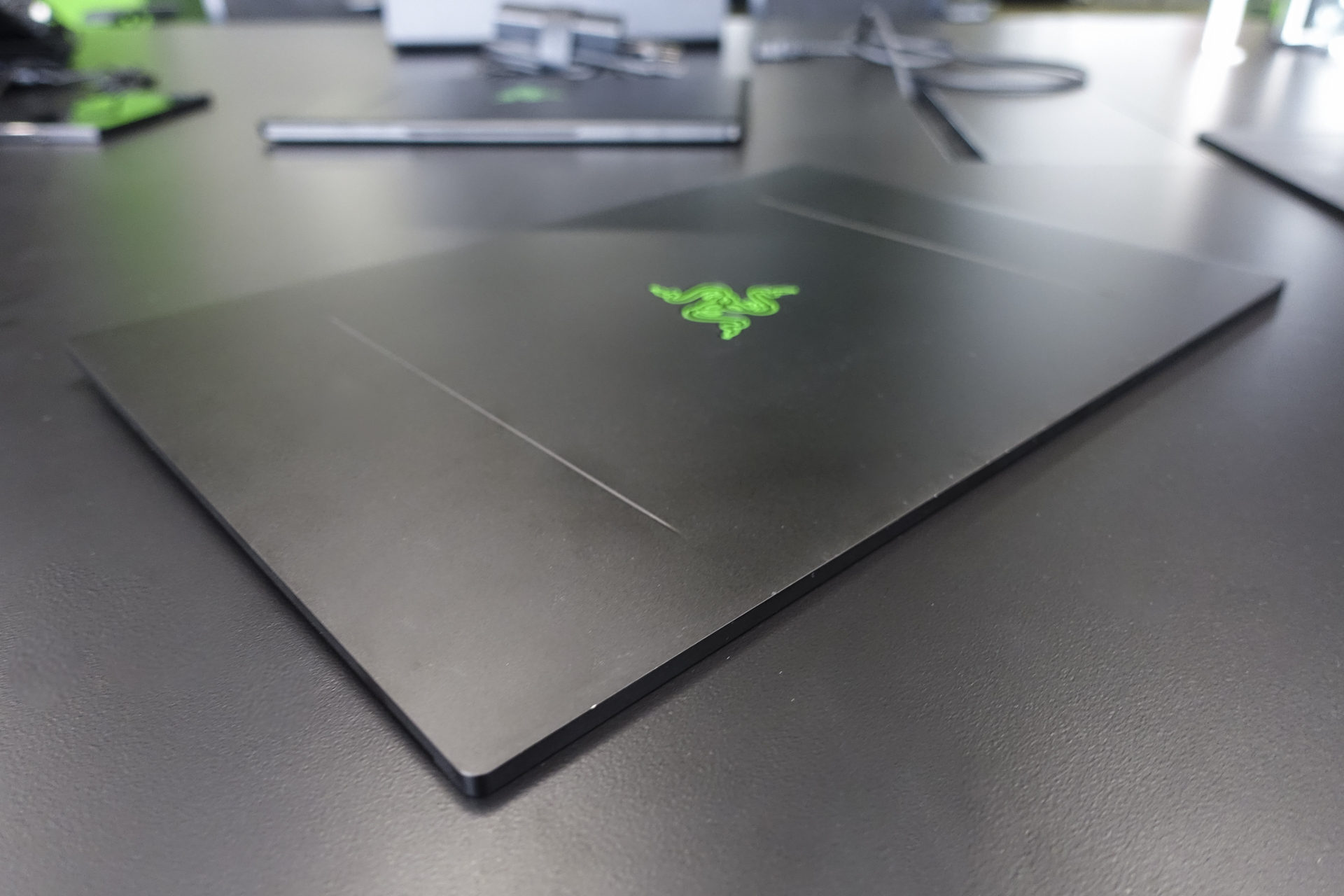
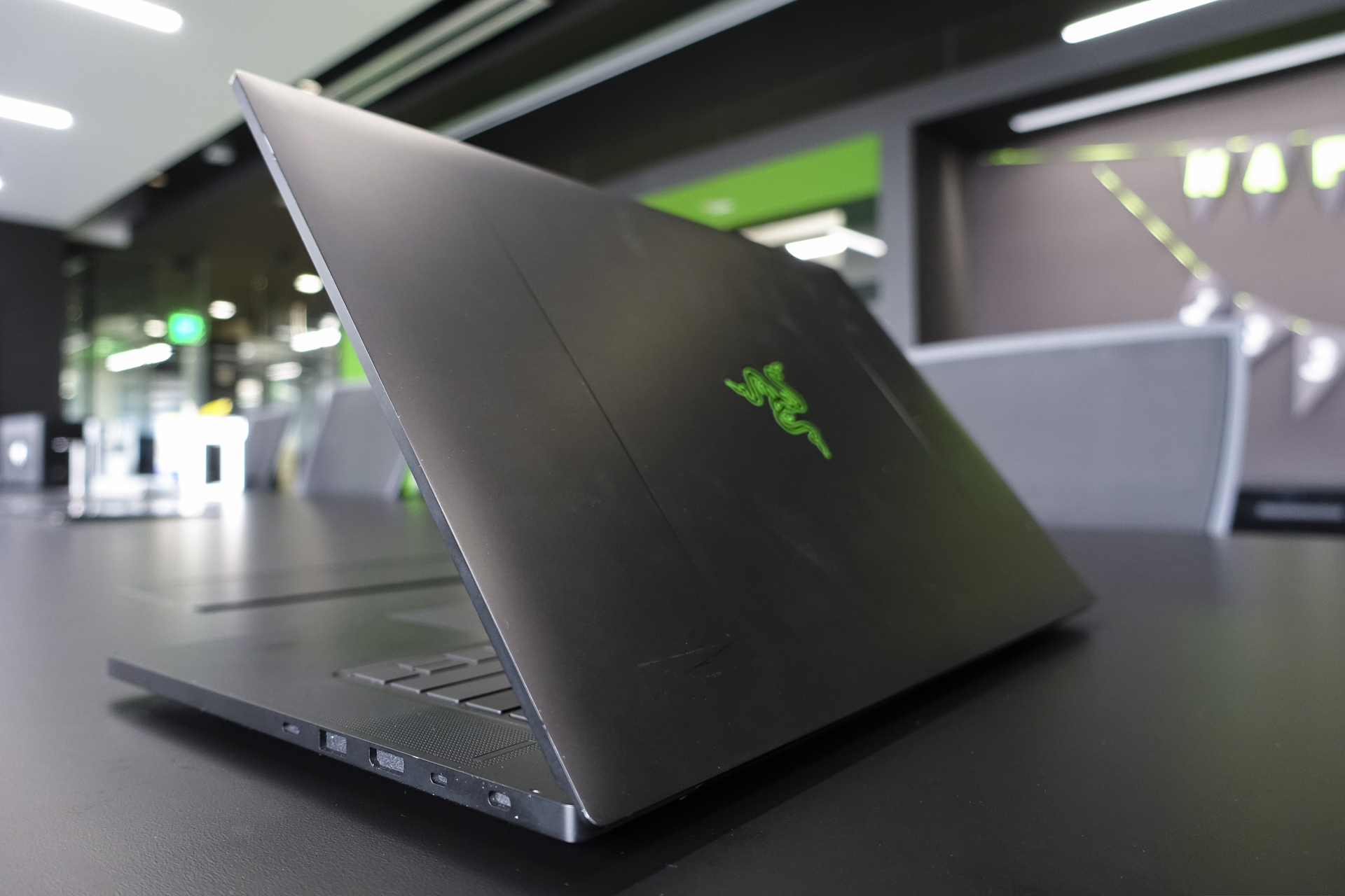
Minimalist black with green accents highlighted by the familiar three-headed serpent emblem — it’s an aesthetic gamers have come to trust over the years. Quite often, if it weren’t for the darkened silhouette, the two spines on the top of the lid, and Razer’s logo, you’d never know these were laptops that could game. But Razer’s challenge in launching the Blade 15, was moving away from this familiar look into a new design language that’s as much about function as it is about form.

That’s according to Razer’s Director of Industrial Design, Stephane Blanchard. The French designer has been working on Razer products for over twelve years now, and has been a central figure in cultivating Razer’s unique design aesthetic over the years. He led us through the halls of the company’s design studio where we learned about Razer’s new design directive.
“What we wanted is something that looks good but isn’t screaming that gaming is all we’re doing”
“The choice has been quite obvious from our perspective,” Blanchard said. “It was a trend in a way, and I feel that’s where we’re going, and it’s being driven by phone.” With the phone, Razer knew it wanted to maximize the front of the device to showcase the display and give gamers front-firing stereo speakers, and Blanchard’s team felt that a flat design with minimal curves was the best approach.
In fact, the Blade 15’s angular design originated several years ago alongside the design of the Razer phone, but Razer decided to launch its phone first. And when it came time to working on the next generation of laptops, the team knew they wanted to port over this design language to the Blade 15.
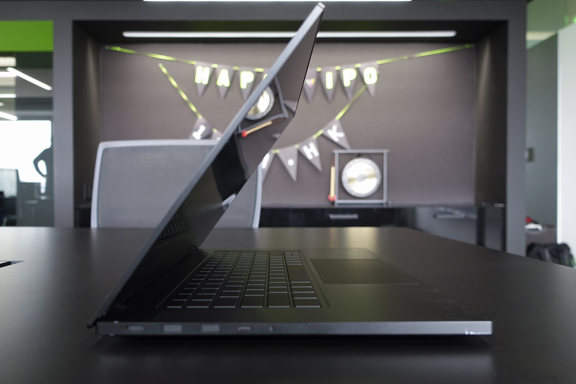
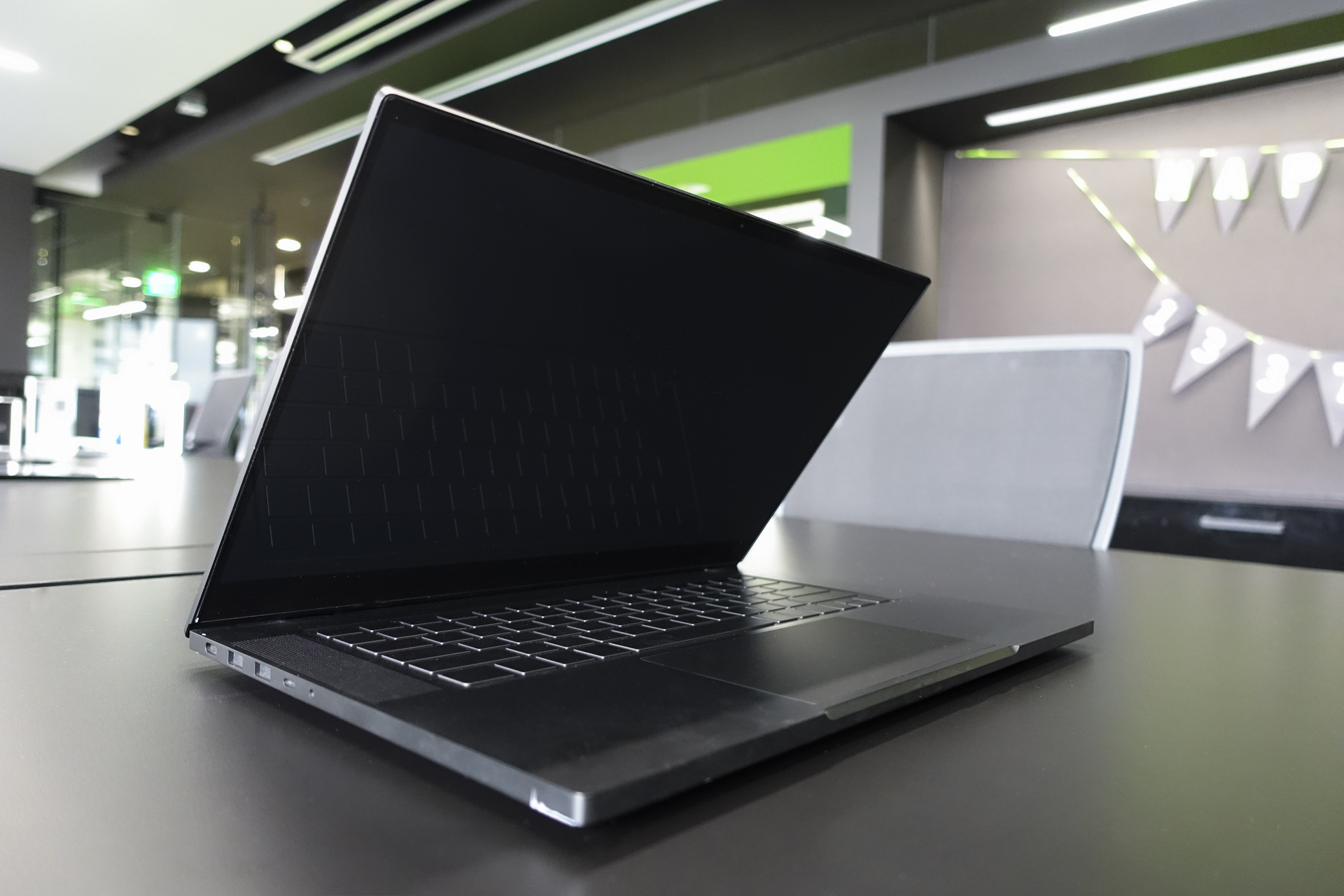
This new design is apparent the first time we saw the Blade. Rather than follow in the footsteps of other gaming brands, Razer has bucked the trend of more flash, opting for more conservative designs.

You won’t find ostentatious speakers, massive grills, or aggressive vents on any Blade, a conscious design decision that the company made to allow its gaming laptops to easily transition between game room and board room environment.
Part of this approach is to design a product that is powerful enough for gaming, but is still utilitarian. At the end of the day, people still write emails, create PowerPoint presentations, and analyze Excel spreadsheets on the laptop, even if it’s one that’s built for gaming.
“What we wanted is something that looks good but isn’t screaming that gaming is all we’re doing,” Blanchard said. “And showing off an aggressive gaming design isn’t all we’re doing.”
But in order to accomplish that goal, the designers at Razer would need to start chopping some of the excess from their designs.
Cutting the fat
With a new mission intact, Blanchard and his team of designers spread across Singapore, San Francisco, and Taipei saw a new opportunity to refine and distill the company’s approach to design. Just like the CNC machined aluminum manufacturing process that shapes and sharpens the Blade’s more angular edges this year, Blanchard wanted to extrude away everything that wasn’t crucial to the Blade 15. Removing anything was unnecessary allowed Razer to focus on performance and perfecting the smaller details.

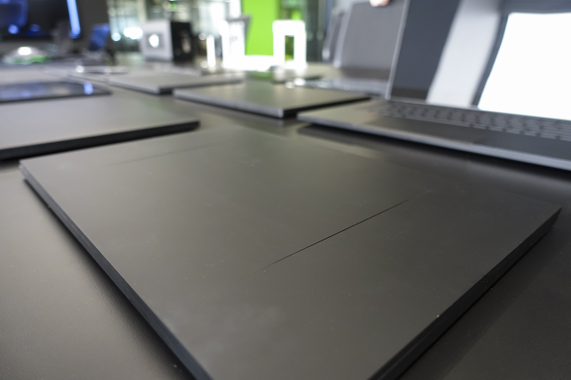
“It’s really hard work to get to the point where we have to remove everything that is not necessary, so there is really that focus of do we need this design element?” Blanchard said as he showed off the Blade 15’s flat lid and blocky frame. This meant that the two signature spines that adorned the top of every previous Blade model are now gone.
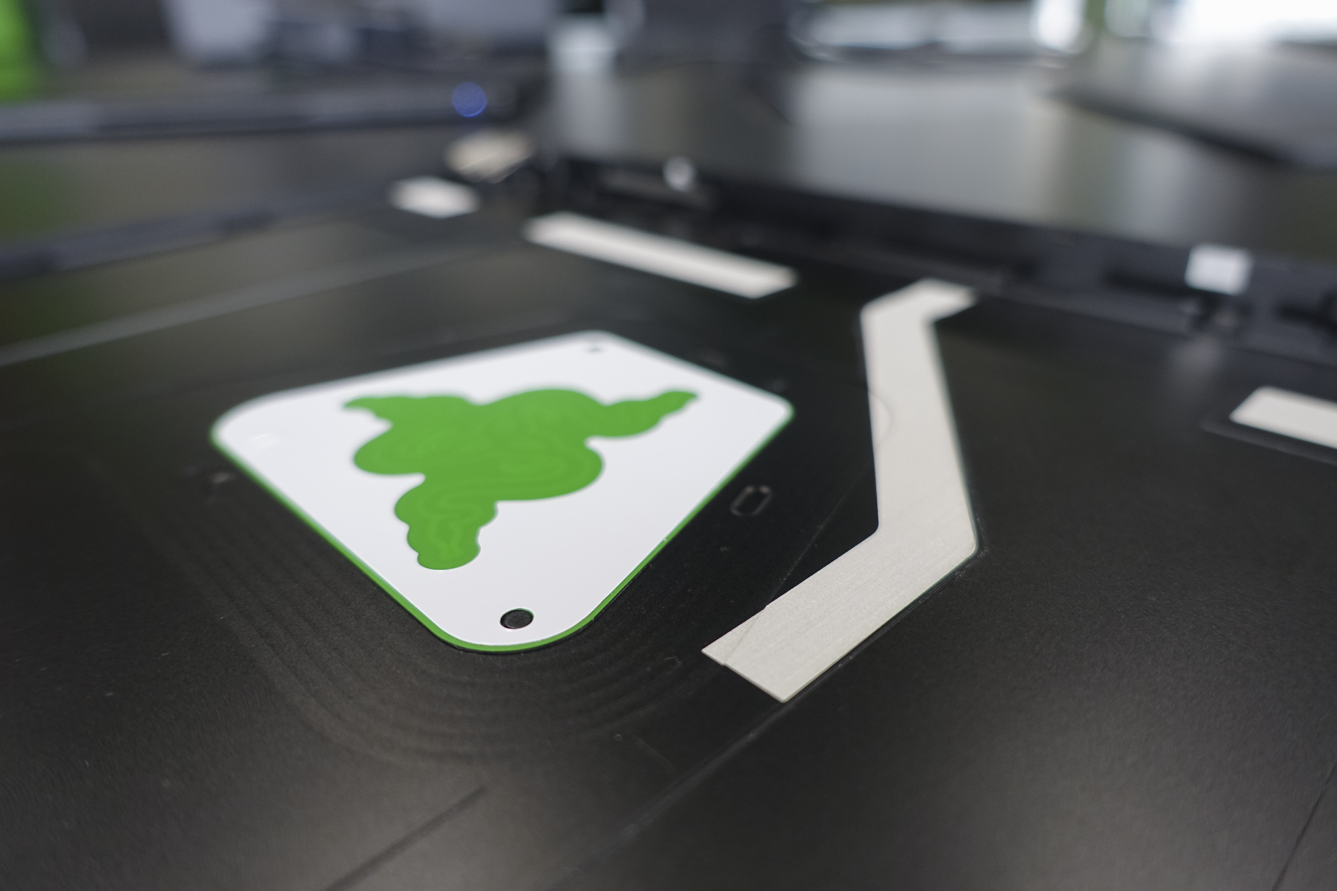
Initially, the team experimented with various spine designs on early plastic prototypes. “For a long time, we were considering whether we were keeping it, not keeping it,” Blanchard said of these lid ridges. “We also studied different ways of doing it — shorter, longer, raised, flat, embossed, not at all.” Ultimately, the team felt that Razer’s design identity is still strong enough that gamers could still identify the Blade as a Razer product, thanks to the signature black and green colorway and the glowing three-headed serpent logo on the lid, and the spines were dropped.
An attention to detail and Razer’s understated approach to design that earned the Blade 15 comparisons with Apple’s MacBooks.
While the spines served a functional purpose, allowing users to quickly grip the laptop when pulling the Blade out from a bag, the detail was inspired by the contouring on top of car hoods. Having studied automotive design in school, Blanchard pulled from his background in cars when designing the Blade 15 and the Core V2 eGPU. You can see the results of that in the laptop’s vents and grills, the bead-blasted anodized black finish, and how light rolls off the surface. On the laptop, the automotive inspiration resulted in rounded edges derived from the idea of continuous curvatures.
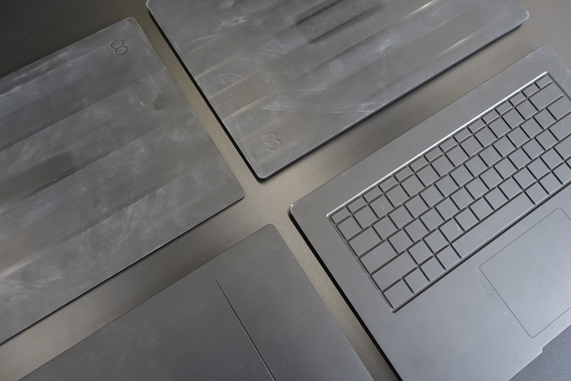
To find the right shape for the laptop, designers used plastic mockups to visualize how the Blade 15 would look when it’s held in the hands or sitting on a desk. Early concepts include a wedge-shaped design, chamfered edge detailing, and prototypes with curvier edges on the bottom to give the illusion of an even slimmer design.
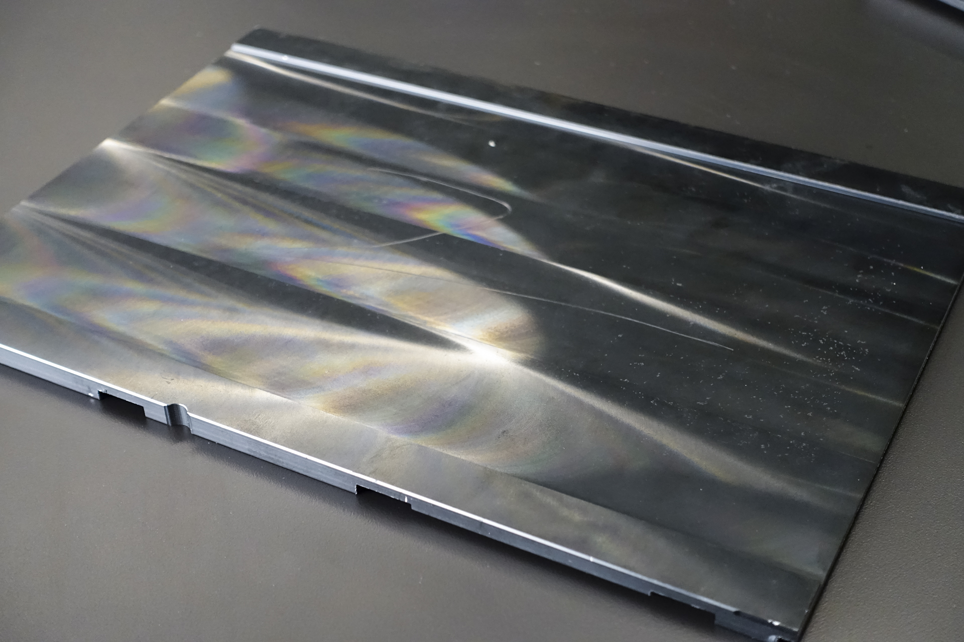
Like previous Blades, the team chose to continue using machined aluminum again this year, despite experiments with other materials – including plastic, magnesium, and carbon fiber – Blanchard explained that the material was a great fit in creating a slim laptop with a sturdy feel. “Going with the CNC aluminum really helped us to achieve a really flat surface,” he explained. “If we were going with a plastic enclosure, then potentially you’ll see some marks. It will not be perfectly flat.”
This attention to detail, a solid unibody construction, and Razer’s understated approach to design that earned the Blade comparisons with Apple’s MacBooks. “We are a definitely a designed-focus brand, versus a purely engineering company,” Razer senior manager of public relations Kevin Allen explained. “Otherwise we wouldn’t spend so much time on design.”
Comparisons between the Blade and Apple’s MacBooks aren’t unwarranted, and Razer has earned its spot as one of the leading designers of notebooks. Arguably, like the MacBook Air — which was a pioneer in the thin, light, and powerful notebook space – Razer has replicated Apple’s success by applying similar philosophies in the Blade’s design to address the needs of gamers. Like the Air, the Blade 15 is an unassuming notebook that’s not much thicker than a standard thin-and-light ultrabook. And just like how the Air could be mistaken for a netbook when it debuted, the Blade packs in plenty of processing and graphics power for its small size.
This new, thin design could have only been possible with the right mix of technologies at hand. Most importantly, powerful chips small enough to fit into the Blade 15’s thin chassis and a thermal system to keep temperatures down.

An engineering puzzle
When combined with the large array of ports, the Blade 15’s use of Nvidia’s GeForce GTX 1070 graphics processor helps it to become one of the slimmest virtual reality-friendly laptops on the market. To keep the chassis slim, Razer worked closely with partners Intel and Nvidia to hone in on the design, relying on the former’s Max-Q reference design for pushing the slim envelope with a 1070 GPU.
“Ultimately, the question has been when should we introduce a new design language,” Blanchard said. “And that’s something that we knew while working closely with Intel and Nvidia with the new processors that this is something that will happen on the Blade 15.”
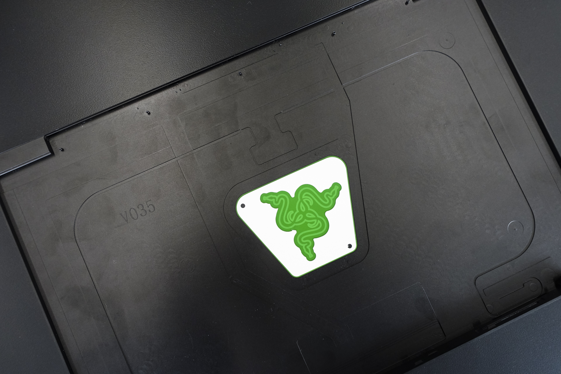
“… We want users to be able to open up the back of the laptop and look inside and see that there is an attention to details.”
As designers pushed to slim down the Blade, engineers were working overtime to try to accommodate the powerful CPU and GPU inside. “We knew we have to dissipate heat, but we try to not add vents every on every surface,” Blanchard said. “We are really fighting — not just to the millimeter, but to 0.01 millimeter.” As a result, engineers ported the vapor cooling chamber that debuted on the Blade 17 over, and the team worked on a new fan.
To address problems with heat, all the internal components were scrutinized to see if their height and placement impeded with airflow. A transistor that’s just a millimeter too tall, for example, could create turbulence and overheat the Blade. Engineers sought out the perfect component to work with the Blade’s design and height requirements, and the team found that they needed to re-architect the fan design to deliver better airflow.
But no component is allowed to exist outside the Razor’s relentless design efforts — even on the inside. Once everything has been thoroughly thermal tested, Blanchard’s team examined the system’s vents, grills, and openings. Any internal component that could be seen from the outside had to be replaced with black-coated parts to ensure that the Blade 15 is sleek.
“Over the years, we pushed forward to get the black motherboard — black PCB, black elements,” Blanchard explained. “With the latest Blade 15, we offer the user the ability to upgrade their RAM, so we want users to be able to open up the back of the laptop and look inside and see that there is an attention to details.”
Setting out to create a laptop like the Razer Blade has inherent compromises factored into the equation. The issue of heat and throttling is one that’s always been a battle for thin gaming laptops, and even for Razer’s own laptops in the past. But this time around, Razer felt prepared to deliver the level of performance and aesthetics that its fans want.
Blanchard’s team learned a few important lessons when they experimented with the Blade 17’s mechanical keyboard.
Managing the heat output on the Blade 15 was no easy feat. It’s a problem for every laptop, but especially challenging given the combination of the laptop’s slim size and powerful internal components. Razer experimented with a number of different fan designs and placements, and ultimately decided on two bottom-facing fans to pull air in and a vapor chamber, an innovation on top of the traditional heat pipes.
“We make a couple of concepts and prototypes to see which one performs the best,” Blanchard described the process of designing the Blade 15’s thermals. “After selecting the best design, we focused on vents in order to have the lowest skin temperature in certain areas. Obviously, the forehead – the area just above the keyboard – is a low-touch area, so we can afford to have slightly hotter temps. The keyboard, palm rest, and trackpad are areas where we try to control. So all the thermals is very complex work to figure out because there’s a lot of testing and simulation.”
Making the necessary compromises
The solution presented in the Razer Blade 15 won’t please everyone. Those looking for the absolute best game performance will have to look to laptops with bulkier chassis and huge vents. But the balance between performance and portability is a tightrope the Blade walks better than any other gaming laptop we’ve ever seen.
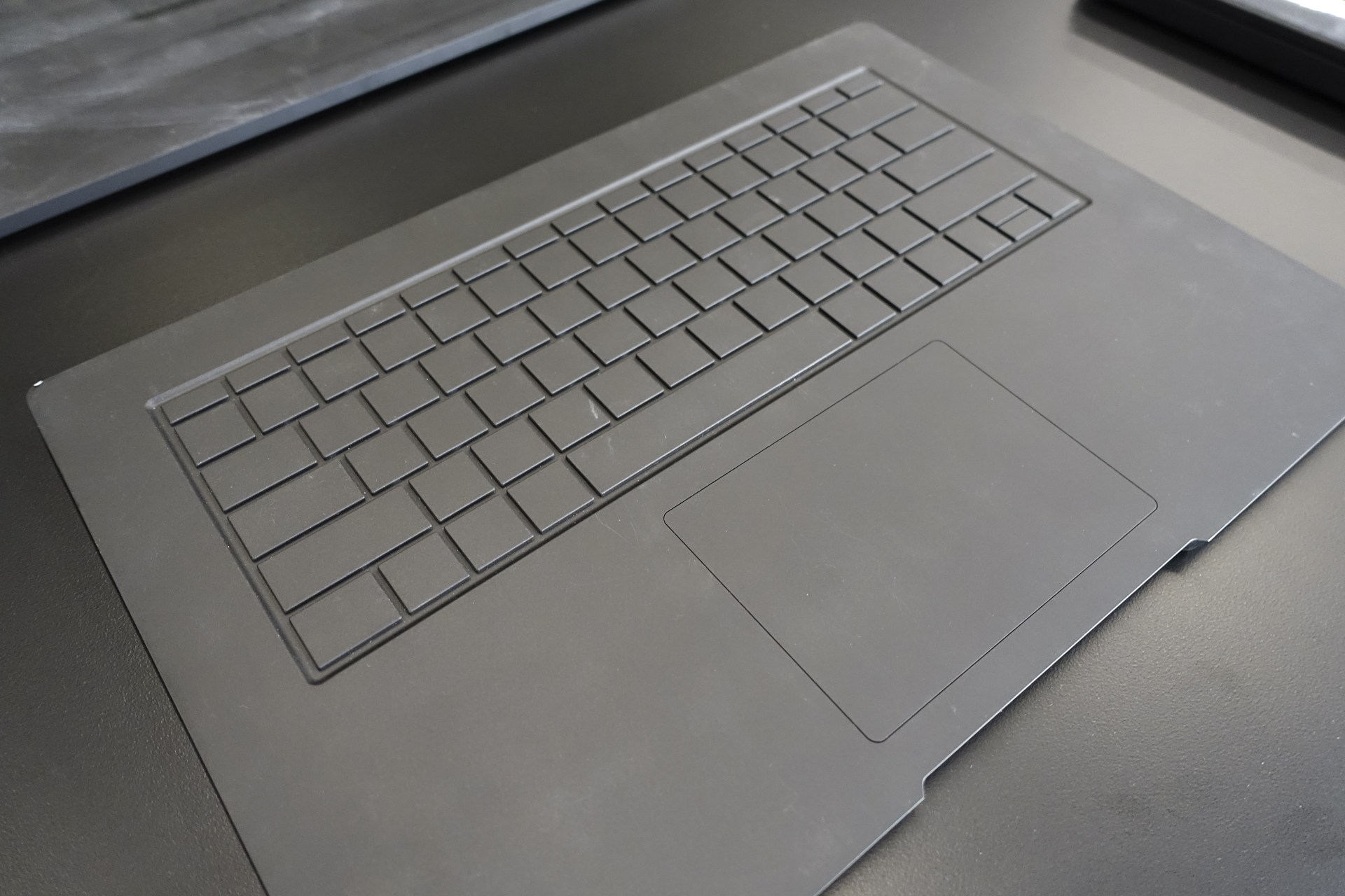
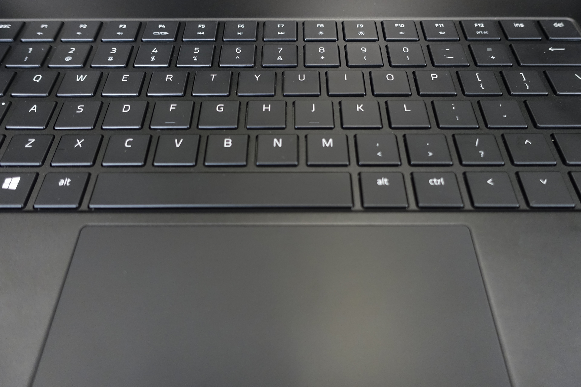
Aside from heat and performance, the keyboard is another important consideration as designers looked to slim down the Blade’s design. Unlike the larger 17-inch Blade, Blanchard’s team had to make the concession of shipping the Blade 15 without a mechanical keyboard.
“Ultimately technology brings us to a point where we can have a thinner stack up for the keyboard and still have a good experience,” Blanchard said of the membrane keyboard. Razer experimented with different key actuation forces, click sounds, key shapes, and keyboard layouts before settling on the final design that offers decent key travel with good actuation force given its demographics of gamers.
The Blade 15’s story is a labor of love that can be traced back to Razer’s careful planning, attention to detail, and a mix of happenstance.
Blanchard’s team learned a few important lessons when they experimented with the Blade 17’s mechanical keyboard. Because it wasn’t possible to create half-height keys, the Blade 17 was the first Razer notebook to ship with full-height arrow keys. And because the full-height arrow keys were well received, Razer brought the keyboard design over to the Blade 15. However, because of the Blade 15’s slimness and fan placement, designers ultimately decided against a mechanical keyboard — Blanchard’s team was unwilling to make the Blade 15 thicker.
And even though designers struggled over the keyboard on the Blade 15, typists felt that the keyboard layout with full-height arrow keys wasn’t suited for productivity. Instead of dropping the arrow keys down a row to accommodate full-sized up and down keys, Razer opted instead to move the up-arrow key up a row, positioning it between the question mark and a shrunken right shift key. Touch typists who rely on the right shift key now have to reach further.
“I’ll be perfectly honest, this is not something that’s easy for me,” Blanchard confessed, noting that muscle memory can be retrained over time to adjust to the new layout. “It’s just a decision from our perspective of what works the best.”
The story of the Blade 15 is a labor of love — careful planning with an unwavering attention to detail, coupled with a mix of happenstance given that the right set of technologies was finally available.
This trend towards thin, light, and powerful is just beginning. At IFA, we’re seeing more manufacturers implement on this trend, and thanks to the maturation of powerful technologies – like faster processors and Nvidia’s new GeForce RTX 2000 graphics – we’re going to see a race to slimming down. Devices like the MSI Stealth Thin, Gigabyte Aero, and Asus ROG series prove that Razer is setting a new trend in gaming laptops.
With a boxier design that maximizes the Blade’s internal volume, we expect to see gaming manufacturers iterate and innovate to bring even more performance in slimmer packages. One thing we know for sure: Razer will be the company leading the conversation well into the future.
