Windows and Mac are very different operating systems. If you recently switched over to a Mac and are missing some of the key features and familiar aspects of Windows 10, there are ways to close the gap.
Some of the solutions we have rounded up in this article mimic Windows 10’s behavior closely, while others add Windows functionality while retaining the Mac’s Apple flavor. Either way, they all help make your Mac look and feel more like Windows.
Start

The Start menu is one of the best-loved and most distinctive features of Windows, so it would be natural to miss its presence if you have just switched to Mac. Apple’s operating system uses a variety of methods to launch apps, from Launchpad’s grid of app icons to Spotlight search. If you are using MacOS but prefer the Windows Start menu, try the aptly named Start on your Mac.
This Mac app adds a drop-down list to the Mac’s menu bar. It can list your installed apps just like the Windows equivalent, as well as files, folders, and even URLs. They are all categorized by type, and you can add tags and colors to help sort your items. If you miss the Windows Start menu, this is the app for you.
uBar

In the clash between the Mac dock and Windows 10’s taskbar, I’ve always preferred the latter. While MacOS merges your app icons and open windows into a single Dock button, Windows differentiates them, making app management a little bit easier. If you feel the same way, give uBar a go.
It brings a new level of customization to the Dock. You can keep things simple and add functionality to Apple’s default Dock, or replace it entirely with a Windows-style taskbar, complete with bars showing your currently open windows. It even adds window previews when you hover over open apps, just like in Windows.
ActiveDock

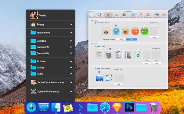
If uBar is not quite your style, ActiveDock is a good alternative. This keeps the Dock but adds a ton of customization, so you can style it up in a way that suits you. This ranges from visual tweaks to wide-ranging overhauls of how the Dock works, so it should come in handy no matter what you have in mind.
If you miss Windows 10’s look, two of the ActiveDock’s most useful features lets you add a Start menu to the Dock, as well as previews of open apps. These add some of Windows’ most useful functionality, while retaining the classic Mac visual style, making ActiveDock a good compromise between the two systems.
BetterSnapTool

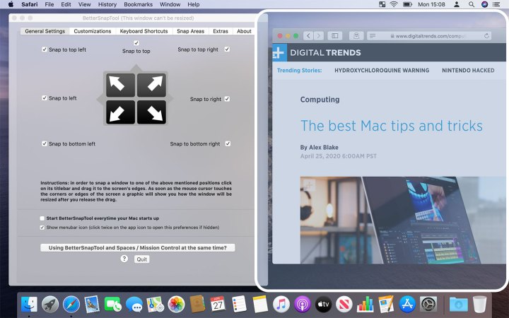
One of my favorite Windows features is its in-built window snapping. Just drag a window to any edge of the screen and it will automatically snap to that side and fill the space accordingly. MacOS does not really have an equivalent — Split View gets halfway there, but is not nearly as good as what Windows has. BetterSnapTool can fill that void.
Like the Windows snapping feature, BetterSnapTool is incredibly simple to use. What makes it stand apart, though, is the wealth of customization options it offers. You can assign keyboard shortcuts, change how windows resize, and even alter what each window’s traffic light buttons do when you right-click or middle-click on them. All that for a mere $3 makes it a great bargain.
Witch

When I first switched from Windows to MacOS, the thing that took me the longest to get used to was app switching. On Windows, Alt+Tab cycles between the open windows of your apps. On MacOS, the similarly placed Command+Tab cycles between open apps; if you want to switch between your open windows, you need to use Command+`, which messes with your muscle memory.
Witch puts things right. This app does not just bring back the Windows method of app switching, but gives you a ton of extra options, down to the finest detail. You can use custom shortcuts to switch between apps, windows, and tabs, change the layout of the app switcher on your screen, switch apps using a Spotlight-style search or menu bar button, and much more.
XtraFinder

Windows 10’s File Explorer and MacOS’ Finder are fairly similar, but there are some small differences that can really trip you up. For instance, there’s no Cut option when you right-click a file in Finder — if you want to move a file, you have to copy it, then press Command+Option+V instead of the normal Command+V. Pressing Return in Windows opens a selected file; in MacOS, it lets you rename the file.
To get things like that back to the Windows way of working, use XtraFinder. It changes cutting and opening files to Windows’ style, and adds a ton of other helpful Finder tweaks, from an unlimited clipboard and custom labeling to a dual-panel view and extra menu commands. It is a great blend of the Microsoft and Apple worlds.
Bonus tip: Sort folders on top in Finder

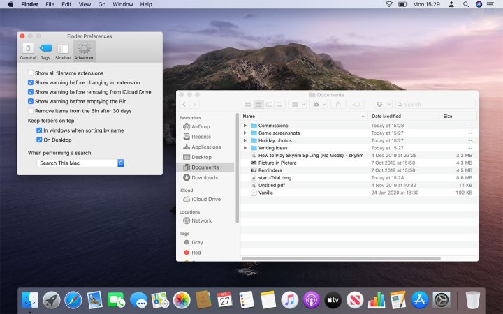
When you sort files in the Windows File Explorer, folders float to the top of the pile. On MacOS, they are mixed in with files. But you do not need to download an app if you prefer the way Windows does things — you canjust quickly change a setting.
Click Finder > Preferences in your Mac’s menu bar, then click the Advanced tab. Under Keep folders on top, tick the checkbox named “In windows when sorting by name.” If you want folders on your desktop to automatically come above files too, tick the On Desktop checkbox.


