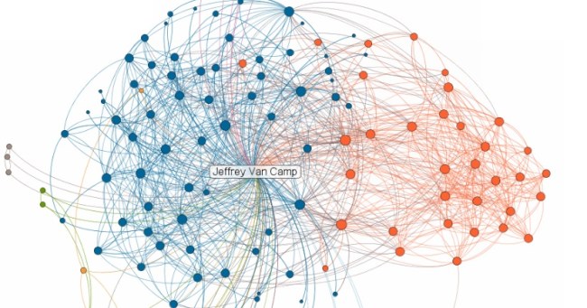
LinkedIn has launched a new feature on its Labs site called InMaps, a visual way to view your network of business contacts on the social network. The new feature has a vague resemblance to a beautiful map that a Facebook intern posted a while back showing what a million Facebook connections look like, but isn’t based on geo-location.
Here’s how it works: LinkedIn sorts your connections and creates a web of dots containing all of your contacts’ relationship to you and to each other. Those with more connections are larger. Clicking on any contact in the cloud highlights its connections to everybody else and lists them in the sidebar.
In addition to mapping your contacts, it also separates them into different colors. For example, my connections (seen above) were separated into eight distinct color groups. In my case, most of them were split by the different jobs I’ve had. All of the blue dots you see are connections I have in the wireless industry, while all of the orange dots are coworkers from one of my past employers. Interestingly, LinkedIn does not label the colors; it leaves this task to you. By exploring, I learned that I need to reach out and start making LinkedIn connections outside of the wireless space because of the lack of diversification in my contacts cloud.
Overall, this new feature isn’t much more than an amusement, but it shows just how many of our contacts know each other. Other Labs projects at LinkedIn include a Swarm feature that shows all of the companies you’re connected to, a Chrome extension, a resume builder, an instant search, an Infinity view that shows the faces of all your contacts, a page that shows all the new members joining LinkedIn around the world, and a Twitter-like Signal feature that lists status updates in different ways. Check them all out at linkedinlabs.com.


