Another year, another MacOS update.
Catalina is this year’s update, and it represents an interesting moment for the Mac as a platform as it embraces iPad apps through Project Catalyst. Beyond that, the update has plenty to offer, with new apps, functionality, and ways of using your Mac.
With the official release having just gone live (and the public beta available for months), we’ve had plenty of quality time living with the most noteworthy new features to give you the lowdown. Does Catalina move the Mac in a fresh direction or should you stick with Mojave?
iTunes becomes Music, Podcasts and TV
Let’s start with the big one. For many, many years, iTunes has been subject to complaints from Mac fans. It has long felt bloated and overburdened, with too many features crammed into one poorly organized app.
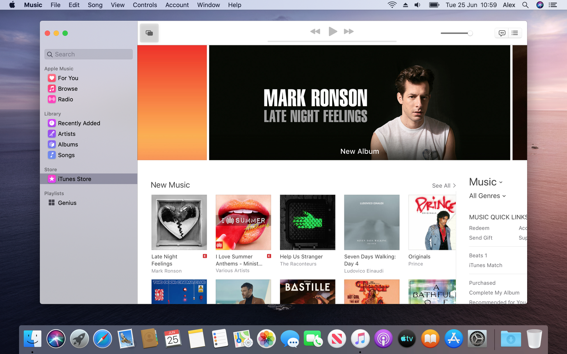
Apple seems to have recognized the criticism and has split out iTunes into three separate apps: Apple Music, Apple Podcasts and Apple TV. All three apps fall under Apple’s Project Catalyst, which is a framework allowing apps to run across iPhone, iPad and Mac without needing to be extensively redesigned and recoded.

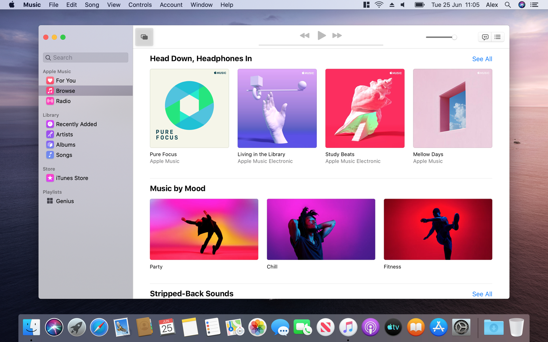
Having two music brands on Mac always felt weird: iTunes to manage your own music and, within the iTunes app itself, Apple Music to stream tracks from Apple’s online catalog. Now they’ve both been brought under the Music brand, which makes a lot more sense.
The new Music app is organized around a main central window, with a sidebar on the left housing the Apple Music catalog, your library (sorted by Recently Added, Artists, Albums and Songs) and a list of your playlists. That means that of the three apps to split out from iTunes, Music feels the most familiar. You can, of course, still purchase individual albums and tracks through the iTunes store within the Music app.
Interestingly, device syncing has been left in an awkward spot by the breakup of iTunes, seeing as it doesn’t really fit into any of the new apps. With that in mind, Apple has now moved it to the Finder sidebar. It looks almost exactly the same as it did in iTunes, it just lives in a new home now.
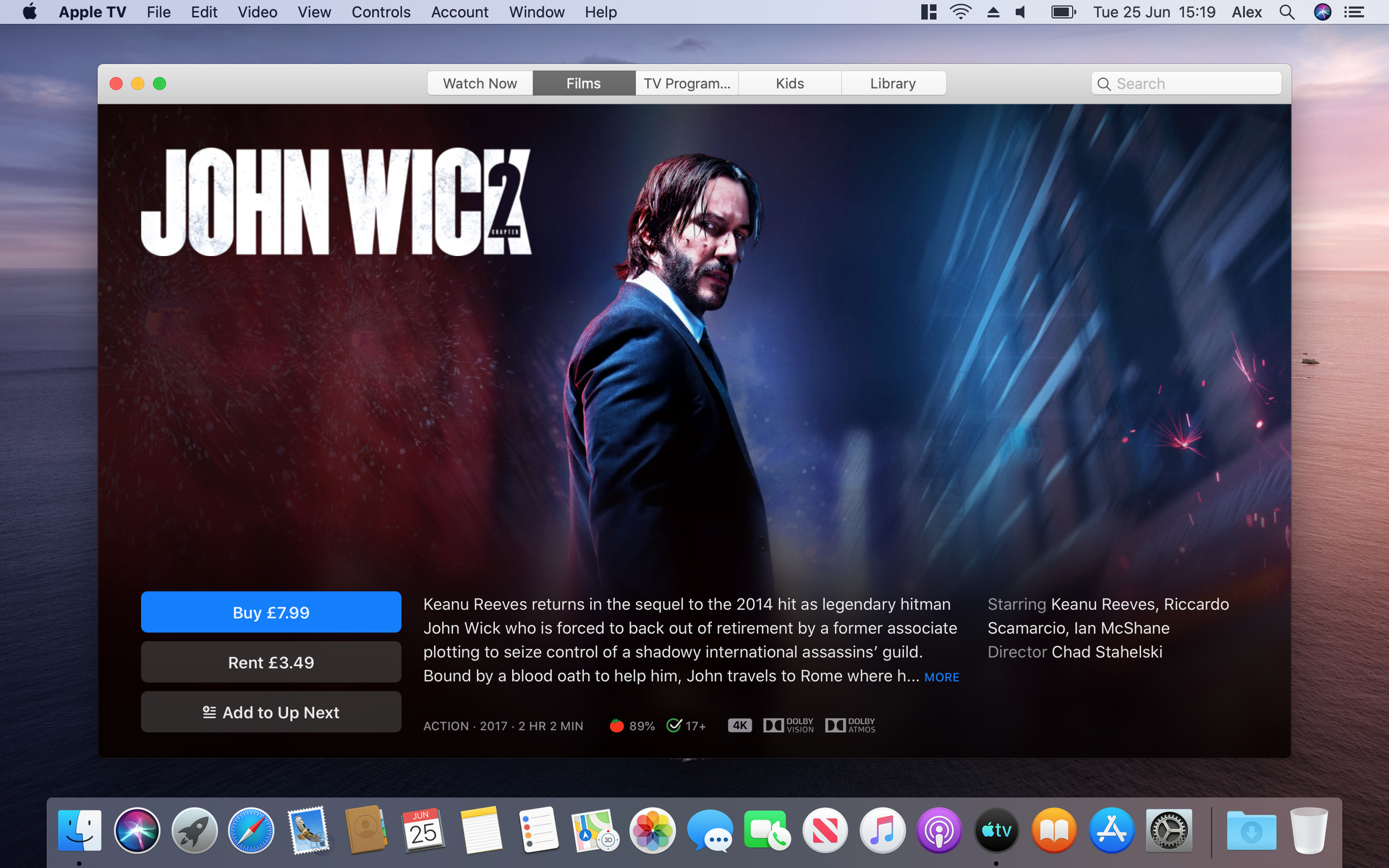
While Podcasts is basic, the Apple TV app feels positively half-baked.
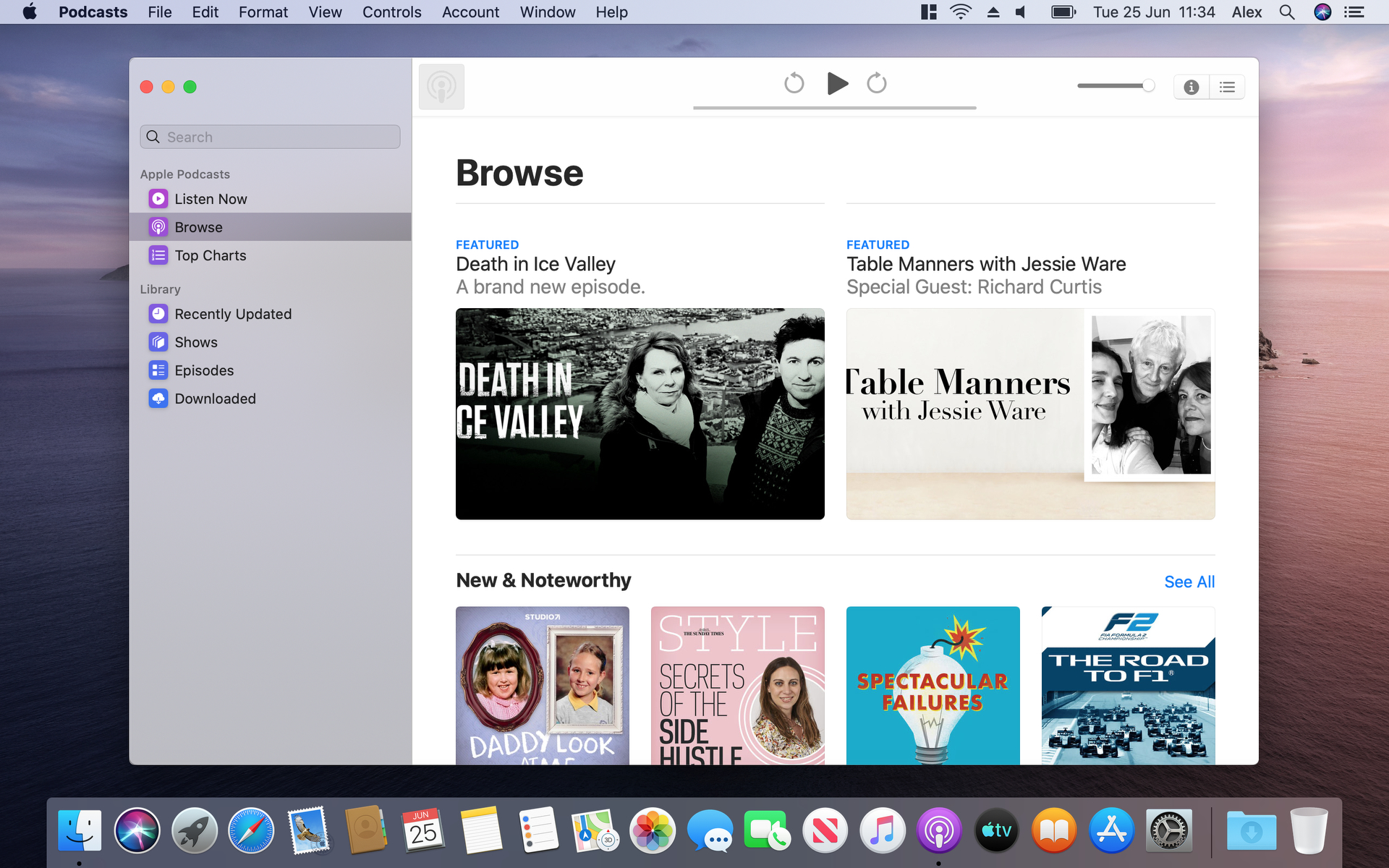
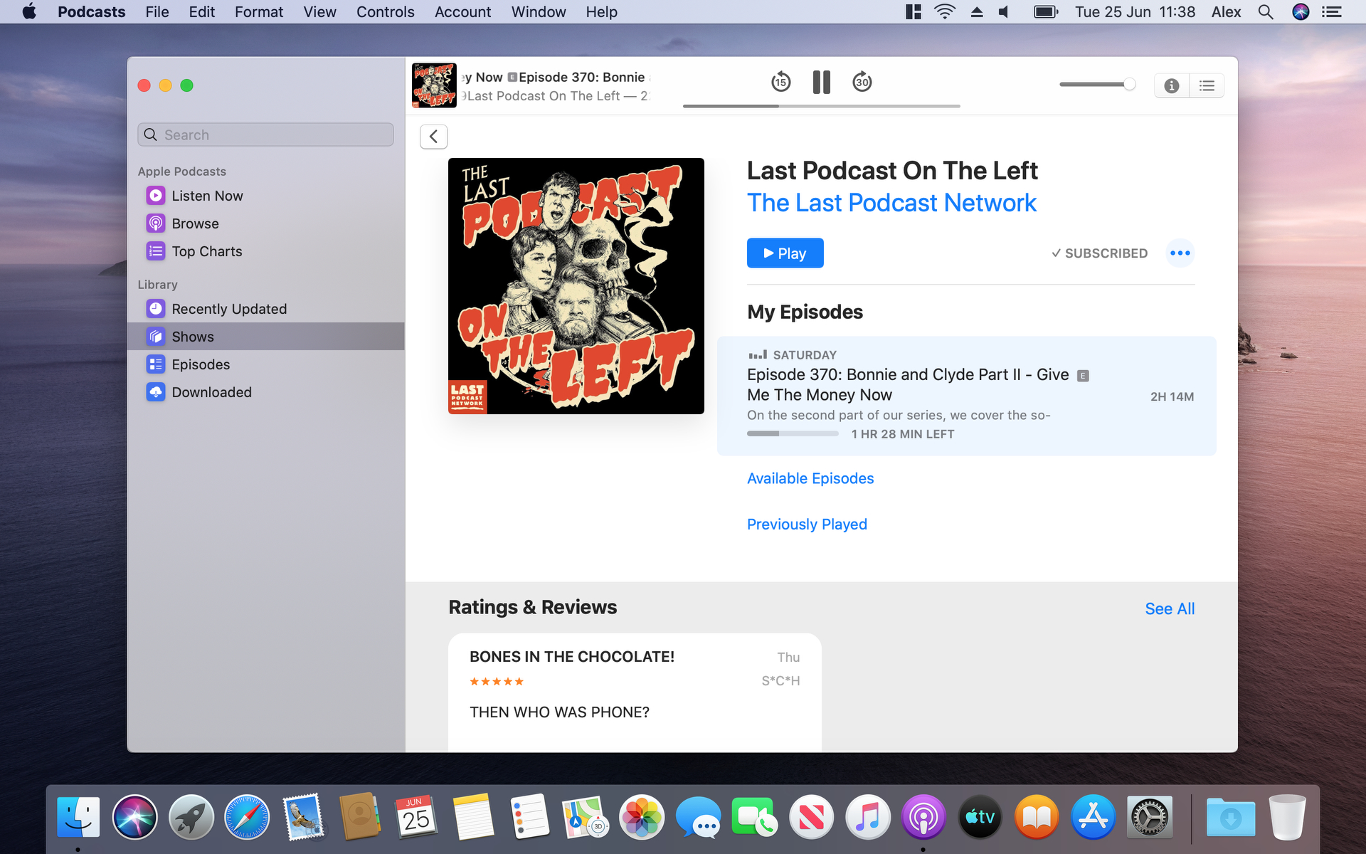
The problem with Apple’s podcasts apps — be that iTunes on Mac or Podcasts on iOS — is that they’ve always been fairly basic podcast players, lacking the advanced playback features of Overcast or episode management flair of Castro.
The new Podcasts app doesn’t really address that problem. As a podcast player it’s acceptable but still somewhat basic. You can add shows to a custom “Station,” but this will add all episodes; you can’t create a playlist of only your favorite episodes, for example. The saving grace is the app’s machine learning-powered search function, which indexes the spoken content of episodes to help you find what you want. It’s a little hit-and-miss, but often helps us find episodes when we don’t know the name of the show.
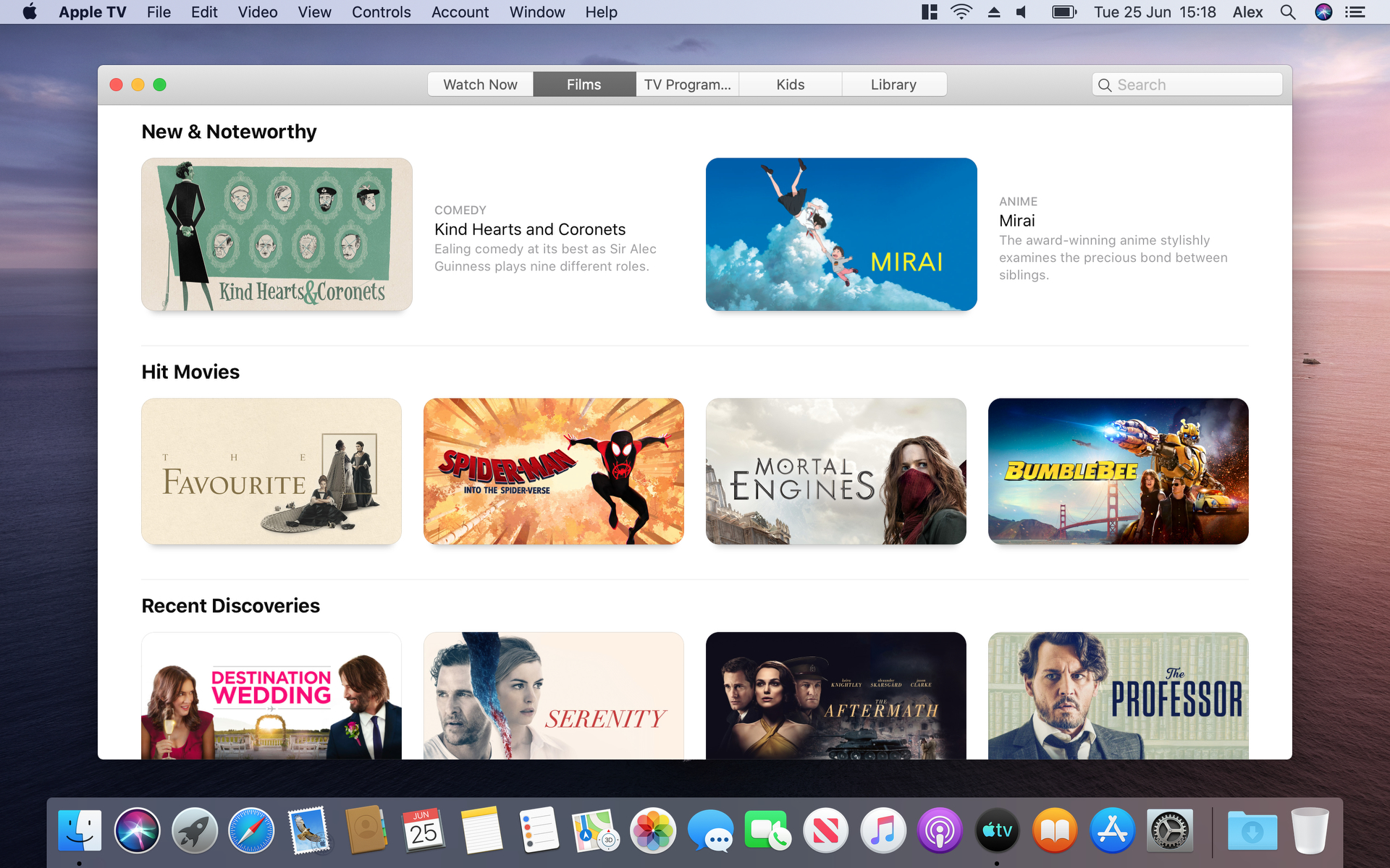
While Podcasts is basic, the Apple TV app feels positively half-baked. While Apple has cleaned up some of the design flubs we saw during the beta, the app still has its issues. It really feels a world away from Apple’s famous design prowess.
The app is organized by tabs at the top, which instantly breaks with the design principles of the Music and Podcasts apps, which both use a sidebar. The main screen of the TV app, meanwhile, is mostly filled with buttons for shows and movies and almost completely devoid of text explaining what each of these shows are even about. If you want to browse genres, you have to scroll all the way to the bottom of each section.
It’s meant to directly emulate the feel of using the app on an Apple TV, but that doesn’t make for a great desktop experience.
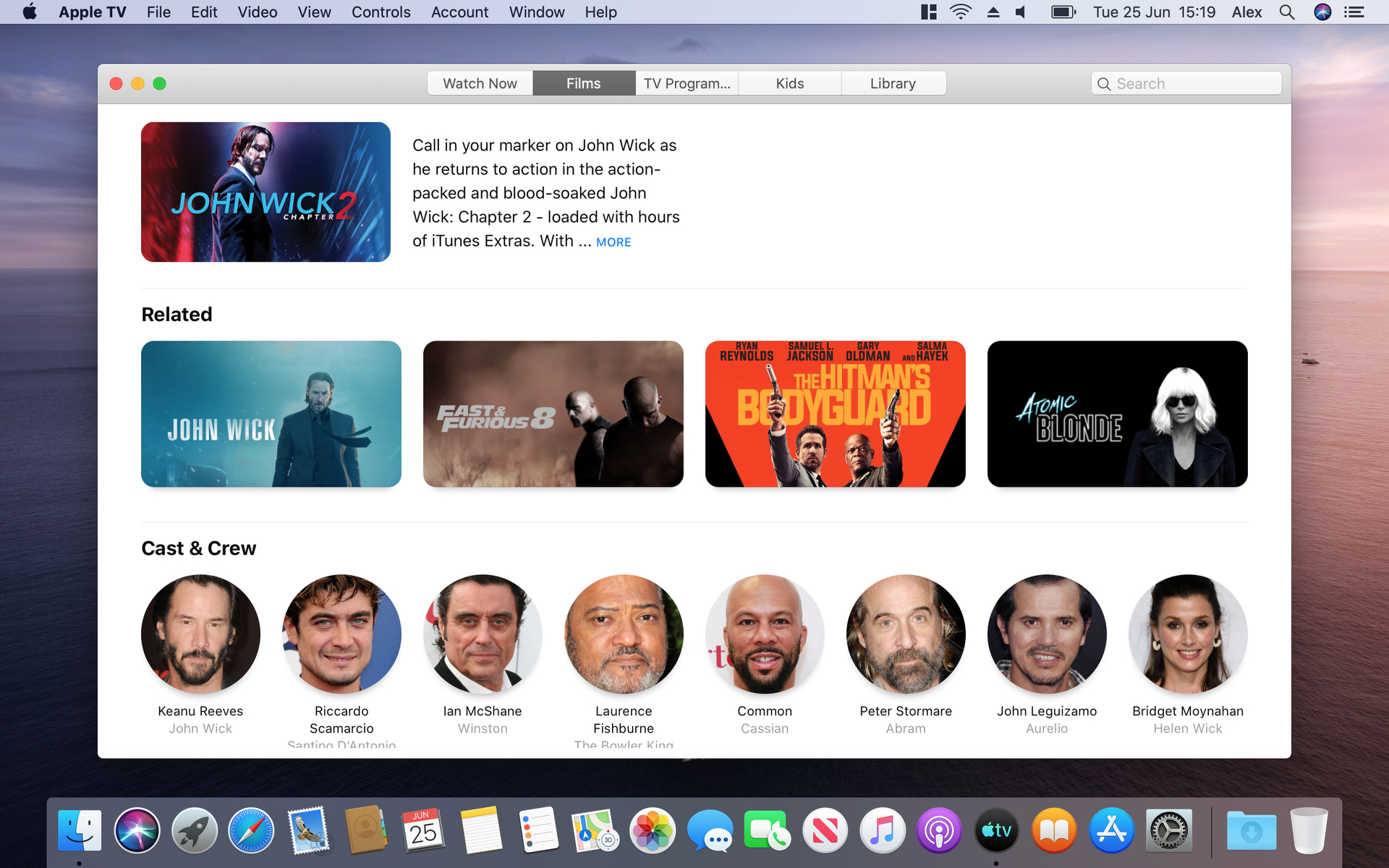
The pages for individual shows and films are much better, with large banners, blurbs and episode lists. The cast for each show is listed, allowing you to see what else they’ve appeared in. Its one of the few areas of the app that feels well thought out. But these niceties don’t take away from the mess that is the main portion of the app.
It’s meant to directly emulate the feel of using the app on an Apple TV, but as it turns out, that doesn’t make for a great desktop experience. It feels very unfinished, like it was the app Apple devoted the least time to.
Sidecar is as close to a touchscreen Mac we’ll ever get
Sidecar is a new feature that lets you control a Mac using a connected iPad. This is especially promising if you have an Apple Pencil, as you will be able to draw on or mark up Mac documents using your iPad.

It can also be configured to have the iPad work as a second display — this could be used to house a second app that you reference while you work on your Mac, for example.
Connecting the two devices was a breeze, and you can do it either wirelessly or wired. The wireless option is set up through AirPlay or a specific settings menu in System Preferences. There are a few more requirements, such as making sure both devices are using the same iCloud account and are both supported devices. For example, MacBook Pros before 2016 won’t support the feature.
Sidecar is a huge win for the Apple ecosystem.
Once you do have the two devices paired, you can easily drag windows right over to the iPad screen, use it for your toolbars and controls, or whatever else you like to do with extra screen real estate. There’s also a sidebar that gives you quick access to the Command, Control and Shift keys right on the iPad — and even the Touch Bar controls along the bottom if you so desire. Drawing and writing on the iPad directly into MacOS feels just as smooth as it would on the iPad itself, and being able to do that in full native desktop applications is awesome. It’s easy to set up and a huge win for the Apple ecosystem.
Using an iPad as a second screen for your Mac has been made possible by third-party apps for a few years now, but with Sidecar, it’s baked right into the operating system itself. While we’re sure the developers of these apps won’t be too happy at being Sherlocked, it’s a boon to people who just happen to own both a Mac and an iPad.
Screen Time comes to the Mac
Apple originally debuted its Screen Time feature on iOS, where it’s used to measure how long you’re using your phone each day, which apps you spend the most time in, as well as allowing you to set app restrictions and schedule downtime.

That functionality has now made it across to MacOS. Screen Time lives in System Preferences, and the first thing you’ll see is a breakdown of how much you’ve used your Mac today and which apps you’ve spent the most time in. You can go back to see how today compares to your usage on previous days, too.
The sidebar contains a number of sections, including Notifications and Pickups. The former shows you how many times you’ve received desktop notifications and from which apps. The Pickups section is used to show how many times you’ve woken your Mac and quickly used an app afterwards, with the apps in question being listed in a pane.
The old Reminders app was far too basic, but now you get features that have been standard in rival apps for a long time.
Further down the sidebar are Downtime and Always Allowed, which are all about encouraging you to take a break from your Mac. In Downtime, you can schedule a period of time wherein only allowed apps (those specified in the Always Allowed section) and phone calls are permitted on your Mac (you can also limit calls in the Communication section). As well as that, if you’ve connected other devices to Screen Time using your iCloud account, Downtime applies to them too.
The App Limits section, predictably, lets you set limits on how long you can use certain apps each day. You can put limits on individual apps or entire categories, such as games, social networking or entertainment. Each app or category can be limited to the same time every day, or you can specify different schedules for different days.

Finally, the Content & Privacy section allows you to put limits on certain types of content, such as adult websites. It lets you block specific Apple apps such as News or Safari, and you can prevent users from making purchases, changing passwords or even altering the Mac’s volume.
We got a really good impression from Screen Time. It’s clear and simple to use, but there’s plenty of power under the hood, with plenty of options for you to make use of. It’s not a nanny, constantly nagging you to do this or that, but rather is intended as a tool that makes clear your usage habits and gives you options should you want to alter them.
Notes, Reminders & Photos get some polish
Several core Apple apps have been updated in Catalina, with the extent of the updates varying by app. Notes, for example, got a minor bump with a new gallery view that shows your notes as thumbnails rather than a list. It also now supports shared folders.
In Photos, meanwhile, there’s a new way to browse your photos. It’s based on a grid layout, with certain pictures displaying large and prominently on the screen. Apple lets you view your photos by day, month or year, with highlights automatically selected by the app. This is contextual, too — if you’re at an event that you attend every year, for instance, the Years tab will show you highlights from previous times you attended the event.
The Reminders redesign is a significant improvement over its lackluster predecessor.
Meanwhile, Reminders has been completely redesigned to bring it up to date. The old Reminders app was far too basic, but now you get features that have been standard in rival apps for a long time. For example, Reminders now understands snippets; you can type “Meet Jack tomorrow at 3pm,” and it’ll suggest setting the reminder’s time to 3pm the next day.
Unfortunately, this is a little uneven. Time snippets aren’t automatically added — you have to stop typing and click them, breaking your flow. Likewise, there’s a box where you can add a location, but it would be nice if Reminders recognized locations as you typed them. Still, the Reminders redesign is a significant improvement over its lackluster predecessor.
Lastly, Apple’s new Find My app merges Find My iPhone and Find My Friends into one place. There’s a sidebar on the left with tabs for People and Devices, and you can share your location to help people find you, too.
Helpfully, Find My can enable you to find a device even if it’s asleep. That’s because an offline, sleeping device will send out a secure Bluetooth beacon that can be detected by other people’s nearby Apple devices. These devices can relay your own device’s location back to your network, allowing Find My to pinpoint where it is.
This Bluetooth signal is end-to-end encrypted and anonymous, plus it only sends tiny amounts of data so there’s no impact on your battery life.
Ride or die for the Mac
We don’t head into annual MacOS updates with expectations for a lot of new functionality. Most of the software focus is on iOS, and there was very little in the way of new ways to interact with your Mac. We’re happy to see apps like Find My and Reminders stay up to speed with iOS 13, though, and there are plenty of small updates across the board that Mac enthusiasts will appreciate.
Sidecar, on the other hand, feels substantial. It’s a new way of using your Apple devices in tandem, and it’s something we’ve been asking for for a long time now. All of a sudden, those $330 iPads have some secondary functionality that a lot of people might like to have.
A lot of the future success of MacOS rides on Project Catalyst, and Apple’s ability to deliver on the promise of iPad apps for the Mac. Our first impressions of the first-party apps have not been the most positive, so hopefully Apple has improvements up its sleeve as the platform matures. It could end up being a significant turning point for the Mac, but Apple has its work cut out to make sure it’s not for the worse.
