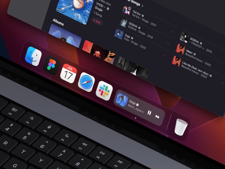
What if your macOS dock behaved more fluidly, dynamically morphing to show background processes such as download progress, media controls, text messages, and so on?
The following concepts demonstrate “what if” macOS and iOS Live Activities got together and had a child, and they have certainly got my imagination going.

UI designer and engineer Janum Trivedi recently dropped his take on a macOS dock that contained icons that could be “expanded automatically for temporal reasons”.
What if the macOS dock and its icons were more dynamic and fluid?
Made a little demo that shows message previews, live music, download progress, and more.
Pretty happy with how this turned out! pic.twitter.com/YpzrWU5klA
— Janum Trivedi (@jmtrivedi) May 2, 2023
The animation shows text messages when hovered over, while music or browser downloads only require a click to access.
Not to be outdone, another concept by Andrew Sereda uses widget stacks, allowing users to scroll through each interaction. Instead of dynamic icons, Sereda pulls stacked widgets from iOS and places them into the dock.
Will we see a dynamic dock soon?
Concept: https://t.co/GuLeuddTdx pic.twitter.com/SId16fcgs7
— Andreas Storm (@avstorm) February 10, 2023
We dig both of these ideas in that it takes what we love about iOS’ powerful Dynamic Island and brings it to the desktop. As it is, iPhone users (via a new feature called Live Activities) are able to dynamically interact with things like media playback or live ride-share/game updates directly on the Always-On Display or Dynamic Island.
Trivedi and Sereda’s concepts both basically imagine macOS leveraging Live Activities data.

All said, even though these are merely concepts, it’d be interesting to see such tools built into macOS at some point.
What do you think? Do you prefer a static or dynamic dock? Looking through some of the replies on Twitter, there’s a mix of feedback, with some loving the idea and some bemoaning how messy people’s docks are.
Still, I think there’s some real potential here. I even think that similar information and interactions could be incorporated into a reimagined Touch Bar. Apple killed off the Touch Bar due to its limited abilities, but what if the company treated it like a desktop Dynamic Island? I’d love to see Apple take the best of these concepts and do something specifically for the Mac that would bring more interactivity to more static elements.


