Will they be able to please both average consumers and power users? Let’s have a look at the new Settings app and see where it’s headed.
Is the Control Panel being replaced by the Settings app?
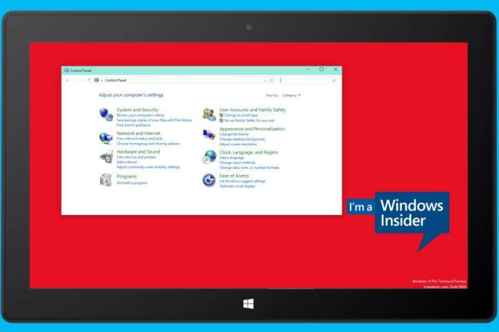
The Control Panel first appeared in Windows 2.0. The utility hosts a collection of applets for controlling system settings. In Windows 8, Microsoft introduced PC Settings, a modern, touch optimized app that contained many of the same features, but referred back to the Control Panel for more advanced settings.
The latest build of the Windows 10 Technical Preview features an overhauled Settings app that attempts to completely replace Control Panel by bringing more advanced settings into the fold. Starting with the January build, more important features have been moved from the Control Panel to the Settings app, most notably Windows Update. Microsoft has said it won’t entirely kill the Control Panel, but it may soon join the Run menu and the Command Line as relics used only by the most advanced users.
Retiring the Control Panel makes sense
Windows has to update its user interface to make key features more accessible.
Due to its origins in the 1980s, when touch was never used, the Control Panel is difficult to navigate on touch devices. Meanwhile, hardware has changed significantly and novel features are seeking a home in the aged Control Panel interface. Moreover, Windows 10 (like Windows 8 before it) hopes to be the first cross-platform operating system. In other words, it has to work equally well on desktop computers and touch first devices.
Consequently, Windows has to update its user interface to integrate new options and make key system features more accessible. Following the introduction of tiles and modern apps, the redesigned Settings app is another move to make Windows easy to use on smaller touch devices. The trouble starts when advanced settings are sacrificed in favor of touch-based operation, which is what we’re seeing for several controls in the Settings app.
The Settings app is more intuitive
Visually, the Settings app, best launched with the keyboard shortcut Windows Key + I , is an improvement over the Control Panel. The design is clear and the available information less overwhelming. That’s partially due to the fact that less options are available from the overview screen. In the Control Panel, every line of text is a link to the respective feature, while the Settings app dashboard is essentially a set of tiles. You’re also confined to the category view and cannot switch to a list of features.

The smooth visual experience continues when you open applets. The Settings app features a clean list of options and uncluttered settings windows with lots of white space and big buttons. The Control Panel, by comparison, is cluttered. Once you dig deeper, you’ll unearth its complexity with nested dialogs and settings only available via separate windows.
Some Windows features can be accessed only via the Settings app
The Settings app doesn’t just duplicate the Control Panel. It presents settings in a more intuitive way and integrates features that are new to the desktop. What we see is the marriage of Windows desktop and Windows Phone; very few features are novel, most have been available on Microsoft’s mobile platform. The most interesting mobile to desktop transfers are located under System settings. Here are a few highlights.
Cortana, Microsoft’s much raved about voice-controlled digital assistant, has a home in the Settings app. At present, however, her settings have been externalized to the Taskbar search window, which comes up when you click the search icon next to the Start button. You can also open the window by clicking the Customize Cortana & search settings option under System.

Battery Saver lets you track and improve battery life. Click Battery usage to see what’s consuming most of the energy. When you enable the Battery Saver feature, Windows limits background activity. This will extend your battery life, but the effect will probably be negligible.
Maps lets you download free offline maps. Eventually, you’ll be able to use your Windows 10 device as a navigation tool. Maps should also tie in with Cortana and location sensing, to offer location-based settings and features.
Are Windows settings being dumbed down in favor of touch accessibility?
As you go through the different features of the Settings app, you’ll quickly notice that some controls are not what they used to be. For example > System > Power options is painfully basic, lacking a host of advanced features that were available via the Control Panel. In the current build, you can search the app for power options and the results will still bring you to the original Control Panel applet. It works, but it reminds us of the wonky design found in Windows 8.

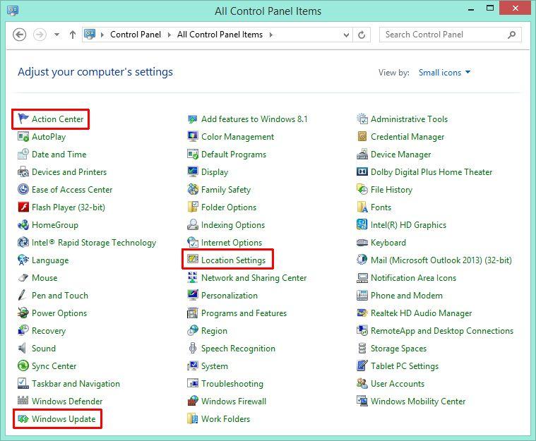
Right now, three applets in the Control Panel have changed compared to Windows 8. The Action Center was simply renamed to Security and Maintenance . Meanwhile, Location Settings and Windows Update have disappeared from the Control Panel.
Location Settings can be found in the Settings app under > Privacy > Location. You’ll find that compared to the Windows 8 Control Panel applet, this is an upgrade. You can toggle the location platform, clear your location history, and control which apps may use your location. Some of these options can also be found in the Windows 8.1 PC Settings app.

Moving this key Windows feature to the Settings app would be fine, if the app allowed the same level of control, but it doesn’t. What’s uncool is that you’re no longer able to prevent updates from being installed, automatically. This may be an attempt to increase security for all Windows devices, but it’s also disarming users in case things go wrong and a buggy update causes serious issues. Fortunately, it’s still possible to uninstall updates via the Control Panel. Just go to > Programs and Features > View installed updates .
A registry tweak re-enables Windows Update in the Control Panel
Meanwhile, if you’d like to be in charge of what gets installed again, head to the registry. Press Windows + R to launch the Run menu, then type regedit and hit Enter to launch the Registry Editor. Navigate to HKEY_Local_Machine > Software > Microsoft > Windows Update > UX and change the REG_DWORD value of IsConvergedUpdateStackEnabled from 1 to 0.
Microsoft warns that this tweak could cause problems because it has not been validated or supported. You might even be excluded from updates and new Technical Preview builds. If you do choose to bring back this Control Panel applet anyhow, be sure to keep an eye on any pending updates, as well as news about new build releases.
The Settings app is a work in progress
This all comes back to the fact that what we see in the Technical Preview isn’t the final product; it’s an alpha version. Eventually, the app could unite many features that were fragmented in Windows 7 and 8, as well as all the advanced settings, which power users are currently missing. Overall, the user experience could be much improved.
Overall, the Settings app’s user experience could be much improved.
What we’re seeing right now is a buggy transition phase. Sometimes, when you search the Settings app for an option it doesn’t contain and click a result, it opens an empty Charms bar or just sends you back to its dashboard. If you’re lucky, it launches the Control Panel applet you were looking for. The app is a far way from offering a smooth user experience.
Meanwhile, it’s hard to imagine that the Settings app will eventually incorporate all features of the Control Panel. Microsoft won’t be able to retire the Control Panel for legacy reasons. Despite improvements to the interface, it appears the old-fashioned Control Panel will remain in charge for the foreseeable future.


