- Beautiful design
- Simple, intuitive hinge
- The best PC touchscreen, ever
- Respectable performance, for an all-in-one
- Solid bundled peripherals
- Extremely slow hard drive
- Last-generation graphics hardware
- Dial is a $100 add-on, of questionable use
Update June 6, 2017: We made note of the Surface Laptop, updated the section on the Surface Dial, updated Warranty information to mention new extended options for the Surface Studio, and added mention of upcoming Dell Canvas in “Is there a better alternative?”
No one knew what to make of Surface Pro when Microsoft launched the Surface line four years ago. It was an unprecedented move, and one that lacked an obvious end. The Surface Pro seemed built to nudge the design of Windows 2-in-1s in the right direction, but what came next? Would Surface really become part of Microsoft’s brand? The answer, surprisingly, was yes. Instead of treating Surface as a side project, Microsoft went all-in, debuting three Surface Pro updates and multiple new models, like the Surface Book, Surface Laptop, and now the Surface Studio.
Frankly, the Studio is a system that’s of no consequence to most PC owners. While the Surface Pro and Book move 2-in-1 design forward in a way that’s applicable to everyone, and the Laptop provides a unique take on education devices, the Studio’s intent is focused. It’s not even for professionals, as a group, but is instead for creative professionals – artists, designers, animators, photographer, video editors, and so on.
That makes the Studio a niche. It’s not for everyone – if the design didn’t tell you that, the base price of $3,000, and as-tested price of $4,200, should make that clear.
But let’s be honest: You’ll end up wanting it anyway.
Would you look at that?
Apple has enjoyed a stranglehold on high-end, all-in-one desktop design for years, maybe decades. Until now. The Surface Studio shrieks premium from the moment it’s taken out of the box, in a way even the Surface Pro and Book have never achieved.
The display, and its hinge, have a lot to do with this. Aside from its technical excellence, which we’ll address later, the massive 28-inch PixelSense touchscreen cuts an impressive profile. The 3:2 form factor means it’s closer to a square than most large displays, and strikes a nostalgic cord. This is how computer displays used to look before they all decided to emulate HDTVs, a move that not everyone thinks was beneficial. The screen also has slim bezels, and a very thin profile, both of which make the Studio look thoroughly modern.
Behind the screen is Microsoft’s geeky “zero-gravity” hinge, a feature that the company seemed proud of at the unveiling keynote. While a hinge may not seem exciting, it’s rather important here, because the Studio’s touchscreen is meant to be used at a variety of angles. It might be left upright for typical desktop use, set at an angle for standing use, or leaned at a steep tilt for use as a virtual drafting table.
Design: Art Director’s take
The Studio screen tilts but doesn’t come close to lying flat. At first, that felt odd. But our Art Director told us it’s for the best, saying “the degree of tilt works, because you can’t really work with a flat table.” He also praised the hinge, saying it stayed in place while he used it, and felt as natural as a drafting table.
The hinge makes this possible by allowing movement with just one finger while also providing enough resistance to keep the screen in place when a user is writing. And it does exactly that. The entire screen can be moved from its steepest incline to bolt-straight with a fingertip, and back again. Yet it’s also stiff enough to keep in place while touching, or even drawing on, the screen.
Move below the hinge, to the computer itself, and…there’s not much to say. Everything inhabits a small, elegant, non-descript base that’s about 10 inches wide, 9 inches deep, and a bit more than an inch tall. It’s subtle. Which is perhaps for the best, as it keeps attention focused on the Studio’s sweet, sweet pixels.
Plenty of USB, and an SDcard too
Though the base is small, it has room for four USB 3.0 ports, an Ethernet jack, a Mini-DisplayPort connection, a headphone jack, and a full-sized SDcard reader. The lack of USB Type-C support feels a bit old-fashioned, as it does on the recently updated Surface Book with Performance Base, but it’s good to see a card reader and plenty of USB ports available.
Wireless connectivity is the usual combination of 802.11ac with Bluetooth 4.0, but there is a bonus. The Studio has Xbox Wireless built in. While the Studio is not designed to be a gaming system, this will help if you want to sit back with an Xbox One controller and play a game, or connect to your Xbox One console.
The best display we’ve seen yet
The Studio comes with a unique 28-inch PixelSense display with a resolution of 4,500 × 3,000. That works out to about 13.5 million pixels, which isn’t as many as Apple’s iMac with Retina, but quite a bit more than a 4K display, which has 8.2 million pixels. The Studio packs 193 pixels into every inch, while the Apple iMac with Retina crams in 220 pixels per inch.
Display: Art Director’s take
Our Art Director was in love with the display, saying he found it “incredibly clear, the best Windows display I’ve seen.” The high pixel density, combined with excellent color accuracy, makes the Studio eligible for color-critical work right out of the box.
Frankly, it’s hard to see a difference in clarity. Fine text and detailed images can look aliased on close inspection, while they’ll look perfectly smooth on the Retina display. But you must be searching with a skeptical eye to notice.
There’s more to a display than pixel density, of course. And that’s where the Studio shines. Our testing recorded a maximum contrast ratio of 1,010:1, which is excellent for a monitor. Dell’s Ultrasharp P2715K monitor, with 5,120 × 2,880 resolution, had a contrast ratio of 620:1. Samsung’s U32D970Q, a favorite of ours, had a contrast ratio of just 460:1. Even Dell’s new 8K monitor, the UP3218K, has a contrast ratio of just 650:1.
Microsoft hasn’t pulled any tricks to accomplish this. The display’s maximum brightness of 464 lux is higher than average, but its black levels are deep and inky, which gives images a realistic sense of depth.
Color is great, too. The Studio hit 100 percent of sRGB, and 91 percent of AdobeRGB, while delivering a default color accuracy reading of 0.97. An error of less than 1 is generally unnoticeable to the human eye, so that’s impressive, even if it doesn’t quite beat the most accurate monitors we’ve tested, such as Samsung’s U32D970Q, HP’s DreamColor Z32x, and Dell’s UP3218K. The accuracy is backed up by a gamma reading of 2.2, which is dead-on ideal.
And the Studio has a trick most monitors don’t. Users can switch between the sRGB and DCI-P3 color space with the tap of a button in the Windows 10 Action Center. We’d like to see even more color space options, but as it stands, it should prove a useful feature for Studio’s target audience.
On balance, when all the pros and cons are tallied, the Studio has the best computer display we’ve ever seen. Its contrast is the best you’ll find without an OLED display, something that’s only available on laptops for now, and color performance is excellent.
Everything adds up to an outstanding experience. Drawing on the Studio looks natural and lifelike, with bold yet realistic colors. And while this PC isn’t designed for movies or gaming, its provides amazing detail to both. Civilization VI looked like a painting come alive.
The speakers are there, just
Speakers are bundled into the Surface Studio. And as you might expect, they’re not great. They do the job you’d and can be quite loud at maximum volume. Yet a muddy quality predominates, and becomes worse as volume comes closer to maximum. Also, like every all-in-one sound system we’ve ever heard, stereo staging is a problem. There’s just not enough space between the speakers to generate convincing stereo sound.
Users who aren’t too discerning will be fine with what’s bundled here. Anyone who cares about audio quality will want headphones or external speakers.
The Studio’s quad-core is a mobile chip, but still pretty quick
The base Surface Studio comes with an Intel Core i5 processor and 8GB of RAM. Our review unit, the most powerful model, arrived with a Core i7-6820HQ processor and 16GB of RAM. The processor model might cause geeks to raise an eyebrow, since it’s from Intel’s mobile lineup, rather than its desktop stable.
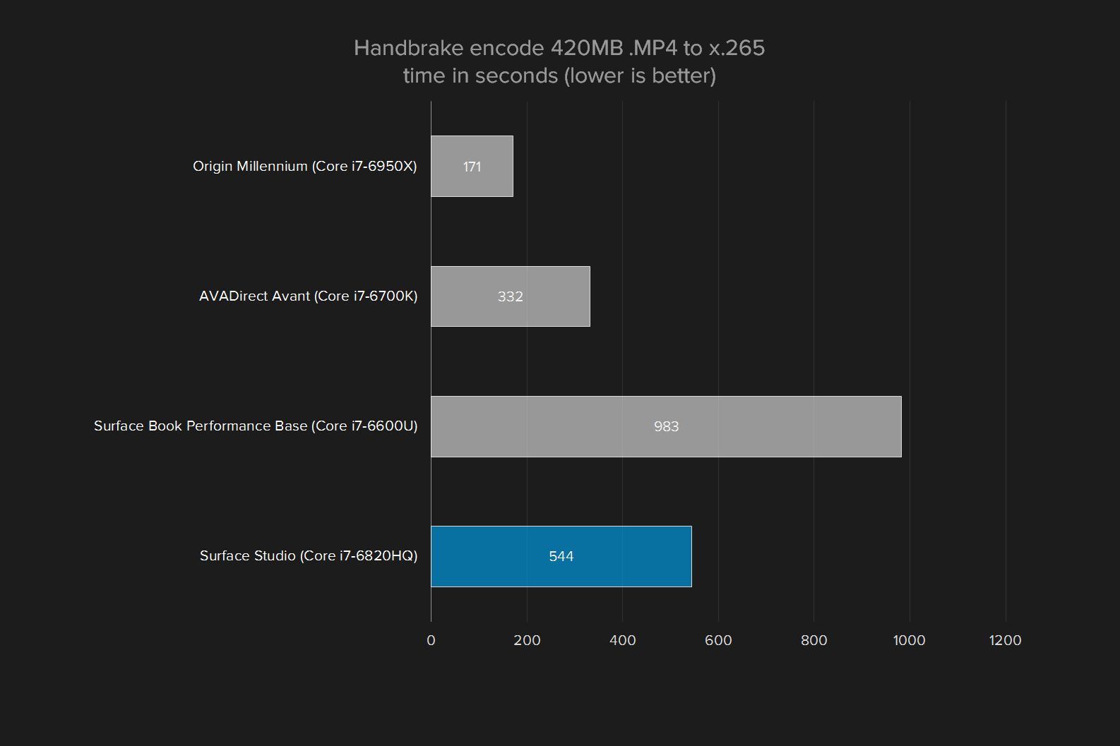
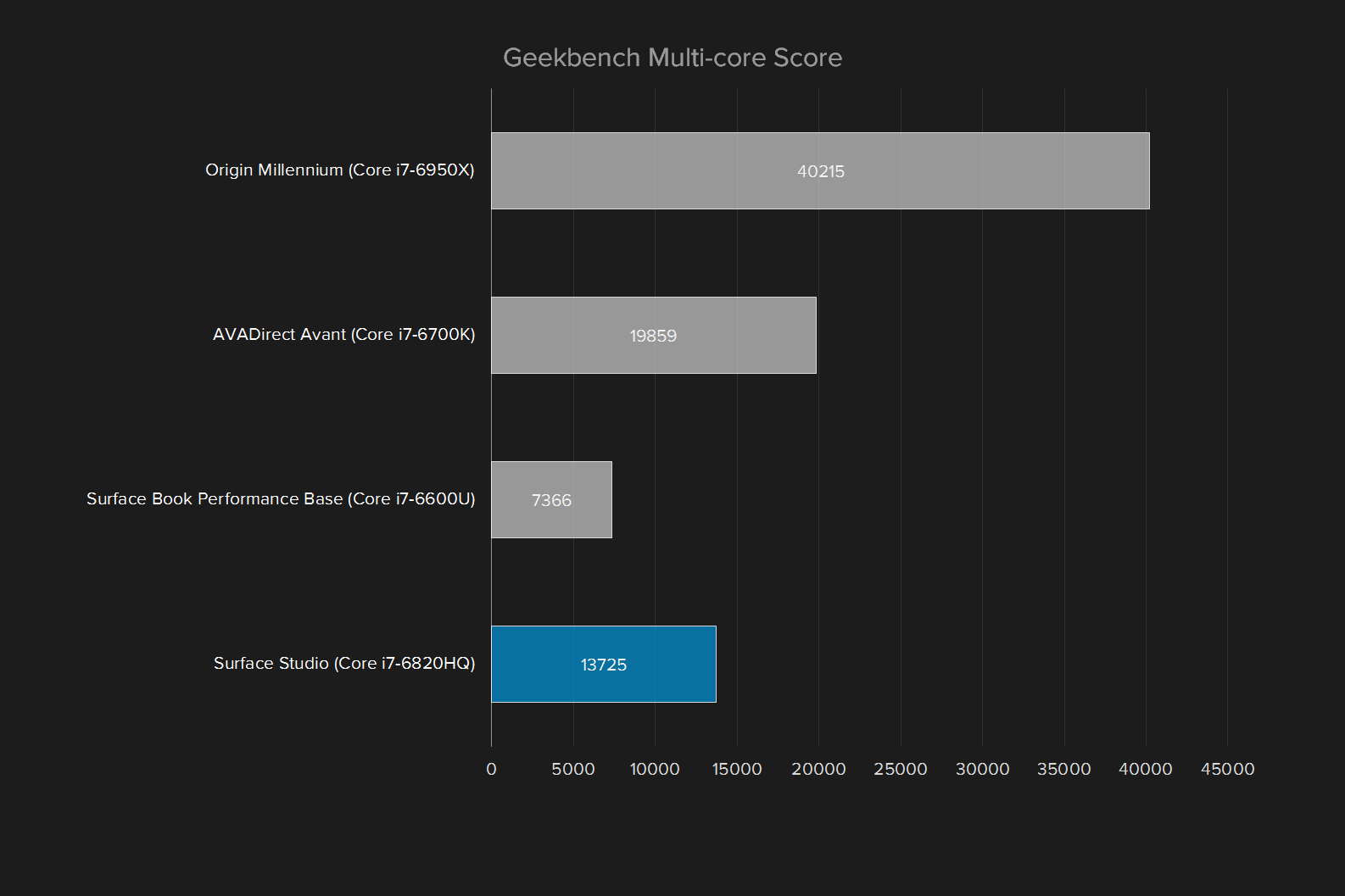
In our graph, we pit the Studio against a broad selection of possible alternatives ranging from the Surface Book, which might be used as a highly portable workstation, to Origin’s ridiculous Millennium with 10-core Intel processor, which is the bleeding edge of modern hardware.
Performance: Art Director’s take
Day-to-day use seems to be the Studio’s forte. Our Art Director loved how it felt, saying “In Photoshop and Illustrator, it’s great. I like it better than systems I’ve used in the past.” He did note a weak spot in graphics power, though, saying “it’s in a weird spot in GPU performance, because it doesn’t quite fulfill high-end needs, but is also faster than what most users need.”
As you can see in the results, the Surface Studio came in at the lesser end of this spectrum. In Handbrake, for instance, it cranked through encoding a four minute, 20-second long 4K trailer in just over nine minutes. That’s not bad, and way quicker than the Surface Book. But it’s also a few minutes longer than the AVADirect Avant, a system we tested with a Core i7-6700K processor.
What about Apple’s iMac with Retina? We did not review the 2015 refresh, but Geekbench 3 scores of that model are widely available. The base model, which has a Core i5-6500 processor, can reach a single-core score of around 4,000, and a multi-core score about 12,000. These numbers suggest that even the base level iMac with Retina can keep pace with our tricked-out Studio review unit. Apple has a slight edge.
What should you make of this? Well, it depends on what you plan to do with your system. The Studio’s performance will prove adequate for any photo editing, digital art, or document work, but it might feel lackluster if you’re doing a lot of video editing. This all-in-one is built for work, but it’s not a top-tier workstation.
A cutting-edge device with last year’s hard drive
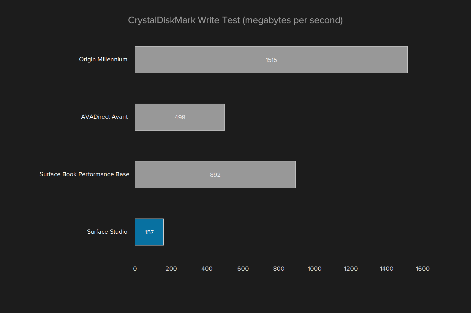
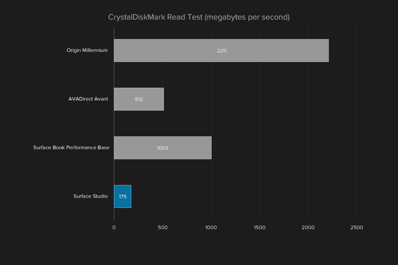
Our performance critique continues – and becomes more severe – with the hard drive. All Surface Studio models come with a hybrid drive which combines a mechanical disk (2TB, in our review unit) with a solid-state cache. The cache dynamically decides which data to store based on how the system is used. In theory, that makes the system as responsive as an SSD, without sacrificing storage capacity.
Ouch. As you can see, the hybrid drive just can’t keep up with solid state drives. The Origin Millennium was ten times quicker in read speeds. Even the Avant, which had a humble (by modern standards) SATA-connected SSD, was several times quicker than the Surface Studio. We can see this being an area of definite concern for certain users, as the drive’s modest performance could put a crimp on certain workloads. Video editing again seems a prime suspect, as 4K editing can task a drive’s write speeds.
To its credit, the hybrid drive usually did its job. Most apps loaded so quickly that passersby thought the Studio in fact had an SSD, and a fast one, at that. But our design team saw the bad side of it, and noted that some applications, like Adobe Premiere and After Effects, took a long time to load. That could become an annoyance if your work requires frequent use of numerous programs.
The elder GTX 980M performs
While the base Surface Studio comes with Nvidia GTX 965M graphics, our review unit had the upgrade to GTX 980M graphics. We panned the Studio at its reveal for the use of GTX 980M graphics, which are a generation behind the GTX 1080.
For reference, the AVA Direct Avant in the graph above had a GTX 980 Ti desktop video card. The Surface Book Performance Base, on the other hand, was equipped with the same GTX 965M found in the base model Studio.

Gamers will scoff at the Studio’s 3DMark score of 7,985, which is barely better than the new GTX 1050 Ti, a $140 add-in graphics card any desktop can fit. On the other hand, there are few comparable all-in-ones, with the exclusion of a few gaming-oriented systems like the Origin Omni. And Digital Storm Aura.
The next-quickest competitor is Apple’s iMac with Retina, but the Radeon chip it uses is quite old, and in past tests its Fire Strike score hovered around 6,100. The GTX 980M, elder though it may be, is impressive hardware in this category.
Dialing it in
Desktops rarely ship with interesting peripherals, but the Studio is obviously an exception. It made waves not only because of its huge, beautiful touchscreen but also because of the Dial, which promises a new form of tactile input that works alongside touch or Pen input.
The Dial looks and feels like you’d expect. Its closest analog is the knob on old stereos, or most modern receivers. It’s chunky and, thanks to haptic feedback, can provide a degree of discrete “click-click-click” feel as you rotate it or tap it.
While it can be used anywhere within Bluetooth range of the Studio, its standout feature is how it work when placed physically on the screen. A radial menu appears around the dial, providing access to custom functions. In a paint app, for example, it can offer an easy way to shift through a color palette. With an audio or video editor, it can be used to warp back and forth on the editing timeline.
Dial: Art Director’s take
Our Art Director didn’t share Microsoft’s enthusiasm about the dial. He said “it’s cool, but seems kind of like a novelty,” because of minimal app support. The Dial also, at times, became a distraction. “In a way, the dial feels like it takes you away from the screen,” concluding that he’d “probably set it to the side, most of the time.”
You might be thinking – doesn’t a scroll wheel already do this? Yes, to a degree. But the Dial is designed to work with the Pen. A designer sketching out a new project won’t have easy access to the mouse, or the scroll wheel, but the Dial can be placed in reach.
And it offers customization. Developers can adapt their program to it, making useful tools accessible. Or, if the Dial is used in Windows or outside a supported app, it summons a variety of options ranging from volume, to screen brightness, to apps. These functions can be changed however you desire in Dial’s settings.
The Dial sounds great on paper, and is fun to use at first. Yet we quickly discarded it. App support is limited, and there’s no point to it unless you plan to use a supported app frequently. Add-in the $100 price tag, and the Dial starts to look like an innovative but unnecessary doohicky.
What else is in the box?
While the Dial is an add-on, the Studio does come with a keyboard, mouse, and Surface Pen.
Then Pen is the same as found with the Surface Pro and Book. We’re familiar with it, and have come to like its design. Some DT staffers find it a bit too chunky, but most have no complaint, or have more severe complaints about other stylus options. It feels responsive when paired with the Studio, and it attaches magnetically to the flanks of the screen when it’s not being used.
The keyboard and mouse, while basic, do the job asked of them. Most people should find them comfortable to use. You’ll find few options on either of them, so you will need to pick up a third-party peripheral if, say, you need five buttons on your mouse. But the Studio isn’t really about mouse use, and we think most users will find the bundled option is adequate.
A standard warranty for an unusual desktop
Microsoft ships the Surface Studio with a one-year limited warranty. While this is normal for computers, the high price of the Studio underscores how inadequate this typical warranty can feel when purchasing an expensive system.
And it should be noted that some potential alternatives – such as an enterprise desktop from Dell, HP, or Lenovo, paired with a Wacom or other brand of large touchscreen device – can lead to better warranty terms.
Our take
Falling in love with the Studio is easy, and it happens at first glance. The beautiful display, elegant design, and featherweight hinge make for instant appeal.
But the Studio isn’t for everyone. It’s a specific type of PC, for specific users. Careful consideration is warranted before you lay down a few grand.
Is there a better alternative?
From a distance, the Surface Studio has many competitors. Most PC all-in-ones could be an alternative, and Apple’s iMac is an obvious point of comparison. Yet most of these more traditional systems aren’t a real alternative. Many, like the iMac, lack a touchscreen. Almost all lack stylus support.
Dell’s Canvas, teased at CES, is perhaps the Studio’s closest peer — but it’s not out yet. The rumormill suggests it will arrive this summer, but until then, the Studio remains unique.
Traditional all-in-ones are only half the competition, however. Another choice is a computer connected to a large Wacom or Yiynova device. A high-quality, 27-inch Wacom Cinteq with touch and stylus support will set you back at least $2,000 on its own, and that’s if you get a deal. Suddenly, the Studio doesn’t look so expensive.
How long will it last?
Hardware is one of the Studio’s pain points. The timing of its release forced Microsoft to use Intel Core processors that will soon be outdated, and the company also went with last-gen Nvidia hardware and a hybrid disk drive.
These slightly outdated components may limit the Studio’s appeal over the years. The hard drive will seem positively ancient in five years, and the graphics solution may quickly fall behind.
At least the screen is unlikely to get old. It’s way ahead of the curve in pixel count, color, and contrast. It won’t look outdated until OLED monitors are widespread, and that advancement has continued to sweep the PC world at a glacial pace.
Should you buy it?
Only if you’ll use it to its potential.
It’s tempting to see the Surface Studio as a fancy all-in-one, and to use that as justification to buy it. You could, and I’m sure you’d be happy. But this PC has a laser-like focus on creative professionals, and their needs. If your work or passion falls outside that realm, you’ll be better served elsewhere, and probably for less.
For its target audience, though, the Studio is a revolution. No major PC manufacturer has ever focused on the needs of creative professionals with the dedication Microsoft displays with the Studio. Until now, these users have made do with expensive add-on displays that, while certainly effective, lack any sense of elegance.
Everyone who tries the Studio is going to love it. But only artists, photographers, and designers need it.


