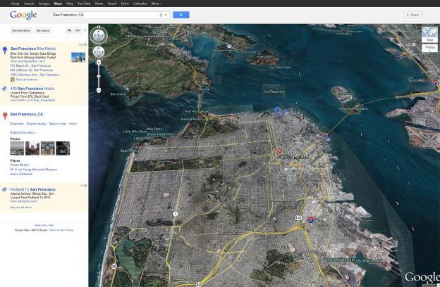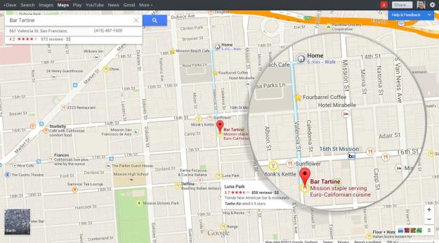

The all-encompassing world of Google Maps has always been remarkable. Today at Google I/O, we were blown away by the new version of Google Maps. Though we got a sneak peak of it this morning when the sign-up page was leaked, the new version of Google Maps is launching today by invite only for the desktop. During the keynote, the Maps team started by reminding us what Google Maps once looked like when it launched in 2005 (it was only a map of the U.S), and then showed off the brand new version of Maps, which includes more detailed directions, social network integration, and tons of 3D images. Oh, and real time clouds. Yes, Google now knows what the clouds are doing in real time!
First up, those ubiquitous red pins are no longer taking center stage. Smaller markers with the name of the businesses next to them will be joining the pins. Click on the name and you’ll see information, reviews on a new five-star scale, and the businesses Zagat review if applicable. Google has also made it so that you can filter search results by places your friends have reviewed (but only your super-cool Google+ friends). When you click on a business, related roads, such as the closest major intersection, and places are highlighted. Clicking on a random part of the map will bring up a card with information about that location.

The new Maps now has the ability to create personal landmarks to give you a better idea of where a new place is located. For example, you can mark a favorite restaurant as a landmark and search for places around there. Additionally, the landmark will appear in other searches and directions so that you have a reference point. Your searches within Maps, your favorited locations, and your published reviews are combined by Google to make more personalized recommendations. Think of it like the music app Pandora, but for restaurants instead of songs.
Directions from your designated home, or current location if you’re not home, are available as usual, but now they compare how long it would take to drive versus how long it would take on public transit. Speaking of public transit, Google now displays a full daily schedule for public transportation instead of just giving a couple of public transit times within directions.

The most visually impressive difference with the new Google Maps is 3D images. Maps now compiles images that have been uploaded to Google to create a full inside view of places. All of the images Google has for a place, including Street View and photo tours, are accessible through the carousel along the bottom of the screen. It’s striking to see the inside of everywhere from St. Peter’s Basilica to a local restaurant. Users are able to upload their own photo spheres of the inside a place and they will appear on Google Maps. It sounds like the majority of the indoor images are coming from user uploads, which makes us wonder if there will be gaps in a building because no one has photographed and uploaded it yet.

During the demo, the map moved smoothly while zooming in and out. Zoom out has been enhanced, too. You can now zoom all the way out to see the earth and its current position relative to the sun on your desktop. This is where the real time clouds also appear. Manipulate the earth, spin it around and watch how it looks at night as the sun sets and the lights of the world turn on. It’s incredible to see.

Google made several updates to its mobile and tablet apps which will debut this summer. One of the most notable for the tablet version of Google Maps is a new exploration feature that suggests places in multiple categories based on your location and what you have searched for previously.
Updated 5/15/13: Added details about personalized recommendations and photo carousel.


