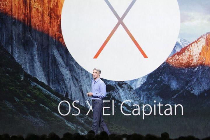

Let’s start with the name. OS X 10.11 is called “El Capitan” after the famous rock formation inside Yosemite itself. We think the name sounds a bit awkward after Yosemite, but it continues the new tradition of naming OS X after locations inside California, and ultimately the name isn’t a big deal. It’s the new features that are most important.
Performance improvements
There were very few rumors about OS X 10.11 ahead of WWDC 2015, which led many to believe the operating system would focus heavily on performance improvements. That appears to be correct.
Apple is boasting a number of general improvements. Apps supposedly switch twice as quickly as in Yosemite, PDFs open four times quicker, and other apps launch about 1.4 times more quickly, in general. Some users complained that Yosemite, while feature-packed, slowed performance. El Capitan is taking steps to address those concerns.

The other big announcement is Metal for Mac. To refresh your memory, Metal is the company’s low level graphics API. It was announced for iOS devices last year, but now it’ll be found on Macs, too. The company says rendering draw call performance can be improved by up to 50 percent when Metal is used, and rendering graphics requires up to 40 percent less CPU performance.
As always, these kinds of enhancements have to be seen to believe. We’re eager to see how El Capitan feels in practice.
Spotlight enhancements
Continuing the theme of refinement, Apple has announced some changes to Spotlight, which was dramatically re-designed for Yosemite. The search window is now a real window, rather than a static interface elements, and it can re-sized and moved like any other. That resolve user complaints that its location front-and-center was distracting.

More significantly, Apple has put effort into making Spotlight smarter with context-sensitive search. If you want to search for documents from June, for example, there’s no longer a need to research and enter complicated Boolean operators. Instead, you can type “documents I worked on last June,” and Spotlight will automatically know what you mean.
Built-in app enhancements
Apple has also added some refinements to how its applications work together. In general, image, text and link elements can now be used between applications more easily. Dragging a link into notes, for example, now auto-generates a thumbnail with a summary description. Similarly, it’s possible to drag images from one app to another, or between different open windows of the same app.

Some organization modifications have appeared, as well. Mail now has tabs, just like Safari. Speaking of the browser, Apple is adding “pinned sites” which appear on the left side of the browser’s tab line. These sites always appear and load when Safari starts. Finally, a new feature makes it easy for users to find tabs that are playing audio in the background, and mute them.
Windows management improvements
The last set of enhancements revolve around windows management. By far the most significant change is a new “snap” feature that lets users easily position a window on the left or right half of the display. In addition, Expose will let users pick which window takes up the remaining display space.
Windows users are no doubt raising an eyebrow at this point, as Microsoft added its own Windows snap feature in Vista, and with Windows 10 has improved it with very similar functionality. Still, it’s great to see OS X has finally improved this part of the operating system, which has lagged Windows for years.

Another big change is the ability to drag windows between virtual desktops, or make entirely new virtual desktops. This again is rather similar to how Windows 10 works, but at a glance it appears that OS X’s implementation is a bit more intuitive.
Last, and certainly least, is cursor shake. Give that cursor a wiggle and it’ll magnify, making it easier to find. Not a big deal, but hey – it’s still nice to have!
A new font
Most people didn’t notice, but the Apple Watch launched a new font from Apple called San Francisco. The custom-designed font was created to provide excellent readability on a small, pixel-dense display while packing in as much text as possible. Apparently, Apple found the font a success, because it’s appearing in iOS 9 and OS X 10.11 as well, where it will replace Helvetica Neue.
This may seem somewhat odd, particularly for OS X, because the original font was designed for an entirely different type of device. But recent updates to the Mac’s operating system have brought its visual design in line with iOS, for better or worse. Cupertino’s designers clearly believe a unified look is desirable.
We’re sure the transition will be met with both criticism and praise, but it’s unlikely to make a difference for most users. San Francisco is similar to Helvetica Neue, and users lacking an eye for the finer details of fonts may not even notice the change.
Swift 2 goes Open Source
Swift, the programming language that Apple put together for both iOS and OS X, will be receiving an update later this year. As expected, the new version promises performance improvements and “whole modulate optimization,” a feature that the company did not describe in detail.
Most importantly, though, Swift will be going open source. In addition to Macs, iPhones and iPads, the language will be available on Linux later this year. That’s a rather significant change, as Apple has restricted development for its devices to Mac OS X in the past.


