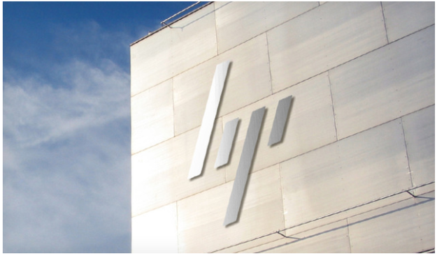
Earlier this week we got a look at what the future HP brand would look like—or at least could have looked like. Just after an image of the minimal-meets-modern take on the company’s logo leaked, an HP representative made sure we knew the futuristic rebranding won’t be coming to fruition.
“In 2008, HP asked marketing agency Moving Brands to propose new ideas for various elements of HP’s brand identify, including fonts, graphics, and logos,” a company spokesperson told Brand New. “HP is one of the world’s most valuable brands and has no plans to adopt the new logo proposed by Moving Brands. HP did implement some of the other design elements shown in the case study.”
The videos revealing the graphics have since been set to private and Moving Brands has been asked to remove much of the content, but a few images remain. Honestly, we wish HP would embrace the visual change. The company has had some well-documented missteps this year and definitely and had some issues keeping up with its tablet and PC competition. Injecting a little new life with an image overhaul would be good for a business that sort of seems musty in comparison to its industry.
We’re not suggesting that a chrome logo would fill all the holes missing over at HP, but it’s become pretty apparent over the last year that the company is struggling with more than just changing an icon.


