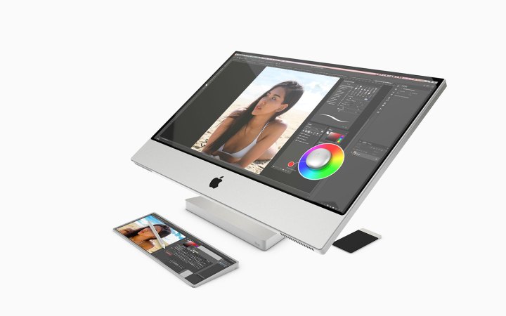
The iMac is due for a redesign. It’s an iconic look, but it hasn’t changed much in the past decade. The good news? If the rumors are true, a redesign is coming soon. Sure, it could be a simple face-lift, but what if Apple has something bigger in store?
A touchscreen Mac has long been a rallying cry of some Apple fans, but not me. As they’re currently designed, a MacBook with a touchscreen still doesn’t excite me. But what if Apple could take design elements from the iPad Pro and make them work on a new iMac? Now there is a concept that has my attention.
Was Steve Jobs right about touchscreens?

Apple has long denied it is interested in bringing touch capabilities to its Macs, despite filing patents for the tech since at least 2010. That same year, Steve Jobs decried touchscreen laptops as “ergonomically terrible,” saying “after a short period of time, you start to fatigue and after an extended period of time, your arm wants to fall off.”
For the longest time, I have agreed with Jobs on this point. Not only is constantly reaching up to a screen a (literal) pain, but you end up making your display a smudgy mess that continually needs to be cleaned. There is not even a desperate need for touchscreen features — the built-in gestures in MacOS achieve many of the same things a touchscreen would. It’s far from perfect, but the Touch Bar even fills in some of the gaps left by MacOS gestures.
But then there is Apple Silicon. At the company’s Worldwide Developers Conference (WWDC) in June, Apple announced that iPhone and iPad apps would work off the bat on Apple Silicon Macs, with no translation or recoding required. These apps are already optimized for a touchscreen experience. If Apple says they will work perfectly on future Macs, touchscreens seem like a no-brainer.

Given Apple’s past reluctance on this topic, it may not be wise to bet the farm on the next iMac having a touchscreen display. After all, as recently as 2018, Apple executive Craig Federighi said, “We really feel that the ergonomics of using a Mac are that your hands are rested on a surface, and that lifting your arm up to poke a screen is a pretty fatiguing thing to do.”
That point of view is all well and good when the surface you are touching is vertical. But what if it wasn’t? That’s where an iPad-inspired touchscreen iMac could sidestep this problem. By creating a much more comfortable angled surface — one you stand above, like a drafting table, meaning you do not need to raise your arms — the whole dynamic is changed.
Apple already created the surrounding ecosystem that could let a touchscreen iMac thrive. There is the Apple Pencil, which is already excellent on the iPad Pro. There is the company’s ProMotion technology, which automatically adjusts the screen refresh rate up to 120Hz for brilliant smoothness.
But now more than any other time in the last 20 years, it really feels like the pieces are coming together for a touchscreen Mac. This is hardly wishful thinking on my part, given how opposed I have always been to the idea. Until now, I have yet to see a compelling example of how it would improve upon the current crop of Macs without causing your arms to fall off.
Two wildly different products demonstrate this concept best. The iPad Pro and the Surface Studio — both involve floating screens and some interesting ergonomics.
iPad meets Surface

Let’s start first with the Surface Studio. It’s one of Microsoft’s most ambitious design experiments, and it serves as the perfect template for a new direction for a new iMac. Using a magical hinge, the Surface Studio transforms from standard all-in-one PC to full-fledged drawing canvas in a matter of seconds. Combined with peripherals like the Surface Pen and Surface Dial, it imagined a way of making a 28-inch screen naturally for touch input.
Apple isn’t about to just steal this design, of course. But the iPad Pro, holstered in the new Magic Keyboard case, sure looks familiar. It resembles for all the world like a shrunk-down version of Microsoft’s Surface Studio, with a healthy dose of iMac aesthetics thrown in for good measure. Scale that up to iMac size and we would have a seriously enticing touchscreen Mac.
The technology is brilliant — a set of magnets inside the Magic Keyboard case strong enough to hold the iPad Pro upright. The case uses a cantilevered hinge at its base and a folded seam roughly a third of the way up; angled correctly, your iPad Pro appears to float above the keyboard. See where I’m going with this?

Now imagine that same technology built into an iMac. Instead of the current design, which uses a rigid arm to fix the body of the computer in place, Apple could take inspiration from the iPad Pro. With an enlarged version of the cantilever hinge, we would finally have an iMac whose height and position could be adjusted on the fly (no, you still cannot do that. Want to raise the height of your iMac right now? Better find a pile of books).
But why stop there? Apple’s touchscreen iMac patent from 2010 contains an illustration showing the computer being pulled down to a 45-degree angle. A cantilevered hinge could be integral to this, mirroring the flexibility of the Surface Studio while allowing Apple to claim it found its inspiration in the iPad Pro rather than Microsoft’s amazing device (sure thing Apple, we believe you).
There’s more. There is a lot of speculation that the iPhone 12 will take on the iPad’s design language, with flat edges reminiscent of the iPhone 5 and earlier. But what if that same inspiration made its way to the upcoming redesign of the iMac? It could be the biggest — and most exciting — shake-up of Apple’s desktop all-in-one in close to a decade.
In fact, there are already clues that this could soon become a reality. As software designer Jordan Singer noted, the rounded corners in MacOS Big Sur fit almost perfectly on the iPad Pro and its smooth edges. That is not to say MacOS will imminently be ported to the iPad, but rather that Apple could be building a new design language for the Mac that takes the rounded corners from the iPad Pro and brings them to the iMac. After all, the software will soon be using these design conventions — shouldn’t the iMac hardware do the same?
Now that Apple has made a compelling “floating” design for the iPad Pro and is bringing rounded corners to MacOS Big Sur, the tide on a redesigned touchscreen Mac could turn. If Apple can put these concepts into action, I would be more excited about an iMac than I’ve been in years.


