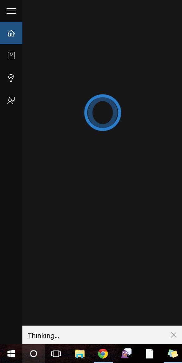
The software is quick to recognize she’s being asked to set a reminder after the first three words. While poised and ready to keep track of the appointment at first, by the time the word “go” is on the screen, she’s totally forgotten what she was doing. Instead, she hums thoughtfully and opens a browser window with a Bing search for the exact phrase.
I decide to try something different. “Cortana, where can I see the Entourage movie tonight?”
As one of the features built into Cortana’s dashboard, the query should be no problem. Again, she recognizes the syntax, contemplates the best course of action – and decides to search Bing for the exact phrase. It works, in this case, and Bing shows an 8:30 show time at a local theater, but it doesn’t feel like Cortana provided an answer as much as she lucked out.
“Cortana, you’re giving me a headache.”
Cortana considers this statement quietly for a few moments, her wheel spinning as she thinks about what she’s just heard. Perhaps taking offense at the slight, she responds in the only way she knows how – by searching for the phrase on Bing.
Blame it on Bing
Over the course of Windows 10’s beta period, Cortana’s functionality has improved vastly. We’ve seen her move from fatal bugs and limited uses, to a personal assistant with a number of queries and apps at her disposal – or so Microsoft says. In reality, Cortana still struggles to contextualize her conversations with you, which seriously limits her usefulness.
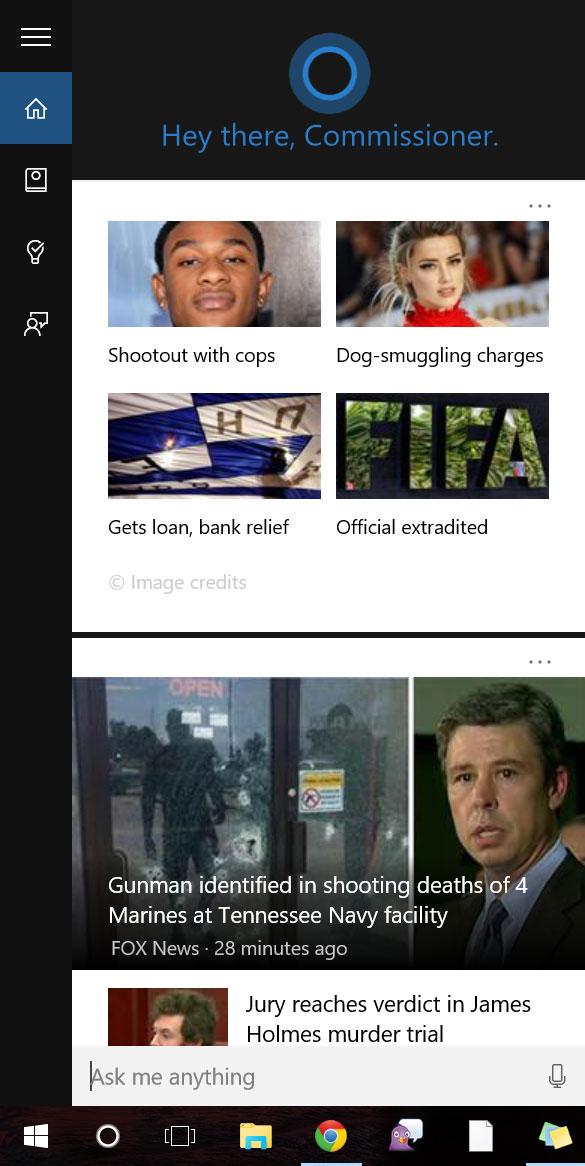
Clicking the search box next to the Start button brings up Cortana’s menu. This dashboard uses your location to pull in your local news source, weather, and movie showtimes. Yelp and FourSquare make appearances as well, providing information on nearby bars or parks. Some link through to their respective Yelp profile or the local news page, but more of them open a browser window with an applicable Bing search.
While the software is supposed to learn and respond to user interests, Cortana did a poor job of learning what I wanted to see, and an even worse job of sending notifications for headlines I might be interested in. Despite clicking through to a number of stories from the local news, I only ever received command center notifications for stock market news.
I can’t really blame Cortana, though, because the issues have more to do with Bing than with her. On the Bing news page, trending headlines are truncated and often impossible to understand. Some headlines are so badly mauled, they seem randomly generated. “$1.5 million water fine?” a headline inquires next to a picture of a man by a fence. “Luxury dog hotels!” another shares with a picture of a swimming pool.
But Cortana is more than just a second Start menu with auto-Bing button. She can also listen to you. Which isn’t as creepy as it sounds.
She’s a good listener
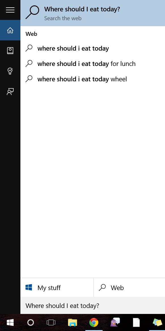
Cortana’s voice recognition is accurate and responsive. She does a good job of listening even through background noise, so she’ll be able to hear you annoy your coworkers by talking to her in a crowded office. She easily deciphers what you’re trying to say — and quickly searches Bing for it.
Cortana still struggles to contextualize her conversations with you.
However, while Cortana always knows what you said, she doesn’t always understand it. The phrase “Get directions to Breakside Brewery on Dekum” will open the built-in Maps application, but “Where is Breakside Brewery?” will not. If you wanted to go see The Entourage Movie tonight, you’ll be hard pressed to find show times through Cortana without searching for it in a new browser window. She’s technically capable of displaying this information – I know, because it worked once or twice — but I couldn’t pry the information from her consistently.
After becoming accustomed to how Cortana works, you’ll find keywords that help indicate to Cortana what you’d like from her. She seems to latch onto common words like “photos” or “remind” and then tries to build details from the words around them. You can say “Show me photos from January” and she’ll understand because she knows what photos are, and knows to look for a date in January. She doesn’t know what “show me” means, and even saying “images” results in a Bing search instead of a search in your own photos.
If you turn the feature on, you can simply say “Hey Cortana” while sitting at your computer to issue a voice command. That’s the theory, at least. Your mileage will vary depending on the environment and microphone. I wasn’t able to signal to her that I was speaking without pressing the microphone button, while others found her audio que usually responsive, though Cortana occasionally missed her call even in optimal conditions.
Looking in all the wrong places
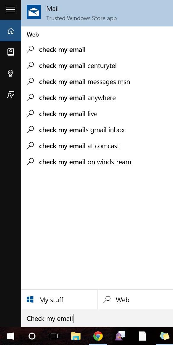
Typing queries into Cortana is the same experience as speaking to her, but worse. The main difference is that many of the commands that work properly when speaking into the microphone don’t when you type them in. Cortana seems to end up searching Bing even more than when spoken to. For example, you can ask her “do I need a jacket tomorrow?” to see the forecast, but typing the same phrase instead results in a Bing search.
If you give up on trying to make it an easy process, and work with Cortana a bit more, the functionality will start to show up. The “remind me to…” syntax works a fair amount of the time, but it’s hard to see the appeal of having Cortana remind you of something unless you have a Windows phone, or you take her with you.
Some of the new software has barely evolved over the course of the Insider preview.
There will be a Cortana app for iOS and Android sometime soon, but there’s no release date yet. A leaked beta of the Android app has been floating around for a while, and it operates roughly the same way as the Windows Phone version, with a few notable changes. On Windows Phone, Cortana can change settings, interact with other apps, and is generally more integrated than on Android. On top of that, both iOS and Android have their own well-integrated voice assistants that are both more effective than her.
Cortana’s accurate voice recognition and convenient location could make her the perfect platform for quick side tasks. In a perfect world, you could check movie show times without looking away from your email, or decide where to eat dinner while perusing Netflix. In reality, Cortana doesn’t make any of these tasks easier or faster. Thankfully, she isn’t the only new feature in Windows 10. Cortana is accompanied by Internet Explorer’s younger sibling, Microsoft Edge.
Edge ate all the buttons
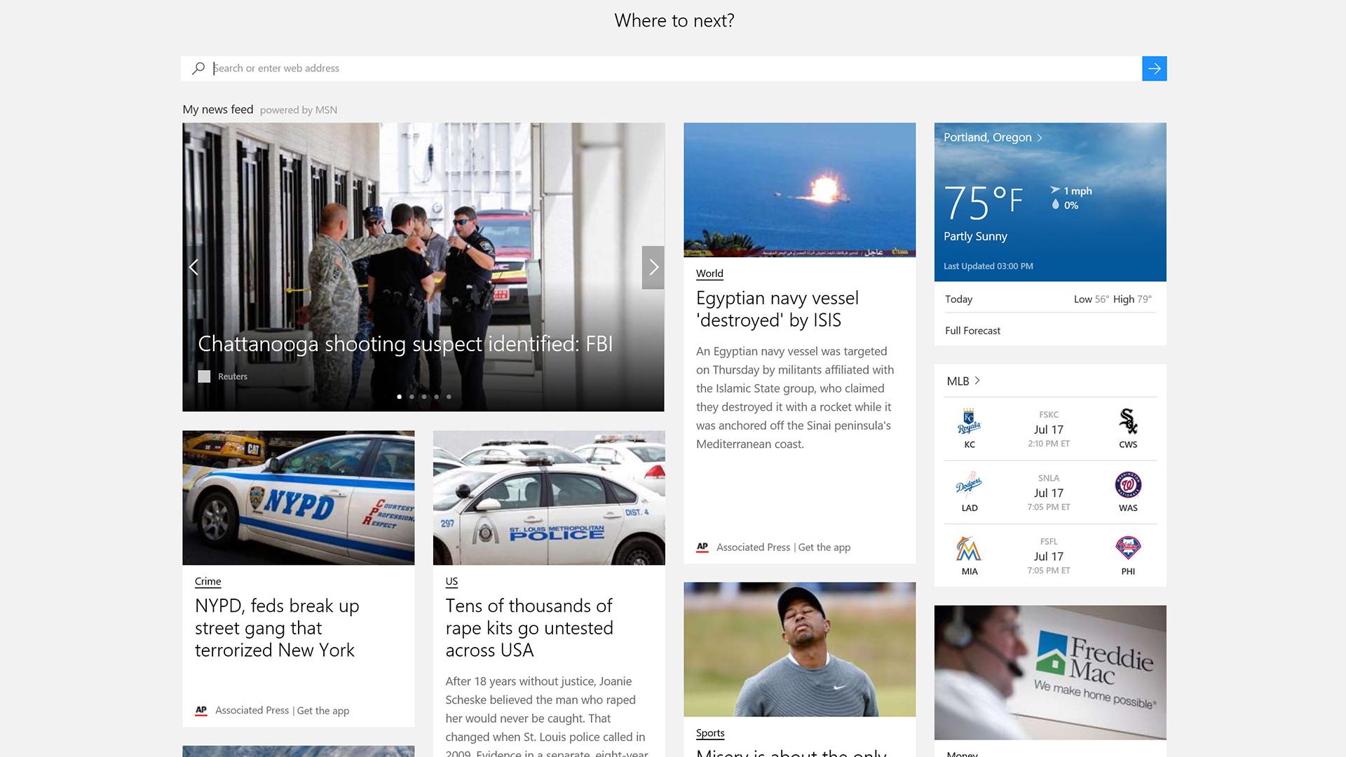
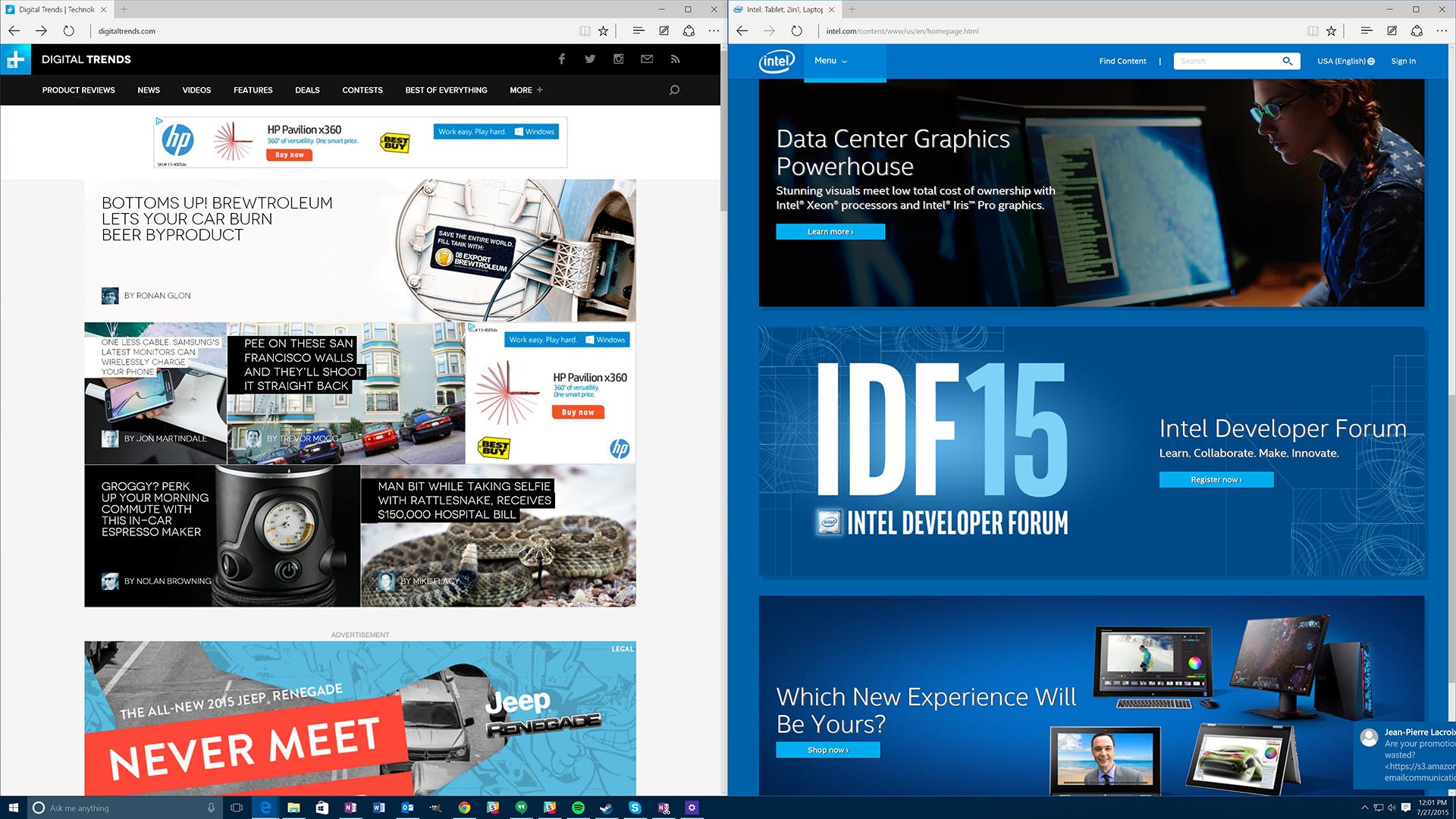
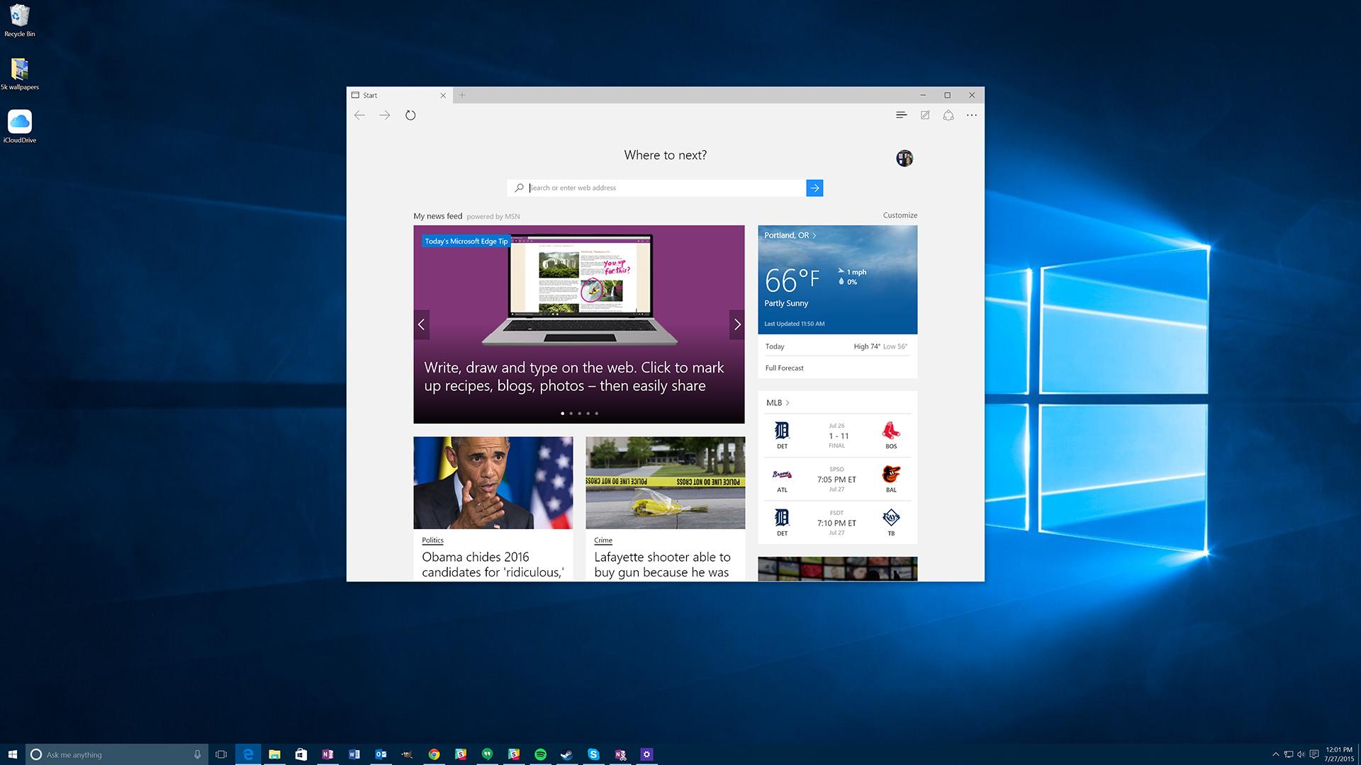
Microsoft started from scratch with the new interface for the Edge browser, but stripping it down to the foundation means many features had to be rebuilt, and it’s very much a work in progress. The interface is clean at the expense of convenience.
Strangely, Edge’s minimalist UI has made its upper bezel larger than the last version of Internet Explorer, and there are less options and buttons in that larger area. The result is a design that seems to offer the worst of all worlds. Chrome is even more minimalist, and Firefox is far more functional. Why choose Edge instead?
One potential reason – you’re a developer. Edge’s developer window is one of the comprehensive to grace Windows in recent memory. It has a slim black menu bar that cuts interface size while still providing a highly functional tab system. The tools are comprehensive: browser performance tracking, memory usage, console, debugger, network status, plus browser and geolocation emulation. If the rest of Edge were designed as well as this one menu, we’d be having a different conversation right now.
There’s a reading mode built into Edge too, and in fact it was built into Internet Explorer too, but Microsoft says use was low because it was only available in the Metro interface. It’s now implemented in all versions of the Edge browser, but it still doesn’t work as well as it should.
Stripping the formatting from pages certainly makes them easier to read, but it causes issues, especially on pages where there isn’t a clear source of content in the center. Images end up in the wrong place, asides and pull quotes are shuffled back in wherever they fit, and often details are excluded that are necessary to the story – like image captions or footnotes.
Cortana is hanging out in Edge, providing easy reading and info links as a sidebar if you right click on a word or phrase. It’s still basically just a Bing search, but sometimes that’s good enough to navigate straight to the Wikipedia page for a person or concept.
New features not working right only compounds the fact that basic features aren’t working quite right either.
She’ll also chime in while you’re searching if she has something to say, but that usually isn’t when you want it to be. Sure, typing “weather in Portland” into the Edge bar presents a prompt with the current weather, but that’s about it. There’s supposed to be integration with Yelp and Bing for better fast pre-search info, but even just typing the name of a well-known bar or restaurant doesn’t produce any special tooltips.
Internet Explorer was bad, but it did build on almost twenty years of experience. Edge, the newcomer, has created some problems that even Internet Explorer didn’t face. The settings are confusing and bulky, and they pull out awkwardly from the side of the window you’re working in. There are too few buttons on the taskbar, so in order to reach any buttons besides back, forward, refresh, and favorites you need to go into a menu. Microsoft’s effort to go minimal has back-fired, and the result is arguably even less appealing than IE 11.
Missing the mark(up)
Edge has a unique markup mode that lets users annotate pages as they browse the net. You can draw in pen, highlight, and make text boxes with notes or hyperlinks. That sounds useful, and it could be, but Microsoft’s execution leaves a lot to be desired.
Drawing on a page is far from smooth, and unless you have a touchscreen, don’t expect clean circles or lines. The editing tools are limited, so there’s no undo or delete. You have to erase the lines by hand using the eraser tool.
The text box tool is equally awkward. It doesn’t resize based on text input, so if you type a little or a lot, the box won’t be the right size. Dragging it around doesn’t show any drag animation — it just hangs out where it was until you release your mouse, then snaps to wherever you landed.

Worst of all, each of the mark-up tools seem to operate without any sort of awareness for the other tools.
Sure, highlighting in yellow over blue marker turns green, but the interaction basically ends there. The paint and highlighter tools cover text boxes and tags, so a note you left can be totally lost behind your drawing, never to be seen again.
The only part of the mark-up tool that works well is the clipping tool. It lets you draw a box around any part of a page, and copy that selection to the clipboard as an image. It’s essentially the same as taking a screenshot, but with only a limited portion of the screen. That image can be shared via OneNote, but is also compatible with any Windows app that supports the built-in sharing function. Power users will still likely use print screen or the snipping tool, but less practiced Windows users will find the screen clipping tool in Edge novel.
At least it’s fast
In order to find out how Edge fares under the hood, we ran it through a gauntlet of common browser performance and compatibility tests. It faced tough competition in the form of the most common browsers, Chrome, Firefox, and the old standby Internet Explorer. The version we’re testing is the one bundled with Windows 10 Build 10240, and according to the Microsoft blog, should pull out an impressive victory over Microsoft options.
Futuremark’s Peacekeeper browser test is one of the most common comparison benchmarks. It tests everything from the speed of a browser’s plugins and rendering engine to its compatibility with web standards. Both Edge and Internet Explorer score roughly the same, and neither of them supports HTML 5 video codecs WebM or Theora. Chrome and Firefox blow the Microsoft browsers out of the water in score and compatibility, with Firefox almost doubling Edge’s result.
Google’s Octane benchmark was created to test the Javascript engine in a manner that’s indicative of real-world modern Web use. Microsoft claims that the newest version of Edge is 11 percent faster than Chrome in the Octane test, and by our testing that number sounds about right. Beating Google at its own game is an impressive feat. Internet Explorer falls way behind the other browser options in Octane, at almost half the average score.
Unlike the other tests, Sunspider measure how long it takes for a system to run a set of benchmarks. That means a lower score is a better one, and here Edge is a clear winner. Internet Explorer already had an advantage over the other two browsers, and it only became clearer as Microsoft shaved another eight milliseconds off the total time.
Edge falls way behind the other browsers in HTML5 compatibility. Support is low across the board, but the worst performing area of the test is forms, where Edge only scores 46/75, as opposed to Chrome’s 73. The new Edge build is an improvement over Internet Explorer’s dismal score, but still falls well behind Firefox and other major browsers for HTML5 support.
Iffy extension support
Microsoft claims that it’s built Edge to accept Chrome and Firefox extensions with very little change to the extension code. That’s a big change from Internet Explorer that has a direct effect on performance and functionality.
Unfortunately, that’s not a feature that’s shipping with Windows 10, and Microsoft says that it hopes to have it live by the end of the year. That leaves Edge crippled, since it’s clear that a lot of the additional functionality that extensions will (hopefully) bring has been passed over by Microsoft for now.
Make new features, but keep the old
Cortana has a great interface and solid voice recognition, but the reliance on Bing to improve search numbers is holding her back. Poor spatial planning and little thought to implementing web features in Cortana has left her over eager to search, and light on functionality. Determining context has been an important step forward for Siri and other voice systems, but Cortana is still in its fledgling stages, and none of that functionality is present here.
Meanwhile, Microsoft Edge has stripped many features from Internet Explorer in order to lose weight, but in the process took out so much functionality that Edge is hardly a usable browser. Speed isn’t everything, and even fast benchmarks directly translate to a notably improved user experience. Adding barely functional new features, like markup, only compounds the fact basic features aren’t working quite right either. The end result feels snappy, but lacks the functionality users expect from a modern browser.
Despite assurances that Windows 10 would provide a sleeker, more efficient experience, the scaffolding is still attached to the building. Some features exist just to look at, while their usefulness in everyday situations is dubious, either because they don’t work intuitively, or at all. Hidden somewhere underneath all the construction equipment and plastic tarp there’s a lot of potential. Cortana has a great ear, and deep within Edge is a well-built web engine, but both headline features are difficult to use in their current incarnation.
Highs
- Solid voice recognition
- Edge is fast in benchmarks
- Great Edge developer menu
Lows
- Bing integration is careless
- “Hey Cortana” rarely works
- Edge is thin on features

