No matter what industry you work in, you’ve probably heard that artificial intelligence is coming for your job. Factory workers, news reporters, even stock brokers have all seen A.I. move into their fields, automating some of their roles. Proponents of automation point out that it tackles the menial, repetitive tasks, freeing workers to focus on more creative aspects.
Now, gig economy marketplace Fiverr recently announced a new A.I.-powered tool that helps businesses create a logo.
As the company puts it in its press release, “There is a specter haunting the future of work in the form of A.I. and automation enabling machines to displace people’s jobs.”
Rather than offer Andrew Yang-esque worries about the future of work, Fiverr takes an optimistic view. “The future of work is one where A.I. supports more people, to create more with less effort,” CEO Micha Kaufman explains in a statement.
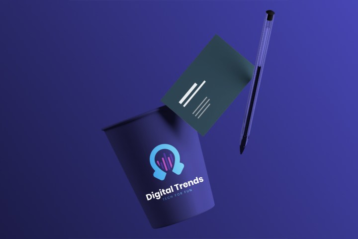
The tool begins with a collection of assets made by Fiverr “community members,” the uses A.I. to quickly select and customize logos tailored to the mood of a specific business. How well does it work in practice? We spent some time playing around with it to create a “new” logo for Digital Trends.
All the logos you need in two shakes of a lamb’s tail
To start, you provide your company’s name and slogan (we took some liberties with the latter for this exercise). You then provide some industries you work in, and any keywords that can help the A.I. narrow down your business model. After that, you’ll see sliders for concepts like Fun/Serious or Simple/Sophisticated. Tune these to your liking and you’re off to the races.
The Logo Maker will spit out a selection of logos, and you can then customize them manually. In our first attempt, we went light on the keywords, and the results, to this writer’s eyes, ranged from decent to incredibly dull (one of the best had a color palette eerily evocative of The Verge, as if we’d skinned their visage and fashioned it into an ill-fitting mask). There was even a knockoff Pokéball!

The experts weigh in
Seeking expert opinions, we decided to consult the graphic designers in our office to see what they think.
First impressions? “Passable, if a bit generic, and the typefaces are pretty uninspiring,” said Digital Trends Content Specialist Chris DeGraw, adding that it’s a “good place to start, though. And hey, I’ve seen many businesses with much much worse in the real world.”

They look “like clean, modern logos, but they aren’t very company-specific and feel a bit disconnected/generic,” said Content Manager Genevieve Poblano. “Still decent but lacking that custom fit. But like I said, if you want something quick and generic or a template to base your stuff off of, this works.”
“If you want something quick and generic or a template to base your stuff off of, this works.”
Senior Designer Will Hawkins said the design reminded him of clip art in terms of “the overall inconsistency. [There are] varying line weights in the illustrations, the illustration style doesn’t necessarily match the fonts being used, and they are all so generic that they become ambiguous, which is why they can’t vary from brand to brand.”
Adding to this, Poblano referenced the logos’ “lack of soul.” [Note: She actually used Slack’s Giphy function to post a GIF for the phrase “lack of soul.”] “I think if you want something quick and generic, this might work. I would be curious to see what it does with a different industry like a restaurant.”
All around me are familiar logos
After consulting Digital Trends’ design oracles, we ventured once more into Fiverr’s underworld of bland but serviceable designs. We decided to test it out with some fake companies from various industries.

Our fake ad firm Mad Men at Work got some interesting designs (including some sort of eldritch octopus), but we noticed some repetitive themes. There was some overlap with the fake Digital Trends logos, with some even using the same colors.
The generic quality became even more apparent when we ran a search for our new sci-fi themed, royalty-free sandwich shop, The Sandolorian. Despite only using “sandwich” and “sandwiches” for tags, we got logos promising a variety of dishes including shrimp, noodles, and pizza. Most inexplicable was the nightmare octopus from our ad agency, this time with creepy, pupil-less eyes.

For now, at least, the graphic designers of the world can relax. Like all artistic pursuits, graphic design rewards a personal, creative touch that Fiverr’s tool isn’t yet ready to offer, although the app “also provides buyers the option to work with the designer who created the original logo template on any special enhancements that can’t be modified through the A.I.”
It’s possible that a tool like this will one day surpass human artists, but until then, The Sandolorian will take its business elsewhere.


