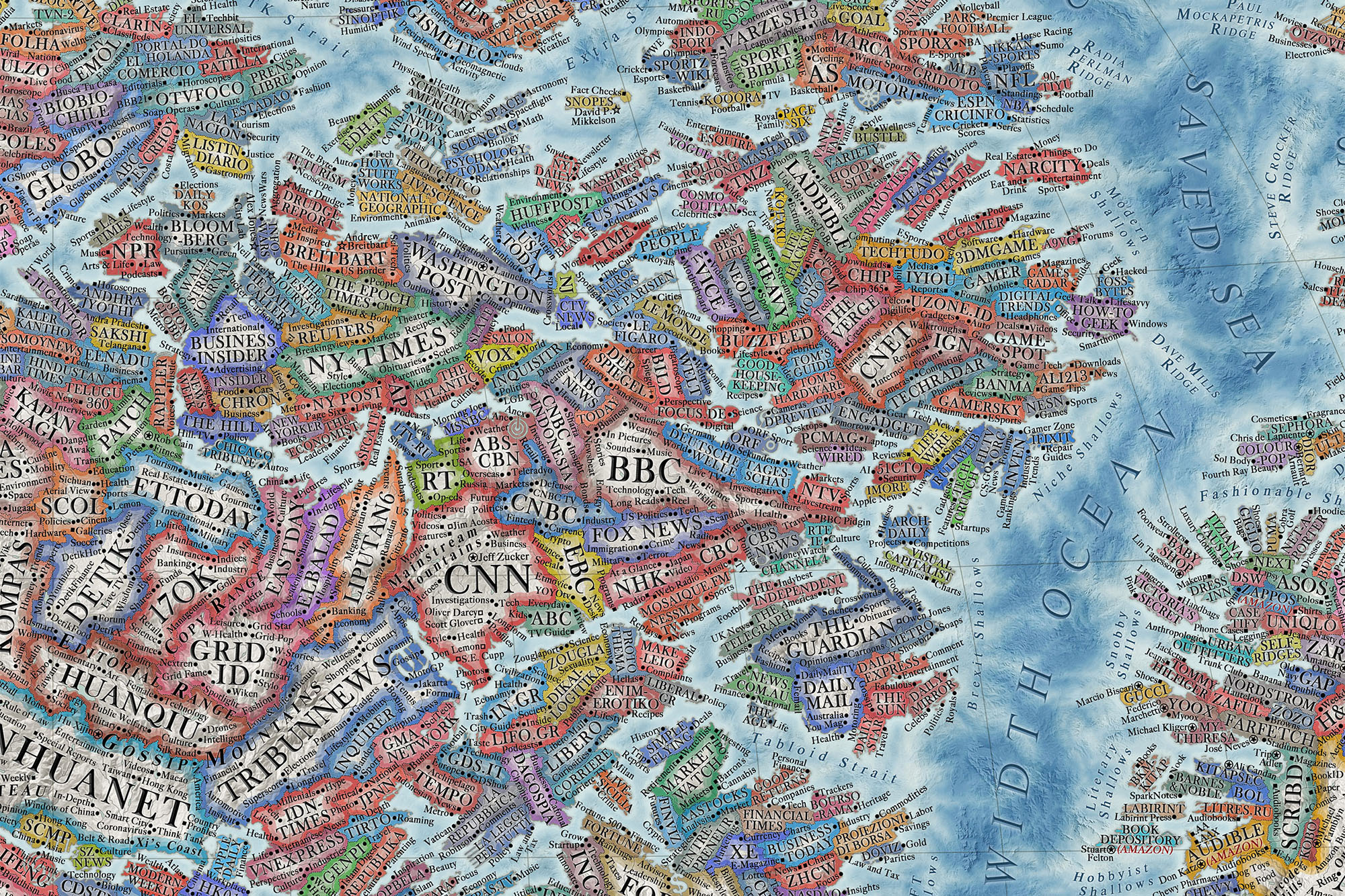
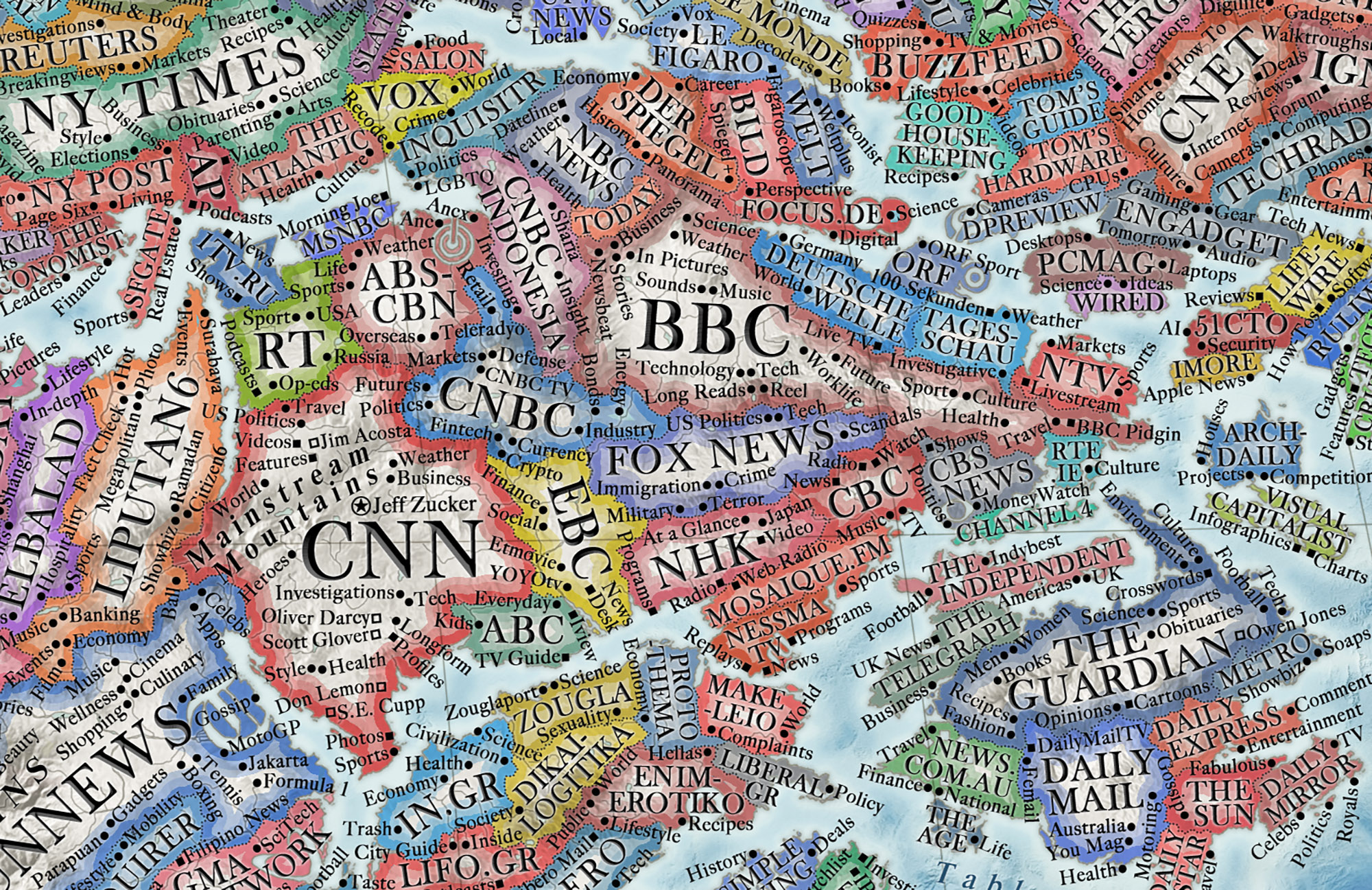
What is the internet, and how do you map it? It’s a tricky question. Despite the fact that it is sometimes, although decreasingly, called “cyberspace,” suggesting some kind of geography, it’s not entirely clear what a map of the internet should actually look like. Is it a map showing the internet, as the former U.S. Sen. Ted Stevens once put it, as a “series of tubes,” piping hot information around the world at 300,000,000 meters per second? Is it a map, akin to the opening credits of Silicon Valley, depicting the opulent headquarters of those companies who rule the online sphere: the Googles, Facebooks, Amazons, and Baidus of this world?
To Martin Vargic, it’s neither: It’s an 18th-century-style map that looks like something out of the golden age of cartography, only depicting the world’s 3,000 most heavily trafficked websites instead of countries and cities.

“Sites that are similar are grouped into continents and regions,” Vargic, a 23-year-old self-taught graphic designer from Bratislava, Slovakia, told Digital Trends. “It’s quite accurate. I use the annual average Alexa rating, which ranks websites by their visitor numbers and popularity ratings. The higher the ranking, [the larger the country.] So Google is No. 1, meaning that it’s the largest. YouTube is No. 2, so it’s the second largest. And so.”
The results, which took Vargic an estimated 1,000 hours to complete (“Presumably you weren’t doing this 12 hours at a time?” “Sometimes I was,” he responded), are pretty spectacular.
There are dozens of distinct regions and continents, grouped into categories like “news sites,” “search engines,” “social networks,” “e-commerce” and “adult entertainment.” Then there are more than 10,000 “cities” and “towns” representing subcategories of these broader nations. Even the mountains, seas, hills, and valleys refer to aspects of individual websites. Some larger websites have hundreds of subcategory tags. Vargic said that he drew the whole thing out on Photoshop, with the eventual file being “like, 5GB of data.”
Vargic started creating maps at the age of 11. “But I didn’t publish them online until I was 12 or 13,” he said. Over the years he has created a number of maps relating to different topics, from potential effects of nuclear war on the United States to the settings of famous animated movies a map of literature, a “truly gargantuan visualization of the 5,000 years of literary masters and their works, showing how the different literary genres sprouted, branched and eventually evolved to their modern state.”
He sells prints of them on his website and has even collected them in a couple of books, variously titled Vargic’s Miscellany of Curious Maps and Vargic’s Curious Cosmic Compendium.
Evolution of the internet
One of the fascinating aspects of maps, of course, is that it cements everything in time. Throughout human history, the world’s borders and nation-states have existed in various states of contested flux. However, when presented on a map they appear fixed in a permanence that, in real life, they never are. This is also the story of the internet. No, Reddit isn’t waging war on Quora or Facebook on Amazon (at least, not in the way that, say, England and France have battled it out at times), but fortunes and prominent sites have certainly waxed and waned over a comparatively brief span of history.

“I have been largely focusing on the evolution of the internet only since 2013 to 2014, when I created the first proto-version of the map, [albeit] much smaller and of much lesser quality, so I missed the rise and fall of MySpace, Geocities, Orkut, and other ‘ancient’ sites,” Vargic noted.
Nonetheless, there’s something definitionally impossible about mapping the internet. It’s as impossible as trying to watch every video on YouTube or keeping a paper record of what’s happening on Twitter. A map of the internet — even one based on 2020 and 2021 data — is already out of date in minor, small details. Over just a few years, it will appear downright anachronistic. Consider that TikTok, Zoom, and Discord would have appeared on no technology maps just a decade ago.

“Overall, since 2014, the popularity of non-English websites has increased considerably,” he said. “About a third of the world’s most visited 50 websites are based in China, with Tmall, QQ, Baidu or Sohu surpassing Amazon, Yahoo, and even Facebook in terms of traffic. There is also a much larger amount of popular Indonesian, Indian, Iranian, Brazilian, and other sites than seven years ago.”
This international shift is visualized in Vargic’s map, thereby showcasing a key change in the development of the internet: perhaps finally living up to that World Wide Web moniker that no one today uses.
In other words, think of this internet map more as a historical artifact than a guide on how to actually traverse the roads of cyberspace going forward. Come to think of it, maybe it really does warrant that vintage aesthetic that Vargic selected for it!


