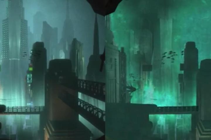
While the character models and environmental textures, there are notable difference in quality for lighting and particle effects, not to mention the overall level of detail. Characters lack shadows, the atmosphere lacks the original game’s pervasive mist, and the camera is not impacted as much when you get hit.
It makes sense that graphical compromises are a necessary trade-off for mobility in the translation to portable devices — especially with Apple’s 2GB limit on App Store downloads — but it’s unfortunate that the original game’s astounding level of immersion takes the hit. Still, if you’re a total newcomer to the series, the wonderful story is intact and ready to be experienced for the first time all over again by a completely new audience.


