“TomTom has the edge in terms of map accuracy and traffic information repeatedly besting Waze and other services. But many drivers will turn to free smartphones alternatives anyway.”
- Reliable maps
- Excellent traffic information
- Quick response times
- Smaller icons make interface trickier
- Smart phone required for traffic info
The trouble with navigation isn’t usually finding your destination, it’s finding the quickest way to your destination. One of the first companies to deliver useful live traffic information to solve that problem on its portable navigation devices was TomTom. Now the company is giving it a new spin with its $250 GO 500.
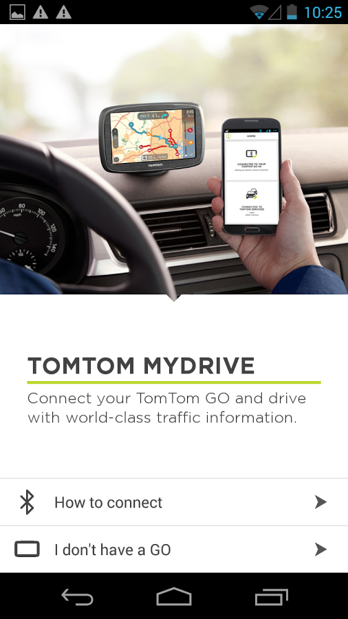
Rather than relying on costly subscriptions and built-in cellular data services, the TomTom GO 500 relies on live traffic information sent from a Bluetooth connected smartphone. It collects live traffic information — position and speed — from fellow TomTom users and shares relevant information for your route. No more additional fees, and free live traffic for life.
The device has a 5-inch touch screen and free maps for life (covering the U.S., Canada, and Mexico). Also included are 3D maps of major metropolitan areas showing animated landmarks along your route and detailed lane diagrams at complicated intersections. TomTom also updates the location of what it euphemistically calls “safety cameras,” those controversial red-light cameras that are cropping up in more municipalities.
New Paradigm Setup
Before testing, we connected the GO 500 to a PC to make sure we had the latest software updates. The TomTom MyDrive online system is sleek, easy to follow, and quick. Once we confirmed we were up to date, we then downloaded the companion MyDrive app to a smartphone (it’s compatible with iOS and Android phones; Blackberry and Windows users need not apply).
Popping open the app, one can check out current traffic. You’ll see an array of orange and red car icons that represent other TomTom drivers peppering congested areas like Manhattan. There’s also what is known as flow data indicating the average speed on nearby roads (red means stay away from FDR Drive, orange means 3rd Avenue is a better bet). It’s all business compared to the colorful bubble heads of Waze.
Tethering your phone to the navigation device lets you use your existing data plan to receive traffic information. Over several hundred miles we didn’t see a bump of more than a few megabytes of data usage.
GO Drive, She Said
In the car, TomTom’s included window mount is unobtrusive and sticky, so it doesn’t create more of a blindspot than it has to and yet remains stubbornly adhered to the windshield. Power is maintained via an included 12-volt adapter.
A second system we tested for comparison occasionally triggered the GO 500 with its own robotic responses (if only they could really talk to one another).
In striving to be more svelte, in some ways the TomTom interface has become trickier to navigate over the years. Older models used large, clunky icons to launch address searches and change settings. They were unattractive, and they took a few more steps, but they were obvious. The GO 500 uses a simplified but smaller array of icons that can be difficult to tap your way through (you should always be parked to do so, of course). On the other hand, entering an address is a single-step process and you can pinch to zoom the touch screen.
The built-in voice recognition is a listener of average abilities. After you say, “Hey, TomTom,” to launch it, you can bark out addresses with relatively few missteps. Although if you look for something unanticipated, like a Canadian address while you are in the United States, the voice recognition will be flummoxed. Humorously, a built-in car voice recognition system we tested alongside it for comparison occasionally triggered the GO 500 with its own voice responses (if only they could really talk to one another).
The basic staples of navigation — maps and traffic — are first rate on the GO 500. Over several hundred miles of testing in the Northeastern U.S. and Canada, it steered us unerringly in the right direction (even around some nasty traffic problems in Ottawa). Newer streets, such as a recently finished private hotel road, were correctly identified when other systems — including Waze — missed it entirely. Traffic information and handy re-routing were extremely welcome along the I-95 corridor where changing construction schedules can cause hours-long delays.
Still a Place for PNDs?
The decline in the use of dedicated portable navigation devices is undeniable. Smartphones have become the default navigators, music players, and cameras for many owners.
However, TomTom was still able to demonstrate that it has the edge in terms of map accuracy and traffic information. The company says it has roughly 150 million drivers in the U.S. providing information, updated every 2 minutes and covering some 99 percent of the country’s roads. In our tests, it repeatedly bested Waze and other live traffic information services. Leveraging owners’ smartphones to deliver that information to the windshield-mounted TomTom navigation device is also a clever way to eliminate additional monthly charges.
In spite of the benefits, however, we can’t help but recognize that many drivers will doubtless decide to forgo the GO 500’s accuracy in favor of freely available smartphone apps.
Highs
- Reliable maps
- Excellent traffic information
- Quick response times
Lows
- Smaller icons make interface trickier
- Smartphone required for traffic info


