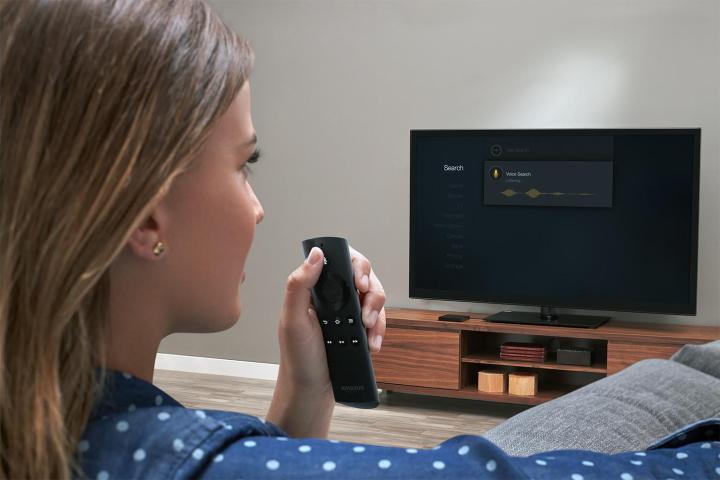
In the most significant change to the UI since Fire TV’s initial debut in April of 2014, the new user experience no longer features different categories in side-scrolling carousels in the primary navigation located on left side of your interface. Rather, you’ll now see everything at the very top of your screen, and you won’t have to choose from so many categories, either. Paradox of choice, you see.
Rather, Amazon told Slashgear, the new larger space allows users to “preview new TV shows like Amazon’s Originals, movies, apps, and games,” and can also be “scrolled from side to side to see other headline titles.”
Moreover, Amazon has learned from its users preferences, and discovered that Fire TV subscribers were much more inclined to watch a show if they could sample it first — not just look at a still image from the series. That means that the hero image of a show is actually a moving image — like a trailer. Ultimately, Amazon says, “hero contents will be shaped by what individual users have been watching.”
Amazon has also made it easier to determine which content is free to watch, and which you’ll have to pay for, by including a “Prime Video” flag for its own shows and movies that are included with your subscription. And if you navigate over to the “Your Movies” tab, you’ll find everything to which you have a subscription. That means all your Netflix, Hulu, and Amazon titles will be in one place, and Fire TV will always play the version that is free for you to view.
So go ahead, friends — figure out your queue for the holiday season. It’s fast approaching.


